The global coronavirus (COVID-19) pandemic has made location analytics more crucial than ever. Esri has been assisting hundreds of responding agencies through the Disaster Response Program, and providing software access at no cost to help jumpstart response to COVID-19. Just added to this software list is access to ArcGIS Insights, a self-service location analytics product. ArcGIS Insights empowers you to perform exploratory and advanced analytics such as spatial, statistical, predictive, and link analysis on your traditional and spatial datasets. Let’s look at a few reports that the Insights team has created over the last few days. These examples range from basic to advanced and contain a complete set of instructions for you to recreate.
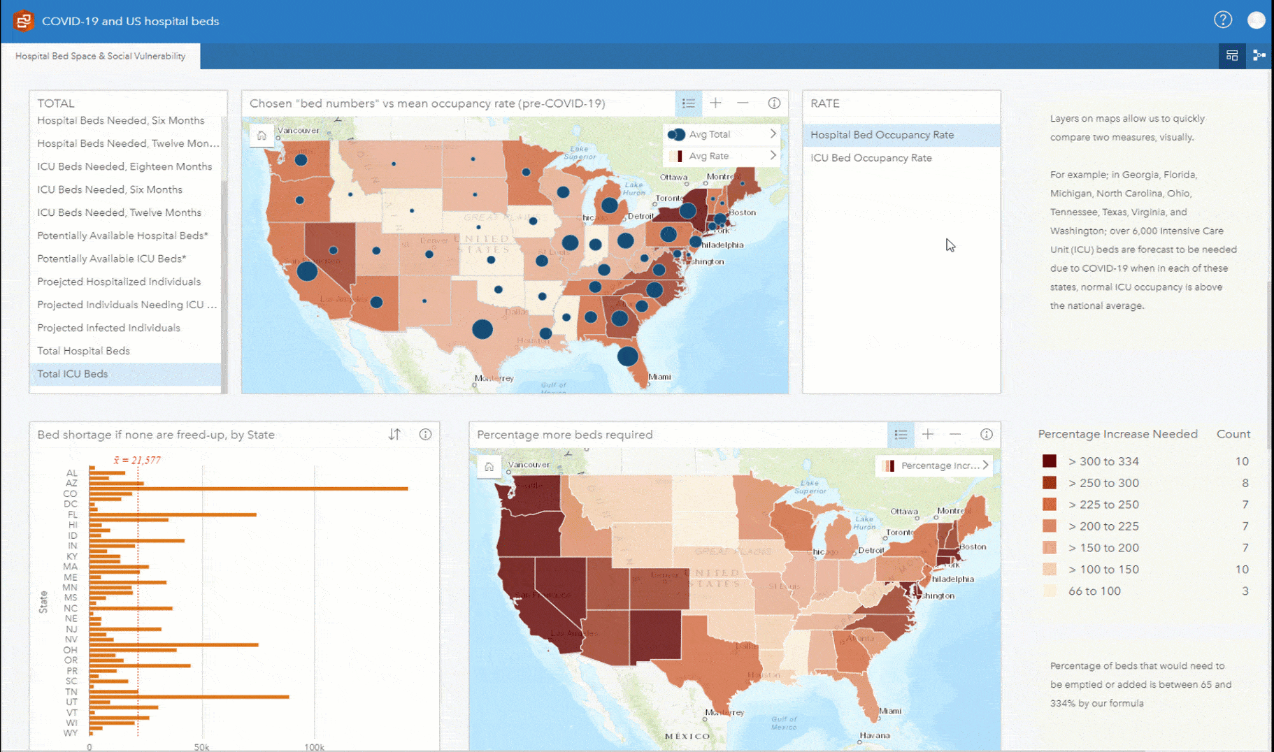
Hospital beds vs Predicted Needs
In this example, compare statistics on bed occupancy across all states in the US against the projected bed requirements as a result of the COVID-19 outbreak. There are specific statistics available for intensive care via a filter. It identifies possible bed shortages at state level and visually shows them in relation to those most vulnerable. This example is created using data from Harvard Global Health Institute (HGHI), Centers for Disease Control and Prevention (CDC) and Definitive Healthcare. Individual hospital employee data is fabricated.
Interact with the visualization
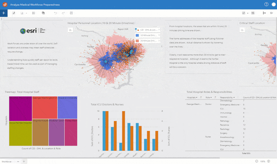
Hospital Workforce Readiness
This example provides you with a snapshot of the readiness of hospitals in Northern Virginia and Washington DC. The visualizations can help you answer questions, such as: How far away are all doctors from the hospitals where they work? What is the total count of employees at any of the given hospitals? Of those, who is the critical staff and how far are they from the hospitals? How many ICU, license, and staff beds and ventilators do the hospitals have? This example is created using Definitive Healthcare: USA Hospital Beds data from the ArcGIS Living Atlas of the World.
Interact with the visualization
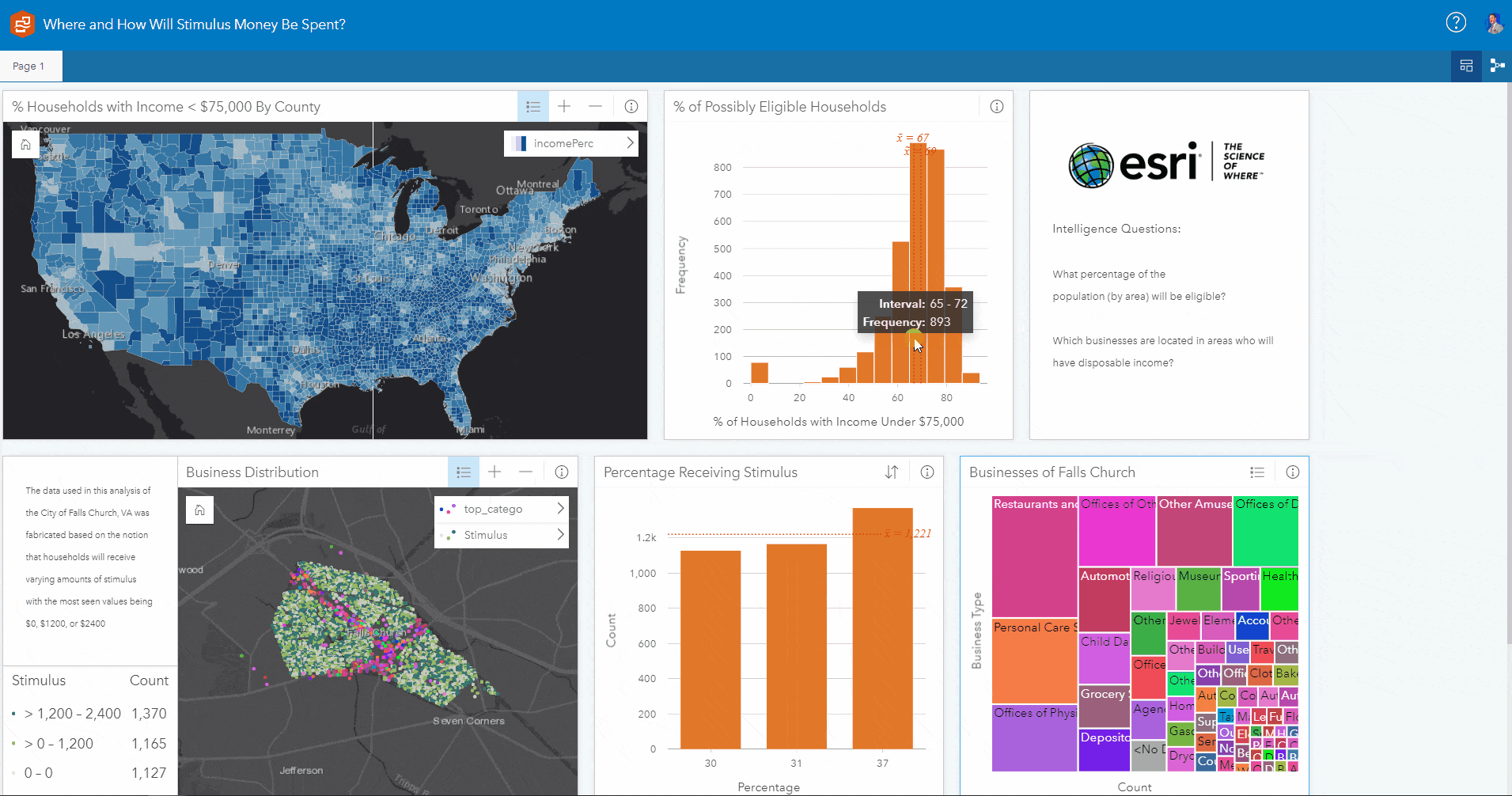
Where and how will stimulus money be spent?
This example helps you filter counties across US based on the percentage of total households eligible to receive COVID-19 stimulus checks by the US government. It also provides you with an overview of the City of Fall Church. You can filter the households in the city according to the varying amounts of stimulus checks and see where they are located. To gain more context, you can also see where different businesses are located across the city. This example is created using data from SafeGraph Points-of-Interest (POI), USA Counties from the Living Atlas of the World, and the City of Falls Church Open Data. Stimulus data for City of Falls Church is fabricated.
Interact with the visualization
The above examples are just few of the ways in which the value of location can help combat COVID-19 and are intended to help you get started. A complete list of examples can be found within the Insights and COVID-19 Discovery Path. We will add more examples, so check back soon and look out for more blogs.
Insights is available as a desktop and SaaS product, and it also works behind your firewall. If you don’t have ArcGIS Insights today and are combating COVID-19 crisis, you can request assistance, including ArcGIS Insights software here. Learn more about Insights.

Article Discussion: