March 17, 2020 |
Multiple Authors | GIS for Good
April 7, 2020
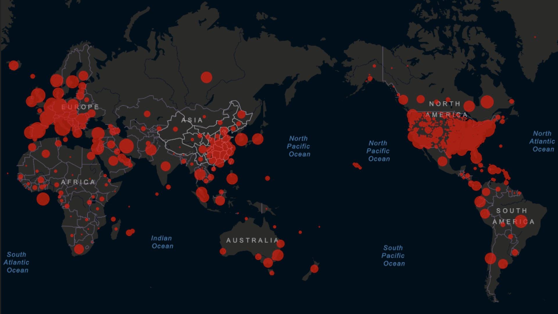
Early on epidemiologists watched with growing concern as the number of people around the globe diagnosed with novel coronavirus 2019 (COVID-19) began increasing this year. When the epidemic turned into a pandemic, many anticipated shortages of hospital beds, supplies, devices, and medical personnel as the number of cases grew.
Ahead of inquiries from concerned leaders, scientists began creating analytical models that could quantify and predict the surge in COVID-19 cases. From that effort, a number of powerful models have emerged as useful tools for planning.
Penn Medicine’s Predictive Healthcare Team adapted the susceptible, infected, and recovered (SIR) mathematical model, to create a new model it calls CHIME (COVID-19 Hospital Impact Model for Epidemics). The CHIME model provides up-to-date estimates of how many people will need to be hospitalized, and of that number how many will need ICU beds and ventilators. It also factors social distancing policies and how they might impact disease spread.
Find the CHIME Geoprocessing Tool here.
Public health administrators, hospital administrators, and government authorities from around the world have been quick to recognize the need for forecast models like CHIME to guide public policy and plan hospital response.
Watch this video for more details on integrating modeling and forecasting into existing GIS workflows.
At the onset of the COVID-19 outbreak, Esri’s spatial statistics software development team worked to incorporate several of these open-source models into the geospatial toolbox, starting with the CHIME model. Bringing a model into a geographic information system (GIS) aligns it directly to the data source that drives the model. This integration provides the means to visualize a problem geographically and ties model outputs to solutions designed for immediate action.
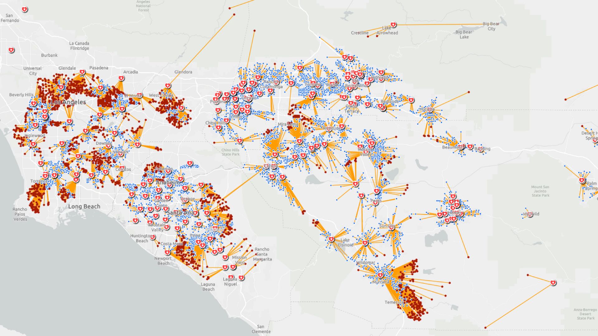
Within GIS, users can drill more deeply into specific geographies to see model outputs alongside other spatially varying data—such as senior populations or communal living places which are more vulnerable—to explore what the model results mean for people and places. This approach also fuels the next question, which is, “where and when should resources be moved to meet the demand?” Tools such as location-allocation can guide these decisions and make sure demand is met as effectively and equitably as possible.
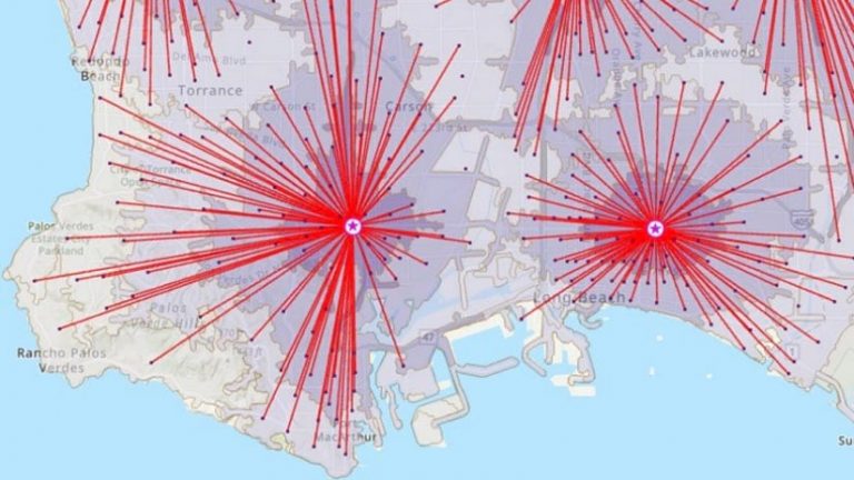
Incorporating CHIME within GIS directly supports discussions within Emergency Operations Centers where model outputs can be shared on large screens to guide collaborative planning discussions. Then, when decisions about what actions to take are made, GIS provides the means to push data and directives into map-driven apps and solutions first responders use in field work.
For emergency response and other essential functions, GIS has long been a standard. It supports the creation of data-driven maps and other visualizations, construction of models to analyze geographic processes, and solutions that guide workers in the field. GIS users around the world are applying these capabilities to a number of different COVID-19 activities to improve health, safety, and economic outcomes.
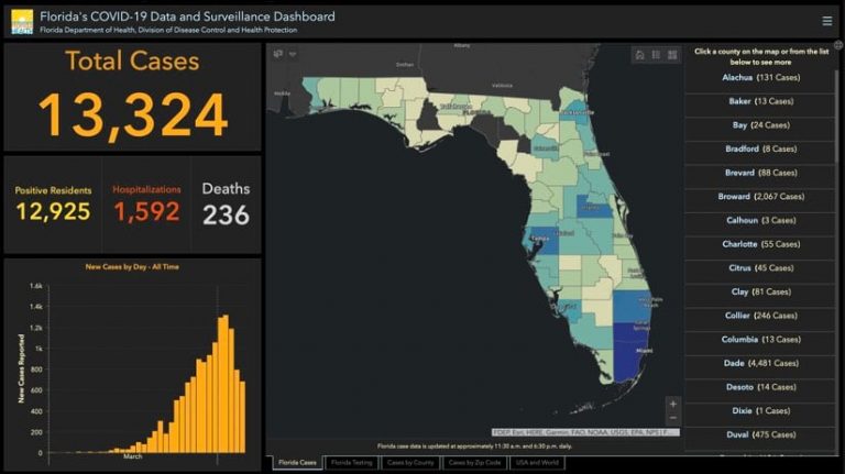
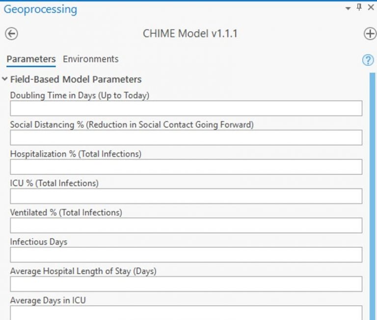
Within GIS, users make connections to the data sources that inform the CHIME model. This data includes current case information about the number of people hospitalized. It also includes the susceptible population and characteristics of the virus such as the hospitalization rate and the doubling time.
To gain a localized forecast, GIS users can choose a specific start date and the average number of days of infection to project the current pattern forward. A number of models emerging in response to COVID-19, including CHIME, can include social distancing measures—such as stay-at-home or shelter-in-place directives—taking into account how reductions in physical contact helps slow the spread of disease. Modelers can use available aggregated and anonymous mobility data, based on actual movement, to augment the inputs for this measure to better gauge areas of high versus low social contact.
Details such as average hospital length of stay, the percentage of people who will be ventilated or need intensive care, are also key inputs to the model. The model can then be compared to current hospital capacity, such as available beds and ventilators. Comparing the peak of disease spread to hospital capacity helps local authorities determine when more hospital beds may be needed and plan ahead to meet spikes in demand. While users of a model can input generalized (averaged) parameters, they will achieve greater accuracy and thus higher value by using more precise values that better represent each area’s underlying population characteristics and response to social distancing efforts.
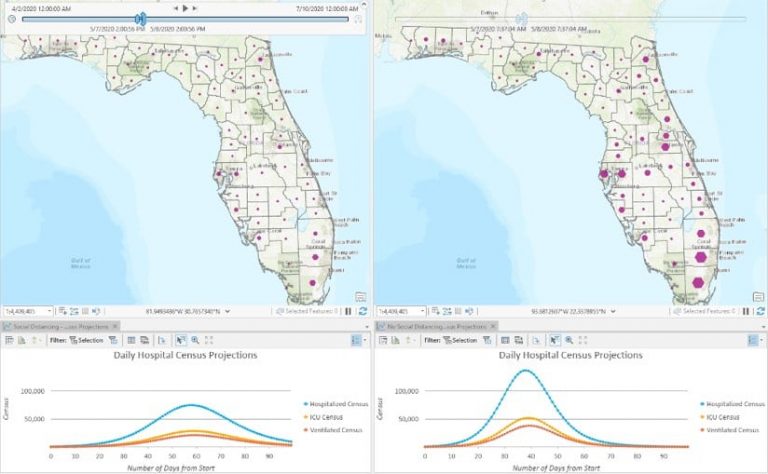
Policymakers can examine a variety of scenarios—such as social distancing, along the scale of none to stay-at-home orders—when the model they’re using has the flexibility to tune a broad set of parameters to show how the forecast changes. Seeing how behavior affects the course of the disease across space and time drives home the importance of policy actions during a pandemic.
Visualization of these inputs illustrates exactly what it means to flatten the curve. With greater social distancing, the peak comes later, lessening the burden on medical care providers and the healthcare system.
Using GIS, officials can further explore the modeled forecast and answer other location-specific questions crucial to response and recovery. The spatial analytical power of GIS can be used to analyze and understand a variety of critical questions related to COVID-19, guiding actions to reduce the impact on individuals, healthcare systems, and businesses.
The Esri spatial statistics software development team continues to build more models into the toolset because they believe that the more ways officials can look at the COVID-19 pandemic and its repercussions, the more prepared and able they will be to respond effectively.
Learn more about how Location Intelligence Enhances COVID-19 Collaboration and read a white paper on Geographic Information Systems for Coronavirus Planning and Response. See the COVID-19 GIS Hub for location intelligence resources. The Coronavirus Response solutions page provides a collection of maps and apps that can be used by public health agencies to understand the virus’s impact and share information about the pandemic with your community.