Each year we look at hundreds of story maps from authors around the world. One of the distinguishing features between good stories and great stories is how authors use graphic elements to create a unified look and feel. In doing so, they create a harmonized experience that can really resonate with readers.
Graphic elements like icons, illustrations, and other visual flourishes may seem subtle, but when done correctly, they can make a major impact on a story map. Here are some techniques for using graphics to make your story map more cohesive.
Graphics create a unified look and feel for your readers.
Graphic elements help build a rhythm and cadence to a story map, which makes it easier for readers to digest the content of the story. ArcGIS StoryMaps has built in content blocks designed specifically for adding graphic elements to stories. The separator block, quote block, and the button block are particularly helpful for doing this.
If these features aren’t enough, try incorporating custom graphics, uploaded as images, into your story map. The most effective graphics have matching aesthetics and tie directly to the content of your narrative.
Tip: Try creating graphics using .png formats with no background for your graphics and experiment with a variety of sizes in the builder.
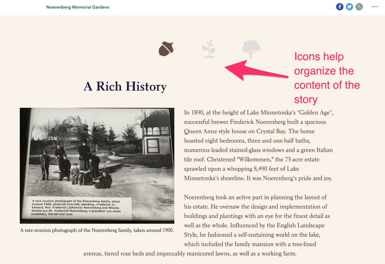
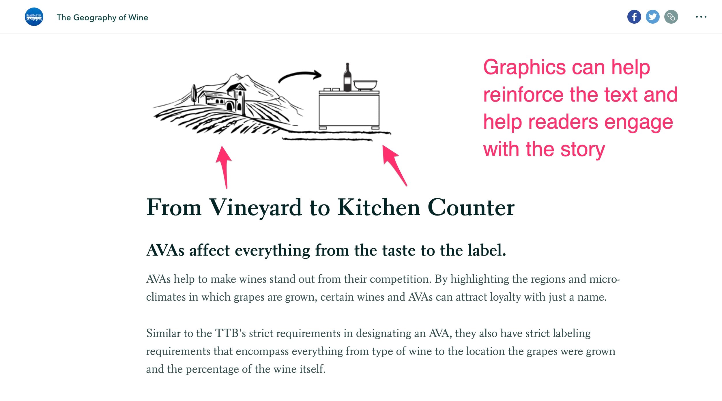
Graphics elements help reinforce the content of your story
A simple artistic element or infographic can support what your text is about. These visuals refocus your readers on the text and keep them engaged in your story. Simple graphics like this may seem hard to create but there are lots of graphics libraries that can help get you started. Check out the Noun project for instance.
Note: Be sure to credit authors work when using artwork and monitor any icon library source to make sure their terms and conditions haven’t changed.
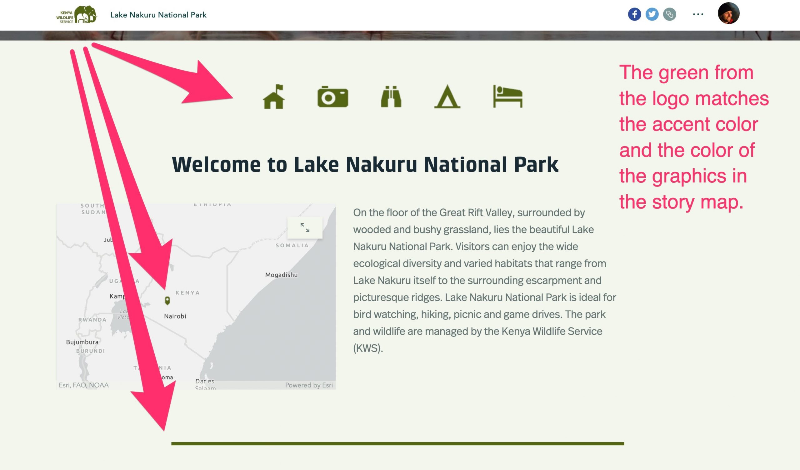
Graphics help your story map stay on brand
All organizations need their story maps to fit with their organizations visual identity. StoryMaps offers some powerful story customizations built into the tool like adding a logo to your story map. Adding an accent color that fits your organizations color palette can help align it with your organizations brand. You can emphasize this brand alignment in your stories by using graphics that match your organization’s design guidelines and color schemes. These graphics will differentiate your story maps from other online content.
Want to add graphics to your next story map? Here’s a package of content that’s free to use and is optimized for StoryMaps, Enjoy!
Note: These icons were adapted from the National Park Service public domain symbol library. Special thanks to the cartographers, designers, and public land stewards at NPS that are committed to educational, accessible, and open source content.


Article Discussion: