The summer months are heating up, and the Business Analyst team has lots to share with you! Not only do we have new updates and enhancements to ArcGIS Business Analyst Web App, but we are also excited to invite you to the hottest event of the summer. In just a few short weeks we will be in sunny San Diego for Esri’s annual User Conference. Whether you’re attending online or in-person, we’ve written a handy blog to help you plan your experience: ArcGIS Business Analyst at the 2025 Esri User Conference.

ArcGIS Business Analyst is Esri’s location-based market intelligence application designed to help you make smarter decisions for market planning, site selection, and customer segmentation. You can pinpoint the right growth sites, locate your target audience, and share market research across your organization. If you’d like to learn more or want to try ArcGIS Business Analyst Web App, sign up for a 21-day free trial.
The June 2025 release of ArcGIS Business Analyst Web App brings significant updates to expand your analysis and community intelligence capabilities. Make sure to read on to get all the details on how you can incorporate ArcGIS Business Analyst Web App in your daily mapping framework.
Highlights of this release include:
- ArcGIS Business Analyst Web App Standard license changes
- Business Analyst Assistant – moving from beta to preview
- Data updates (including ArcGIS Tapestry)
- New Effects tool
- Points of interest (POI) search enhancements
- New correlation matrix and infographic in suitability analysis
- Infographic improvements
- ArcGIS Business Analyst Mobile App updates
- Business Analyst Widget in ArcGIS Experience Builder updates
ArcGIS Business Analyst Web App Standard license changes
Great news! In the June 2025 update of ArcGIS Online, any ArcGIS Online user with a Creator user type or above will now have access to ArcGIS Business Analyst Web App Standard now included among the apps that come with their license.
ArcGIS Business Analyst Web App is offered in two license levels: Standard and Advanced. The two offerings of Business Analyst Web App provide users with different capabilities based on your organizational or individual needs. With the Standard license, you can view maps, apps, information products, and infographics that you can share with other users. The Advanced license provides more advanced analysis capabilities, allows you to create custom reports and infographic templates, use custom data, and share your work to ArcGIS Storymaps and ArcGIS Dashboards.
We are thrilled to welcome more users to ArcGIS Business Analyst as they explore the wealth of ArcGIS products newly included in their ArcGIS Online user type. To welcome our new users and aid them in getting started, we have added a new interactive onboarding experience.
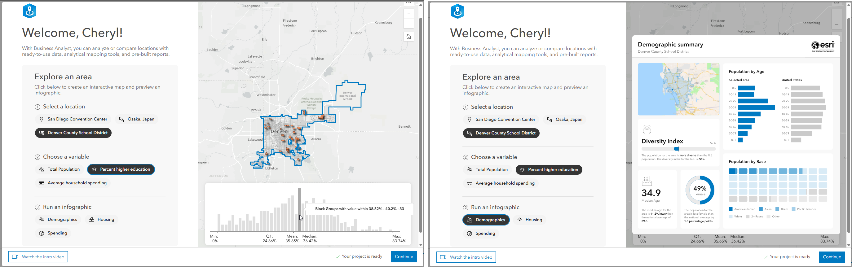
For more details on what’s included with ArcGIS Business Analyst Standard, the differences in standard and advanced capabilities, and how to get started with the web application, visit the handy blog: Discover the power of ArcGIS Business Analyst Web App Standard: Now included for Creator and above user types.
Business Analyst Assistant (preview) updates
Business Analyst Assistant (preview) has been a favorite among users, and our product team is always eager to deliver improvements for optimized performance. The assistant is an AI productivity tool designed to guide you through your workflows by providing intelligent suggestions, responding to prompts and search queries, and lending a helping hand by offering useful tips and resources.
The latest update expands the availability of the assistant to even more users. International users will be excited to learn that Business Analyst Assistant (preview) now supports multiple languages, including Brazilian Portuguese, English, French, German, Japanese, Spanish (Mexico), and Spanish (Spain).
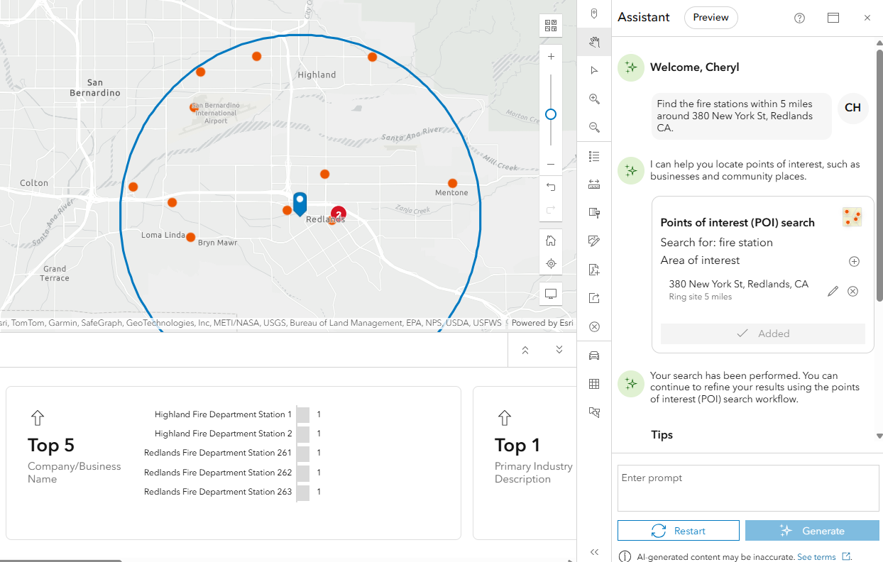
In addition to language support, the assistant is now smarter and more capable. It can handle more complex requests, such as combining site creation with mapping tasks, helping you get more done with less effort.
For example, you can use a prompt like “Find the fire stations within 5 miles around 380 New York St, Redlands CA.” In two clicks, the site and map are created for you.
Finally, you may have noticed we are no longer using beta to refer to the assistant. That’s because the assistant is moving into preview. Preview is designed to offer users the opportunity to use AI assistants prior to general availability, without the typical constraints associated with beta software. The purpose of the preview is to enable users to use the feature in their ArcGIS environment for a limited duration, until the transition to general availability. The assistant has already grown so much since its beta launch in June 2024, and the team has worked hard to continue delivering improvements to make it a smarter and more efficient tool.
Data and boundaries updates
Data is a crucial component of ArcGIS Business Analyst, and this release expands data availability with updates to the following datasets:
- ArcGIS Tapestry
- 2025/2030 Esri Updated Demographics, 2025/2030 Esri Consumer Spending, 2025 Esri Market Potential, 2025 Retail Demand by Industry, 2025 Urbanicity
- 2019-2023 American Community Survey data for the U.S. and Puerto Rico
- New and updated boundaries: State Legislative District and Public Use Microdata Areas (PUMA) for USA and Puerto Rico; Tribal boundaries for USA
- Business Summary data for U.S. and Canada from Data Axle (April 2025)
- POIs: Data Axle (April 2025), Safegraph (March 2025), and Foursquare Global Open Source (April 2025)
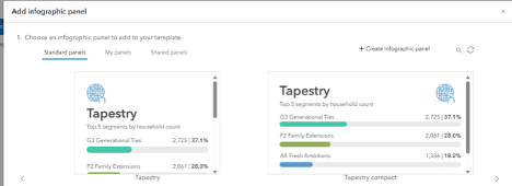
Introducing the latest generation of Tapestry segmentation: ArcGIS Tapestry
Tapestry is one of the most widely used tools for understanding U.S. community demographics and lifestyles. Tapestry combines consumer traits with residential characteristics to classify nearly 240,000 U.S. neighborhoods. This update marks the third iteration of the Tapestry system and includes reconfigured segments and LifeMode groups, comprehensive access to urbanicity attributes, a refreshed user experience, and expanded data documentation.
When building infographics, the Tapestry panel has been redesigned and modernized, and you have options between viewing a large and compact version of the panel, making it easier to replace the Tapestry panel in migrated custom infographics.
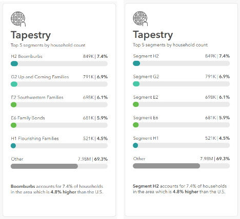
You may opt to display either the Tapestry name or code in mapping, analysis, and reports, based on your organization’s preference.
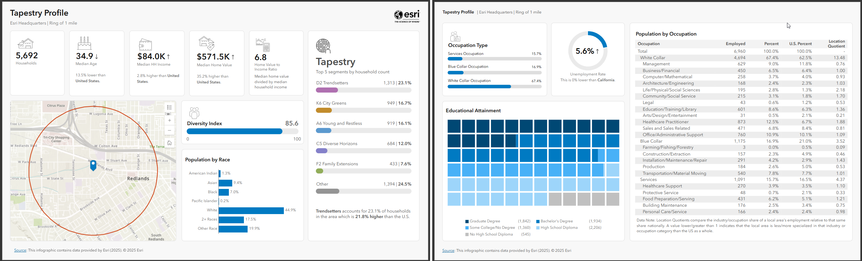
A new Standard infographic is available for Tapestry Profile, replacing the previous version. This older version can still be found in the Gallery as Tapestry Profile Legacy.
For even more information on ArcGIS Tapestry and how to use it in your mapping and analysis, visit the What’s new in Tapestry blog.
New geographic boundaries
There are new geographic boundaries for tribal, legislative, and PUMA areas in the United States.
Tribal boundaries
Tribal boundaries officially define the territories of indigenous tribal lands. Tribal boundaries aid users in understanding the extent of tribal territories, helping to support the management of tribal areas. The June release introduces data for:
- American Indian, Alaska Native, and Native Hawaiian areas
- American Indian tribal subdivisions
- Tribal block groups
- Tribal census tracts
State Legislative District and Public Use Microdata Areas (PUMA) for USA and Puerto Rico
State legislative districts are geographic areas within a state used to elect representatives to the state legislature and help in analyzing electoral trends, planning public services, and effectively addressing the specific needs of different communities within the state.
SafeGraph data updated to NAICS 2022 from NAICS 2017
As part of the June 2025 release, SafeGraph data in Business Analyst is updated to use NAICS codes from 2022, making it consistent with the NAICS codes used in the other points of interest (POI) data sources. For more details on NAICS codes in Business Analyst, read the blog article SafeGraph NAICS codes update in ArcGIS Business Analyst.
Crime Indexes updates
ArcGIS Business Analyst uses CrimeRisk, a crime index from AGS to provide crime data boundaries. In the June U. S. data update, 2024 crime data will be redelivered using 2025 boundaries. This dataset will be available through October of this year. The Esri Data team is working hard to secure the most accurate and up-to-date data for use in ArcGIS Business Analyst and other ArcGIS products that use crime index data. We will provide additional details on crime index data as they become available.
Points of interest (POI) data enhancements
Along with updates to the latest demographic data, this release introduces a few enhancements to points of interest data. For SafeGraph and Foursquare data, there is a significant increase in record numbers. SafeGraph will now also provide additional attributes such as Parent Locations and Industry Sector. Lastly, in line with other NAICS codes updates, SafeGraph has been updated to support 2022 NAICS, which will bring parity with other datasets. Now you’ll be able to use the same, consistent NAICS code lists when switching POI data sources.
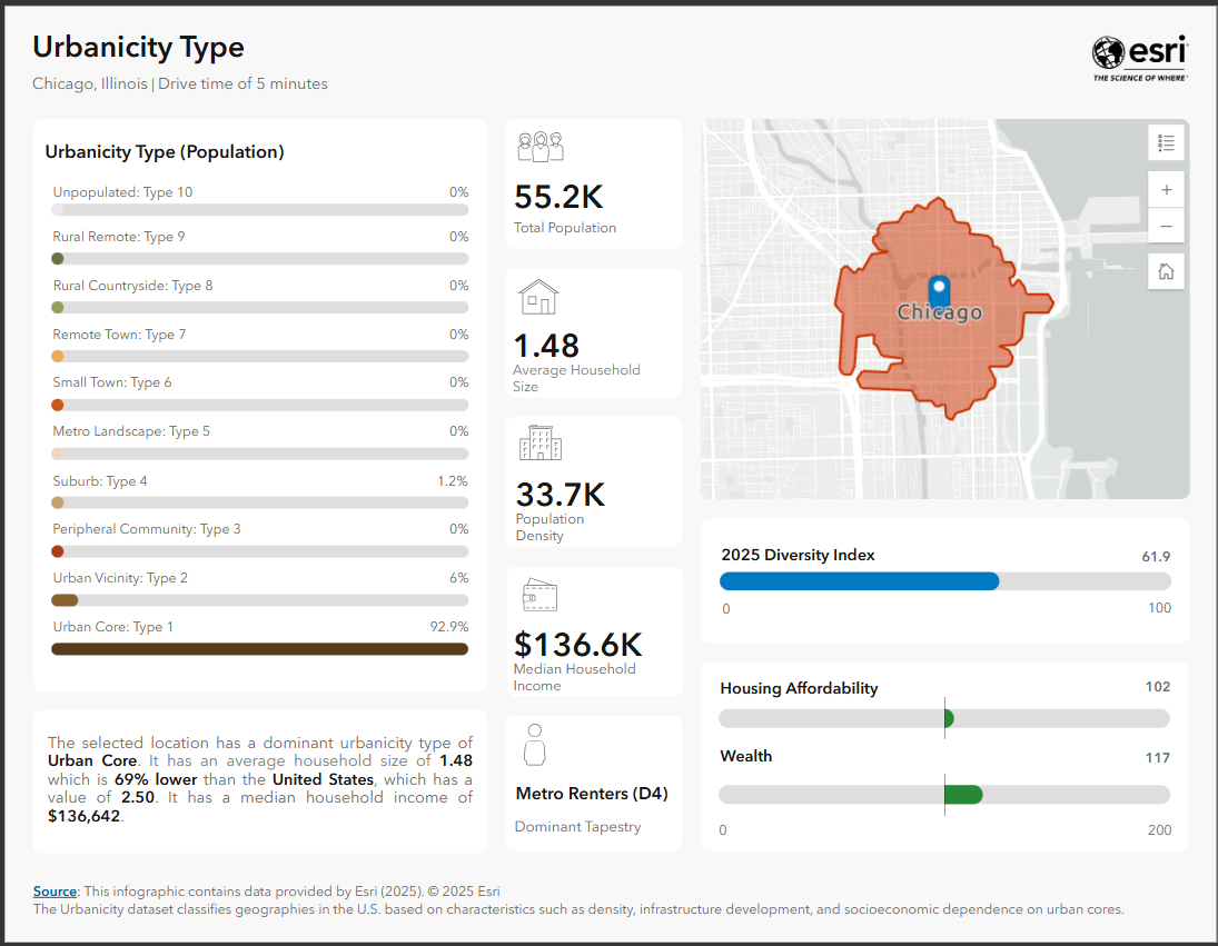
Dominant Urbanicity variable
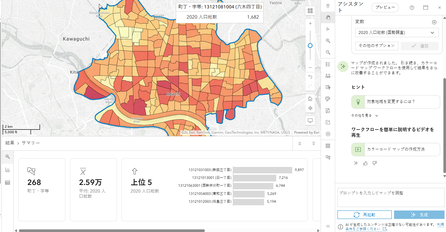
Finally, a new variable, Dominant Urbanicity, is now available. You can use this variable for mapping in color-coded maps.
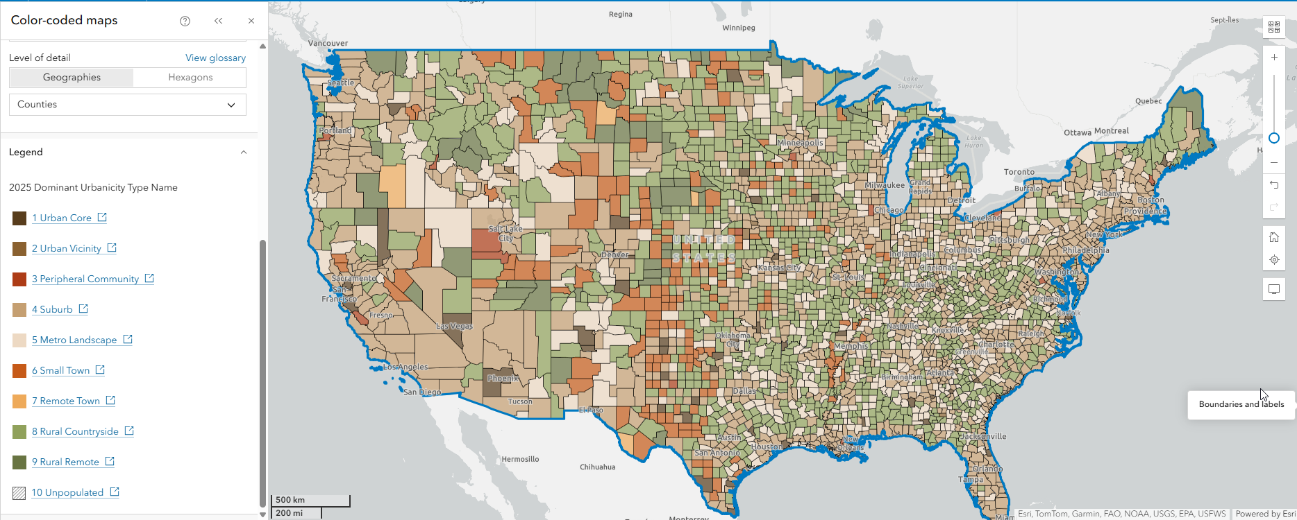
Additionally, the infographic for Urbanicity Type has been updated. You can find it in the Gallery for Esri 2025.
For further details on what’s new in data for ArcGIS Business Analyst Web App, explore the What’s New Esri Demographics blog.
New Effects Tool
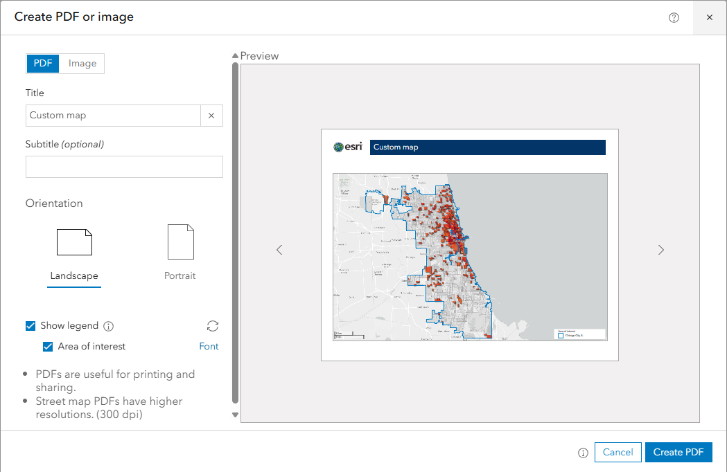
We all know that credible and accurate data are important factors when it comes to maps. However, presenting the results of your analysis in a visually stunning way can be just as important. We are excited to provide the first version of Effects in Business Analyst Web App. The Effects tool can be used to add compelling visualizations to your results. Once you have your results on the map, simply select a layer to edit and explore effects options.

After applying effects to your map, share the results by creating a PDF or image, or sharing an ArcGIS web map with the Export to a new hosted feature service option enabled.
Points of interest (POI) search enhancements
ArcGIS Business Analyst provides information about specific locations–such as businesses, government buildings, landmarks, tourist attractions, and more—through points of interest (POI) data. With POI data, you can identify key businesses and community locations, plan for future expansion, market gaps, and perform competitive analysis.
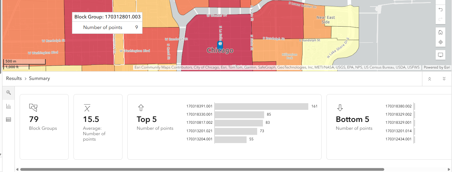
In this release, searching POIs by code has been significantly improved to provide better results. POI search is a helpful way to answer questions about a selected area. Maybe you wonder how many restaurants are located near a site, or the average number of hospitals by county in California. The new option for point data aggregation can help you answer these questions with ease.
Now, after running a POI search, you can perform dynamic on-the-fly aggregation and visualization of points by sites, hexagons, or geographies. The option can be used to create a map of areas that summarizes the count of points or other numeric attributes present in the chosen POI data source.
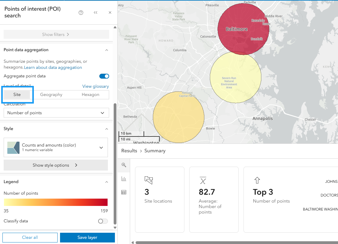
When a POI search is performed for the first time after the release, a coach mark will be seen to introduce point data aggregation. The Learn about data aggregation link can be used to launch in-app documentation for more information.
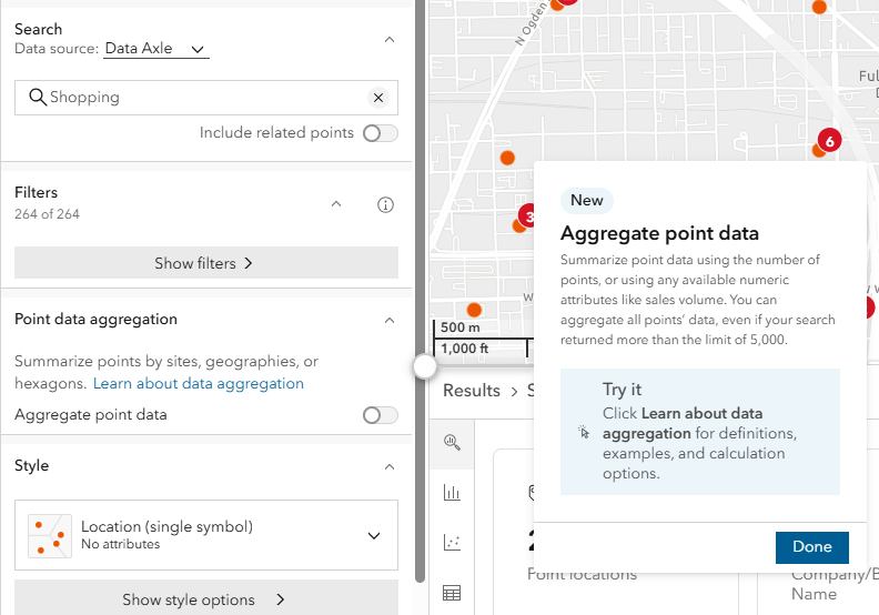
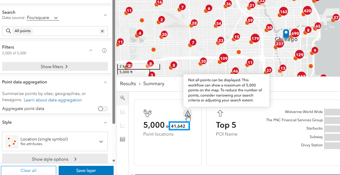
The new aggregation capability also overcomes the 5,000-point display limit previously imposed due to contractual constraints, meaning data for an unlimited number of points can be displayed on a map. Additionally, 22 new Places icons are now available for mapping, giving you more flexibility and visual clarity in your visualization.
Additionally, when using the new point data aggregation, the Results pane updates with a summary, histogram, and table. The table only shows the geography level and measure value; individual POI are not listed.
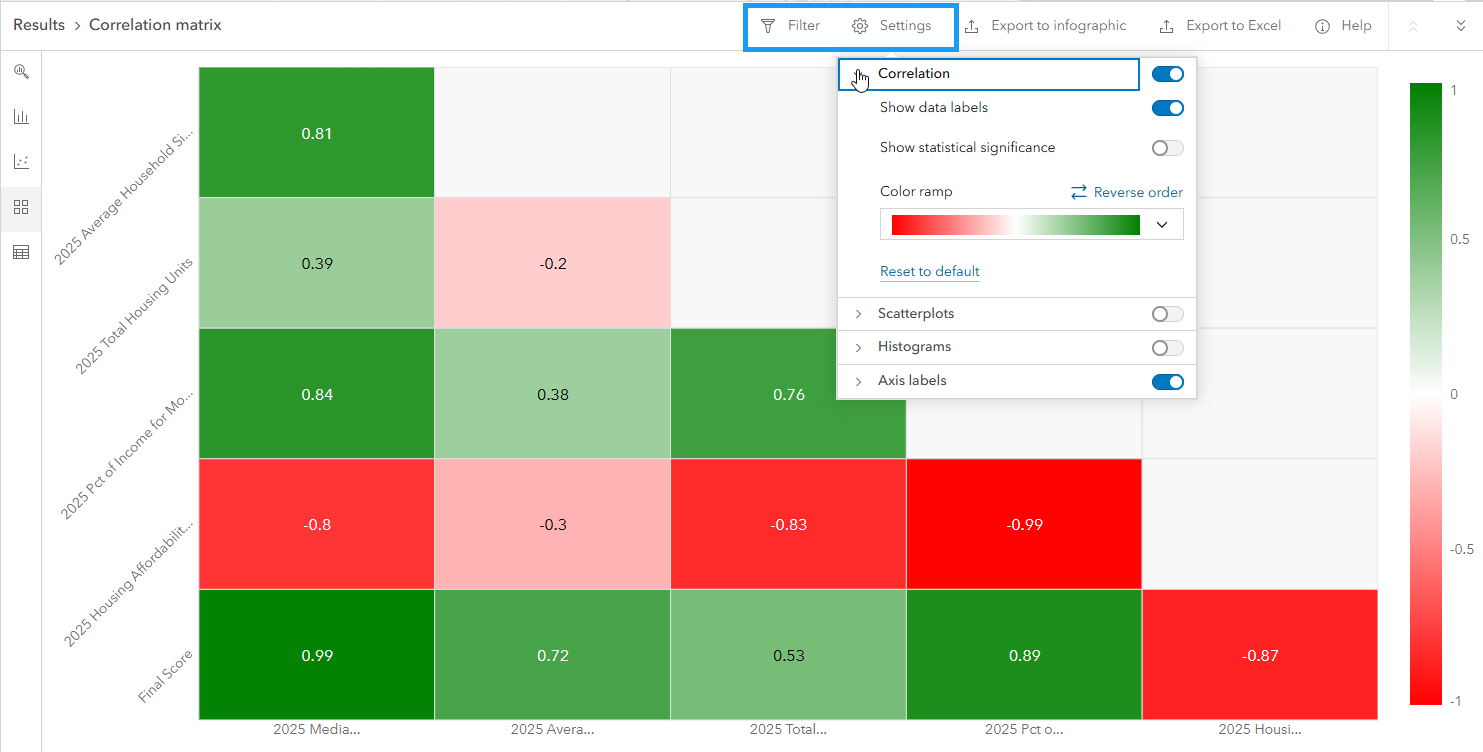
New correlation matrix and infographic in suitability analysis
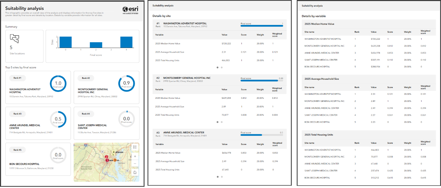
Users asked and we delivered: suitability analysis is even smarter with new correlation insights and infographic sharing. In this release, we have added a new option to export the suitability analysis results to an infographic. Simply use the Export to infographic button in the Results pane to load the analysis template in the infographic player.
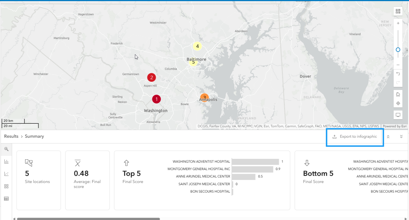
The new infographic provides an overall view of the analysis, displaying information for the top 5 sites by final score. The reports include a map, details by location, and variables for all sites in a clean and accessible format.
Selecting the right variables is crucial to perform a meaningful suitability analysis, and highly correlated variables can accidentally skew your results if double counted. If correlated factors are overweighted, the accuracy and credibility of results can be jeopardized. To help mitigate this issue, you can now use the correlation matrix to examine relationships between selected variables and modify those with high correlation.
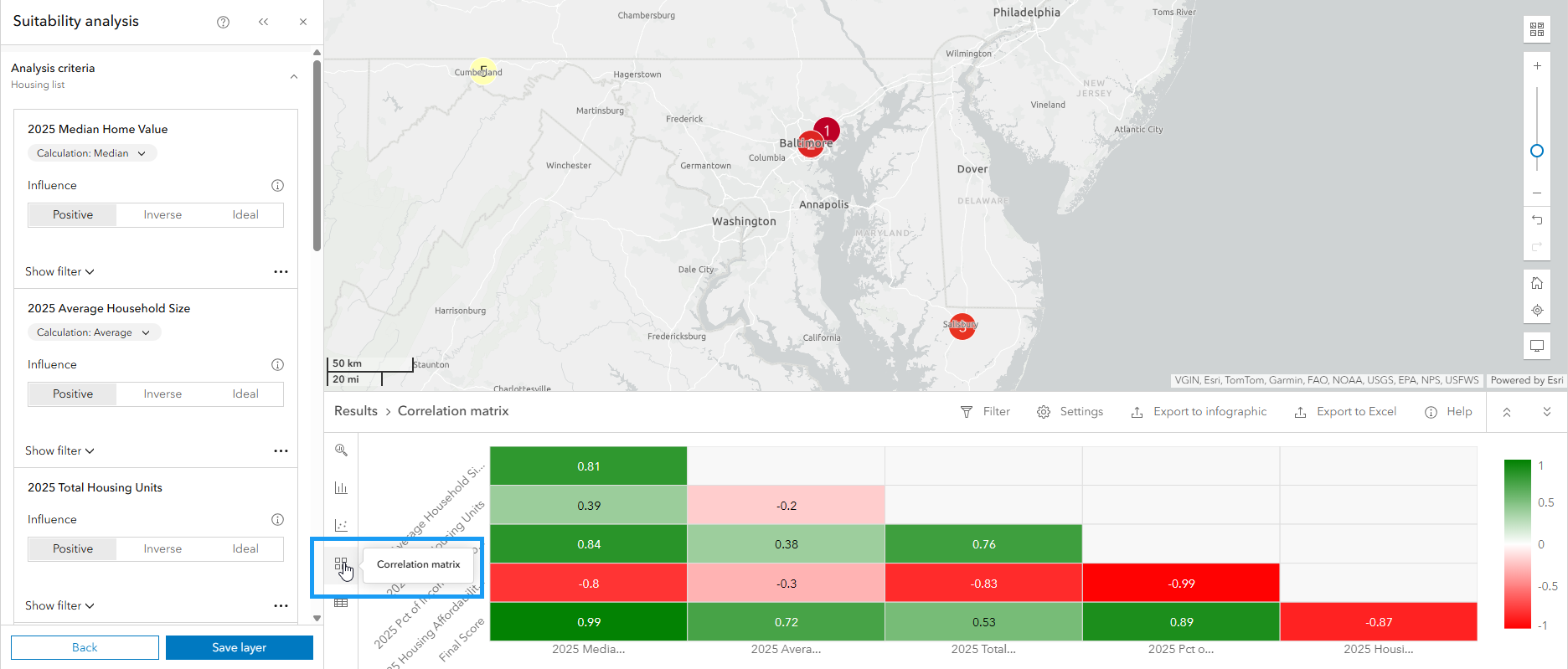
The correlation matrix identifies criteria that can be conceptually or statistically redundant and visualizes them in the Results pane. You can use the Settings button to add histograms and scatterplots for further analysis.
You can customize the results in the correlation matrix using the Filter and Settings buttons. For instance, only show items with high statistical significance or change the correlation matrix color ramp. You can share the results by exporting them to Excel.
Infographic improvements
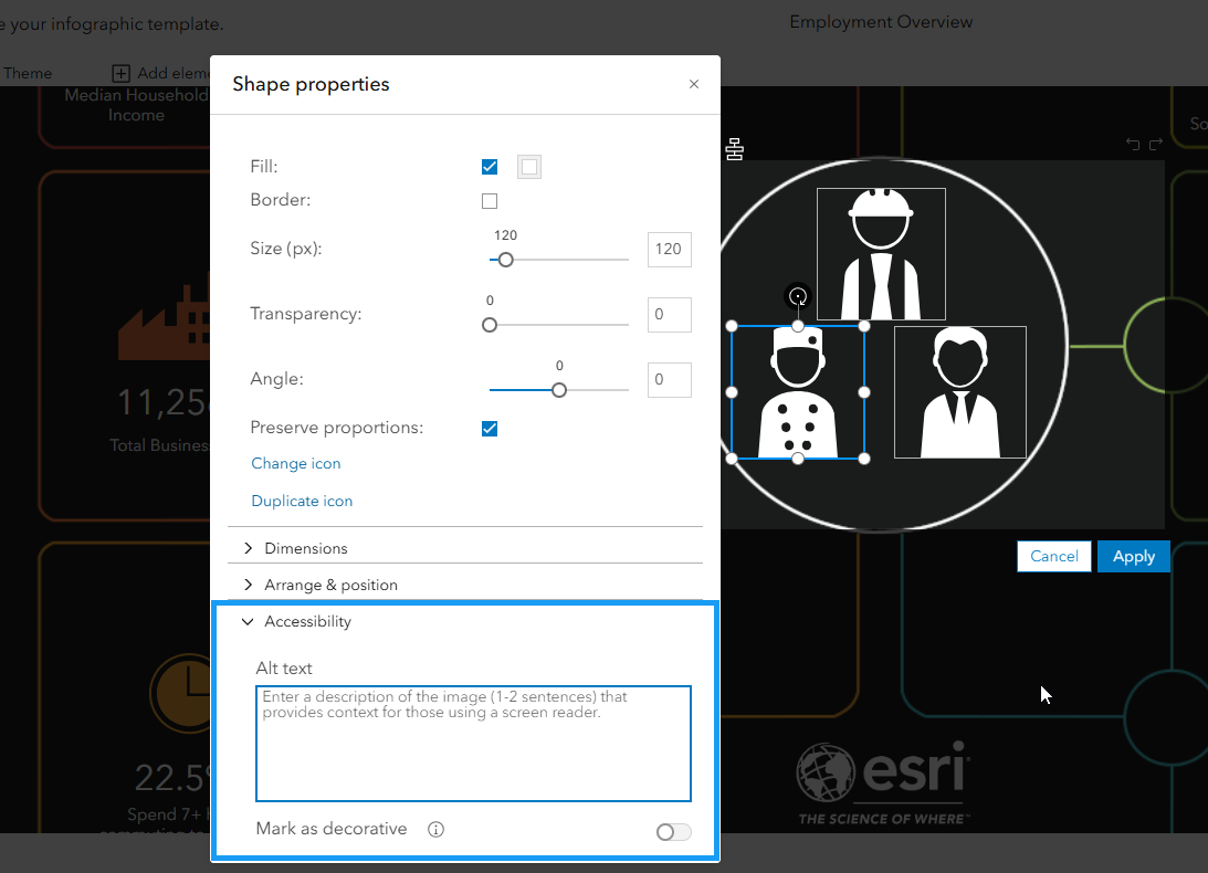
Infographics are presentation–ready templates allowing users to present location information in a visually compelling form. We are dedicated to making our infographics more accessible to all users and enabling more organizations to share infographics on their websites for public information. We have made several key accessibility improvements to the infographics player to ensure 508 compliance and enhance the user experience.
Improving accessibility in the infographic player
During infographic creation, users can now add alternative text for screen readers, making information more accessible. We’ve also introduced thoughtful enhancements to keyboard navigation, ensuring a seamless browsing experience for all users.
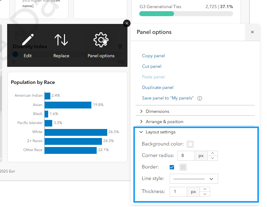
Users now have more flexibility and control when customizing infographics:
New chart type: Progress bar chart
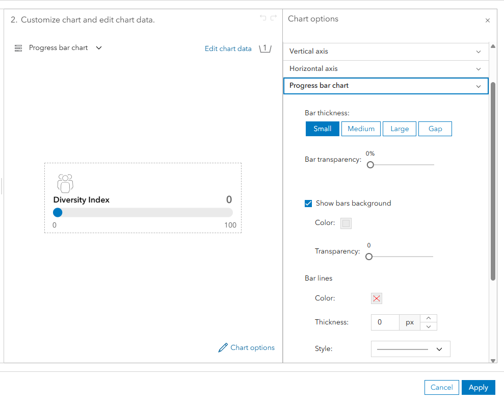
Use enhanced panel styling with customized outlines and new corner radius setting options.
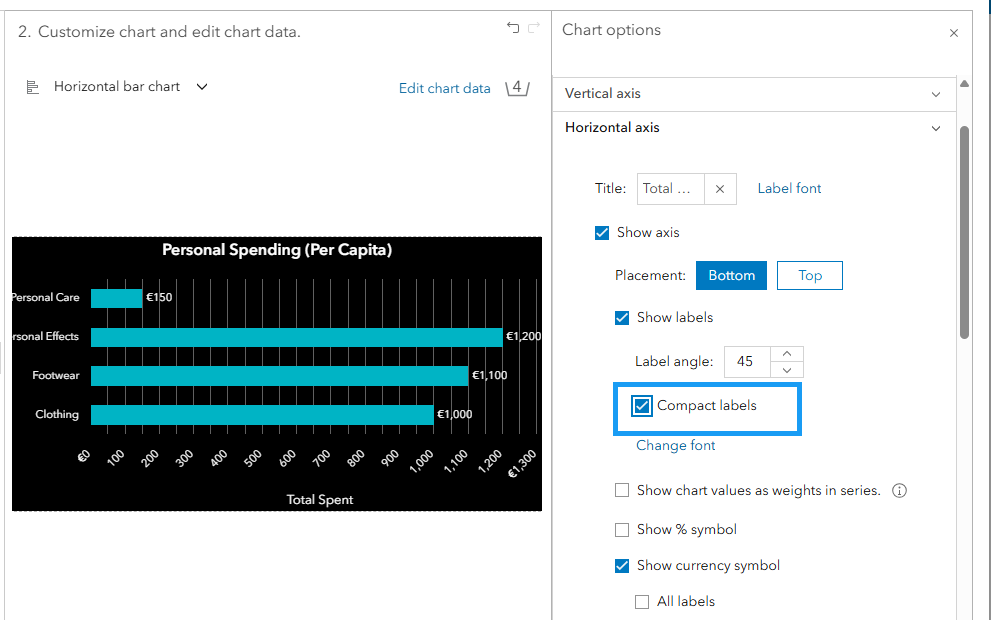
Use the Auto compact setting with chart labels for label management.
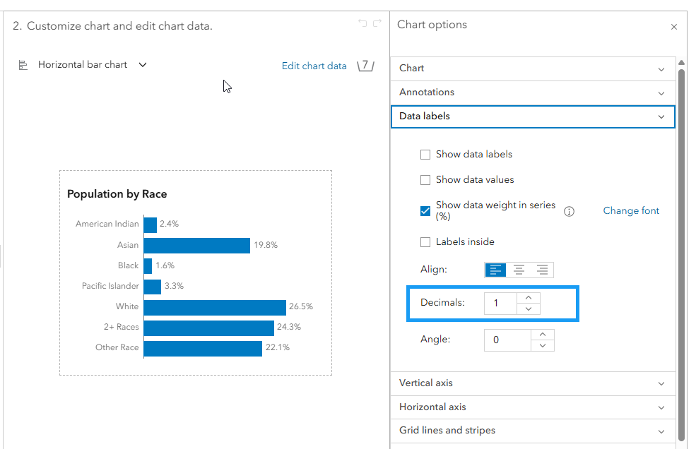
For cleaner data display, percentage variables now default to using one decimal place.
ArcGIS Business Analyst Mobile App updates
Are you on the go or in the field and want to use ArcGIS Business Analyst? All you have to do is download the ArcGIS Business Analyst mobile app from the App Store or Google Play Store. This update of the mobile app delivers new Tapestry segmentation infographics on par with those in the web app.

Updates to Business Analyst Widget in ArcGIS Experience Builder
The Business Analyst widget in ArcGIS Experience Builder is a popular tool that provides users with the ability to view additional information about any point or polygon feature on a map through the creation of reports and infographics. This release delivers a new infographic category called “Esri Tabular Reports” that contains the new report styles of the classic Esri reports that were available in the previous Business Analyst widget for ArcGIS Web AppBuilder. These new reports have a presentation-ready design for improved accessibility. Additionally, when creating drive times in the widget, there is now support for custom travel modes. Finally, a new option is also added to allow your app to use the latest data and infographics automatically when there is a data release annually for the U.S.
Additional resources
We’re so happy to share this latest release of ArcGIS Business Analyst Web App and ArcGIS Business Analyst Mobile App with you and we can’t wait to see how you use these updates and enhancements to make smarter, data-driven decisions. Below, we’ve added resources to help you with your ArcGIS Business Analyst journey:
- Business Analyst product overview page
- Review pricing and purchase Business Analyst
- Join our LinkedIn Business Analyst User Group
- Join our Business Analyst Esri Community
- Follow our weekly #BATipsandTricks posts on social media
- Read more Business Analyst blog articles on ArcGIS Blog
- Watch Business Analyst Web App videos
- Watch Business Analyst Mobile App videos
- Visit the Business Analyst Resources page
- Visit the Community Analyst Resources page

Article Discussion: