The COVID-19 pandemic has revolutionized the way population-aggregated anonymized, mobile device-location data is used in business and society. BlueDot based in Toronto, Canada, have been analyzing patterns and indices within these data to detect the outbreak of disease and safeguard lives by mitigating exposure to infections that threaten human health, security, and prosperity.
BlueDot’s social distancing data is available in the Esri COVID-19 GIS Hub for every county in the United States via this link. It contains many different attributes about the behaviors of people in each county and how those behaviors change. Many products in the ArcGIS suite allow you to combine exploratory analysis, visualization and analysis but Business Analyst (BA) Web provides a unique combination of those tools to allow any user – novice or expert – to tease out valuable insight from the BlueDot data.
Getting Started and Exploring
The BlueDot data, summarized at the end of this article, contains anonymized check-ins every half hour, metrics on the where the check-ins occur as well as the distance and the proportion of check-ins occurring at the day-home location. This data has been essential to many organizations modeling human movement during the pandemic.
The richness of BlueDot’s data is also its curse. The wealth of variables, complex interrelationships and geographic patterns are neither simple nor immediately obvious. Business Analyst’s Smart Map Search is the ideal tool to explore, examine and explain patterns within and between variables, behaviors, locations and communities.
To use the BlueDot data in Business Analyst Web, first add the feature service layer by copying the URL address listed above. Next use the Maps> Add Data> Web Maps and Layers workflow to bring up the Web Maps and Layers explorer screen.

Paste the URL you copied into the search box and hit enter to load the feature service into your BA project.

The BlueDot layer will be added to the table of contents in the Web Maps and Layers accordion section. Clicking on any county will bring up a dialog which shows the different short-cut actions that can be performed on the data, as well as all the attributes.

Using Smart Map Search
I love the power of BA Web’s Smart Map Search. It lets me explore data, discover patterns and dial into trends, correlations and relationships that can’t be seen one data variable at a time. To use Smart Map Search, select the Maps> Create Maps> Smart Map Search workflow to bring up the data explorer.

Select “Browse All Variables” to bring up the full category list and map data options.

Next click the “Map Layers” icon to examine the attribute table for the BlueDot feature service.

In this article I am going to explore three variables:
1) Percent of phones staying home (percent stay)
2) Previous week percent change in max distance (prev_wk_percent_change_max), and
3) The total distance travelled by the 75th percentile of phones (sum_dist_75)
Select each of variables from the data browser using the radio toggle button then click the “Apply” button.

These 3 variables allow me to explore how many phones remain at home, how the distance being traveled changes week to week and how far the upper band of long-distance travelers are traveling beyond home base.
The initial summary statistics for the current BlueDot release are shown in the interactive data range graphics. Hovering over a county will also generate a pop-up with these attributes summarized.

When the attributes are first loaded into Smart Map Search all the counties are shown. Each of the data summaries has two handles that can be used to select a new range of values and slide the filter range between the minimum and maximum values in each series.
The animation below shows how these values can be used to explore the relationships between each of the variables, explaining how rural counties tend to have both long-distance travelers and high numbers of phones staying at home.
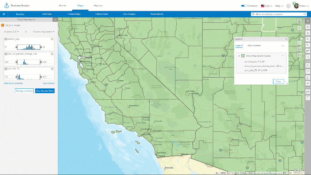
Other patterns reveal themselves as you explore the ranges independently and in parallel. The similarities in behavior of residents of San Francisco, Los Angeles and Las Vegas can be seen in the screenshot below.

These three communities share a narrow band of similar characteristics, defined by distinct ranges in each of the 3 attributes. Hovering over an unshaded county brings us a pop-up that shows why characteristics fail to match the smart search criteria. For San Bernardino County, the Percent Stay value of 28, is less than the selection criteria of 33 to 41 percent. This is explained by the red county outline and the red highlighted number in the attribute pop-up.

Exploring the BlueDot data via Smart Map Search brings out a kaleidoscope of regional and local patterns, of similarities and differences that play out across the country.
Summarizing Counties with the BlueDot Infographic
In addition to the power of Smart Map Search, BA Web users can visualize and summarize social distancing for each county using my summary infographic which can be downloaded here.
http://mediamaps.esri.com/Infographics/Templates/BlueDot_Social_Distancing.brpt
To load the infographic template into BA Web, use the Reports> Build Reports> Build Infographics workflow to navigate to the infographic template library pages.

Next select “+ Add template”, then “Add template from file”.

When the file explorer has loaded, navigate to where you have downloaded the template and locate the file which will be named “BlueDot_Social_Distancing.brpt”
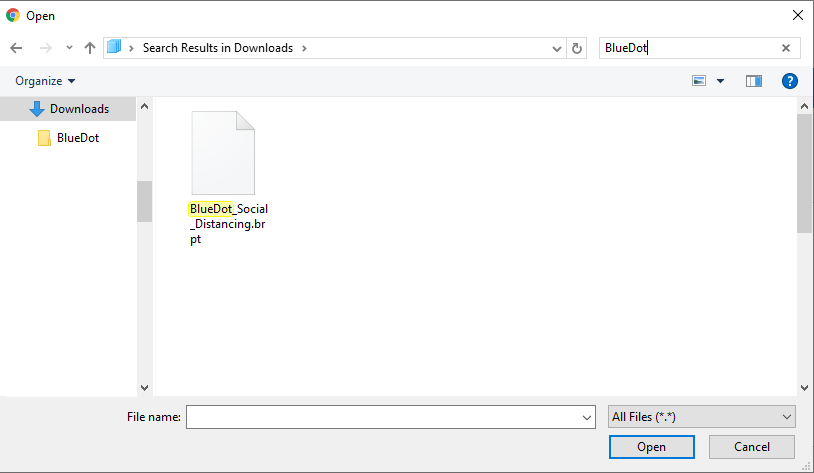
Click open to load the infographic and accept or change the infographic’s name to add the template into the “My Templates” area. You will see a prompt to confirm that the template has been successfully uploaded and added to Business Analyst Web.

If you have not done so already, click on “My Template” to show all the editable templates.
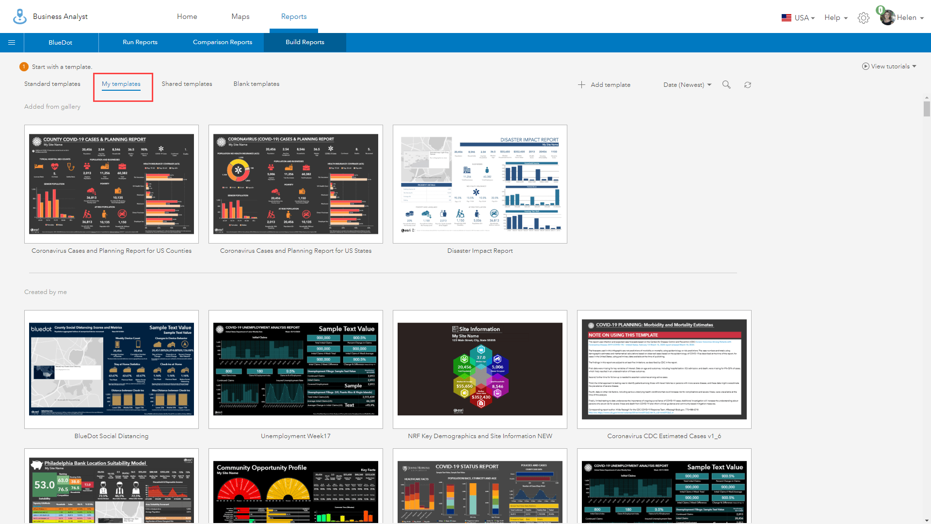
Next, hover over the BlueDot infographic thumbnail to highlight it, then click on the ellipsis (three dots …) in the bottom right hand corner to bring up the additional actions menu for this template. Select “Set as default infographic ⓘ” to make this template the default infographic which is run each time you select the infographics option from the quick actions pop-up.

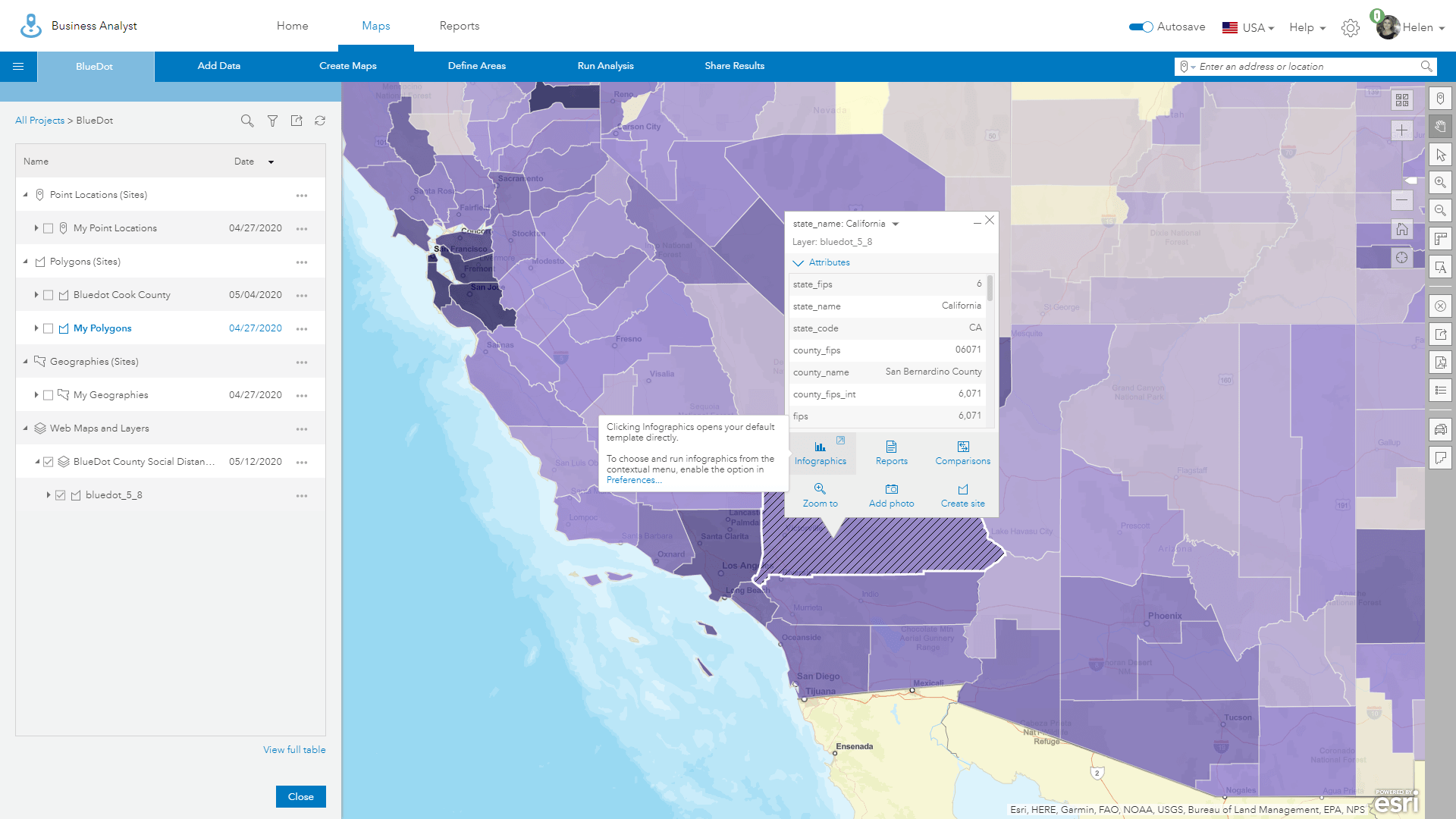
Use the Maps tab to return to the map view and click on a county to bring up the quick actions menu, then select the infographics icon. The BlueDot infographic template will be used, with each of the attributes summarized for your selected county.

Comparing Social Distancing Between Counties
The BlueDot infographic can be used to compare how social distancing varies between counties. First, click on an adjacent county, and expand the attributes list if you have not done so. Use the pulldown list at the top of the pop-up to examine the attributes choices and select the “county_name” item to appropriately name your county for the new infographic.

Next use the “Create site” action button to begin the processes of defining a new county-level site.

You can modify the color and transparency of the county area, so it shows up better in the infographic. In the example below I have chosen a navy-blue color and 50% transparency.

When you have finished defining the symbology click the blue “Create site” button.
In the subsequent dialog box, choose a layer for new site or create a new layer. I recommend creating a new layer so you can better manage your sites, keeping it county separate in the table of contents. I have called my new site “Kern County” to match the county name. Click the blue “Save” button to complete the creation of your new site.

Once complete the new site will be stored in the “Polygon (Sites)” accordion in the table of contents. Repeat this workflow with other counties as needed to create a set of comparable sites in your project.

Once you have the sites you want to analyze, click on the county of your choice (it may be highlighted with the color you chose earlier) and use the Infographic action icon to run the infographic for your selected county. Note that Business Analyst Web now always use the default infographic (BlueDot Template) you selected earlier.
In the example below I am going to run an infographic for San Bernardino County.

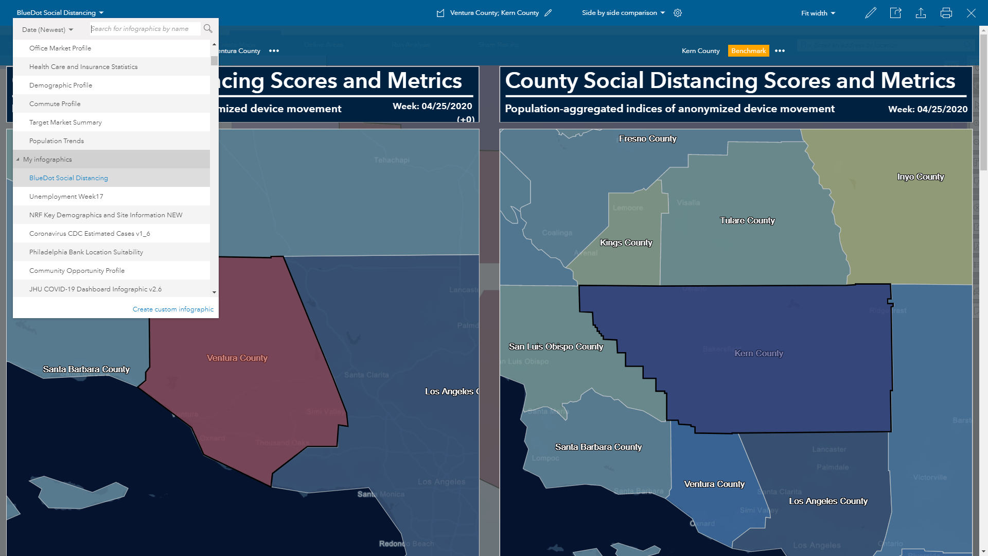
You can use the site dropdown menu in the blue bar menu at the top of the infographic viewer to add new sites and compare them. It the example below I created a new site for Ventura County which I want to compare with Kern County. To do this, use the dropdown menu will have the name of your current site (Ventura County) and a down arrow next to the name.
Next select “+ Add sites to compare” to bring up the Select Site menu dialog.

Navigate to the “From Projects” tab to identify the list of sites in your project and select sites you want to compare. Click the blue “Apply” button to add one or more sites to the infographic.

The new site will be loaded into the site dropdown list under the name of your original site.
You can create infographics for each of the sites in this list or use the “Side by side comparison” option to compare the differences between counties using one of the sites as a benchmark.

In the example below I am comparing social distancing in Ventura and Kern Counties.

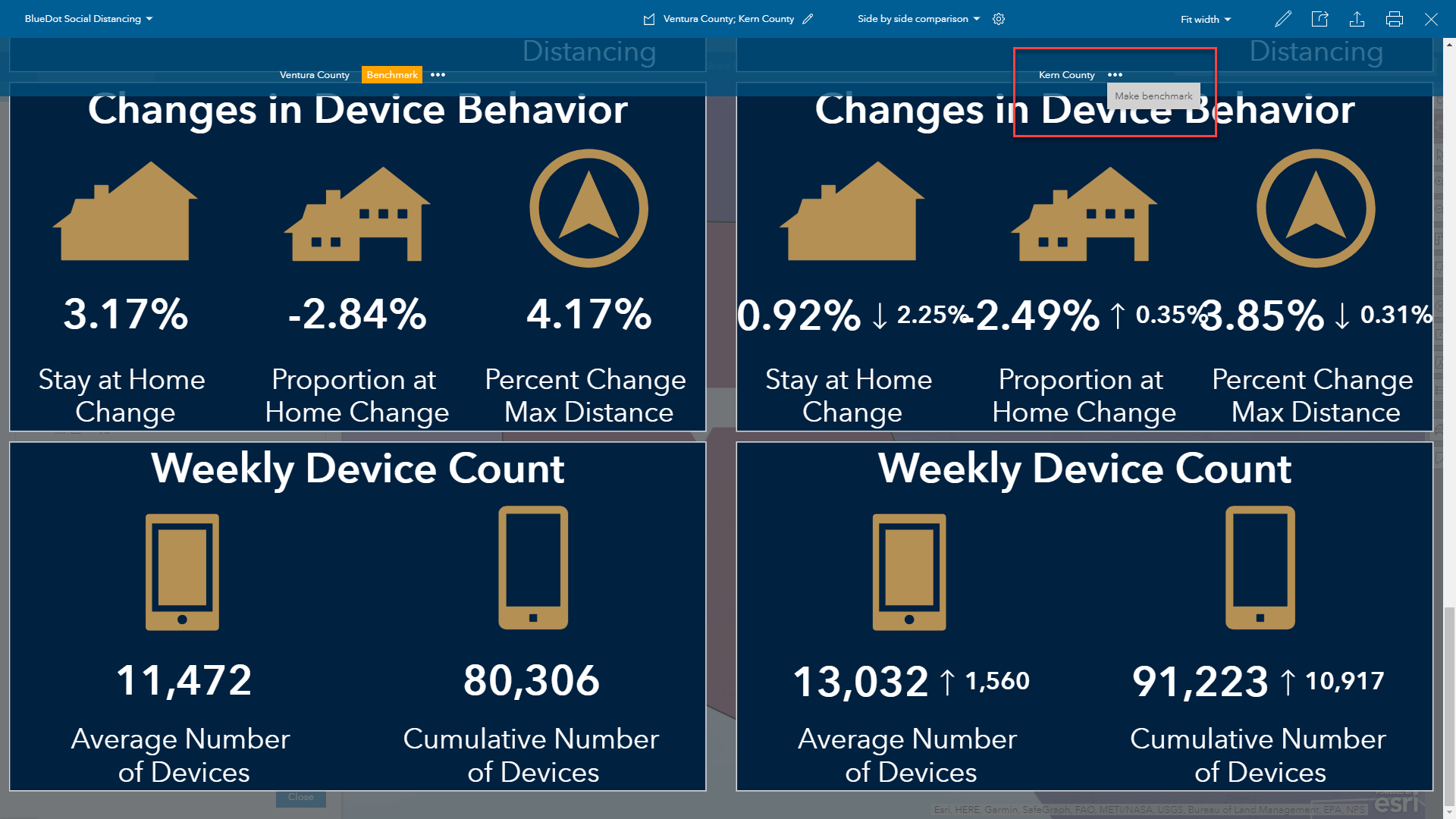
To change the benchmark, simply click the yellow ellipsis icon on the alternative benchmark site.

The infographic you have created can be exported as a PDF, image or interactive HTML or printed locally using the action icons at the top right-hand corner of the blue menu bar.

To explore the demographics of the counties, select one of the Esri templates like the Tapestry Profile to understand more about the people and their lifestyles.

We Appreciate Your Feedback
Now that you’ve learned about how to access the BlueDot data in BA Web, use Smart Map Search and import the BlueDot infographic template, we’d encourage you to explore more infographic and analysis tools in BA Web.

Article Discussion: