
A couple of weeks ago, the ArcGIS Business Analyst Web App (Web App) team published a blog on creating an infographic using the latest state-wide coronavirus disease 2019 (COVID-19) data. That infographic is based on data from Johns Hopkins University Center for Systems Science and Engineering (JHU CCSE), which is updated multiple times a day. Since then, JHU CCSE has released the ability to obtain county-wide data.
In this blog, we will show you how to create a county-wide infographic that shows the daily status of confirmed cases from COVID-19 (via JHU CSSE data feeds). Compared to traditional tabular reports, infographics provides interactive maps, charts, tables, and indicators that can be shared with your team as a pdf, StoryMap, or an ArcGIS Web Map.
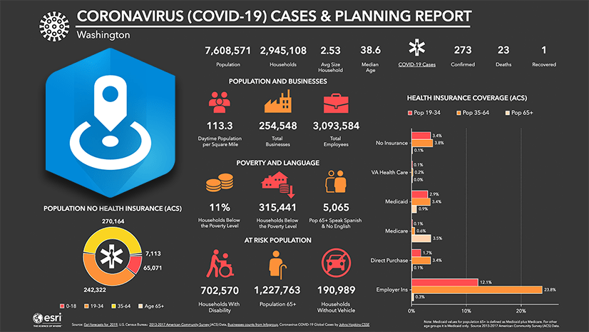
In addition to the COVID-19 data, the county-wide infographic also adds key demographic characteristics (e.g. vulnerable populations) that comes with the Web App as well new content from Definitive Healthcare that provides information about what typical healthcare capacity (e.g. estimate of licensed beds, ICU beds, staffed beds) would be for a county.
Enabling the infographic within your organization takes only minutes, and when you’re done, you’ll have an infographic that clearly and concisely shares the impact that COVID-19 has on your county and help you prepare for mitigation efforts.
The remainder of the blog is designed for beginner users to follow along. For those who are familiar with the Web App, you only need three steps to create the county-wide infographic:
- Add the Coronavirus Cases and Planning Report for US Counties template from the gallery
- Define your County geography site
- Run the infographic

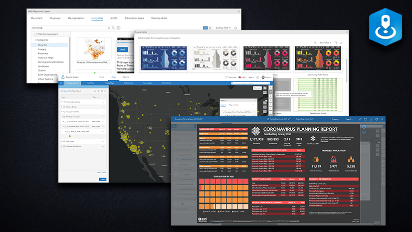
Add the County-wide COVID-19 Infographic Template to Your Template Folder
We will kick off a detailed tutorial that even beginner users can follow by adding the county-wide COVID-19 infographic template called “Coronavirus Cases and Planning Report for US Counties” to your own template folder.
First, login to ArcGIS Business Analyst and following the next steps:
- Click on Reports > Build Reports > Build Infographics.
- Next, select Add a Template then select the Browse gallery option.
- Navigate to the Coronavirus Cases and Planning Report for US Counties template.

- Hover over the infographic and click Add.
- The infographic will be added to My Templates folder. This county-wide COVID-19 infographic can now be selected for any county.

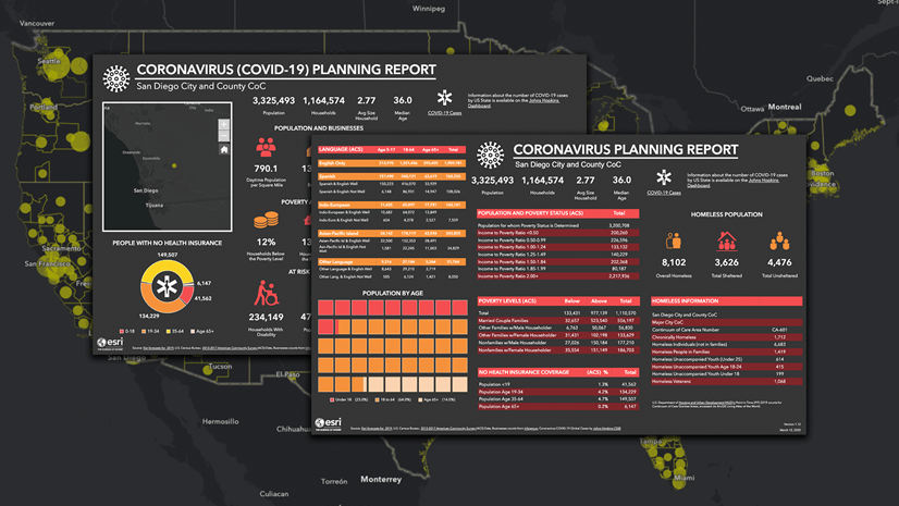
Define and Run Infographics for Your County
Before we run the “Coronavirus Cases and Planning Report for US Counties” infographic for your county, we need to define the county area. For this exercise, I will demonstrate how to obtain information about COVID-19 cases in King County, Washington, but you can use the following instructions for any county of your choice.
- From the main menu, click Maps < Define Areas < Select Geography.
- Click Search.
- In the next screen, type “King County, WA” and click Enter.
- Select King County, WA from the Search Results below and click Next.

- In the next screen, select Run Infographics.
- Then click to expand the infographics under My Infographics.
- Once an infographic launches, go to the top left to select Coronavirus Cases and Planning Report for US Counties.

And there you go. You have successfully created a COVID-19 infographic for your county. Click around to explore interactive pop ups and filter capabilities.
We hope you found this blog helpful in planning for your county needs. For additional details on infographics, you can go to our help documentation. You can also go to your profile (top-right of app screen), select Guided Tutorials from dropdown, and try Level 1, tour 3: Run an infographic for an area.
We are here for you if you have questions (businessanalyst@esri.com).
Update: Some content referenced in this article may no longer be available as the COVID-19 situation progresses.
Additional Resources
COVID-19 Specific Resources:
- Impact Planning for COVID-19 – Infographics for every county in the United States – Web App
- State-Level COVID-19 Cases & Demographics – Web App
- Coronavirus Planning for Vulnerable Populations – Web App
- Build Your Own Vulnerable Population Infographic – ArcGIS Blog
- Explore COVID-19 Impact Using Infographics – ArcGIS Blog
ArcGIS Business Analyst Specific Resources:
- Business Analyst product overview page
- Business Analyst resources page
- LinkedIn user group
- Business Analyst YouTube playlist
- GeoNet community
- Business Analyst Web App login page
- Business Analyst help and documentation pages
- What’s New in Business Analyst Web App documentation page
- Email the team: businessanalyst@esri.com


Article Discussion: