Infographics allow you to summarize and visualize data interactively, presenting information in a beautiful and immediately comprehensible way. These on-screen reports can contain charts, graphics, tables, images, text, and maps to represent information about a site—or multiple sites, using side-by-side infographics. The June 2021 release of ArcGIS Business Analyst Web App features improvements to side-by-side infographic capabilities, such as the ability to construct these comparison infographics in dynamic HTML.
Let’s now walk through the steps for generating side-by-side infographics in dynamic HTML using Business Analyst.
How to download an infographic in dynamic HTML
- Log in to the Business Analyst Web App.
- Select the project you are going to work with.

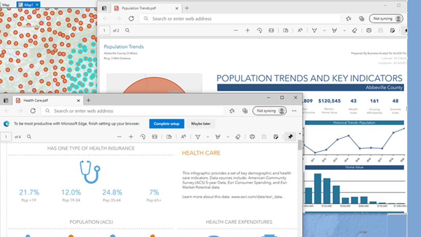
- Create a site with buffers, drive times, or walk times or load a previously created site. For example, let’s say we load a site with three ring buffers, which we’d created in a previous work session.

- Click on the site. The site’s information menu displays options for modifying and working with the site.

- Click Infographics. Business Analyst automatically runs the default infographic template on the smallest of the three buffers. In this example, the Demographic Summary infographic is set as the default. You can change the default infographic template in the application settings page.

- On the top right of the infographic interface, you will see an option to export this infographic. Click Export.

- In the Export as drop-down menu, choose Dynamic HTML.

- Make sure to check the Enable interactive experience box. If your infographic includes a map, also check the Export maps as static images box. Click Create HTML.

Note: When exporting to dynamic HTML, the data at time of export is captured and saved in the generated HTML content. This data will not change—it is a snapshot from that moment in time.
- This infographic will now be downloaded and saved as an HTML file to the path/directory you choose.
- Open the saved infographic from your local machine.

You can now view the same infographic, downloaded locally. The file will open in your default browser.

Note: Once you export the infographic, it can be pulled from your local machine as shown above, or you can also host it from a website, email it, or embed it within another web page.
There are different parameters that you can pass for this dynamic HTML page, allowing you to customize the appearance of the infographic. You add these parameters by manually typing them at the end of the URL.

Here are the supported parameters:
- viewMode – “full-pages” | “panels-in-slides” | “panels-in-stack” | “panels-in-stack-all”
- theme – “dark” | “light”
- toolbarViewMode – “full” | “popup” | “none”
How to add parameters to an infographic
Adding parameters to an infographic in dynamic HTML allows you to specify the way the infographic displays in the browser. You can specify the way panels are laid out, the color theme of the infographic, and the way the infographic’s toolbar is displayed.
To set a parameter, type ?[parameter name]=[value] at the end of the infographic’s URL. To add a parameter at the end of another parameter, type &[parameter name]=[value]. Let us take a look at each parameter and its possible values, one by one.
viewMode
The viewMode parameter defines the way the infographic’s panels are organized. Supported values for viewMode are:
- full-pages
- panels-in-slides
- panels-in-stack
- panels-in-stack-all
Note: The default value of viewMode is full-pages.
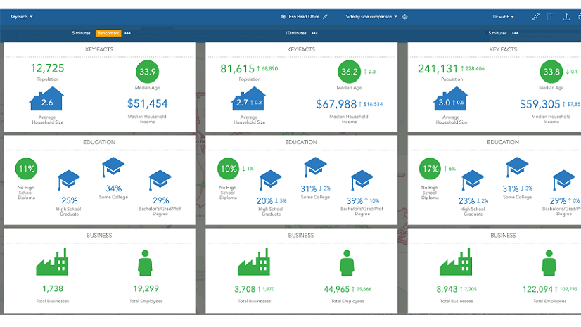
Let’s view infographics for each buffer ring side-by-side. At the end of the infographic URL, type ?viewMode=panels-in-stack-all and hit Enter on the keyboard. This parameter returns infographics for all the buffer rings of your site, side-by-side, making them easy to compare. In this example, you will see three infographics, which display information for the 1-mile, 3-mile, and 6-mile site buffers side-by-side.

You can turn the side-by-side comparison off and on using the drop-down menu on the extreme left of the above page. Turn the Side by side comparison toggle button on or off.

You can also set the comparison benchmark by clicking on the ellipses near any buffer. Click Make benchmark.

Once you set the benchmark, the other buffers are compared against the benchmark. Let’s say we make the 1-mile ring the benchmark in our example—you can see that the information displayed about the other buffers is compared against this 1-mile ring. For instance, the median household income in the 3-mile ring is approximately $3600 higher than the median household income in the 1-mile ring. The median household income in the 6-mile ring is approximately $1400 lower than in the 1-mile ring.

You may want to view infographic components for a single buffer in a larger “slide” mode. When viewMode is set to panels-in-slides, you can see each element of the infographic as a slide for the selected buffer distance. You can browse through the slides using the left and right arrows. This mode is mostly used on mobile devices with larger screens, like tablets.


At times, it can be useful to view infographic elements as an easily scrollable “stack.” When the viewMode is set to panels-in-stack, all the elements of the infographic are stacked one on top of another for the selected buffer distance. This mode is especially helpful while viewing infographics on small mobile devices like phones.

theme
The theme parameter defines the color theme for the background of the infographic. Supported values for theme are:
- light
- dark
Note: The default value for theme is dark.
To change the theme from dark to light, you can add a theme parameter. Start with your infographic in viewMode panels-in-stack-all. Type &theme=light at the end of the URL and hit Enter on the keyboard. The infographics for each buffer are shown side-by-side (your first parameter), with the light color theme (your second parameter).

In contrast, if you use ?theme=dark (or &theme=dark, in this example), you will be able to see the same infographic in dark mode:

Note: If you are adding theme along with viewMode, or any other supported parameter, then you can concatenate the parameters using &.
toolbarViewMode
You can also change the way the infographic toolbar appears on the page. Supported values for toolbarViewMode are:
- full
- popup
- none
Note: The default value of toolbarViewMode is full.
Keep the default full mode or add &toolbarViewMode=full along with other parameters, to see this:

To show the toolbar as a pop-up button, add &toolbarViewMode=popup at the end of the URL along with other parameters and hit Enter on the keyboard. You can then view and use the toolbar by clicking on the button to expand it.


To remove the toolbar from the infographic, add &toolbarViewMode=none at the end of the URL along with other parameters and hit Enter on the keyboard.

You have now learned how to generate side-by-side infographics in HTML, with all different parameters and their supported values. I hope this helps as you explore and enjoy the benefits of this feature! For more interesting articles about our new features, refer to our Business Analyst blog category.
Additional Resources
To learn more (or refresh your memory) about side-by-side infographics, check out the following short videos about this feature in Business Analyst Web App:
We hope you are enjoying the June 2021 release of ArcGIS Business Analyst Web and Mobile Apps! Please visit the following sites for additional information on ArcGIS Business Analyst:


Article Discussion: