ArcGIS Business Analyst infographics provide an interactive way to view key indicators for your sites and areas. These data visualizations are very popular, and we are constantly amazed by the beautiful infographics our user community are building for their organizations.
The Business Analyst Web App includes a new way to explore the relationships and differences within an infographic in a “side-by-side comparison” mode.
This 2-minute video provides a really nice overview of side-by-side comparison infographics.
Comparison infographics is one of my favorite recent additions to the Business Analyst Web App. There are three main areas where this new capability can be applied.
1. Multiple rings and drive-time buffer comparisons
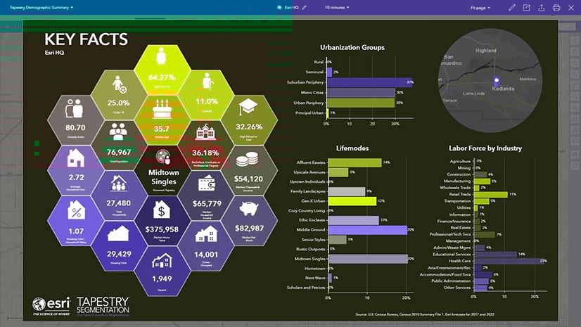
Use side-by-side comparison infographics to visualize and examine the differences for ring and drive-time buffers around a site. For example, the map below has three drive-time buffers around Esri’s headquarters.

Examine the Key Facts for the three areas in a single view using side-by-side comparison. Differences for the key values are displayed within the infographic. As a result, you can easily see which values are higher and lower in the infographic.

For instance, the 15-minute drive-time area around the office has a median household income of nearly $8,000 more than the households within a 5-minute area.

2. Compare your site against a market or other area
Neighboring and intersecting geographic areas can be added to your side-by-side comparison infographic. Because this comparison provides context, better information is available about the values and key indicators for your sites. For example, you can examine how education levels for the drive-time areas around the office compare to the State averages.

3. Comparing multiple sites and areas
Add multiple sites and areas from projects to compare values for up to 10 different areas. For instance, you can compare how access to health care coverage differs around a set of urgent care clinic locations.

All the capabilities to interact with individual variables, charts and maps work in the new comparison mode. Infographics can be exported to an image, PDF and shared as an interactive HTML document. Side-by-side comparison infographics work with any of Esri’s starter infographic templates. Because comparison infographics also work seamlessly for your own custom infographics, they will function with your own custom data.
We’re so happy to share this new capability with you. Please reach out and let us know how we can improve infographics and other capabilities in ArcGIS Business Analyst.
Email the team: businessanalyst@esri.com
Below you can find some links for Business Analyst that you may find useful.

Commenting is not enabled for this article.