
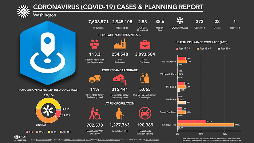
In my previous blog on this topic, I illustrated how an infographic about vulnerable populations, including information about homeless populations, can be used to plan for the impact in of the coronavirus disease 2019 (COVID-19) pandemic in the United States.
In this follow-up blog, I am going to explain how I customized an infographic in the ArcGIS Business Analyst Web App with additional content from the ArcGIS Living Atlas of the World. This can be used as a model for adding other content from your own organization to create compelling and interactive infographics.
Adding Data from Living Atlas
In order to highlight vulnerable populations, we want to examine the number of homeless individuals and the number of people living in shelters. As I noted in my previous blog, information about homeless populations in the Unites States is sparse and information is not tabulated nationally for well known geographies likes Census Tracts or Counties. This example will use the information about the homeless population that is publicly available in the ArcGIS Living Atlas of the World. This layer is derived from the Continuum of Care (CoC) Program. Information about this program can be found on HUD Exchange. The homelessness information is based on a Point-in-Time count that summarizes sheltered and unsheltered homeless persons on a single night in January in 2019.
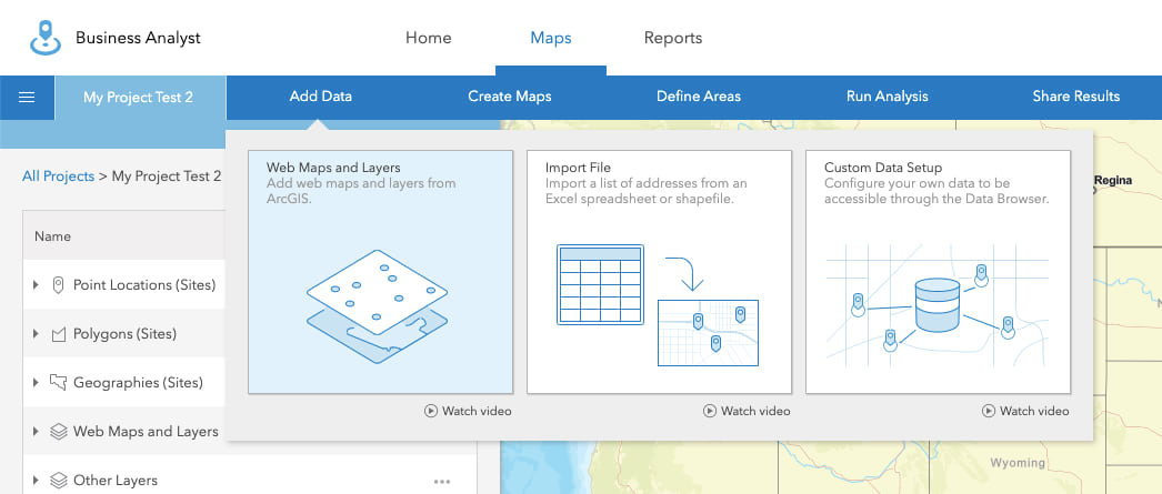
In the Business Analyst Web App, start by browsing the ArcGIS Living Atlas of the World for information about homelessness. To get started, in the top menu select “Add Data” and the “Web Maps and Layers” button:
Select the “Living Atlas” tab at the top and search for “Homeless”. Hover over the Homeless Point in Time Count, 2019, by Continuum of Care (CoC) Area web map illustrated below and you can read summary information about the layer. Cick “Add” to open:
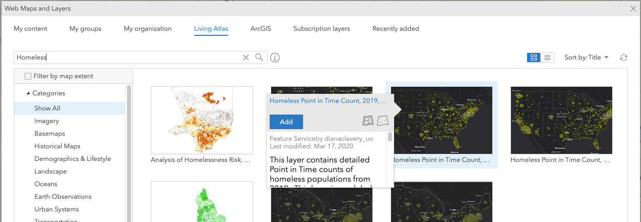
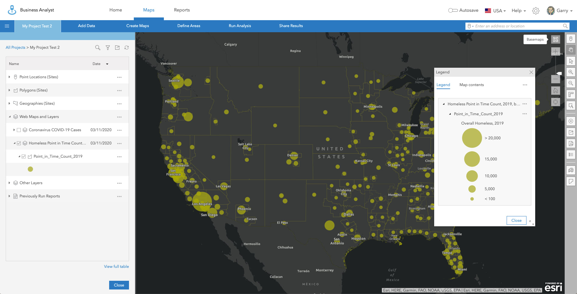
The web map contains Continuum of Care (CoC) Area boundaries from the U.S. Department of Housing and Urban Development (HUD). Each dot is sized to represent the homeless population in each CoC Area.
Add an Infographic Template from the Gallery
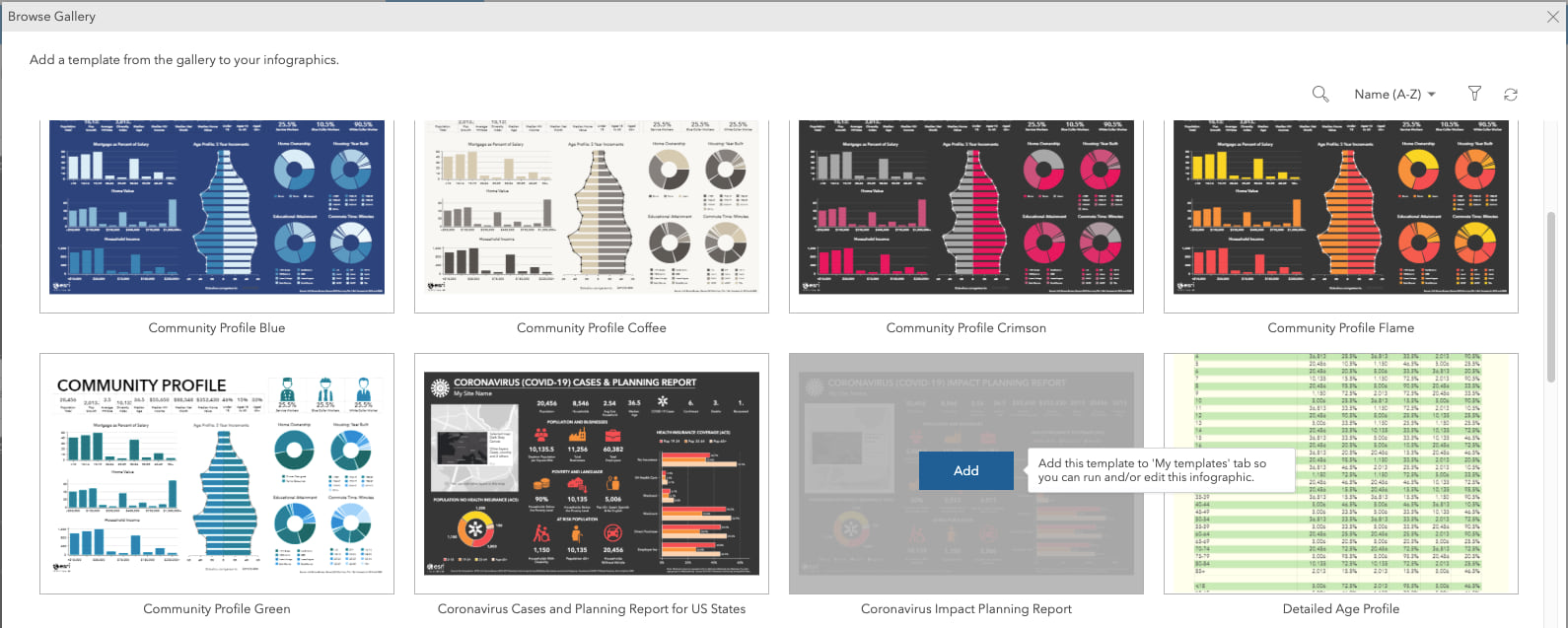
In order to follow the rest of this blog, you will need to add the “Coronavirus Impact Planning Report” infographic template from the gallery. My colleague Helen Thompson’s blog provides a really nice overview of how to do this. In summary:
- On the “Reports” tab, select the option to “Build Reports” and “Build Infographics”.
- Click the “+ Add template” button and the “Browse gallery” option.
- Add the “Coronavirus Impact Planning Report” template.
Edit the Infographic Template
Once the template is added from the gallery, on the “My templates” tab click to “Open” the template to make edits:

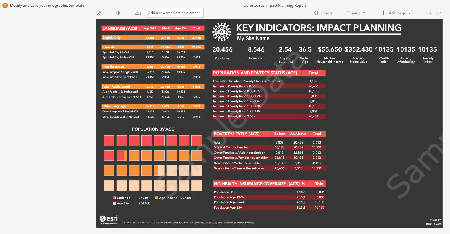
This will open the infographic template in the editor so you can make changes. We are going to leave the first page as is, so scroll down to the second page. To add new content, we will use the space that currently contains charts for Household Income, Home Value, and Housing. Hover-over and click the “x” in the top right-hand corner of the three charts and their titles to remove them from the template:
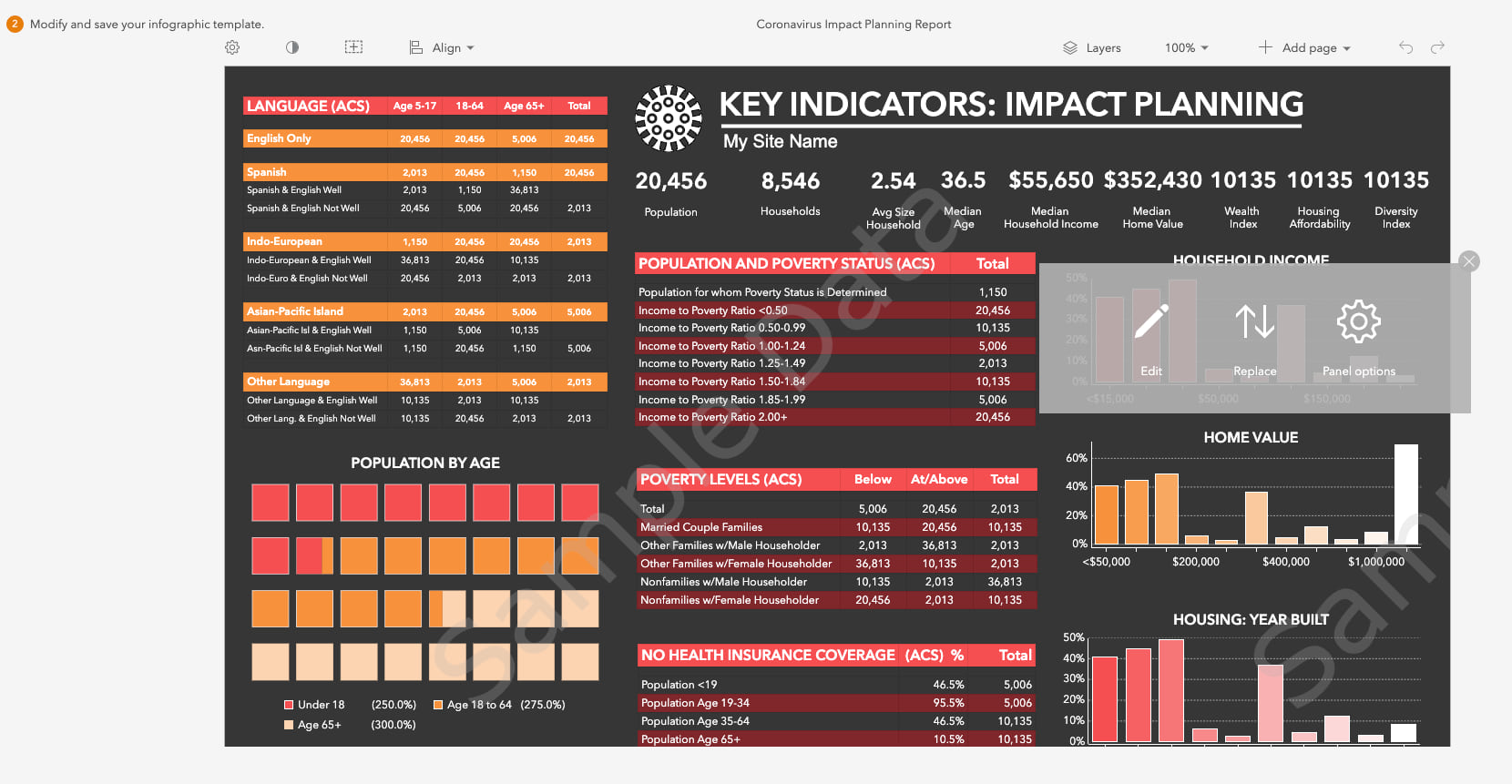
Remove all three charts, as we are going to use this space to add content about the homeless population:
Add a Table
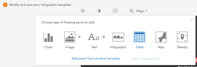
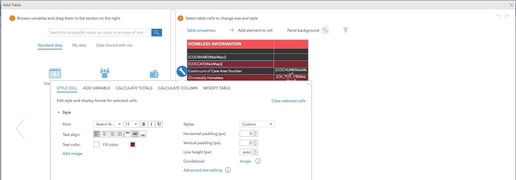
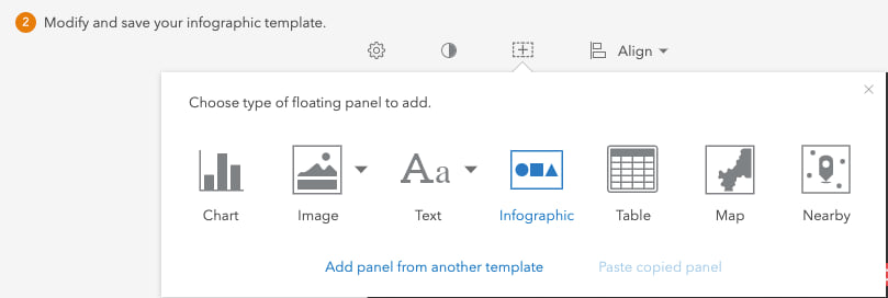
After you remove the charts, click the “Add a new free floating element” button at the top. Let’s start by adding a table that will contain summary information about the homeless population in each area:
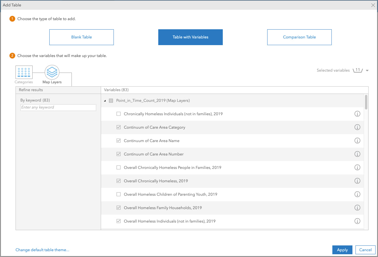
Click the “Table with Variables” button at the top and then select the “Map Layers” category. Find the “Point_in_Time_Count_2019” layer added perviously and select the variables you want to include in the table and click “Apply”:
The table gets added to the center of the page and you can move and resize it to where you want:
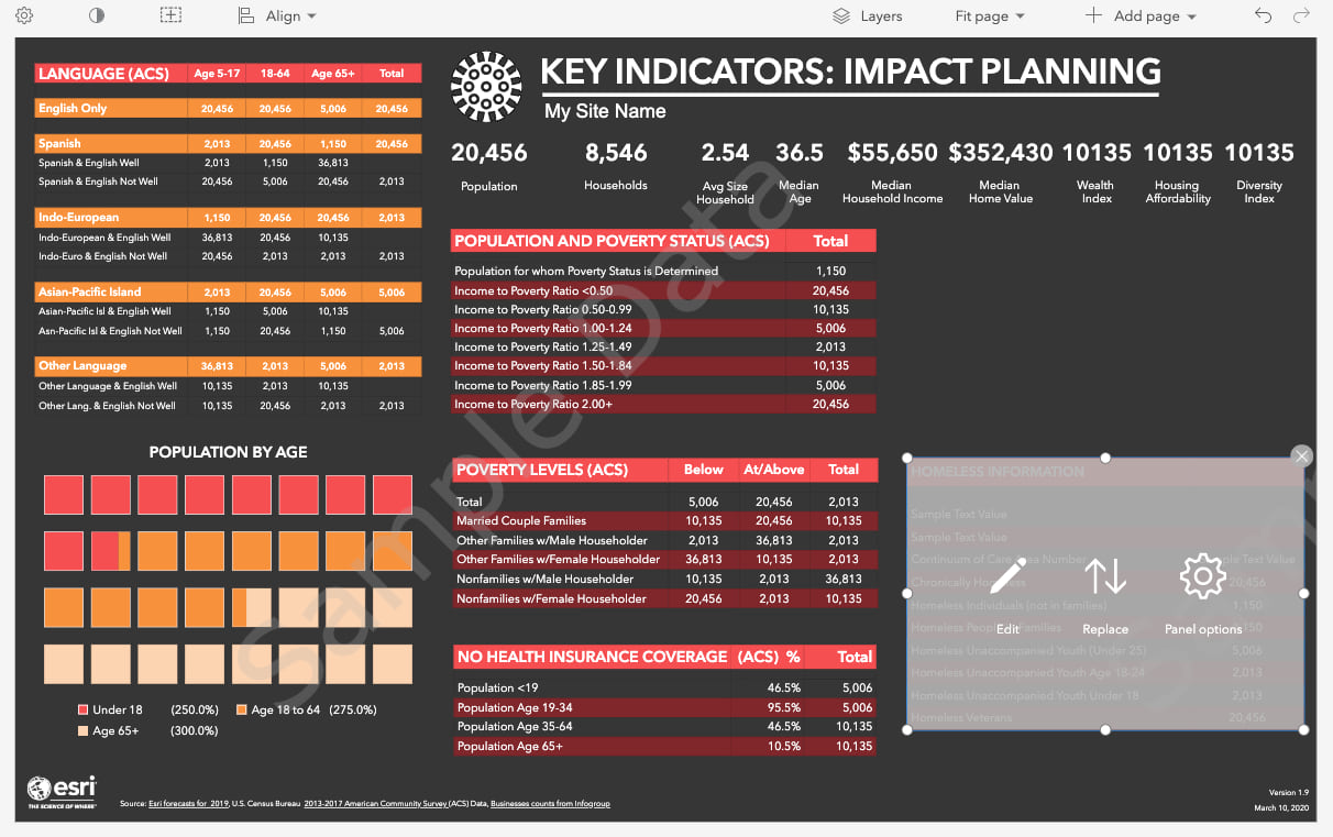
Hover over the table panel to “Edit” the table. For example, you can change the title, variable descriptions, font and change the background color of the table rows:
Add an Infographic Panel
After you add the table, let’s build a nice-looking infographic panel that summarizes the three key indicators within this web map – overall homeless population, homeless population in shelters and the overall unsheltered population. To get started, add another free floating panel at the top and this time select “Infographic”:
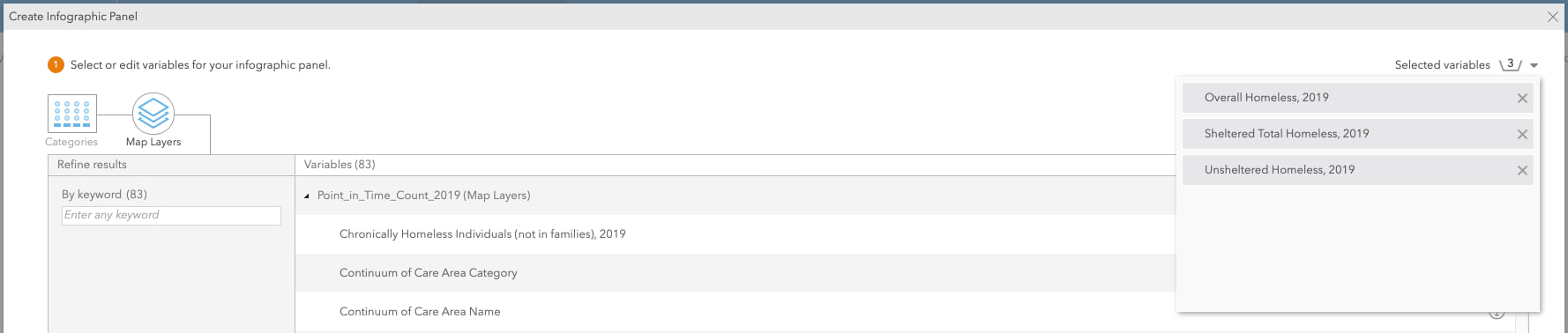
Here, you can select any of the standard infographic panels provided in Business Analyst. Because we want to create our own infographic with the homelessness data in the web map, select the option to “+ Create infographic panel”:
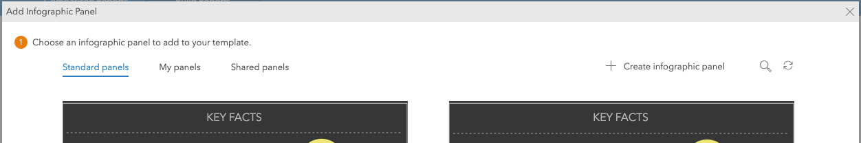
Like we just did for creating a table, select the homelessness layer under “Map Layers”. Then, select these three key attributes:
Click “Next” and an infographic panel is created for you. You can add icons from a library of shapes included with Business Analyst or add your own icons or images that are associated with each variable. You can edit any of the text and style and color any of the elements as well:
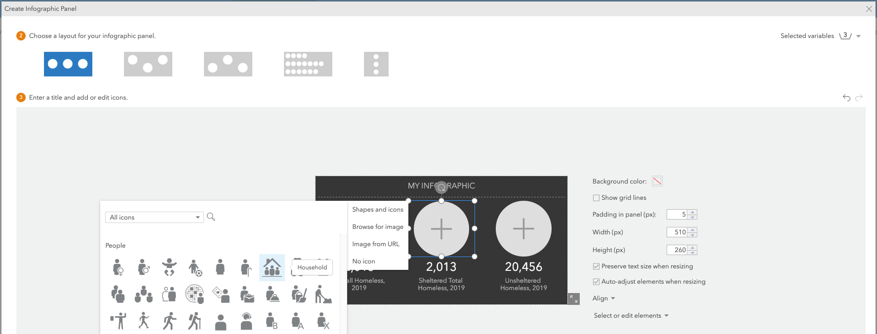
When you are finished with your edits, click save and the panel is created for you. The panel is added to the center of the page and you can move and resize it anywhere on the page you want.
Add a Text Box
The final step is to add a text box with a data source citation so that people that view the infographic understand the source and vintage of the information:
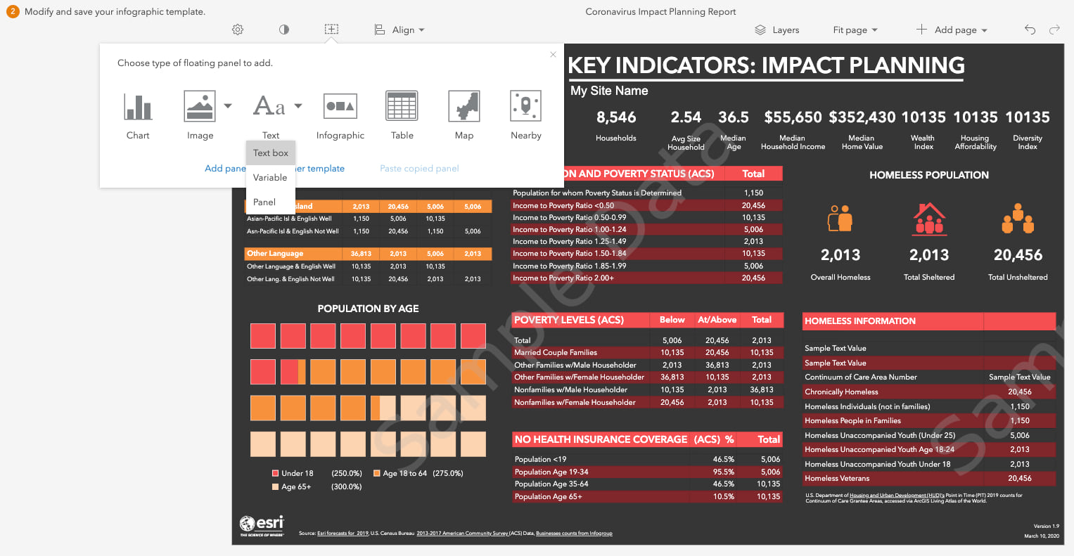
After you add a text box, move and resize the text box element under the table we previously added. For example, you can add the recommended citation from the Living Atlas web map details. You can even use advanced text editing capabilities to add a hyperlink to external documentation.
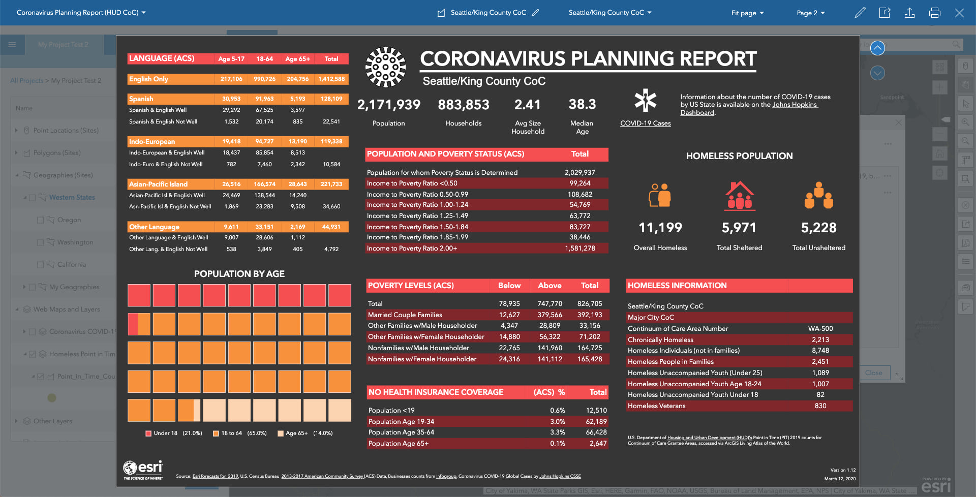
Save and Run Your Infographic
After making these final changes, click “Save” and give your template a new name.
In the “Maps” tab, select any CoC boundary on the map, click the “Infographics” button in the contextual popup and select the new infographic you just created. The second page of the infographic now contains dynamic information about homelessness:
You can try the Coronavirus Vulnerable Population Infographic Demo to see what this infographic looks like.
I hope this example provides a good overview of some of the capabilities in the ArcGIS Business Analyst Web App for adding your own content and creating interactive and engaging infographics that provide key indicators for an area. There are many more options to visualize information in an infographic using tables, charts and maps that you can explore as well.
If you have any questions, please reach out to our team by emailing businessanalyst@esri.com.
What’s Next
In the next, I will demonstrate how to use this ArcGIS Business Analyst Web App infographic template in an ArcGIS Web App Builder application.
Additional Resources
For additional COVID-19 resources, please view the following:
• How GIS departments can respond to COVID-19
• ArcGIS Hub sites for COVID-19
• Coronavirus Impact Planning infographics template


This is awesome, Gary!