Pop-ups are often the single most important aspect of web mapping applications when it comes to enabling interactivity with the map. In fact, a well-designed pop-up can be the difference between a good app and a great app. This article covers some of the subtle yet powerful capabilities of the pop-up that you can take advantage of as a developer.
Pop-up anatomy
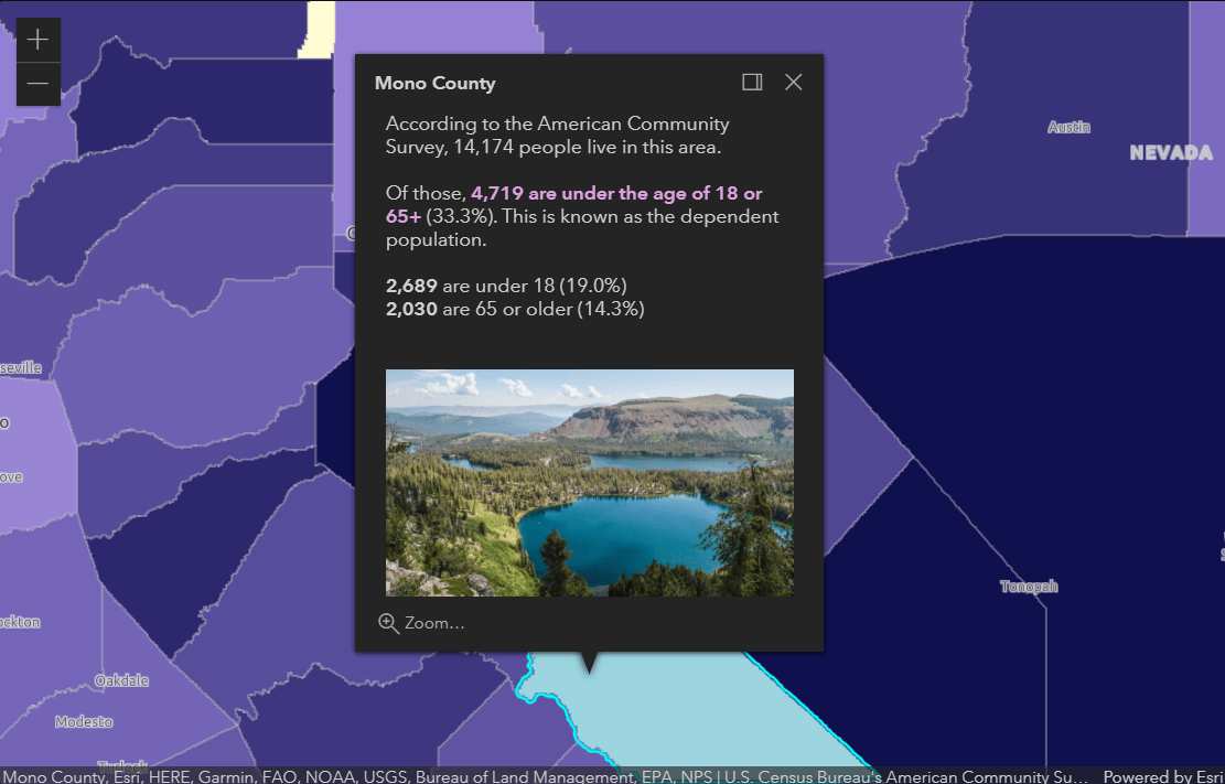
A very low-effort way to define the pop-up content – and how it is displayed – is by using the ArcGIS Online and ArcGIS Enterprise authoring tools to define the pop-up content for each layer. Then, when you load the layers in your map they “just work”. Under the hood, the ArcGIS API for JavaScript creates a Pop-upTemplate for each layer. This contains the pop-up elements that have been configured such as the attribute display, media elements like charts, images, etc that you’ve configured, as well as any attachments associated with each feature.
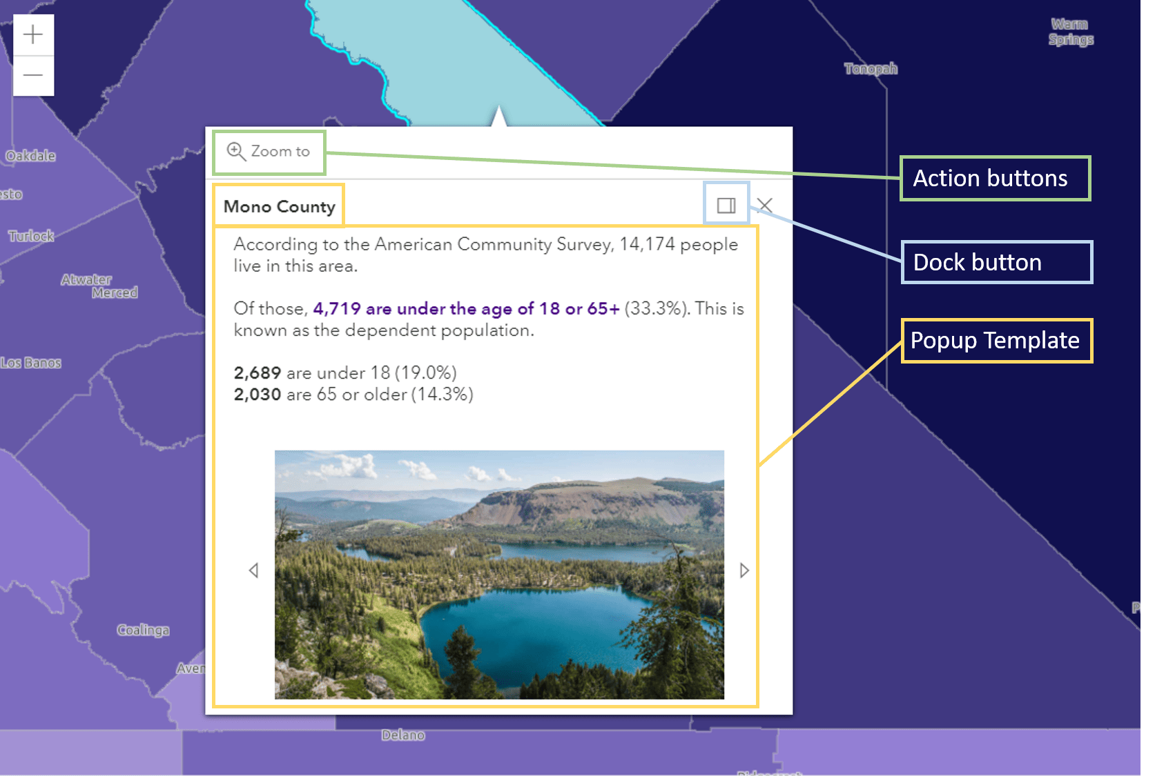
Alternatively, developers can programmatically define their pop-up using the JavaScript API’s Pop-upTemplate class. It is a little more work, but you can achieve the same look and feel as if it was defined in Online or Enterprise and you gain the ability to do more customization. If you search the ArcGIS blog site, you’ll see a large collection of helpful blogs covering tips, tricks and best practices for designing pop-ups.
This takes care of the “meat” of the pop-up, and at this point many developers would consider their pop-up job done. However, you have more options when it comes to tailoring the pop-up experience, and even its content.
Put anything you want inside a pop-up
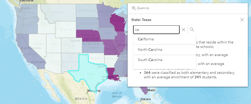
Version 4.16 of the JavaScript API introduced a new content type to the Pop-upTemplate called “CustomContent.” This type of content element can be added to the pop-up just like the other types (attribute tables, charts, etc) and can work with content such as strings, HTMLElements, and API widgets. This gives you a lot of flexibility in terms of what you can easily place inside of a pop-up.
In the example below, the API’s search widget is embedded in the pop-up as a custom content element.
At a high level, you’ll follow these steps:
// 1. create the custom content
let customContent = new CustomContent({
  creator: (function (graphic)) {
  // this returns either string, HTMLElement, Widget, or Promise
  }
});

// 2. Create the PopupTemplate and reference the content elements
const popupTemplate = new PopupTemplate({
  outFields: ["*"],
  title: "State: {state_name}",
  content: [customContent, chart, textDescription]
});

//3. Configure the layer to use the popupTemplate
layer.popupTemplate = popupTemplate;
One important aspect to note about the code above is the outFields property. For optimum performance, the API only requests the feature attributes that it needs for visualization and those needed for the layer’s pop-up definition (if it was pre-configured in Online or Enterprise). If you are doing something custom, you must specify the attributes that you’ll be working with so that they are also downloaded. In addition to these steps, you can use the customContent’s destroyer property for cleaning up any custom content when it is no longer needed.
Click on a button, execute a function
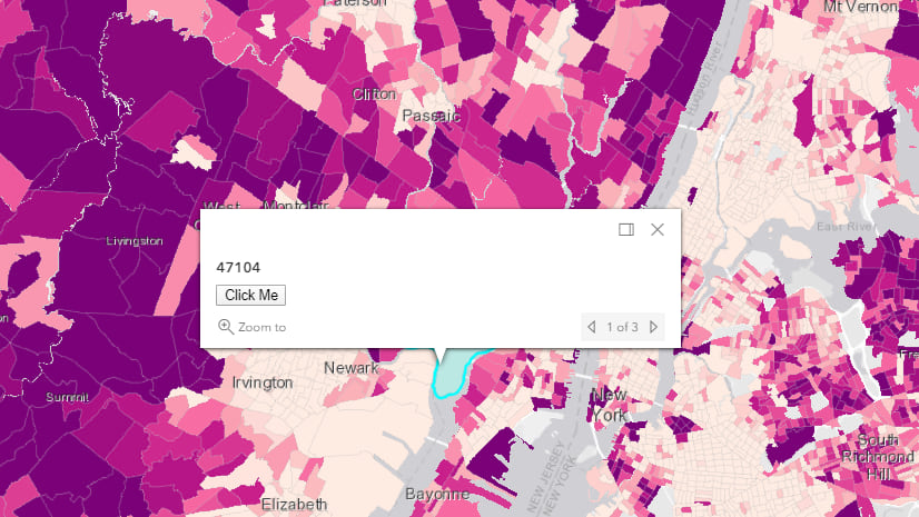
You can easily configure the pop-up to have one or more buttons that executes a function that you’ve created. These are called pop-up “actions.” You may have noticed the zoom-in button that is symbolized by a magnifying class in the default pop-up – that is an action. When clicked, the map zooms in and centers on the selected feature. You can add any number of custom actions to the pop-up, and control how many are displayed before added to a “…” menu. This capability is most often used when you want the user to be able to do something with the selected feature. For example, if you had a layer containing possible retail locations, you could have an action that when clicked on, it calculates a 10-minute drive-time around the selected feature and displays demographic statistics about people living within the drive-time polygon. Or it could do an intersection using the buffer and another layer in the map. You can decide exactly what you want to happen when the user clicks on your custom action – the concept of actions was created to give developers an easy way to integrate their custom workflows into pop-ups.
Alternatives to using the default pop-up
You might want to display information about a feature in a way that differs from the default pop-up experience. There are a few very helpful mechanisms in the API for building out your own experience. Here are some examples:
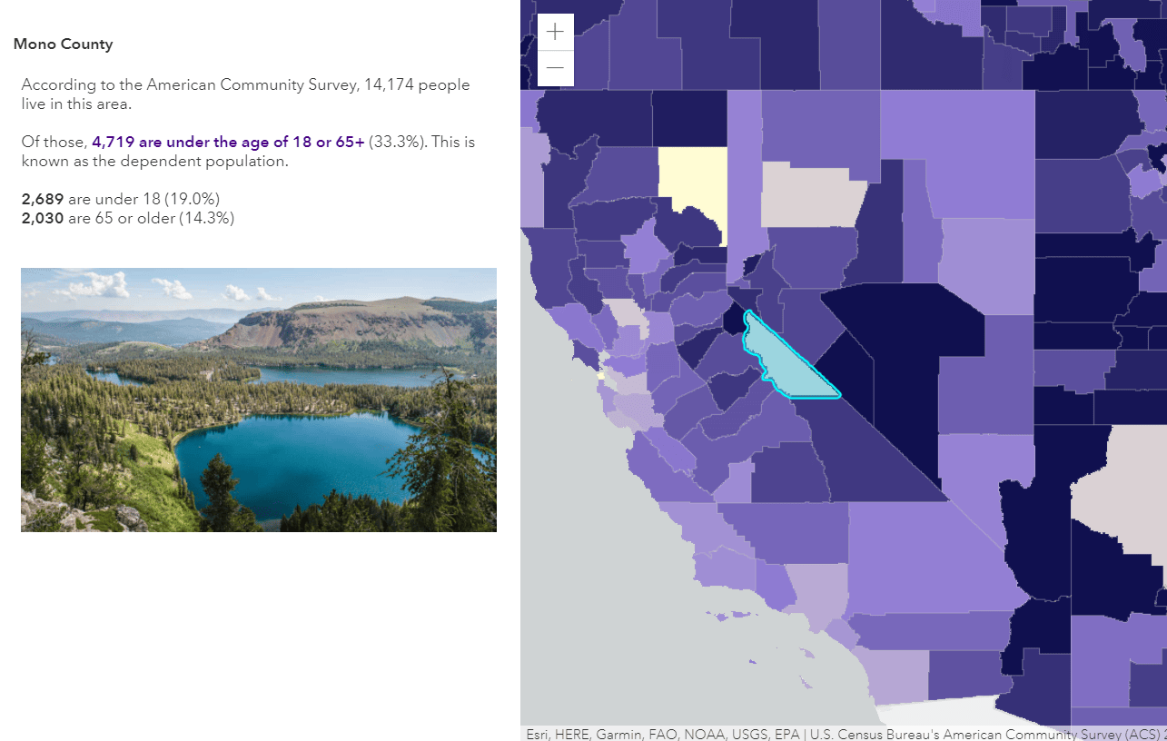
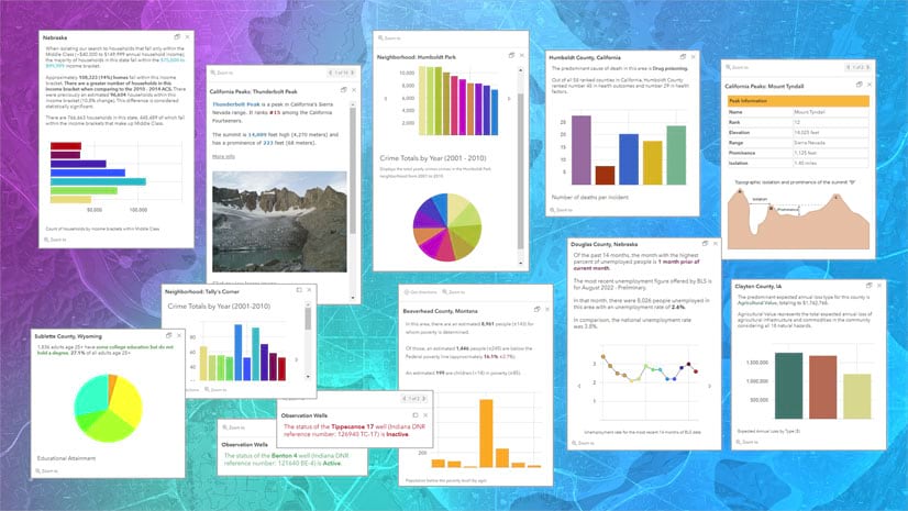
Formatted content outside the pop-up. As mentioned earlier, the PopupTemplate is used to display nicely formatted pop-up content. If you’d like to display the formatted content somewhere in your application outside the pop-up, you can use the Feature widget. The Feature widget renders information about a feature according to its PopupTemplate. In fact, under the hood, the pop-up uses the Feature widget internally to display content, and surrounds it with the pop-up UI such as the docking control and pagination. The Feature widget can be placed in any container, on top of the map or completely outside the map. Two common examples of this are when you want to display the feature’s information in a side panel next to the map, or if you want to display it in a floating window as you hover over features. In the example below, the Feature widget is displayed inside a side panel.
Display more than one pop-up at once. In most cases, the best user experience is to show one pop-up at a time, which is how the API is designed. However, some developers have a requirement to display more than one pop-up at once. This can be achieved using multiple instances of the Feature widget, and a pop-up helper method. Rather than showing the information inside a pop-up which automatically closes when another feature is clicked, it is shown in Feature widgets that are added to the UI. You can display them next to the selected feature and provide a button for the user to explicitly close them.
You will have to do a little plumbing to get this to work. This includes setting the Pop-up’s autoOpenEnabled property to false, adding a click listener on the view, and then getting all the features that were clicked on. You can get the features at a given screen location using the PopupViewModel’s fetchFeatures method (the business logic that powers the pop-up is the PopupViewModel). You might wonder why you wouldn’t just use the map view’s hitTest for this… There are two important distinctions with using fetchFeatures: 1) you get all the features in all layers from the client and server rather than limiting it to what is already loaded on the client, and 2) you get the features which have a pop-up enabled and popupTemplate defined for you to use.
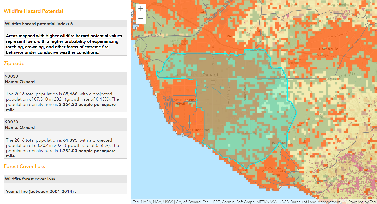
Display pop-up information in a side panel. In the following app, multiple Feature widgets are used to display information from three layers at once. Rather than the pop-up information being inside a window near the feature, it is added to a side panel.
Disable the pop-up altogether. If you don’t want to show pop-up information at all, you can disable the pop-up by setting a layer’s popupEnabled to false, or disable pop-ups for all layers like this:
view.map.layers.forEach( layer => layer.popupEnabled = false );
Fine tuning the experience
There are several configuration options related to the pop-up experience that you can try out. A few that are easily overlooked are:
Customize the feature highlight color. When the user clicks on features, what color would you like used for highlighting? You can customize the color by setting the map or scene view’s highlightOptions.
Remove parts of the pop-up. Using the “visibleElements” property, you can turn individual elements of the widget’s display on/off including the “close” button and the navigation controls for cycling through selected features.
Control docking behavior. When a pop-up is “dockEnabled” it means the pop-up no longer points to the selected feature or the location assigned to it. Rather it is placed in one of the corners of the view or to the top or bottom of it. Docking the pop-up allows for a better user experience, particularly when opening pop-ups in apps on mobile devices. You can control various aspects of the docking behavior, including the dimensions of the view at which to dock the pop-up automatically (i.e. what screen size should cause the pop-up to be docked for usability?) setting the “breakpoint” property. You can also turn off docking completely if you don’t want your pop-up to switch to docked when the view is small.
Pop-up styling
You can style your pop-up to match the rest of your app and company branding, or change specific elements based on your preferred design. Although it isn’t immediately obvious, the pop-up is a widget, architected in the same way that other widgets are architected in the API. It can be styled in the same way that other widgets are styled in the API.
Use an API theme: One way to quickly change the style of all widgets in your app at once is to apply a theme. You can pick from light (default), dark, light/dark blue, light/dark green, light/dark purple, and light/dark red (see the dark theme in the app below). A more involved option is to create your own theme and apply it across all widgets. To learn more about doing this, check out the Styling topic in the JavaScript API Guide.
Override individual properties in CSS: You can change a handful of properties by overriding the pop-up’s CSS. An easy way to figure out what properties you want to change is to use the browser’s developer tools to inspect and experiment with the CSS of an individual element
Widget SASS: If you need a scalable approach with more fine-grained control, you may want to consider working with the pop-up’s Sass file. This is the recommended approach to customizing the CSS as it provides access to theme variables and specificity.
How to learn more
We have shared a wide variety of content for helping developers create beautiful, effective pop-ups. Here are some of the resources you can check out if you want to continue your pop-up learning.
- There are a lot of samples in the JavaScript documentation that cover a wide variety of pop-up topics.
- Since the pop-up is such a critical part of web mapping applications, we are constantly evolving and improving the pop-up experience and flexibility – be sure to watch out for pop-up updates in the release notes and release announcement blogs.
- As mentioned previously, there are a lot of blogs covering pop-up authoring topics published on the ArcGIS blog site.
We cover topics involving pop-ups at every Esri Developer Summit and Esri International User Conference. To see recordings from the last Developer Summit, check out the JavaScript API playlist on YouTube here: http://esriurl.com/JSPlaylist
Banner photo by Clark Tibbs on Unsplash

Article Discussion: