In 2019 we introduced collections to ArcGIS StoryMaps, giving authors the ability to publish an aggregation of stories on a single page. Lately I’ve been encountering some really exciting collections created by our community of storytellers. Those happy encounters inspired me to spend some time perusing dozens of publicly-shared collections in search of outstanding examples and patterns of use. Although the uses are quite varied, I think I’ve discerned a few patterns. I’ve organized these collections into four main categories, which I’ll call story books, story aggregations, story lessons, and story guides.
I hope these examples will motivate you to create and publish your own collections. We’ll be adding some cool features in the near future, including additional design options. Stay tuned!.

1. Story books
Story-book-style collections treat individual stories as chapters in a book. Stories in these collections are usually created by a single author, and reflect a consistent editorial and design style throughout. Here are some inspiring examples.
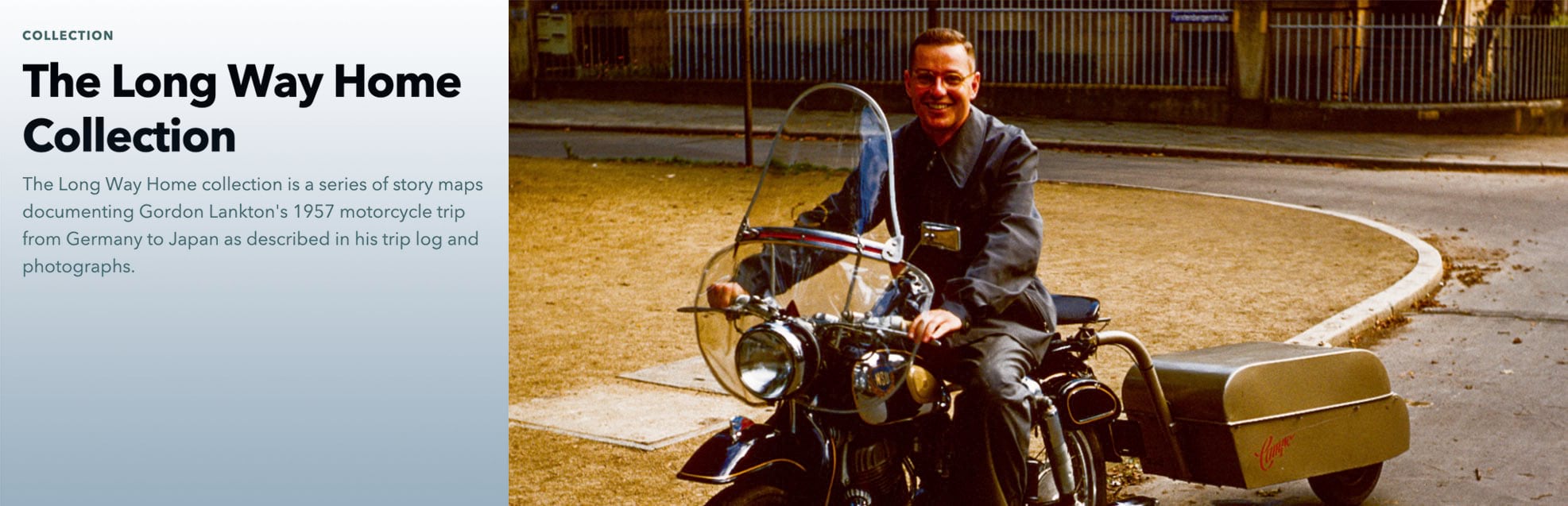
The Long Way Home depicts Gordon Lankton’s thoroughly documented mid-1950s motorcycle trip across Europe and Asia. The initial story serves as an introduction; each additional story depicts a leg of Lankton’s odyssey.
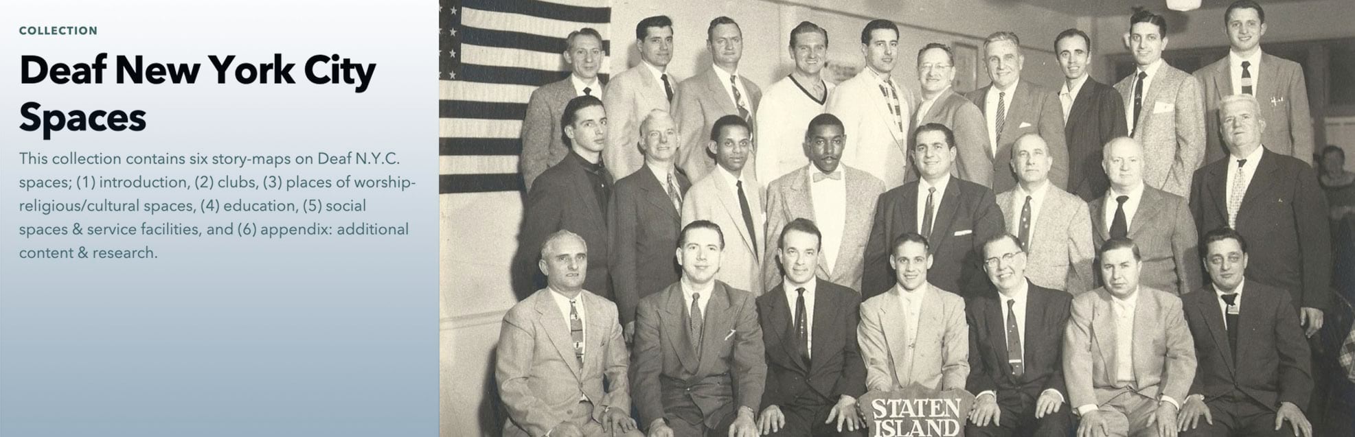
Deaf New York City Spaces is the brainchild of Gallaudet University student Brianna DiGiovanni, and reflects her deep research into the history of gathering places for the deaf in New York from the late 19th century to today. Like the Long Way Home collection, the initial story serves as an introduction; DiGiovanni has used the final story as an appendix to present additional information and cite sources.
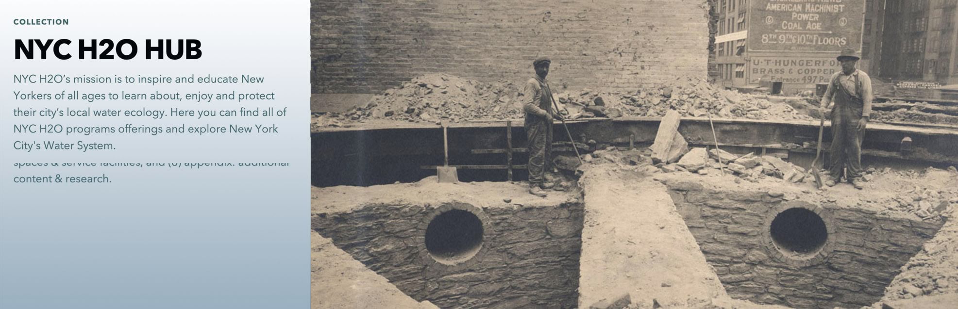
This collection takes a dramatically different look at New York, exploring the city’s remarkable water system. NYC H2O Hub is meant to “inspire and educate New Yorkers of all ages” about the sprawling engineering marvel that pipes millions of gallons of fresh water into the city every day and distributes it across five boroughs.
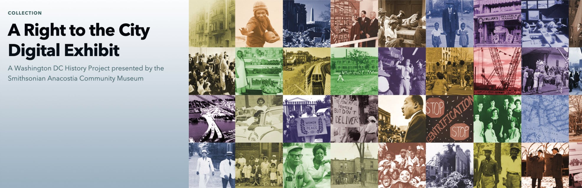
A potentially exciting subset of story books are digital exhibits, online companions to physical exhibitions. A fine example is A Right to the City, produced by Texas educator Kathy Carroll during an internship at Smithsonian’s Anacostia Neighborhood Museum. Both physical and digital versions profile the history of citizen activism and urban change in selected Washington, DC neighborhoods.

The consulting firm AECOM takes a fresh approach in celebrating the International Year of Sounds with monthly installments, each authored by a different acoustics specialist.
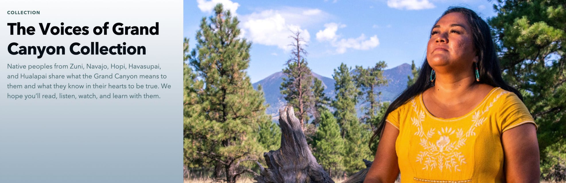
Two wonderful collections explore the rich intersection of indigenous cultures and conservation. The Grand Canyon Trust’s Voices of Grand Canyon Collection expands on their overview story with profiles of five tribal representatives, each of whom describes the deep ties that connect their cultures with the Canyon and sacred places within it.
Lands of Freedom, by the Amazon Conservation Team, celebrates the oral history and cultural heritage of the Matawai Maroons in Suriname. Maroons are people of African descent whose ancestors escaped slavery and established lasting communities in the Amazon rain forest.
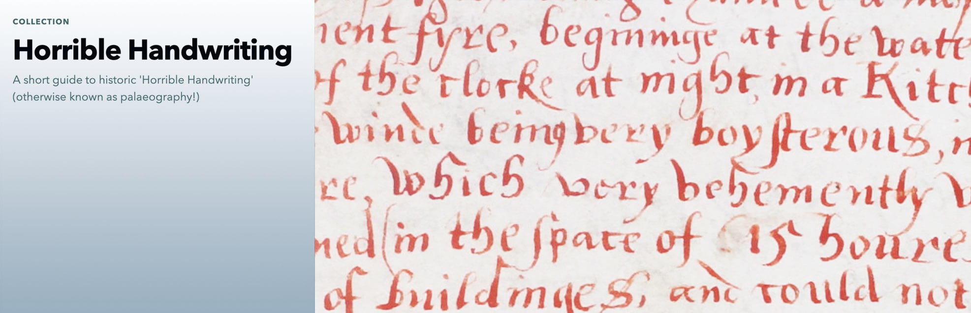
Finally, in the exciting and expanding realm of digital humanities, is Horrible Handwriting, an examination of old manuscripts, whose cryptic cursive is the delight of palaeographers. Never heard of palaeography? It’s defined as the study of ancient writing systems and the deciphering and dating of historical manuscripts. Note that this collection contains not a single map. Even though my colleagues and I are cartophiles through and through, we find the collection delightful and informative nonetheless.
2. Story aggregations
Aggregations feature stories that are related by theme, but don’t form a unified narrative. In most cases, stories have been produced by a variety of authors and organizations; thus styles and approaches vary.
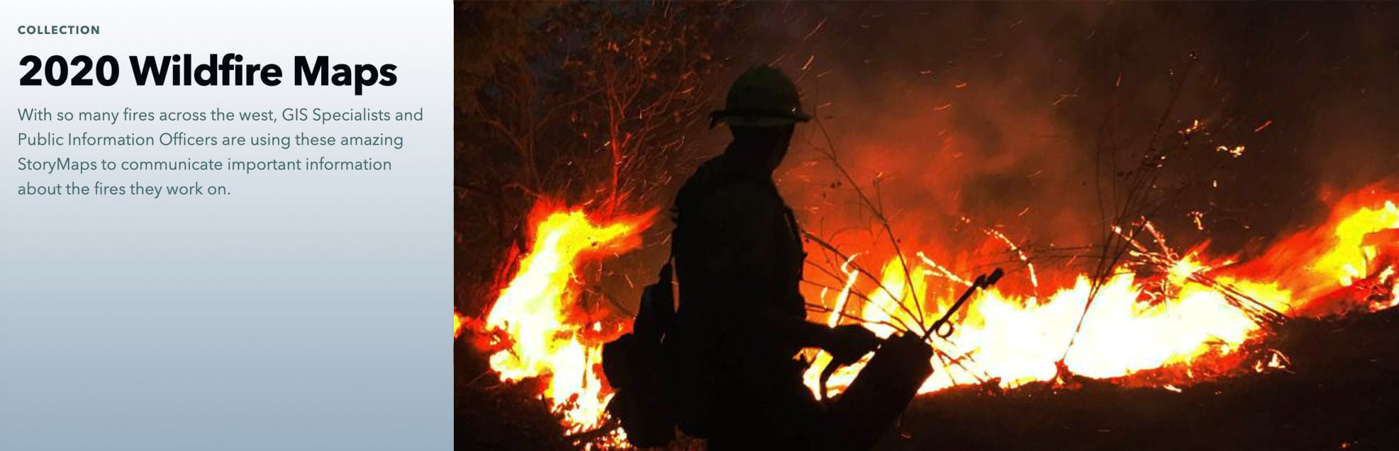
Among the many traumatic events of 2020 was a disastrous wildfire season in the American West. Many organizations utilized ArcGIS StoryMaps to share information about major fires; 2020 Wildfire Maps aggregates about two dozen of them.
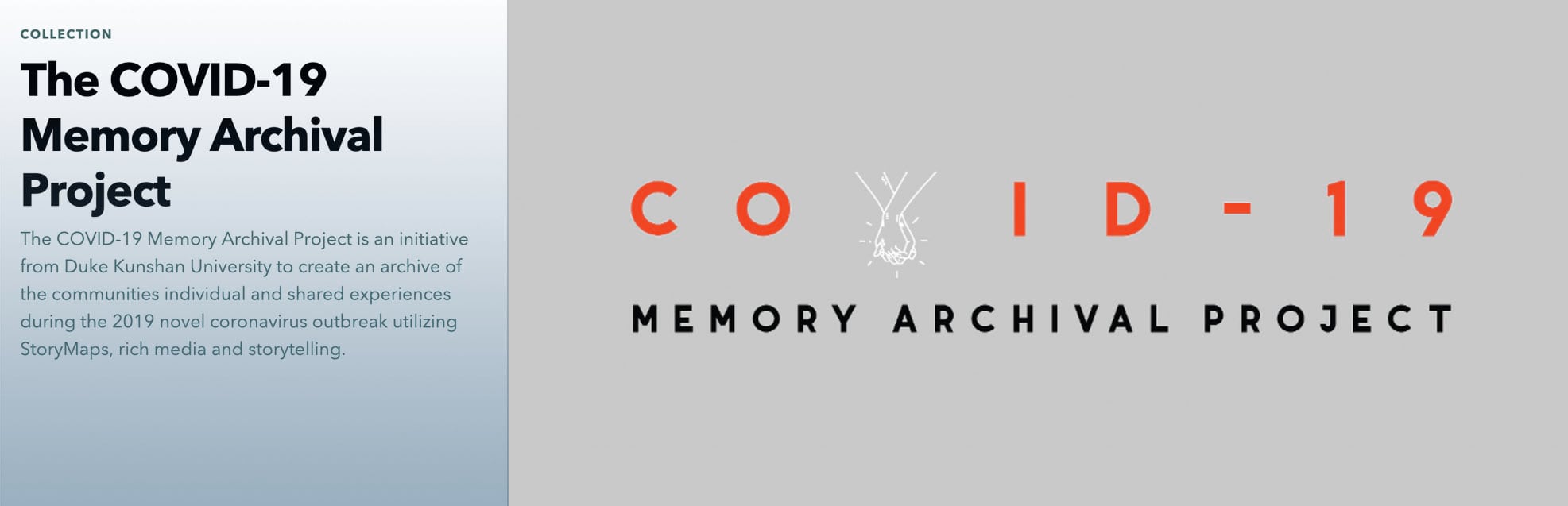
This extraordinary aggregation was spearheaded by Benjamin Bacon, associate professor, and Weijing (Vivian) Xu, assistant professor, both of the Media and Arts program at Duke Kunshan University, the campus of which is located near Shanghai, China. Members of the Duke Kunshan community were invited to create stories recounting their experiences during the COVID pandemic. Submissions range from relatively conventional narratives to highly subjective and original depictions of the anxiety and isolation brought on by the crisis.
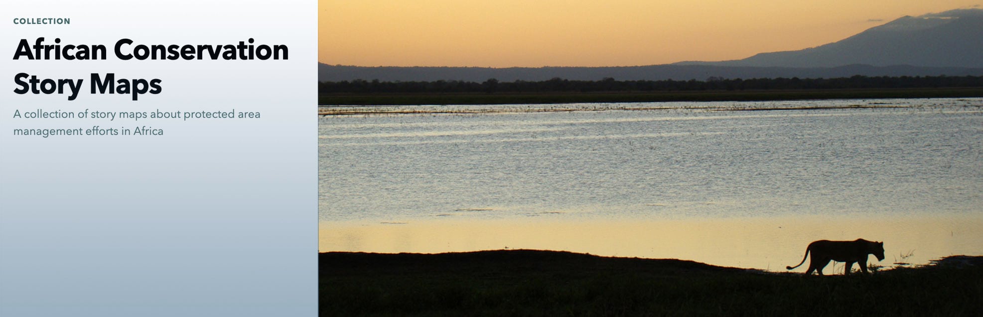
African Conservation StoryMaps aggregates a series of narratives illustrating the diversity of conservation efforts across the continent. It serves not only as a means of access to interesting stories, but also potentially as an inspiration to conservation professionals and private citizens.
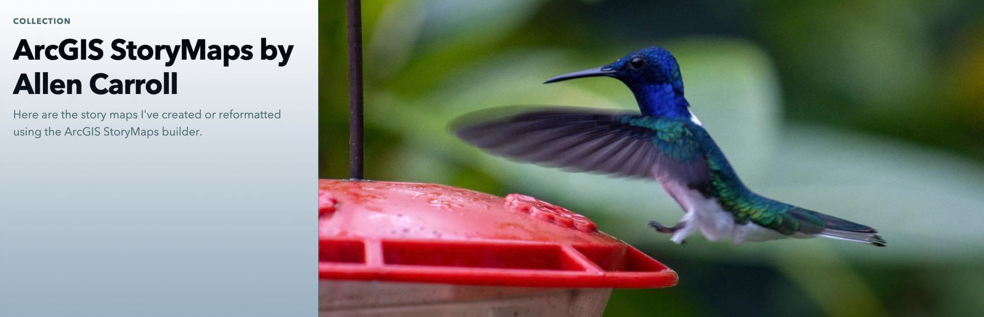
Collections are convenient places to aggregate stories to which you might want to periodically refer. I have two collections along these lines: ArcGIS StoryMaps by Allen Carroll is where I put stories I’ve authored (not counting the many stories by my team, for most of which I played a minor or supporting role).
When I encounter a community-produced story that I particularly admire, I add it to Outstanding stories from the ArcGIS StoryMaps Community. I refer to this collection when I’m planning presentations and workshops, and want to show off the best of the best. There are many more “best of the best” stories out there; these are ones that particularly resonate with me, and that use storytelling techniques that I think are worthy of emulation.
3. Story lessons
This is a more narrowly defined category with fewer collections. I’m listing it as a separate use category in part because of the rapidly increasing use of ArcGIS StoryMaps by educators and students, a happy phenomenon that we like to actively support.
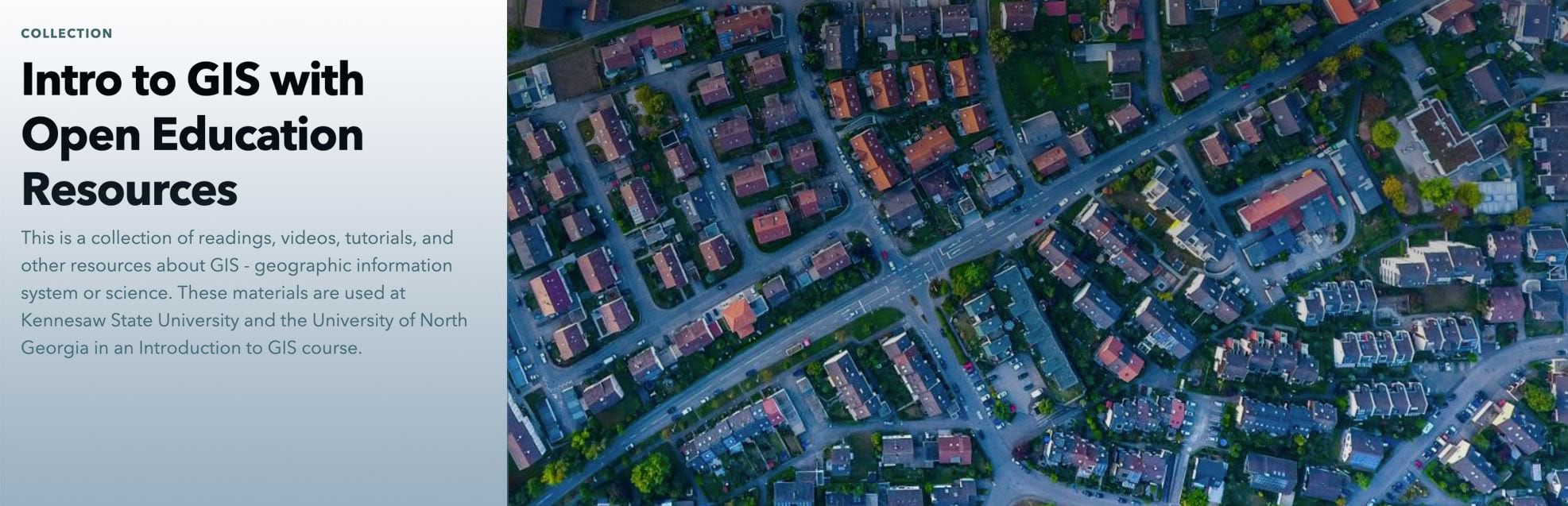
StoryMaps are being widely used as instructional tools. Intro to GIS with Open Education Resources aggregates “a collection of readings, videos, tutorials, and other resources” for use at Kennesaw State University and the University of North Georgia in their introduction to GIS courses.
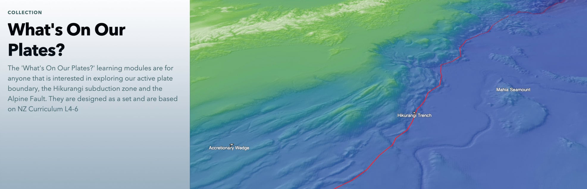
StoryMaps isn’t just for teaching about GIS, of course. Three New Zealand organizations teamed up to create What’s on our Plates?, presenting six learning modules exploring plate tectonic features near New Zealand.
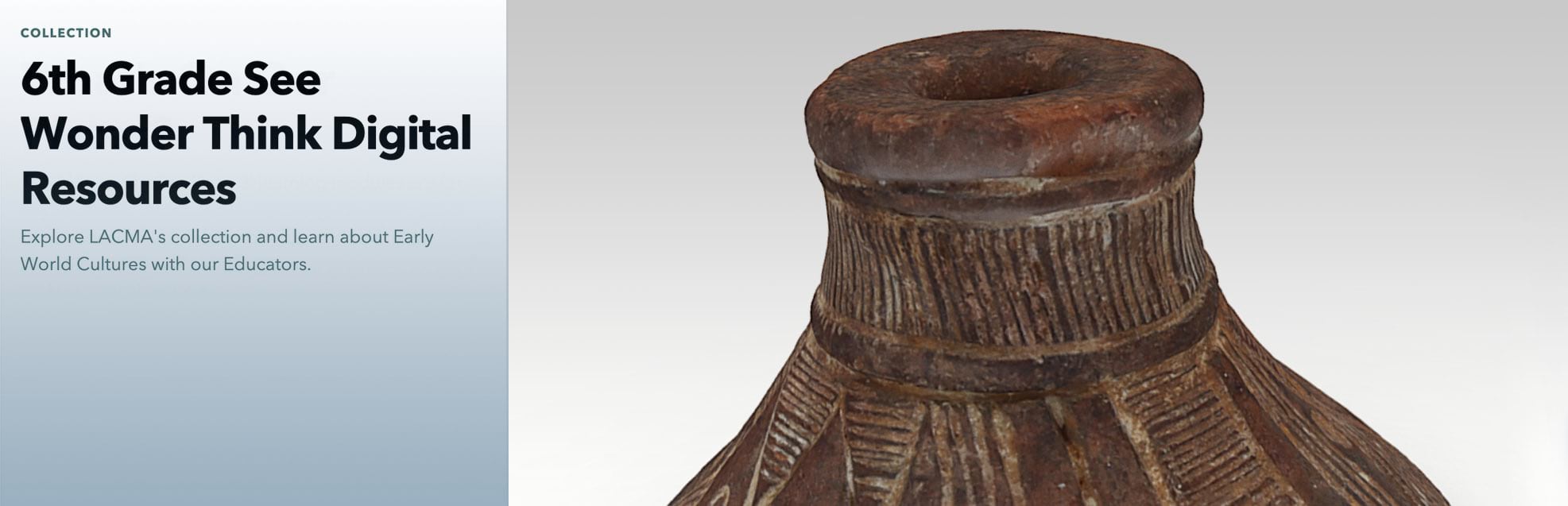
The Los Angeles County Museum of Art (LACMA) has created a series of simple StoryMaps featuring objects in their collection. Sixth Grade See Wonder Think Digital Resources features objects as windows into early world cultures.
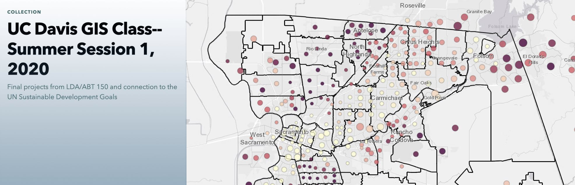
I’m especially excited about student-produced stories. More and more educators, especially at the college level, are giving their students StoryMaps assignments in place of traditional research papers. Karen Beardsley, a professor at UC Davis, aggregated her students’ stories into this collection: UC Davis GIS Class—Summer Session 1, 2020.
This example is from a GIS course, but instructors across a broad array of science and humanities classes are also challenging their students to create stories. As a result, ArcGIS StoryMaps are becoming a gateway to the geospatial realm: some students discover a hidden passion for maps and geography via StoryMaps, and go on to become geography and GIS majors.
4. Story guides
Story Guides might be considered a subset of Story Books. They differ in that they present stories about a series of locations, usually in and around a city. The best of them use consistent styling and story structure across the collection.
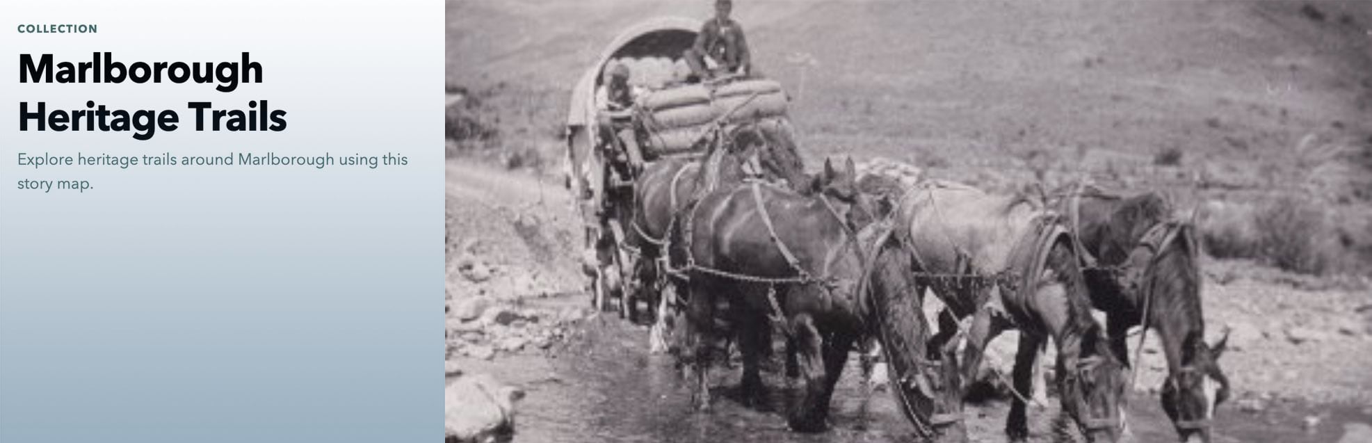
Perhaps my favorite is another New Zealand collection, Marlborough Heritage Trails. Stories are listed alphabetically by theme. Each begins with an overview map, an introduction, and a portrait and bio of a “tour guide.” The bios personalize the stories, and tie Marlborough’s history to the present. The heart of each story is a floating panel sidecar immersive that combines maps, images (many of them from historical archives), and text into engaging narratives.

Scotland’s Whole System Approach to Diet and Healthy Weight tailors a “healthier future” message to eight communities. Each story has an identical opener, indicating that the intention is to put less effort into publicizing the collection and more effort into promoting the individual stories to citizens of each Scottish town. However, the collection itself can serve as a means to recruit additional communities as participants in the program.
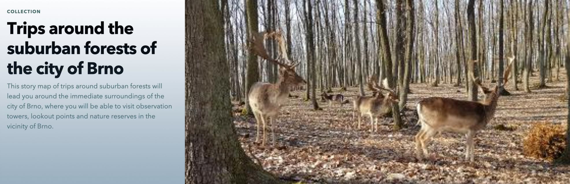
Trips around the suburban forests of the city of Brno is also admirably consistent in its presentation. After an initial introductory story, each tour includes a detailed map, a description with map actions pinpointing key locations, and “route information” summarized with icons and concise text. Don’t know where Brno is? It’s in the Czech Republic.
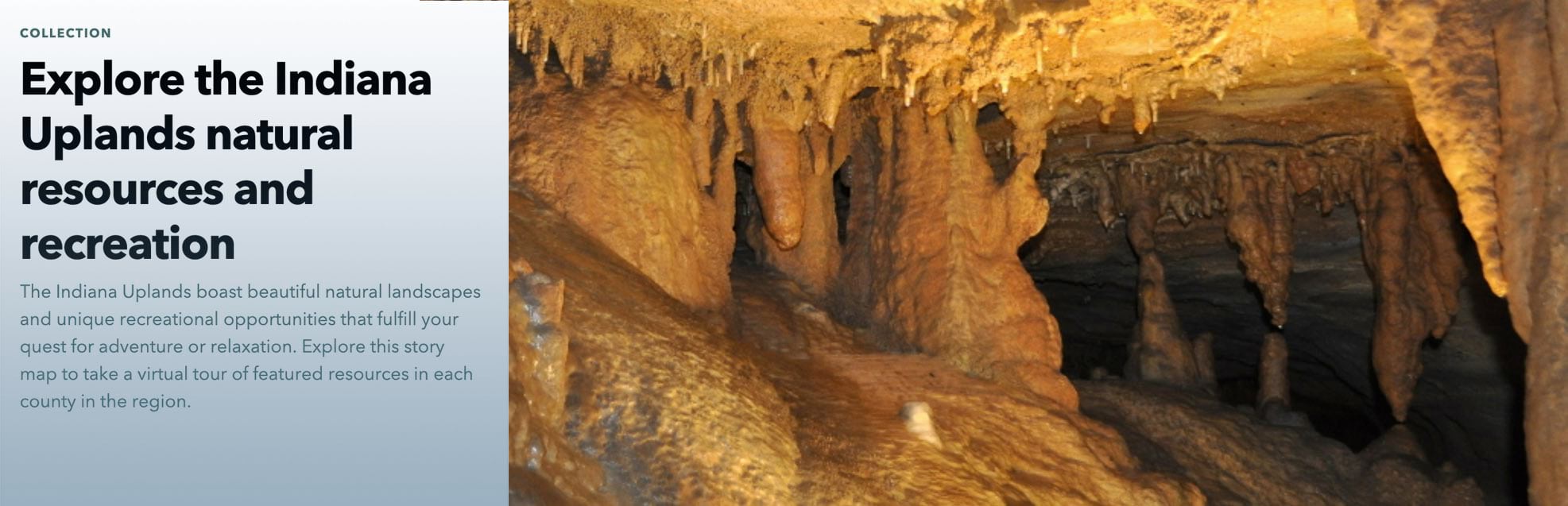
Much of the Indiana landscape is flat (I know—I grew up there), but the south-central part of the state is hilly and largely wooded. Explore the Indiana Uplands natural resources and recreation, by the Indiana University Center for Rural Engagement and the Eppley Institute for Parks and Public Lands, presents 11 map tours of county landmarks and attractions in this region, which escaped being squeegeed during the Ice Ages. Each tour point includes a photo, description, address, and web link.
This concludes my little collection of collections. Please do make your own collections—it’s easy and fun. And let us know when you create or encounter an extraordinarily effective collection. We’d love to see it, and if we agree that it’s worthy, we’ll do our best to spotlight it on our website or our Weekly Waypoint stories—which, not surprisingly, we aggregate into a collection!


Article Discussion: