As you may know, a recent enhancement to ArcGIS StoryMaps has made it easy for authors to choose from a long list of typefaces made available by Google. The addition of Google Fonts to the ArcGIS StoryMaps theme builder gives you much more flexibility to express your own aesthetic predilections, to evoke a mood or style appropriate to your story, and to more closely match the branding guidelines of your organization—especially when you customize color treatments as well as font choices.
I’ve been a designer for close to a half-century, so my eye is perhaps typographically attuned to a greater extent than most. (Poor type choices can actually offend me—the Souvenir font, don’t get me started!) But many of us are only vaguely aware of typography. When we see different type styles, they might only elicit a subliminal reaction. But the subconscious and subliminal are important to storytelling, especially multimedia storytelling, where images, text, maps, color, type, and even sound can all work together to create an immersive little world. The importance of pairing the right type with the right narrative is exactly why we expanded the options in theme builder so dramatically.
As usual, though, with freedom comes responsibility—you need to choose your typography wisely. Inappropriate fonts can confuse or contradict your story’s purpose. A frivolous-looking typeface within a serious, issue-driven story can weaken your message and trivialize your narrative. Conversely, a heavy, stern-looking font within a light-hearted tale can send its own kind of mixed messages. And, perhaps more importantly, all of us as storytellers should feel ethically obligated to make our narratives as accessible as possible, including to people with visual impairments. Poor font choices can compromise your story’s readability—even to people with 20-20 eyesight.
Typography for beginners
Before looking at specific examples, and without diving too deeply into the obscure parlance of typography, let’s start with a few font basics. With rare exceptions, fonts are either serif or sans serif, serifs being those little extensions at the tops and bottoms of letterforms.
Fonts often come in sets or families, with visual weights ranging from spindly (light) to normal (medium or regular) to fat (bold and heavy). Fonts can be squished (condensed) or stretched (extended); they can be upright (roman) or slanted and script-like (italic). And, of course, there are capitals (caps) and lower case (lc). (The latter term is a remnant of the type drawers that printers used back in the analog age.)
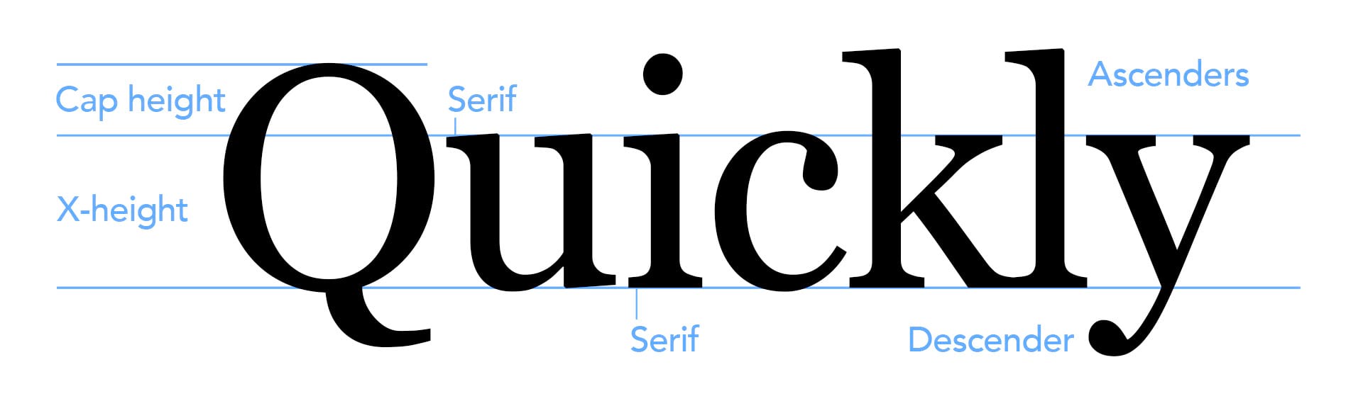
A subtle but important detail to consider in type choices is the proportion of x-height vs. ascenders and descenders. As you’ll soon see, some fonts have ascenders and descenders that are quite tall relative to the “main” part of the letterforms where most of the action occurs. Older serif fonts tend to have taller ascenders and descenders than more modern versions.
How do all of these different variables come in to play when choosing the right font for your story? The best way to explain this is with a few examples.
Comparing fonts in action
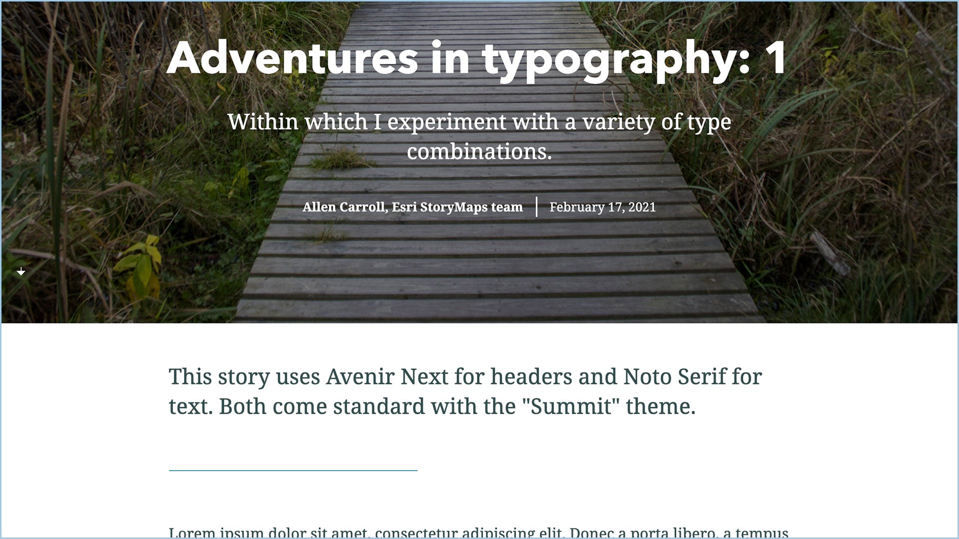
To illustrate the importance of type choices, I created a brief story using Summit, one of our pre-designed themes. It employs Avenir Next (a sans serif font) for titles, and Noto Serif for paragraph text. It’s an effective combination, but as one of our original themes it’s widely used and might have lost some of its distinctiveness as a result.
I created the original story using dummy type, or “greeking”, which can be a handy way to evaluate the look of your text even before you’ve drafted your narrative. You can copy dummy text at this site, free of charge, and paste it into your draft story.
You might notice it ends with “The quick brown fox jumped over the lazy dog.” Why? Because that sentence uses every letter in the alphabet, and provides an efficient way to inspect a potential type choice.
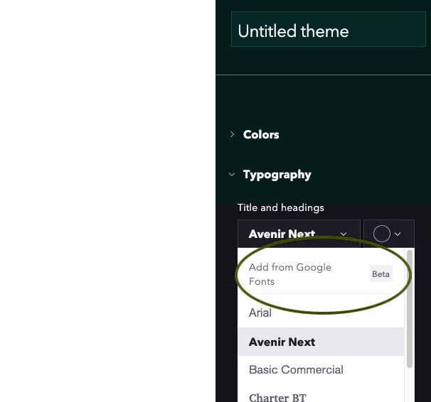
With my original in place, I then made several duplicates of the story. Next I went into the theme builder to create several font pairings. You’ll find Add from Google Fonts under the Typography menu in the theme builder.
Mismatched personalities
For the first part of the experiment, I made an effort to find fonts that I thought might be particularly inappropriate and that don’t work well together:
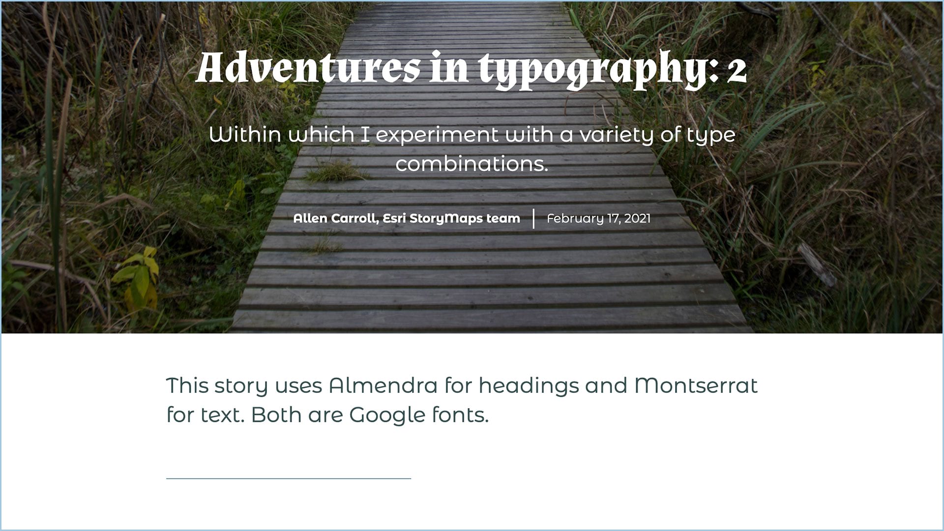
What’s wrong with this story? The fonts, Almendra and Montserrat, are designed to call attention to themselves rather than to maximize readability. And their styles are utterly different, which means they make poor bedfellows. Almendra’s ornate, antique look might work well on a treasure map, and Montserrat’s informality might be effective on a take-out menu, but it’s hard to imagine their being appropriate for a story, regardless of topic.
Out of sync serifs
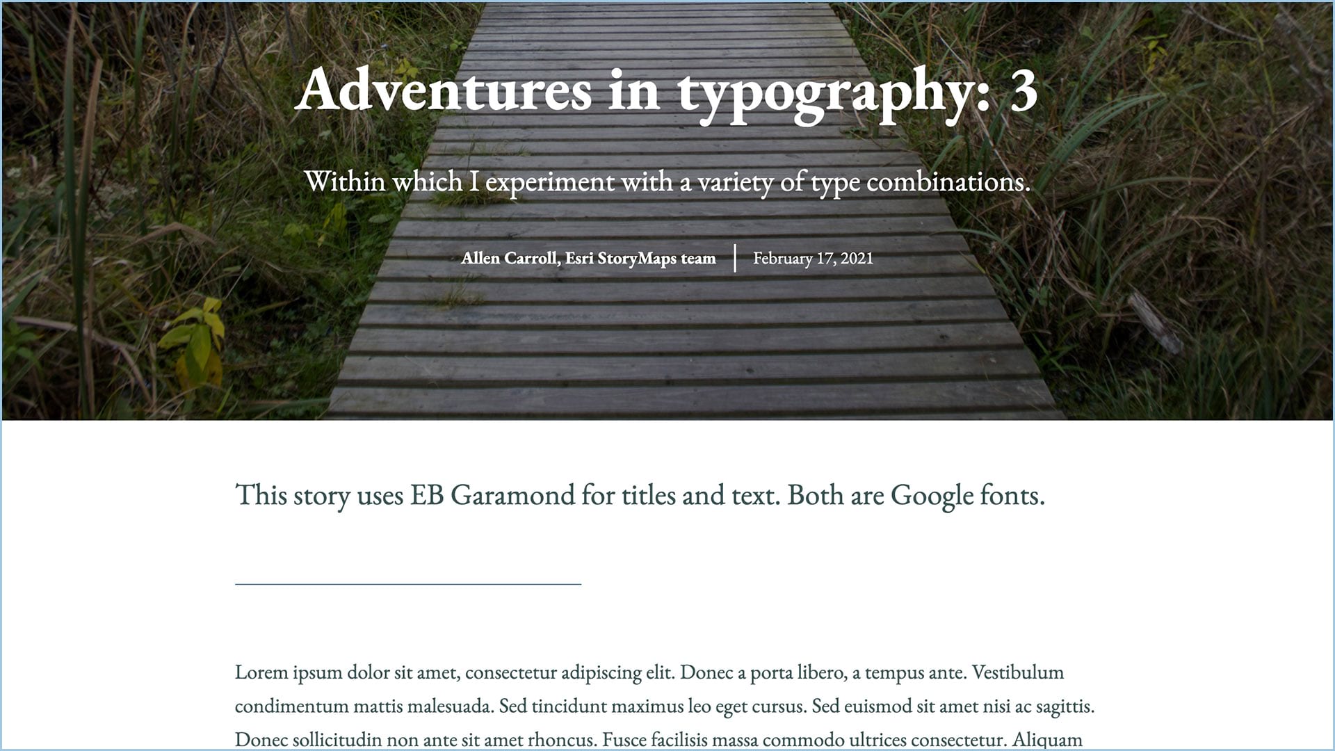
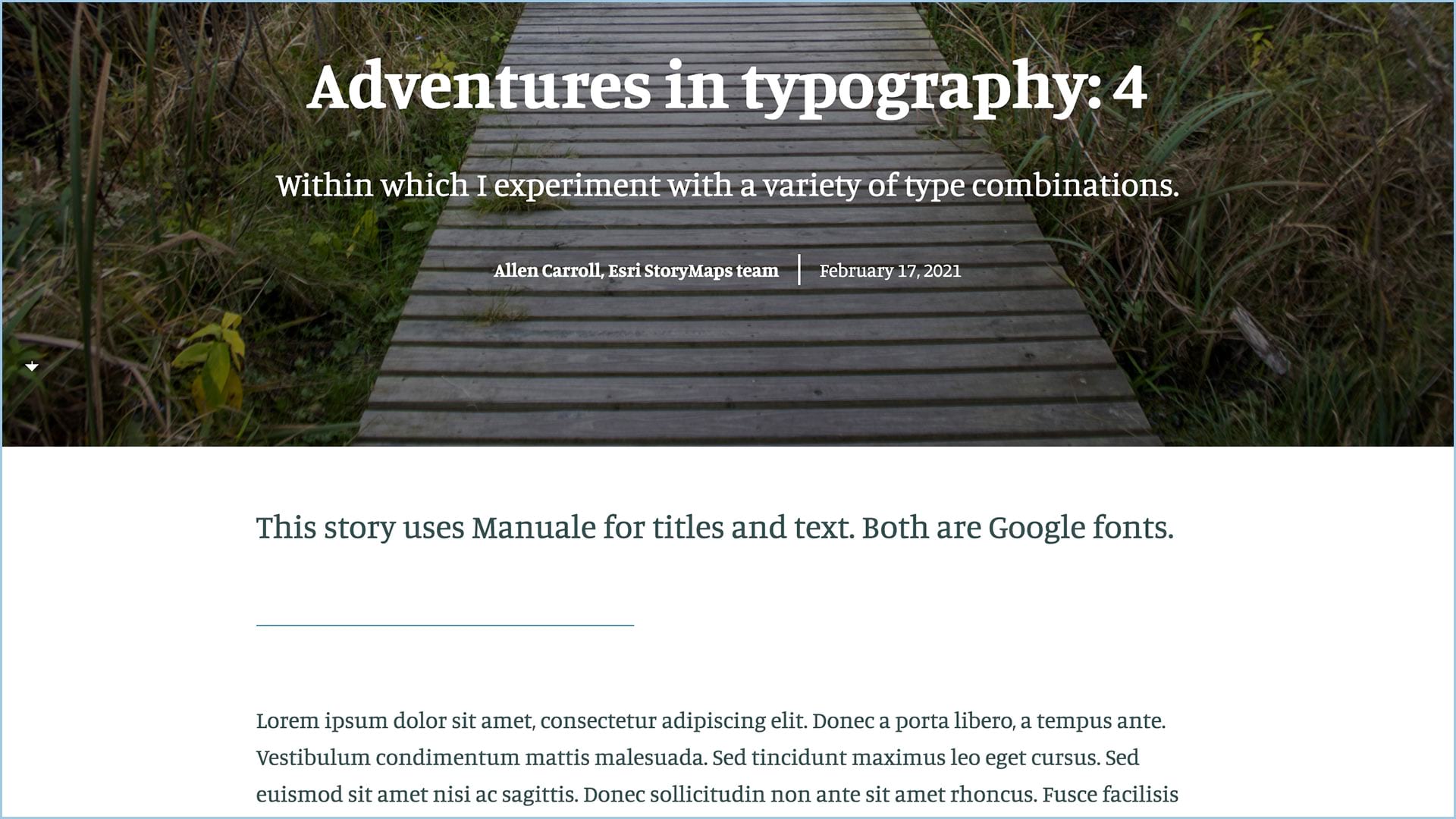
Here are two other versions of the Adventures in Typography story. They both use serif fonts. But note how the paragraph text in the story that uses EB Garamond looks much smaller than its sister, which uses Manuale. The type is the same size in both stories, but the styling of the font makes the text in story number 3 look considerably smaller. Blame those tall ascenders and descenders. I like the classic look of the Garamond, but the Manuale version scores higher in accessibility.
Are serif fonts less readable than sans serif? The conventional wisdom for print media is that serif fonts are easier on the eye, and that those terminal strokes and slabs help our eyes move across lines of text, especially within books and lengthy articles. But reading on screens is a different experience. Those fine serif strokes tend to break up or even disappear on some displays; thus, sans serif fonts may be a better choice for paragraph text. But screens on newer computers, tablets, and mobile devices have higher resolutions, so the serif/sans serif issues are increasingly negligible. What’s more important is how ornate and decorative your fonts choices are.
In other words, whether a font is serif or sans serif is less important than the thousands of little design details that, in aggregate, make a font easier or harder on the eye. I’m quite fond of a Google Font called Open Sans, used in this version:
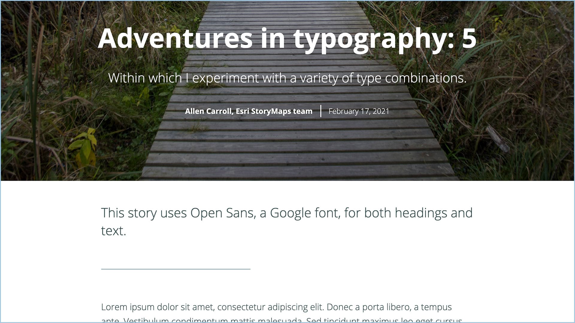
To me it’s elegant and readable, and has a subtle sense of style that’s not fussy and distracting.
Carefully chosen combinations
Is it kosher to mix serif and sans serif fonts within the same story? Answer: Yes. But it’s important to strive for pairings that complement each other. That can either mean that the fonts provide a clear contrast, or that they bear a family resemblance.
Let’s imagine you’re doing a story on, say, 1950s-era drive-in theaters, or Game of Thrones. In those cases, a more flamboyant font might be appropriate for titles and headers. But I’d choose a paragraph font that’s more conventional and readable, rather than making both of them shout for attention—as in Adventures in Typography: 2.
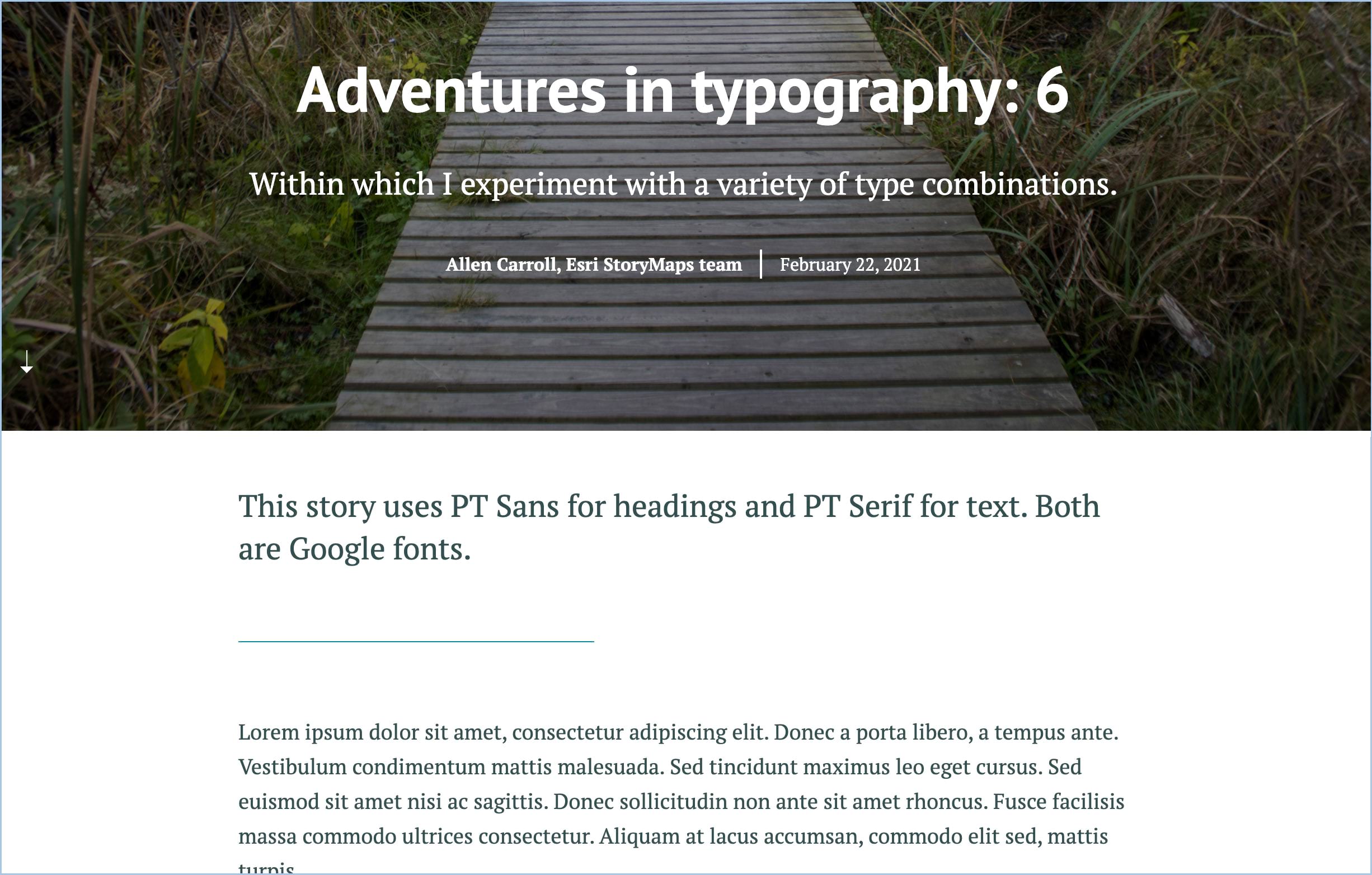
Conversely, you can choose fonts that are designed to be sympatico. A good example from the Google Fonts list is PT Sans and PT Serif (above). They share both a name and a family resemblance—and both are easy on the eyes.
By the way, our “pre-packaged” story themes—Summit, Obsidian, Ridgeline, Mesa, Tidal, and Slate—all contain font pairings for which we carefully considered both aesthetics and accessibility.
Regardless of your motivation, any and all typographic choices should be made with accessibility in mind. We’ve already incorporated some items that help ensure the readability of ArcGIS StoryMaps: We’ve done our best to optimize letter spacing (the gaps between individual characters) and leading (line spacing). But there are things you need to keep in mind as you customize your story themes, including:
- Maintaining high contrast between the color of your type and the background color
- Choosing fonts—especially for your paragraph text—that have a large x-height relative to ascenders and descenders
- Selecting weights that aren’t too heavy (extra-bold) or spindly (light), both of which are often hard to read
- Using fonts whose letter forms are clearly different from one another (example: With some sans serif fonts there’s very little difference among capital “I”, numeral “1”, and lower case “l”)
- Testing your choices within the story before finalizing the decision. If you find your text challenging to read, others will, too. Take a deeper dive into creating accessible web content here.
Want to learn more? This guide from the UX Collective provides lots of valuable detail about type and accessibility. For a fascinating deep dive into the world of typography, check out Thinking with Type, based on Ellen Lupton’s book of the same name.
We’re excited to give you lots of new font choices, and are eager to see what you do with them. Please share your best efforts with us!


Article Discussion: