In case you missed it, ArcGIS StoryMaps has added a new look with briefings, unveiled in August, 2023 before being fully released in February, 2024. In a nutshell, briefings are a type of ArcGIS StoryMaps output that are geared towards shorter-form storytelling such as presentations, or other kinds of simple information sharing. Briefings differ from stories in that they are entirely based on a sequence of slides and are constrained by finite space within a handful of pre-set slide layouts. Like stories, however, briefings support a variety of media and embeds. (If briefings are brand new to you, feel free to stop and watch the introductory video below. Otherwise, go ahead and skip past it to continue reading this post.)
If you’re anything like us, you’ve gotten so used to diving into the story builder that thinking about when and how to incorporate briefings into your content production requires some conscious effort, especially while briefings are relatively new. As an exercise to help ourselves prepare for this brave new world, the StoryMaps team put together four sample briefings in the lead-up to the release of the briefings beta. Each of these samples represents a different broad reason for sharing information via a briefing rather than a story, so we wanted to share some of the thinking behind each example in hopes that it might help you start to think about how best to work briefings into your own processes.
Briefings can be used…
To give a presentation
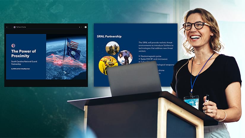
Arguably the most obvious use for briefings is as a presentation tool. While many of you undoubtedly already have your presentation-creating software of choice, the benefit of briefings in ArcGIS StoryMaps is that you can easily integrate geospatial elements and data.
Stories, of course, are still an effective way to present information, especially with their own slide-based blocks such as sidecar. Often, though, when it comes to presentations, time is of the essence. Briefings’ built-in limitations on space and content blocks inspire an efficiency that ensures the intended audience won’t wander off before the critical points are made or pertinent questions asked of the viewer.
The StoryMaps team’s Gustavo Cardenas and Sharon Kitchens worked together to produce a briefing that pitches a theoretical new community garden to hypothetical community leaders in the Bronx. “Briefings enabled this proposal to show community leaders the big picture idea in a concise format,” they explain, while capturing all of the key supporting information in just a handful of slides, thanks to a mix of bullet-point lists, visuals and maps.

Gustavo and Sharon’s briefing is also instructive in that it represents the ease with which anyone can produce briefings. Whether you’re a GIS professional putting together a high-level corporate or military presentation, or just some community members looking to improve their neighborhood, there’s virtually no barrier to entry in terms of technical skill or expertise. Gustavo especially appreciated the ability to incorporate express maps: quick, simple cartography that is built on the fly and can provide useful supporting context or details without requiring any GIS experience.
As a primer on a complex topic
Everyone is passionate and knowledgeable about something, and when given the excuse to talk about that subject, it’s natural to want to fill pages and pages. Take the story The lines that shape our cities, for instance, a collaboration between the StoryMaps team and the University of Richmond. Speaking personally, it’s one of my favorite stories ever. An engaging blend of well-written narrative, innovative graphic and cartographic approaches, and relatable specific examples provides the reader with a deep understanding of the discriminatory planning and real estate practice of redlining.
It’s also a lot to take in. Perhaps not everyone has the time or energy that is required to absorb everything that story has to offer, but that shouldn’t preclude anyone from at least being able to get the basics down. Briefings provide a ready-made format for distilling a complex topic into a quickly digestible primer. In her sample briefing, Ashley Du took the topic of redlining and made sure the reader can pick up the essentials in just ten slides.

Du’s briefing covers what redlining is, provides a specific example of how it continues to have adverse effects today, discusses how communities are working to push back against those effects, and ends with a call to action. Anyone who really wants to dig into the topic is welcome to check out the original full-length story, but a briefing can be a great way to at least get people in the door, first.
There’s also something about briefings, Du points out, that feels “much more personal” to the intended audience, especially in environments where the author will have the opportunity to directly present their briefing. In getting straight to the point, briefings can “enable real-time dialogue and foster [audience] engagement” in ways that is harder for a longer story to do.
As a means to relate the outcomes of research or data analysis
Trying to explain what’s happening in a set of data, especially to a lay audience, can be a challenge even in the best of times. The ArcGIS Living Atlas of the World’s layer comparing land cover between 1992 and 2020 is pretty to look at and fun to play around with, but it takes a little bit of deeper knowledge to be able to figure out where to start investigating that data and then form any conclusions about it. Warren Davison, an experienced data visualization specialist, took his observations of that data and boiled them down to bite-sized chunks in a briefing.
His briefing succinctly lays out one angle to exploring the land cover data—change in urban extents over the past three decades—serving as a gateway into an otherwise potentially overwhelming data set. Specific examples from across the United States are put front and center through maps and the swipe block. According to Warren, the briefing format “lets the maps and visuals shine while ensuring the audience has the most critical information about the case study cities and the data layers behind the analysis.”

As a way to depict a plan, schedule, or program
Finally, our team’s fourth sample briefing demonstrates how briefings lend themselves to information that might need to be organized temporally, like a schedule or itinerary. Some obvious applications could be things like walking through a military or government operation, or laying out the programming for a conference. Andria Olson, though, used her background in academia to bring the briefings concept to higher education, creating a theoretical course syllabus in briefing form.
Andria’s imaginary geography course, about food and culture around the world, could very well be real: The slides break the semester down into thematic sections, letting the hypothetical students know what to expect as they traverse the path of learning. The ability to tease out concepts using live, interactive maps “stimulates spatial thinking right off the bat,” says Andria.
“I wanted to reimagine a course overview that would have better introduced me to the topic and got the wheels turning more effectively on the first day of class,” she adds.

The food and culture course syllabus also serves as a reminder that there can be room for fun in briefings, too! While some topics are naturally more serious than others, college students might respond better to something that isn’t so staid or stoic. With that in mind, Andria applied a jazzy color scheme using the ArcGIS StoryMaps theme builder and used stylized, circular photographs to create a more enticing experience for her “students,” which in turn signals that “creativity would be encouraged and embraced throughout the course.”
Briefings are just getting started
The four examples outlined here cover a substantial range of potential uses for briefings, but we know our remarkable community will come up with many, many more. At the same time, we’ll be looking to regularly update and improve the briefings building and viewing experience to best suit your needs.
So, please do use the ArcGIS StoryMaps space in the Esri community to let us know how you are using or intend to use briefings, and if there are any features or capabilities that would enhance those uses for you. You can also use the feedback form in the help menu that can be found in the ArcGIS StoryMaps app header (just be sure to select Direct product feedback from the initial question and then Briefings from the “Product area” drop-down menu below). We’re so excited to see what you come up with!
________________________
Cover photo by Anton Gvozdikov via Adobe Stock, © 2023 (all rights reserved).

Article Discussion: