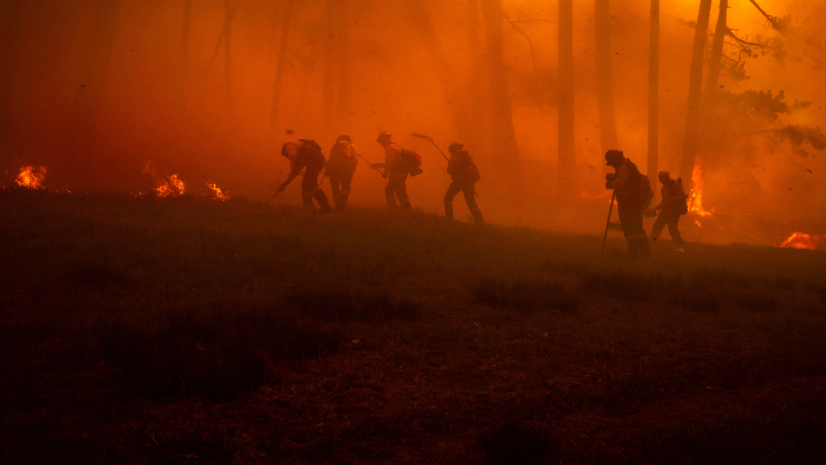
In our first post of this series, we explored the apps and dashboards that answer the question, “What’s burning and where?” Those tools wouldn’t exist without the data feeds behind them. In this installment, we’re going to pull back the curtain on those feeds, sharing some data sources like the Integrated Reporting of Wildfire Information (IRWIN) data and other national datasets that power your favorite wildfire apps.
IRWIN and USA Current Wildfires Layer
Maybe you’re more of a DIY mapmaker and need to integrate fire information into your own application or enrich it with your own data. Enter the USA Current Wildfires layer—a wildfire location and perimeter feed that you can drop into any map or dashboard. This data is likely what you’ve seen as part of any traditional-media maps or other mapping information and applications. That’s because it’s the most authoritative data we have and it’s updated by agencies and firefighters managing the incidents. The points in this layer come straight from IRWIN while the fire perimeters are sourced by the National Interagency Fire Center (NIFC). In plain language, this means the layer is pulling information from the same data that the interagency fire community uses to track incidents, so you’re getting official info without any manual effort on your part.
Great—how does it work? Functionally, as firefighters update the data for a specific fire, those updates are recorded and shared via IRWIN—and no, this IRWIN isn’t like your uncle’s friend sharing outdated fire information on Facebook. IRWIN was designed as an end-to-end wildland reporting capability. If you used the Wildfire Aware or Watch Duty apps mentioned in our last post, you’ve already been consuming this data—those apps update automatically whenever IRWIN records a new fire or perimeter.
IRWIN has been in operation since 2014 and represents a major leap in wildland firefighting technology and data sharing. In this author’s humble opinion, IRWIN has contributed to the United States being at the forefront for data sharing, maturity, and management and fire reporting across the globe. Anytime I hear people talk about how wildland firefighters don’t innovate, leverage technology, or lag behind the times, I just reply, “IRWIN.” To be fair, we can always do better and there are many, many areas for improvement (location sharing, anyone?). So, those who criticize have a valid point, but: IRWIN.
OK, rant over—you can read more about IRWIN. Anyhow, ArcGIS Living Atlas of the World makes this data available and is updated every 15 minutes with the latest fire data as agencies post their updates. Check out the data.
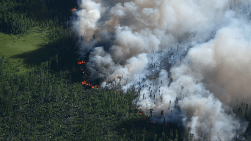
What can you do with the USA Current Wildfires layer? A lot, it turns out. Geographic information system (GIS) analysts can use it to quickly stand up a custom map of fires affecting their jurisdiction. For example, if you’re in a state or county GIS department, you can mash up this layer with your local data, such as critical infrastructure, evacuation routes, or shelter locations, to get a common operating picture. It’s also a building block for dashboards: Many fire agencies and emergency operations centers embed this layer in ArcGIS Dashboards to monitor fires alongside weather warnings, evacuation orders, and resource statuses. If you’re feeling fancy, you can even combine it with satellite hot spot layers (like the Visible Infrared Imaging Radiometer Suite [VIIRS] thermal hot spots) to see heat detections beyond just the mapped perimeters—useful for understanding the hottest spots within ongoing wildfires.
In terms of audience, the USA Current Wildfires layer is a gem for technical folks: GIS specialists, developers, and anyone who needs to incorporate live fire data into their own products. It’s also handy for analysts in fire agencies who might be using ArcGIS Pro or ArcGIS Online to do analysis or create briefing maps. By using the live layer, you ensure that your analysis is based on the latest available data (no more looking for the newest perimeter shapefile).
Wildfire Hazard Potential Maps
Believe it or not, most activities surrounding wildfire season shouldn’t be reactive. A big part of preparation is understanding hazards and planning, ideally long before there is smoke in the air. This is where fire hazard potential layers can be useful. ArcGIS Living Atlas (noticing a theme yet?) offers access to authoritative datasets like the wildfire hazard potential (WHP) map from the US Forest Service. In a nutshell, the WHP map is an index that shows where wildfires are most likely to occur. It’s based on factors like fuel models, historical fire frequency, terrain, and climate. Think of it as a heat map (no pun intended) of where the landscape has the ingredients for wildfire. The data can be coarse, but it’s a good measure of hazard potential at landscape scale.
With hazard potential layers and a mix of your local data, you can start to prioritize your preseason efforts. Fire mitigation specialists and planners use these maps as a building block to identify communities at greatest risk. For instance, if you see a town bordered by a “Very High” wildfire hazard on the map, that’s a flashing red sign to focus fire fuel-reduction projects and community outreach there.
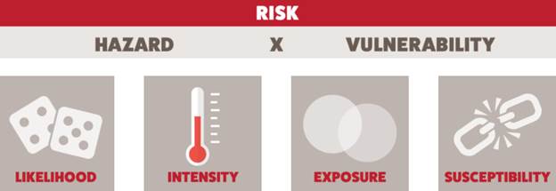
It is important to note that the WHP map by itself isn’t a full picture of risk, as defining risk is subjective. However, when you pair it with data about homes, infrastructure, or other values, you can gain a relative sense of wildfire risk to those assets. In other words, combine the hazard map with information about the things we care about protecting, then you can start to understand true problem areas for wildfire risk. To help, here’s a graphic from wildfirerisk.org to describe how to think about risk—just click on the graphic to read more about the different elements of wildfire risk.
For emergency managers and GIS analysts, these hazard layers are great for targeted planning, scenarios, and exercises. These maps are also useful for communication. Showing local officials or the public a hazard map can be an eye-opener: “So that entire area west of town is rated high hazard? Maybe we should do something about those overgrown open spaces.”
Many people only think about wildfires when there’s one burning, but hazard maps quietly remind us of where the dangers are lurking year-round. On the tech side, ArcGIS Living Atlas makes these layers easily accessible, sometimes even enriched with demographics or other data. We hope that by making these layers easily discoverable and usable, you’ll be able to leverage WHP data to help inform grant applications, mitigation plans, and policy decisions by providing a foundational building block to help quantify risk.
- Average Wildfire Hazard Potential in the US
- USA Wildfire Hazard Potential with Demographics
- WHP—Wildfire Risk to Communities
NASA’s Fire Information for Resource Management System
Now, a quick word on availability: the VIIRS/Moderate-Resolution Imaging Spectroradiometer (MODIS) hot spot data we rely on is also openly accessible via NASA’s Fire Information for Resource Management System (FIRMS). In fact, the Living Atlas layer is leveraging FIRMS. FIRMS is a free web mapping service provided by NASA that displays active fire detections globally. FIRMS deserves a nod here as it’s basically the backbone feeding these hot spot layers. Many wildfire folks keep the FIRMS website bookmarked as well—it provides an interactive fire map where you can toggle between VIIRS and MODIS and even set up email alerts for new fires in your area of interest. If you’re tracking fires outside of US (or just want to double-check what you see in ArcGIS), FIRMS is clutch. You can watch wildfires in the Amazon region, Siberia, or Australia the same way we do in California or Colorado. So, while we use ArcGIS Living Atlas for convenience, remember the companion source is FIRMS, working behind the scenes to keep us updated on the world’s fire activity.
To sum up: VIIRS and MODIS hot spot data (via FIRMS and ArcGIS Living Atlas) is great for wildfire situational awareness. This data does have limitations, chiefly timing and resolution; but when used wisely alongside other intel, it ensures that you’re not fighting fire blindly. We’ll talk more about these datasets in the final blog article in our series.
Check out FIRMS.
Final Thoughts
By now, you’ve seen that good maps and dashboards live and die by the quality of their data. In our next post, we’ll show you how the interagency fire community shares and manages geospatial data and how you might get access yourself. Hint: You don’t need to be a federal firefighter to get access.isely alongside other intel, they ensure you’re not fighting fire blindly. We’ll talk more about these datasets in the last blog in our series.
Learn More
To learn more about GIS solutions for wildland fire, visit our solutions page or download our ebook.