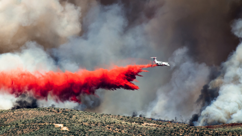
Every year, fire season seems to arrive faster, hit harder, and stretch longer. Whether you’re on the line, behind a screen, or just living in a fire-prone area, staying ahead of wildfire activity isn’t optional. But with dozens of apps, dashboards, and feeds out there, it’s hard to know which ones to trust, let alone how to use them. That’s why this first post tackles the most critical question during fire season: What’s burning and where?
Grab your coffee, bookmark this post, and let’s try to level up our situational awareness.
Fire Information Tools and Applications
Incident Management Summary Report
Topping this resource list is the Incident Management Summary Report (IMSR), formerly known as the National Situation Report. The IMSR is the authoritative daily update for fires across the nation. It’s what firefighters across the country use to be briefed on new initial attack activity, the national situation regarding large fires, and understanding how many resources are assigned to each fire throughout every Geographic Area. This is something I have bookmarked, and I glance over it once a day as we enter PL 2 and above.
Yes, it’s a PDF, yes, it’s old school, and it will takes some practice to understand how to read the IMSR, but don’t fret! The National Interagency Fire Center (NIFC) provides a ‘how-to’ document to help. The link to the help documentation is below.
Wildfire Aware: Authoritative Wildfire Intel

Fire information applications are always at the top of our minds as we look to reliably and consistently inform the public of ongoing incidents. One free tool in your wildfire data toolkit is the Wildfire Aware app. If you haven’t tried it yet, Wildfire Aware is essentially a one-stop shop for authoritative data on current fires across the United States. It brings together 22 open data layers from the ArcGIS Living Atlas and other sources to paint a picture of what’s burning and what’s at stake.
The app opens with a list of active fires sorted by the number of personnel assigned to each fire. By default, we sorted by personnel, as I think this is a clever way to use the reported data to create a “quasi-priority list” of incidents nationwide. The more resources assigned to a fire, the more emphasis that state and national agencies are placing on it. Thus, one can assume that these are the fires you’re looking for information about! Interestingly, this approach has allowed us to closely match the IMSR priorities over the past couple of years, and you may wish to do likewise in your own applications if you use some of the feature services below.
Anyhow, on selection of an incident, you’ll get details on a specific fire, such as its status, size, perimeter, and the potential impacts on nearby people and the environment. It doesn’t just show you where the fire is; it gives context about who and what is in harm’s way.
Wildfire Aware is great for authoritative updates and situational awareness. Response agencies, EOCs, and those looking for the last authoritative update appreciate it because it aggregates authoritative data from agencies like the USGS, NOAA, USDA, etc.) into one interactive map. The data is updated as often as the agencies managing the fire update the official fire record. Once a fire record update is made, that change makes its way through the national data pipeline and data exchange, IRWIN (more on that later), which means you’re not looking at yesterday’s information if an agency is updating their records. As a wildland firefighter, I can’t overstate how nice it is to not be working off a day-old map as you brief the public or elected officials; been there, done that, watched the fire jump two ridges since.
Instead of juggling a dozen websites or waiting for the next briefing, you can refresh Wildfire Aware, or any app reading the same data, and get a snapshot of nationwide fire activity. Analysts and GIS staff can use it to inform leadership about emerging incidents. It’s also a great tool for public information officers or even the public themselves—anyone who wants a reliable, broad view of what’s going on. After all, the app’s design is aimed at general community awareness as much as it is at firefighting professionals.
Inciweb
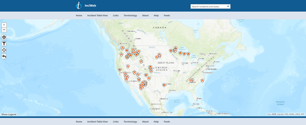
For those looking for additional authoritative sources of information, Inciweb should also be on your list. Inciweb is a great spot to get a more narrative driven writeup of incidents directly from the agencies managing them. Often pictures of work being done on the incident are also available. Do note that, because of a multitude of reasons, Inciweb updates may lag or the fire you’re searching for may not be on the Inciweb list.
One limitation of the authoritative data used by Wildfire Aware or found on InciWeb—data provided by agencies with authority over the incident—is that it is tailored to a specific audience and purpose. Because we are using services that are open, available, and can be taken from a source like Living Atlas, you won’t find data detailing areas under current evacuation or the visualization of live aircraft locations. For that, you’ll need to leverage a tool like Watch Duty.
Watch Duty
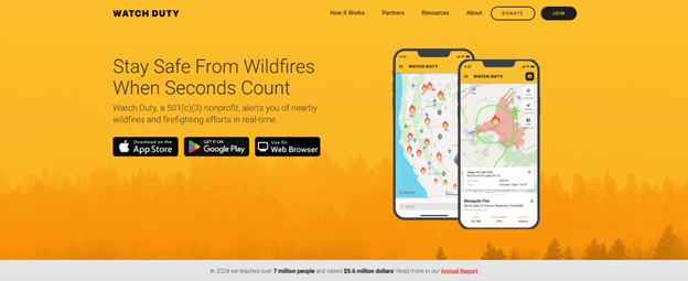
Over the past few years, Watch Duty has emerged as a public favorite for wildfire tracking thanks to its ability to pair authoritative data with near-real-time updates for individual incidents. Think of it as a more frequently updated version of Wildfire Aware or InciWeb, combined with an incident “X” feed. It provides timely fire information, push notifications, and ongoing updates by monitoring and contextualizing firefighter and agency radio traffic
Because many of you are likely reading this on your phone, download the app and check it out for yourself! It’ll likely quickly become your go-to!
Or use their service via Web Browser
CAL FIRE 3D Map
I’ll try to avoid locally specific resources; however, I wanted to call out CAL FIRE’s 3D Incident Map. The 3D map is a great way to see ongoing incidents in 3D. Like Watch Duty, you’ll be able to see evacuation order geometry, live aircraft locations and more
Community WUI Awareness Tools from USFA
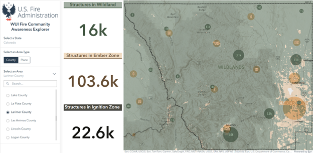
Wildfire response doesn’t start with a lightning strike or an abandoned campfire; it results from fire department and community planning and preparation efforts. That’s where the U.S. Fire Administration (USFA) comes in, providing tools to help assess wildland urban-interface (WUI) locations nationwide. In late 2024, USFA rolled out a set of WUI Explorer tools that have quickly become resources for community risk reduction personnel and fire departments alike. These tools leverage GIS to visualize and quantify the homes in the WUI in a way that’s easy to use for firefighters, emergency managers, and the public.
The two applications USFA launched are:
WUI Fire Property Awareness Explorer: This application allows users to search addresses or communities to gain a contextual understanding of their area relative to the WUI and vegetative fuels. The application also includes an assessment of a location’s structure density and proximity, both important factors to consider for creating fire-adapted communities in the WUI and for developing mitigation plans and outreach campaigns. It’s useful for individual homeowners to get a quick snapshot of their exposure, and equally useful for fire prevention officers crafting their defensible space outreach; you can show a homeowner a dashboard of their property’s exposure profile.
WUI Fire Community Awareness Explorer: This dashboard provides a quick snapshot of counties or places in the U.S. and maps exposure to wildfire hazards for structures in the WUI. Users interested in building fire-adapted communities and resilience can quickly identify vulnerable structures or areas in the WUI to help inform community risk reduction planning and targeted outreach efforts.
This one is fantastic for planning and grants. You can select a county or community and see aggregated info like “How many structures are in the WUI here? What proportion of the community is exposed to high wildfire hazard?” It basically identifies areas of exposure so city planners, land management agencies, and fire departments can prioritize where to focus mitigation efforts. For example, it might reveal that the northern half of County X has 80% of the homes in the WUI and a history of high fire exposure—time to target fuels reduction or Firewise programs there. It supports community risk reduction planning by highlighting the WUI extent and the exposure of structures in those zones.
It’s also great for communicating with elected officials. A mayor looking at this dashboard can immediately grasp the scale of their city’s wildland fire problem.
By making these tools public, USFA is nudging communities to self-educate and act. Awareness is the first step, as they say. The USFA explicitly notes that these tools are about raising awareness, not giving a precise risk score. They include disclaimers that this is not an official “risk assessment,” but a way to visualize factors contributing to wildfire risk. That’s smart if you’ve been paying attention to the public reaction to risk maps. As of now, no one tool can tell you if your house will burn or not, but we can certainly show you if you’re in a danger zone, enabling you to seek an assessment and take actions to mitigate your risk.
In the spirit of awareness, these new tools say, “Dear America, one-third of you live in the WUI and most of you have no clue what that means.” It’s a conversational way to spur a serious discussion. Many people don’t know the threat they face until you show them a map with their house on it. By visualizing it, these tools help drive home this point and spur communities to better prepare, discuss building codes, prioritize fuel mitigation, and plan evacuations.
The USFA Wildfire Outreach page is located here.
The WUI Fire Property Awareness Explorer Application is found here.
The WUI Fire Community Awareness Explorer can be accessed here.
A blog on how the tools that were put together is located here.
Wildfire Risk to Communities: A National Lens on Local Wildfire Risk
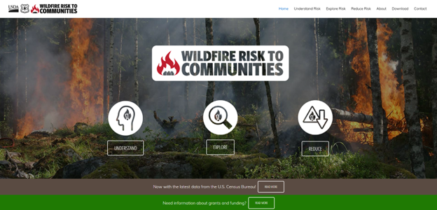
If you’re looking for a national-scale tool that helps communities understand, visualize, and communicate their wildfire risk, Wildfire Risk to Communities should absolutely be on your radar. This website, developed by the U.S. Forest Service in collaboration with numerous partners, is designed to support local fire departments, planners, and community leaders in making data-informed decisions about wildfire risk and mitigation.
What makes it especially useful is its ability to drill down from national-level data to the community scale. You can explore wildfire risk metrics for any U.S. community, including exposure levels, potential loss, and vulnerable populations, all backed by data.
There are three standout features:
Community Risk Profiles: These are pre-packaged summaries for thousands of cities and counties across the U.S. They show the relative wildfire risk, potential exposure of homes, and the distribution of vulnerable populations. You can download these as ready-to-go PDFs, which is super helpful when briefing leadership or applying for grants.
Interactive Mapping: The mapping tool allows users to visually explore where wildfire is likely to occur, how it might behave, and what assets are at risk including homes, infrastructure, and populations. It’s intuitive enough for the public but detailed enough for planners and mitigation specialists.
Mitigation Resources: The site links directly to strategies, success stories, and planning guides tailored to community risk profiles. It’s not just about identifying risk—it’s about acting on it.
This isn’t a flashy app, but it’s a trusted and underutilized resource of community-scale wildfire intelligence. If you’re in charge of anything remotely tied to community wildfire protection planning, grant writing, or public outreach, bookmark it!
Use the Apps!
All the apps or websites in the world won’t help if we don’t use them and teach people to they exist. So, carve out a few hours this week. Load the apps and websites. Understand how to read the reports and understand why they matter. When things get chaotic, you’ll be glad you did. And if someone else in your agency, community, or mutual aid network could benefit from these tools? Pass it on. We’re all in this together.
In the next blog we’ll get into several of the data sources that power these apps so that you can map your own maps, apps, and dashboards!
Learn More
To learn more about GIS solutions for wildland fire, visit our solutions page or download our ebook.