March 17, 2020 |
Multiple Authors | GIS for Good
March 26, 2020
With much of the world focused on halting the spread of the novel coronavirus disease 2019 (COVID-19), real-time maps are delivering a new global awareness.
As with epidemics of the past, authorities and responders look to maps for updated details about confirmed cases, highest risk populations, and available or needed health-care resources.
Disease surveillance is now a map-centric activity, with geographic information system (GIS) technology being used to collect, analyze, and share key data. Over the past 20 years, leading health organizations—including the World Health Organization (WHO) and the Centers for Disease Control and Prevention (CDC)—have consistently relied on mapping and spatial analysis to manage disease outbreaks.
In 2000, for example, the CDC created the web mapping application ArboNET in response to West Nile virus. This tool funnels data from local and regional sources for a national view of human cases and the animal or insect vectors that spread the disease. Since then, maps have proven critical to keeping on top of constantly mutating zoonotic diseases, which make the leap from animals to humans.
Disease tracking systems have continued to evolve alongside web capabilities, online platforms, and mobile applications. Advances in location technologies, including GIS, have helped facilitate and improve response.
Tracking SARS
During the severe acute respiratory (SARS) outbreak in China in 2002 and 2003, local GIS experts helped health departments track the disease. SARS, a contagious and sometimes fatal respiratory illness also caused by a coronavirus, rapidly became a global threat.
In response, the WHO published daily updates to disease maps on a SARS website. Although the maps were not interactive, they were up-to-date, built on the latest data reported by the local authorities.
In Hong Kong, a SARS map team took it to the next level because the area was initially the hardest hit. Every morning, the SARS map team used department of health updates to geocode case information against Hong Kong street and building databases. This turned what had been tables of building names and statistics into data that could be intuitively presented, analyzed, and understood as a local map.
The map presented information on suspected, actual, and recovered SARS cases. Residents and visitors to Hong Kong could easily check the website to see which buildings in their neighborhoods had, or were suspected of having, residents infected by the disease and which had been cleared. This helped alleviate the fear and concern due to a lack of information that had so disrupted lives during the early days of the outbreak.
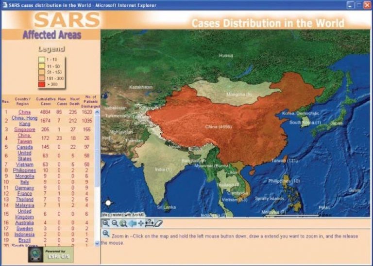
During the SARS response, WHO teams relied on GIS to analyze spatial trends and interrelationships that would otherwise be difficult to discover. The system has become ingrained in the WHO’s daily workflows to provide information for health research and practice.
Understanding Ebola
During the 2013 to 2016 Ebola crisis, health and government agencies used GIS to understand the virus, determine its causes and origin, and trace how it travels. Spread through contact with bodily fluids such as blood, Ebola causes severe bleeding and organ failure, and is often fatal. To help fight the outbreak, which marked the first time the disease spread across multiple international boundaries, the WHO published live maps of confirmed cases in Sub-Saharan Africa.
Officials could, for example, use a map to study one affected person and figure out where they had traveled to determine where others may have been exposed. Agencies also used mapping technology to site emergency Ebola treatment centers, manage bed capacity, and figure out how a sick person could efficiently access care.
This deadly outbreak was declared an international public health emergency, which precipitated a more coordinated response that included improved field data collection using apps on mobile phones.
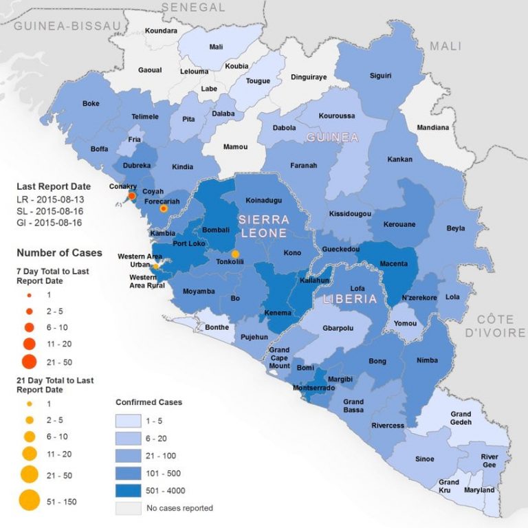
Health agencies used GIS to communicate and coordinate with local religious centers for safe and dignified burials and to keep track of the location of teams who were educating people about the burials. A map-based view helped authorities consider the impact of large events and the potential benefits of social distancing measures. Now, story maps help explain the disease origins and life-span, documenting efforts that stopped the spread.
Predicting Zika
In 2015, cases of the Zika virus broke out in Brazil, and instances quickly grew to epidemic levels in many countries. Zika, a mosquito-borne virus, was most concerning for pregnant women because if infected, the virus could cause severe brain damage in fetuses due to microcephaly.
In response, the National Aeronautics and Space Administration (NASA) used GIS to forecast risk by modeling the conditions that create suitable habitats for the virus-carrying mosquito, such as temperature, water, tree cover density, elevation, precipitation, and seasonal change. This helped public health departments be intentional about mosquito vector management based on an enhanced global projection of where Aedis mosquitos thrive to act decisively to halt the spread of the virus.
The WHO and CDC used GIS to analyze data about mosquito habitat and demographics to predict likely locations of Zika and thus reveal populations vulnerable to infection. These predictive maps helped public health departments target outreach and stage resources.
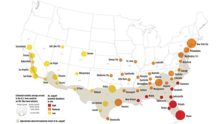
In New York City, the Department of Health and Mental Hygiene (DOHMH) used GIS to predict which areas were most at risk of transmission and to target its outreach to canvass the neighborhoods and clinics where pregnant women were likely to seek services.
GIS for Disease Prevention and Response
Most ministries of health around the world, and all 50 US state health departments are using GIS maps to analyze health trends and relationships that would otherwise be difficult to discover. These efforts build on and integrate with work being done by the CDC and WHO.
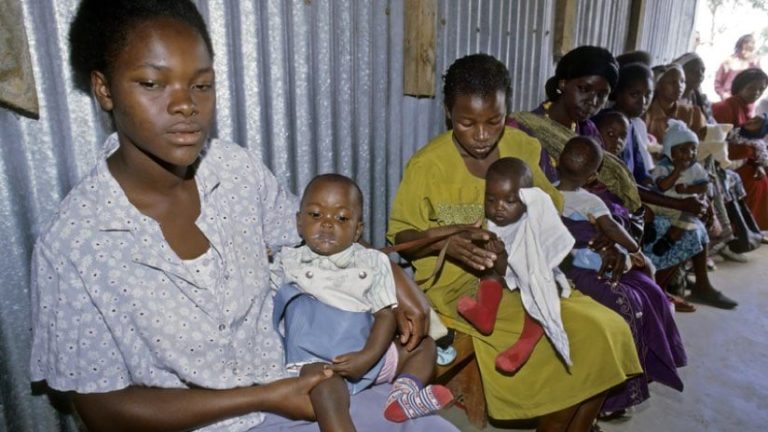
For decades, public health agencies have also used GIS to manage immunization campaigns. They create maps to assess vaccination needs, plan interventions, and evaluate results. Health services staff can query the system about vaccination rates in a given area or consider other important questions, such as where to concentrate future efforts, where pockets of need are, and where vaccines are available. They can see if their vaccination delivery networks are sufficient. These kinds of queries are frequently reported by using a set of key metrics called performance indicators, which when mapped provide program managers the means to monitor unmet needs and see the progress of vaccination programs.
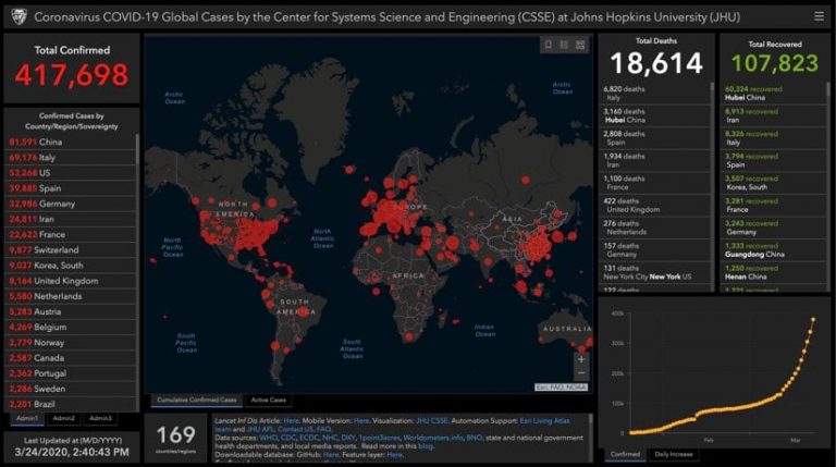
The sophistication of health maps to track disease has progressed a great deal from the simple online static maps of the past. The WHO Novel Coronavirus (COVID-19) Situation dashboard provides a proof point, as this interactive map-based tool provides visualizations of cases by date and frequency, maps the number of cases at both a country and regional scale, and shows statistics of confirmed cases and deaths.
COVID-19 continues to test our collective ability to respond around the globe. Visualizing the spread on a map quickly surfaced the need for social distancing. Perhaps the greatest contribution GIS offers to this effort is to put pandemic information, once restricted to researchers and public health professionals, into the hands of local responders who now have the tools to make sense of this data. It has enabled more local agencies to locate disease, inform the public, and target services.
See the COVID-19 GIS Hub for location intelligence resources. The Coronavirus Response solutions page provides a collection of maps and apps that can be used by public health agencies to understand the impact and share information about the pandemic with their communities. Local authorities and organizations that need help in crafting their responses can reach out to Esri’s Disaster Response Program for assistance.