
September 9, 2025 |
Ryan Lanclos | Public Safety
When Monica Youngman and her family emerged from their home after all the wind and rain, there was one sentence she heard that she still can’t shake: We didn’t know this was coming.
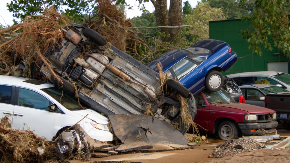
The chief scientist and AI lead at NOAA’s National Weather Service knew that wasn’t true. Yet that’s what everyone was saying as they worked together to clear downed trees and debris. Yes, it was hard to fathom the destruction. They were cut off, with crushed cars, holes in roofs, no phone signal, no electricity, and no water.
However, the National Weather Service had tracked Hurricane Helene for days. Forecasters issued a rare press release a full day before landfall, warning of catastrophic inland flooding and asking the news media to put that risk in front of the public. The models of flooding intensity held. The storm track was accurate.
“It broke my heart,” Youngman said. “Later I realized what they were saying was I didn’t know how this would affect me, my family, and my community. Before the storm they couldn’t imagine or believe the level of the destruction and disruption—no power, cell service, or internet for weeks and no water for 54 days.”
A forecast had reached them, but the consequence hadn’t.
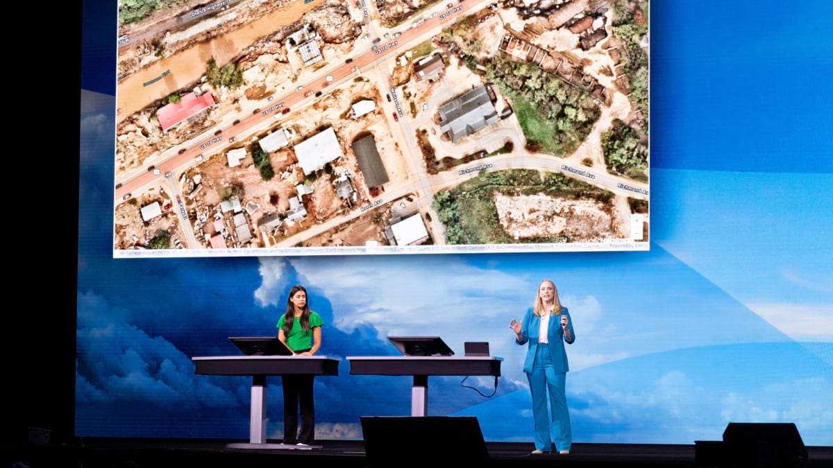
Youngman found her answer five months later, at Esri’s Federal GIS conference when she watched MITRE present Project Homeland, a tool built with ArcGIS Knowledge to trace dependencies inside the nation’s critical infrastructure. Before the talk ended, she saw how the unique combination of graph databases that trace linkages and GIS with its location intelligence can describe the dependencies of critical infrastructure and the chain reactions when something fails.
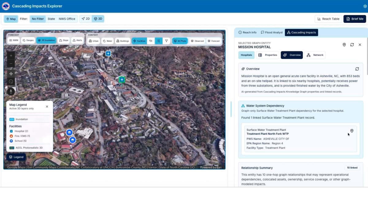
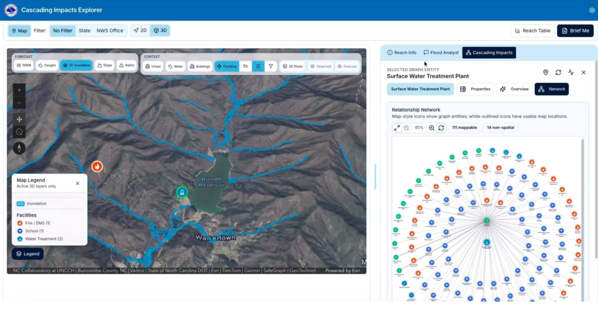
A map shows infrastructure locations, and the graph shows dependencies. Put every infrastructure site directly on a map and the result is unreadable—a knot of lines with no way to trace a single thread. Put the dependencies in a graph instead, and a forecaster can follow one all the way down: a flooded road, to a damaged water treatment plant, to a hospital that loses water, to every service that hospital supports. Then tie that thread back to the map, and the abstract connection becomes a vulnerability a forecaster can point to.
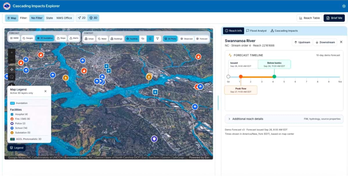
That pairing of the map and the graph is the engine behind the Cascading Impacts Explorer, built by MITRE, Esri, and NOAA to answer not just where the water will rise, but who loses what when it does.

Project Homeland was built for energy-grid resilience and homeland defense. MITRE’s Ryan Hollins, chief engineer of complex systems, describes the shift to the consequence of flooding as a redirection rather than a rebuild. “This gave it a different direction than we were originally intending,” Hollins says, “one where it’s less homeland defense and more focused on the public sector, saving lives and property from extreme weather.”
The combination surfaces risk nobody thought to look for. It provides a way to show what’s at stake today as things stand given the storm conditions. It’s also a lens on what to harden so the worst impacts are never felt.
Some dependencies are obvious when you use this new tool—a hospital’s flood exposure, a road’s washout risk. “Some things you unfortunately may never discover until something happens,” Hollins said. “We’re working to avoid that.”
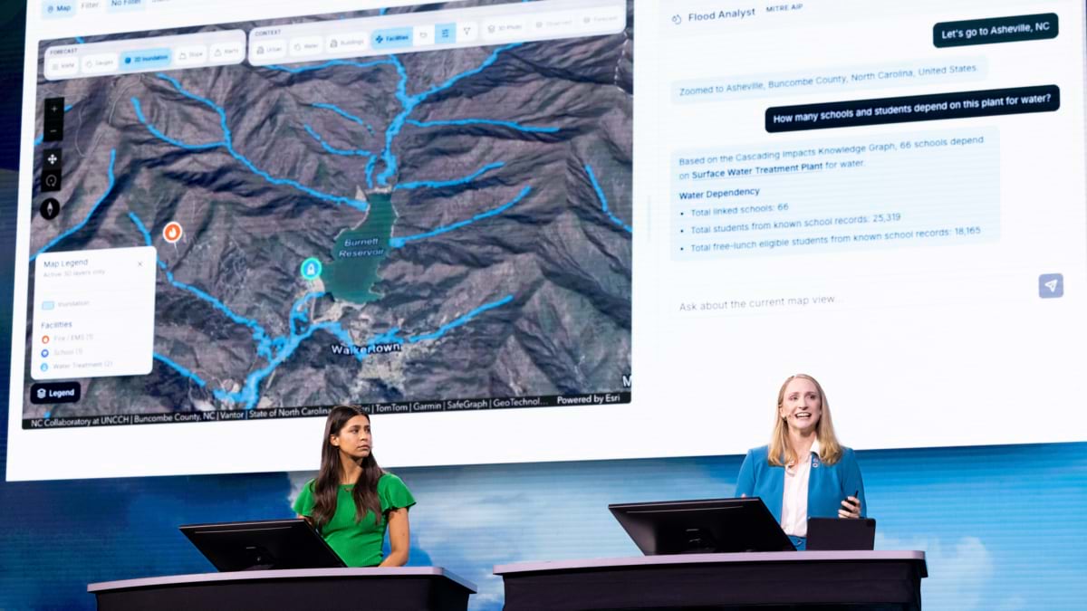
Set the Cascading Impacts Explorer to September 26, 2024, the day before Helene made landfall, and the tool shows what invisible risks look like. A hospital near Asheville sits outside the flood zone. Trace its dependencies, though, and it relies on the North Fork Water Treatment Plant, which is exposed to flood debris rather than floodwater. Ask the tool how many schools and students depend on that plant, and the graph returns an answer in seconds: 66 schools, more than 25,000 students, over 18,000 of them eligible for free lunch who depend on their school for sustenance.
During Helene, the plant failed and schools closed for a month.
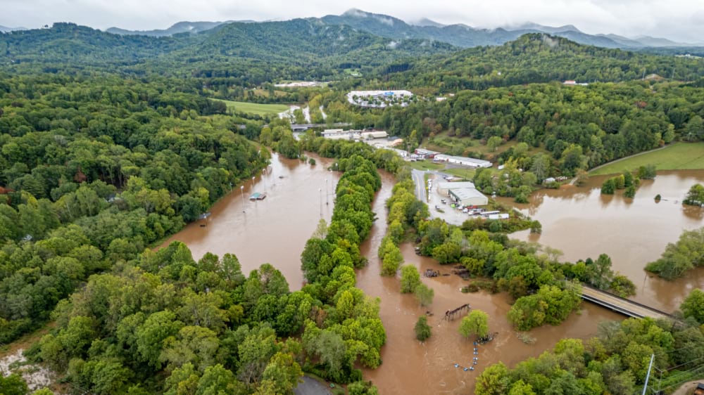
The tool didn’t exist yet to warn anyone, but the impacts of Helene have been used to test it. If a forecaster or an emergency manager could have asked it questions, more resources may have been applied to failure points and some of the worst consequences could have been lessened or even averted.
The current build leverages the National Water Center’s experimental Flood Inundation Mapping Service, the stream-by-stream forecast layer that gives the Cascading Impacts Explorer its ten-day view of peak flooding. This partnership is deep enough to earn its own story.
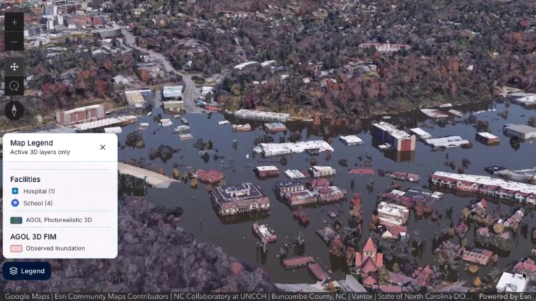
What makes that forecast legible is the jump to 3D. Hollins demonstrated it with Helene drone impact imagery alongside a photorealistic 3D rendering. The two matched closely. The visualization had caught up enough as to be nearly indistinguishable. Youngman describes the payoff in human terms. Showing someone the building they walk past every day, submerged above head height, connects a forecast to the reason to evacuate in a way a flat map and numbers cannot.
Coastal storm surge is next. Each new hazard layered in expands the same question the graph was built to answer: not just where the water goes, but everything that stops working because of flooding.
MITRE and NWS talk every week. It’s a coming together of weather and data scientists along with emergency managers. Every feature is tested as it lands rather than later. “We’re working so quickly and so integrated together,” Hollins said. “We don’t want to gather specs and then go away for six months and develop a tool that nobody’s going to use.” Together they are building and testing against real-world weather scenarios and past consequences.
Youngman credits the pace to restraint as much as urgency. The team focused on the overwhelming hazard of water inundation, not every threat the Weather Service forecasts. The time from a conversation at a conference lunch table to a working prototype took roughly a year, fast by any measure of federal infrastructure work.
A forecaster typed a question to get the North Fork consequence numbers: how many schools, how many students. That kind of plain-language query, powered by large language models—is the next frontier. Hollins wants that kind of plain-language query matured and validated, so asking the graph a question becomes as natural as asking a colleague. Youngman wants to expand the tool further, toward what-if scenarios. Bury a power line. Expand a stormwater system. Add a levee. See not just the cost but who is protected. Illuminate the potential return on investment.
The Cascading Impacts Explorer is solid, and now the public needs to see it in use to understand that what happened is what the forecasters said could occur. How the very idea of cascading impacts is a leap in preparedness that everyone can trust. If we know what will happen when that 100-year flood hits, then we have what we need to prepare now—not after the storm—so nobody experiences such harsh and expensive impacts.
Learn more about how GIS is used to understand where hazardous events will occur and how to help communities prepare for them.
Watch Monica Youngman’s complete presentation from the 2026 Esri User Conference below.