
April 7, 2020 |
Marianna Kantor |
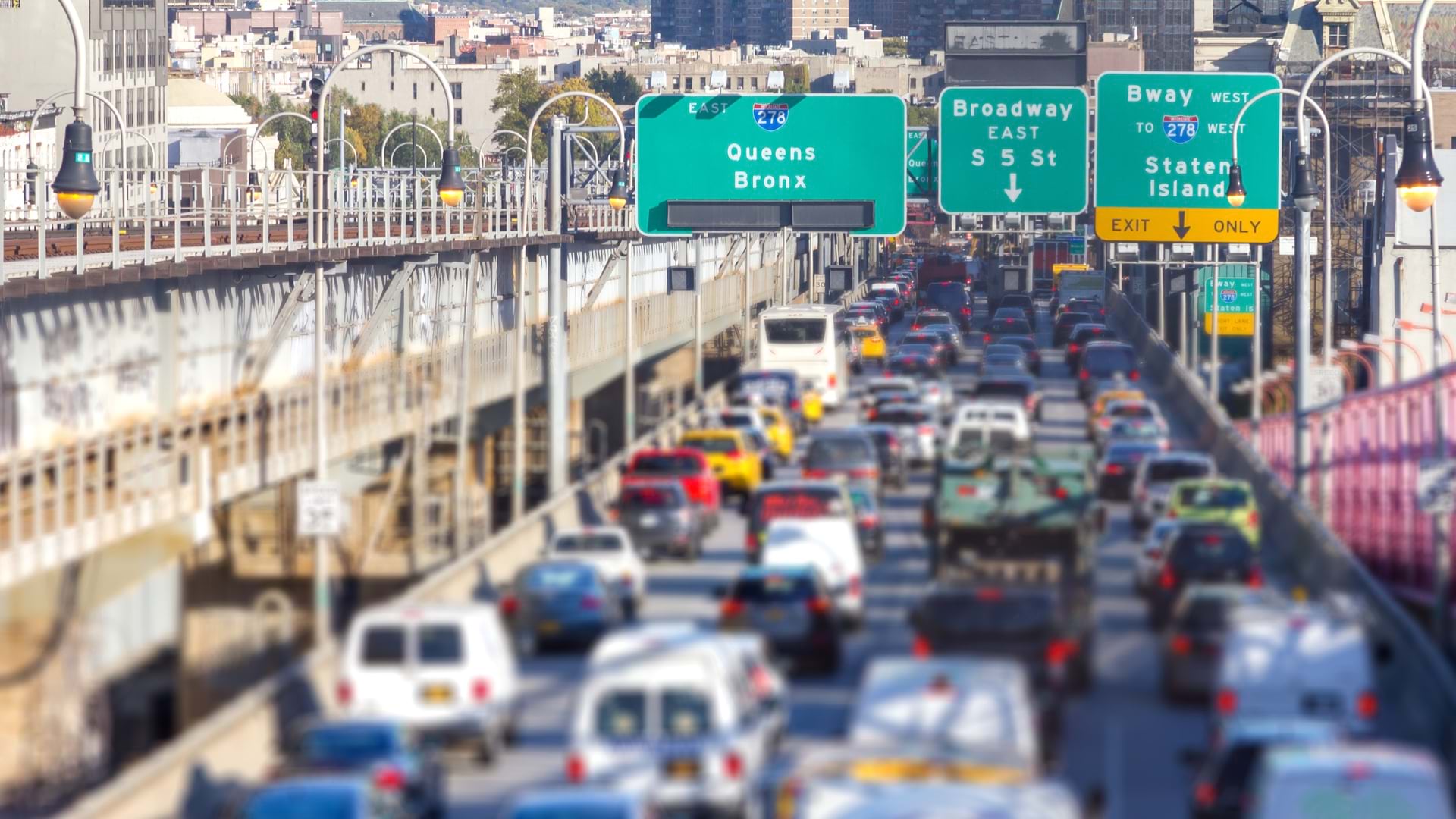
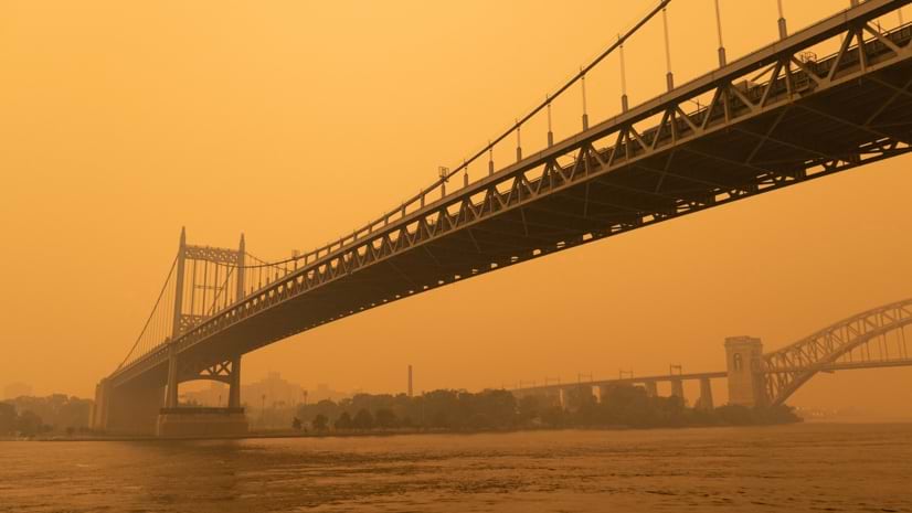
You didn’t need an app to know something was wrong. In vivid oranges and yellows, the skies over New York City this summer—the result of Canadian wildfires hundreds of miles away—repeated a stark truth about our changing climate: the impacts of wildfires and other natural disasters are growing more intense, and even at a distance, it’s getting harder to escape them.
Still, an array of apps and geospatial data are helping Americans better understand their air, whatever color it is, and plan accordingly. Public health officials are increasingly interested too. Research from the Centers for Disease Control and Prevention (CDC) has identified that people with asthma or other cardiovascular conditions, as well as poorer communities, elderly people, and those working outdoors face the highest risk from air that’s heavy in fine particulate matter (PM) and ozone. Fine particulate matter measuring 2.5 microns or less in width (PM2.5) ranks as one of the most concerning toxic air pollutants.
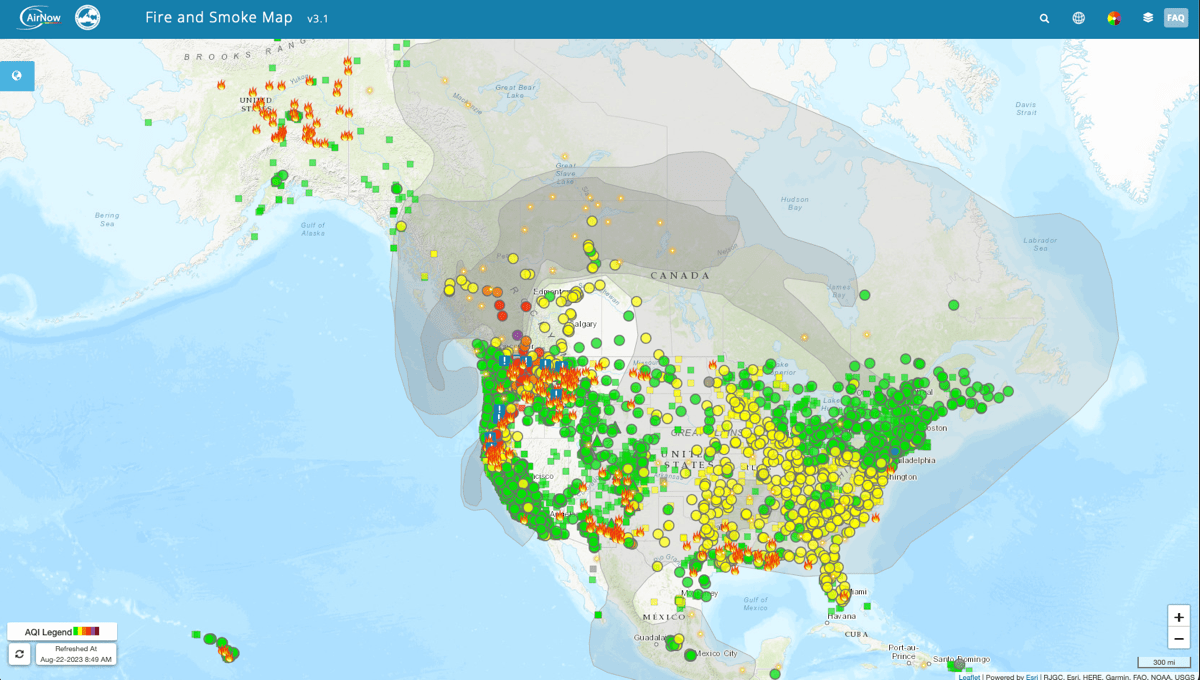
In 2020, the US Environmental Protection Agency (EPA) and the US Forest Service (USFS) collaborated to release AirNow Fire and Smoke Map, a first-of-its-kind map powered by geographic information system (GIS) technology that combines official data on fine particulate matter with more granular readings from a vast network of low-cost sensors run by volunteers. Compared with older government air maps, the new map increased the total number of PM2.5 monitoring locations almost fivefold, to over 900 cities. President Biden has called the enhanced map “an important tool,” and in early June, a day after White House press secretary Karine Jean-Pierre mentioned AirNow.gov during a White House briefing, a record 12.4 million people visited.
“It’s really important for EPA to be able to deliver this information,” John Millett, the communications director for the EPA’s Air and Radiation Office, which runs AirNow.gov, told The Washingtonian at the time. The AirNow app, he added, “was actually able to edge out TikTok for highest number of downloads for a little while.”
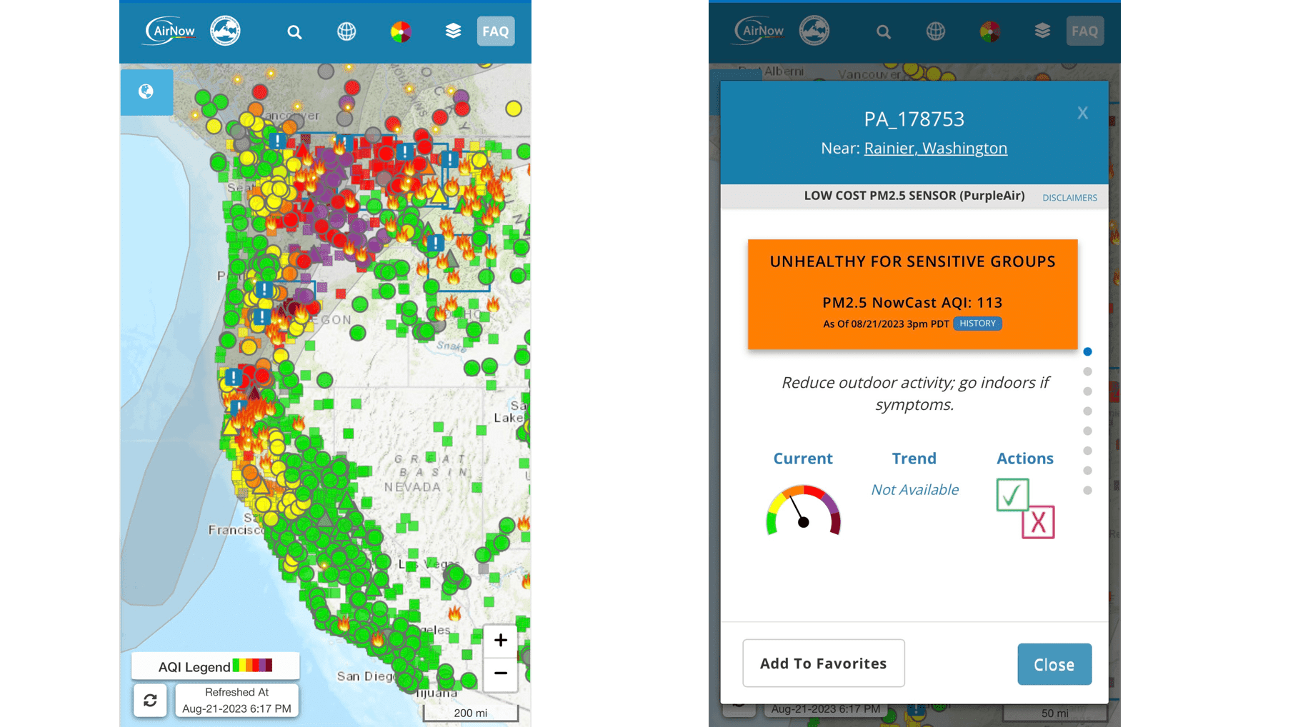
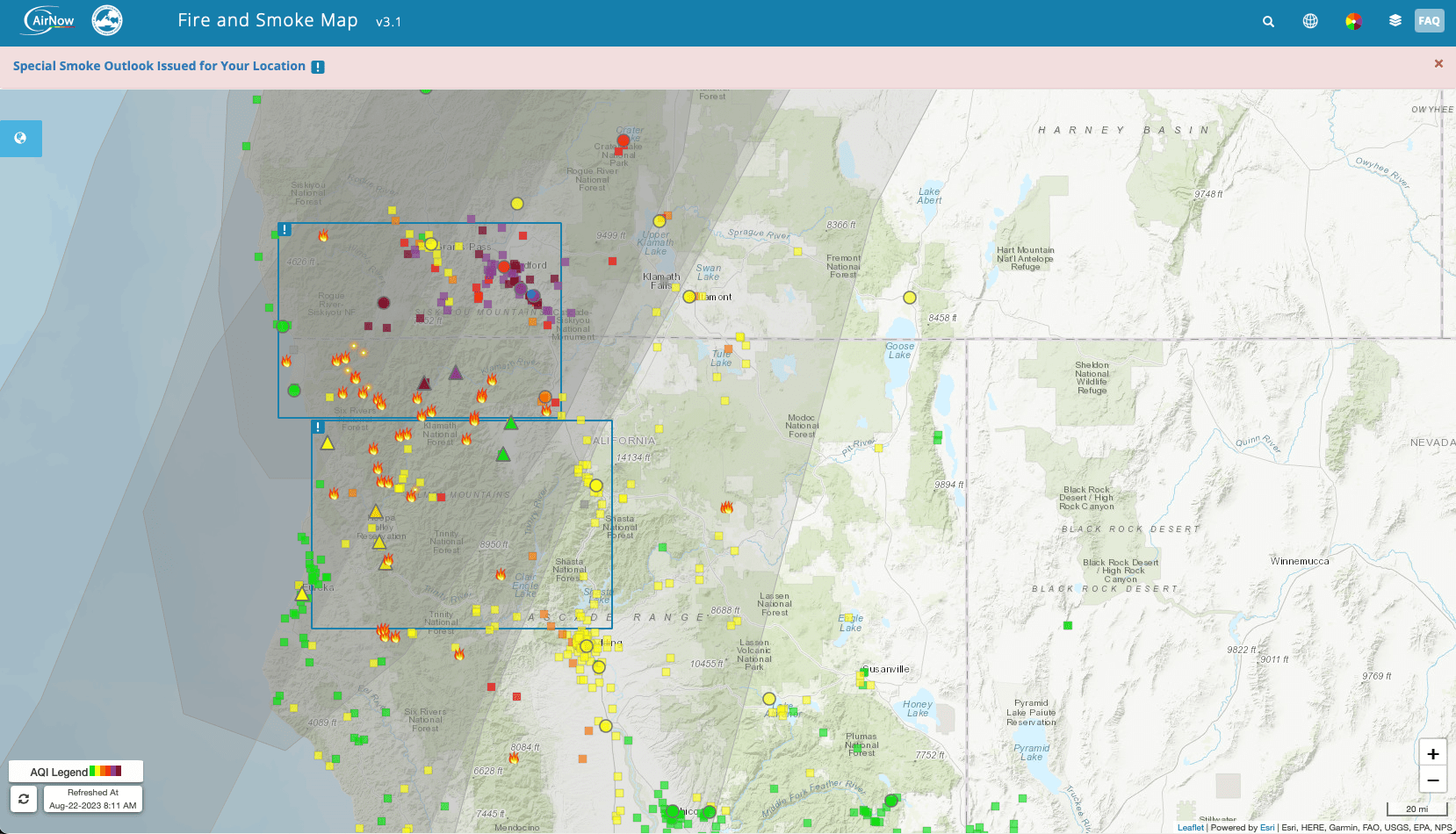
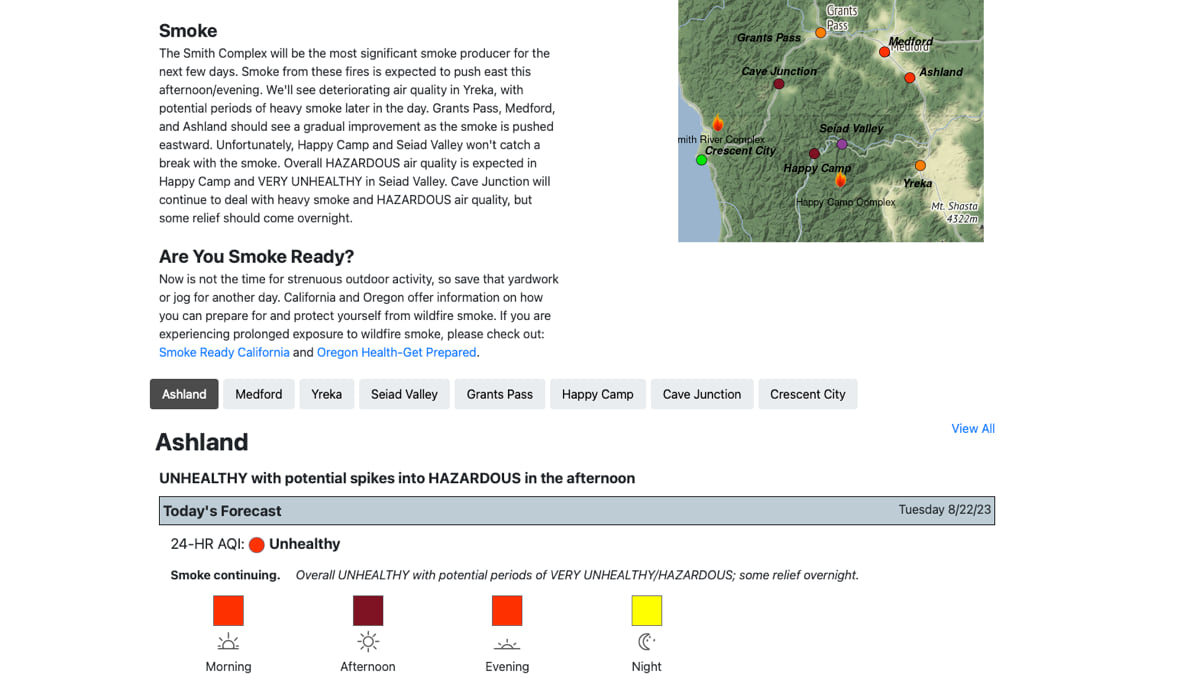
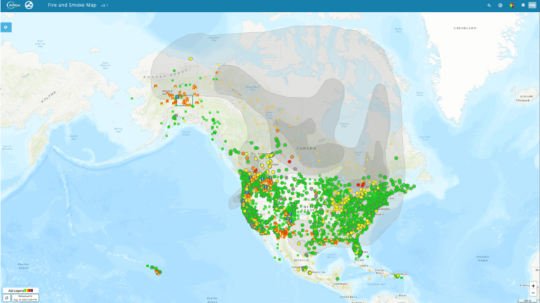
Type in your location at fire.airnow.gov, and you’ll likely see a map sprinkled with icons. Flames indicate reported fires, circles represent official AirNow monitors, triangles show temporary monitors set up by state or federal agencies, and squares indicate air sensors run by members of the public. Colors, from green to dark purple, indicate the quality of the air at that location, from good to hazardous. Click on any sensor and a pop-up box reveals more details.
When the AQI, or air quality index, value is above 100 for more than 24 hours, the air is considered unhealthy according to the EPA, at first for certain sensitive groups of people, then for everyone as AQI values get higher. A reading of 300 or higher means the air quality is hazardous. In that case, cautions the map, “Avoid all physical activity outdoors.”
Though it looks simple, the new map was a complex undertaking and built on a national air monitoring system, which took decades in the making. Under the Clean Air Act, a partnership led by the EPA, state and federal agencies, along with Canada and Mexico, built and maintains a network of air sensors now numbering in the thousands. Data from these monitors appear on the standard map at the EPA’s airnow.gov site and mobile app, and informs 24-hour air quality forecasts developed by the National Oceanic and Atmospheric Administration (NOAA).
But in recent years, air monitoring has undergone a technological revolution, led in part by a small company called PurpleAir. The company was born after a self-proclaimed tech geek named Adrian Dybwad grew worried about the choking dust blowing into his town of Draper, Utah, from a nearby gravel pit. Like many places, Draper has historically lacked extensive sensor networks to monitor airborne particulate matter; even big cities like New York and San Francisco only have about a dozen government-managed sensors in the AirNow network. Checking the AirNow map didn’t help much.
Buying his sensors was also out of the question: the systems on the market cost thousands of dollars and weren’t designed to quickly detect the effects of dust and smoke particulate matter. So Dybwad built his device, using low-cost circuit boards, PVC pipe, and lasers. He found enough volunteers around the Salt Lake Valley willing to host the homemade sensors and started building a small network before officially launching PurpleAir in 2015. The company, which now sells three models from $199 and up, has shipped over 30,000 devices over the past five years. Users have the option of sharing their data with PurpleAir to enrich its real-time map.
Like AirNow, PurpleAir by default uses the EPA’s Air Quality Index, or AQI, which measures levels of pollution on a scale from 0 to 500. The index governs the five pollutants regulated by the Clean Air Act—particulate matter, ground-level ozone, carbon monoxide, sulfur dioxide, and nitrogen dioxide. PurpleAir’s sensors only measure PM2.5.
Although its data isn’t as reliable as the readings provided by the more sophisticated devices in AirNow’s network, air quality specialists have found PurpleAir’s cheap, plentiful devices hard to resist. After a successful trial run by environmental officials in Southern California in 2016, Dybwad was soon fielding requests for the devices from air quality groups and academics across the country. During wildfires, local firefighters and the EPA’s air resource advisors have begun turning to PurpleAir’s sensors to help guide the placement of temporary air monitoring devices, and to provide more immediate data municipalities and emergency responders.
In 2019, Congress signed the Dingell Act into law, which for the first time mandated a better way to protect Americans from wildfire smoke. Soon, fire specialists at the USFS Research and Development unit and Interagency Wildland Fire Air Quality Response Program began a partnership with colleagues at the EPA. In the interest of better tracking fast-moving wildfire smoke, they wondered, if they could integrate PurpleAir’s vast data into the official AirNow map.
Because of differences among the sensors, they knew combining the two streams of data would be complicated. Researchers noticed that PurpleAir devices were problematic on smoky days, at times dramatically overestimating readings of PM2.5. Woodsmoke particles have a different density from gravel dust or other pollutants, which can confuse PurpleAir’s sensors.
By contrast, the government’s more delicate sensors are costly, state regulated, regularly calibrated by scientists, and can more accurately measure fire pollution. Unlike the PurpleAir machines, which use a laser to estimate the concentration of PM2.5 in an air sample, the official devices measure particulate matter by drawing air through a filter and then weighing the filter once an hour.
Placement is another problem. It’s hard to know, for instance, if a PurpleAir sensor has been placed next to a park or inside a chimney. AirNow sensors are installed according to more stringent and transparent rules to not bias the measurements (Of course, even official assurances should be checked: in the runup to the Beijing Olympics in 2008, officials dramatically improved the city’s air quality readings simply by moving the pollution sensors to areas outside the city limits; in response, the US Embassy began publicizing its own AQI numbers).

To start, researchers at EPA and dozens of state, local, and tribal partners began installing PurpleNow sensors nationwide, side by side with the official monitors. Armed with months of that data, EPA scientist Karoline Barkjohn and a team at the Pacific Northwest Research Station then built a correction equation to make the PurpleAir data more accurate, leveraging data from co-located sensors as well as local historical temperature and relative humidity measurements.
The final Fire and Smoke Map, built using Esri’s ArcGIS software, applies a range of filters to the open data it gets from PurpleAir. It removes questionable data when sensor readings disagree, applies the correction equation, and displays the single AQI score, which is averaged over time using an EPA formula called NowCast. Flame icons indicate where fires are reported to be burning, based on data from the US National Interagency Fire Center and automated satellite fire detection. Fire data also appears in NOAA’s Hazard Mapping System as well as Esri’s Active Wildfire Map, which uses weather and wind models to track and forecast smoke.
Click on any sensor reading on the Fire an Smoke Map and a pop-up box appears, showing the AQI for PM2.5 at that location. Users can scroll to see data that can help them plan outdoor activities and receive suggested actions to consider taking based on the AQI. In some cases, indicators and graphs show whether air quality is improving or worsening. On smoky days, the site may remind people to wear masks, close windows, or stay indoors.
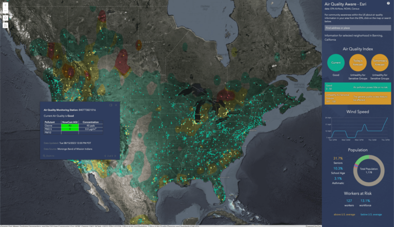
The hybrid approach of the Fire and Smoke Map suggests other tantalizing combinations. For instance, the Air Quality Aware app, available in the ArcGIS Living Atlas of the World, combines air quality data with Census Bureau data, which could help local leaders locate vulnerable populations, like asthma sufferers, and adjust public health efforts accordingly. Others are also tapping into PurpleAir’s data to map air quality risks and find new insights.
Last year, Esri engineer Joanna Nishimura and her team used ArcGIS Velocity, the big data analysis capability of ArcGIS Online, to build a proof of concept map that can send out air hazard alerts, helping school officials plan outdoor activities on smoggy days. After combining PM2.5 information from PurpleAir and EPA’s AirNow on a map of the Bay Area, she added elementary schools, using a layer from ArcGIS Living Atlas. With the incident detection tool in ArcGIS Velocity, Nishimura then set up email notifications that are triggered when PM 2.5 concentrations around any of the schools reach unhealthy levels.
By adding in data from CalEnviroScreen 4.0, a landmark mapping tool created by the California Office of Environmental Health Hazard Assessment, the map allowed Nishimura and her team to visualize the vulnerable populations that may be adversely affected by poor air quality. By animating historical pollution data, for instance during the July 4th holiday, they could also depict the impacts that fireworks smoke may be having on certain populations.
EPA and USFS researchers continue to improve their maps. Last year, the agencies enhanced the sensor data correction equation, added a Spanish version, and included a feature called ColorVision Assist, which makes the map accessible to color-blind people. Users can now save sensors to a “favorite” list, and see fire perimeters on the map when they click on a fire incident.
In addition to improving the public’s understanding of air quality conditions during wildfires, the map and the correction equation are helping PurpleAir improve its data. The EPA has encouraged other air quality device makers to continue improving their systems, and hinted at the possibility that their data could also appear on the map.
The agency is also pushing for even better national coverage of air quality, and for more monitoring on the local, municipal, and tribal level. As researchers at the University of California, Irvine, found, PurpleAir’s sensors tend to be more common in wealthier communities with lower air pollution. To help fill in the gaps, last year the agency began distributing air quality monitors to 132 underserved localities, as part of an historic $53 million federal investment in local air monitoring .
Wildfires are becoming more frequent and more intense, powered by warming conditions that allow for more fuel to burn. As the fires on Maui demonstrated, the effects can be deadly, wiping a whole town off the map. But the impacts from smoke extend far beyond fires. During the wildfire season of 2020, more than half of California’s population spent a month or more breathing in “unhealthy” or “hazardous” air. If we can better track the smoke and smog, researchers hope, we might be better at protecting our communities. Dynamic maps of changing conditions may encourage more people to purchase sensors to fill in data gaps too.
Learn more about how GIS assists with equitable environmental monitoring of harmful contaminants and pollutants.