
September 14, 2021 |
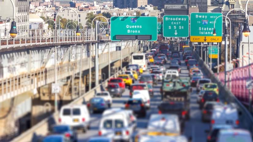
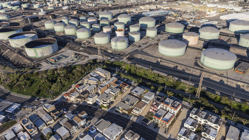
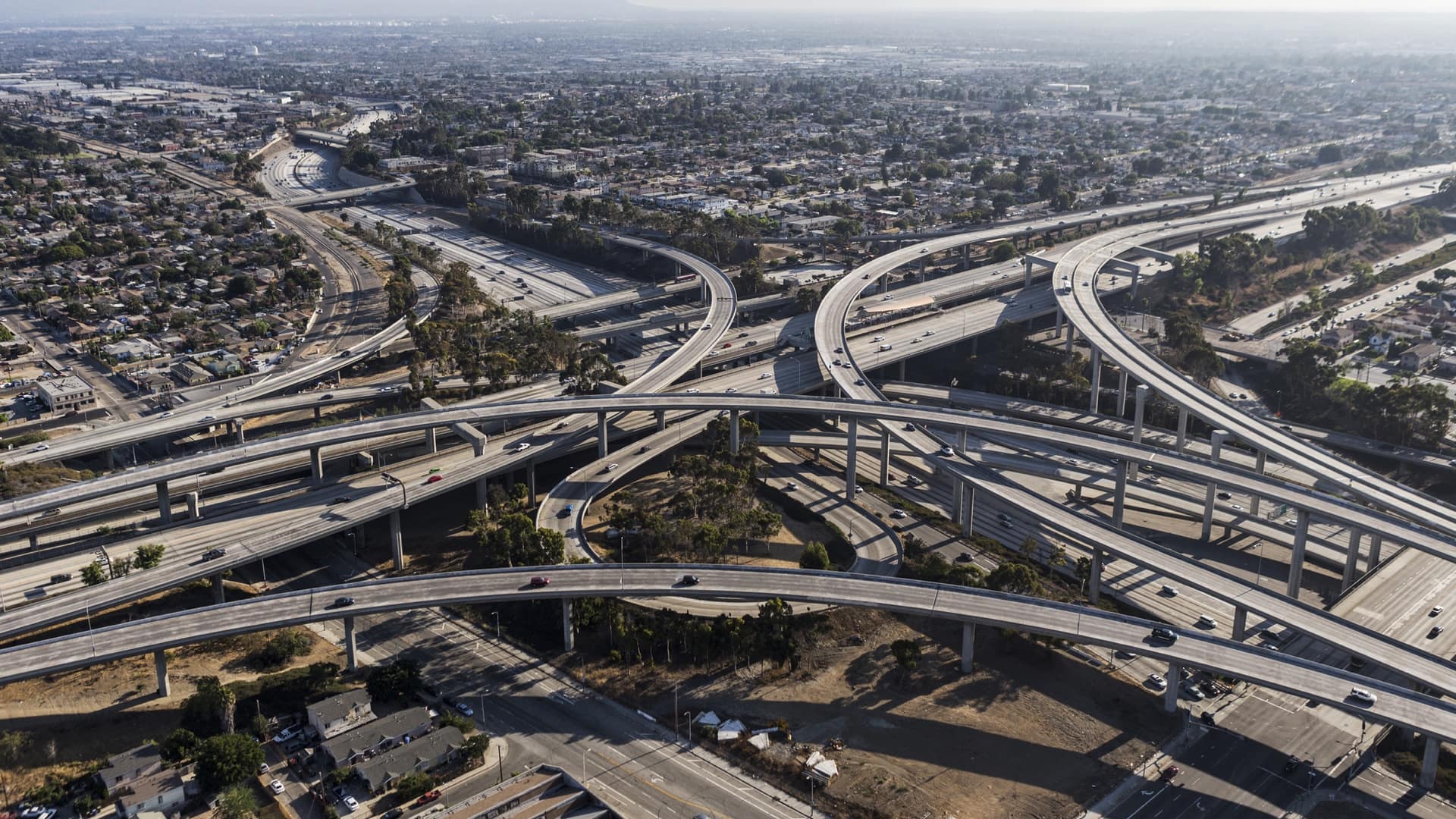
When New York City passed a law in 2019 that would charge a fee to motorists who drive into Manhattan south of 60th Street, one of the world’s most traffic-clogged business districts, climate advocates hailed it as a historic win for the health of New Yorkers and the environment. But if you zoomed out on the map from Manhattan, things looked more complicated. Forecasts showed that truck drivers seeking to avoid congestion pricing would end up driving more through areas outside the tolling zone.
“All tolling scenarios will increase heavy-duty truck trips in neighborhoods along the Cross Bronx Expressway, worsening emissions and associated harms to health,” wrote Rachel Levine, President Biden’s assistant secretary for health, in a letter last November to the Metropolitan Transportation Authority (MTA) and other agencies behind the plan.
Referencing full-color maps of the South Bronx, she urged measures to counteract the additional traffic, like prioritizing nearby schools for air filtration systems and deploying zero-emissions buses. She added, “These communities likely breathe more diesel [particulate matter] than 98 percent of communities nationwide.”
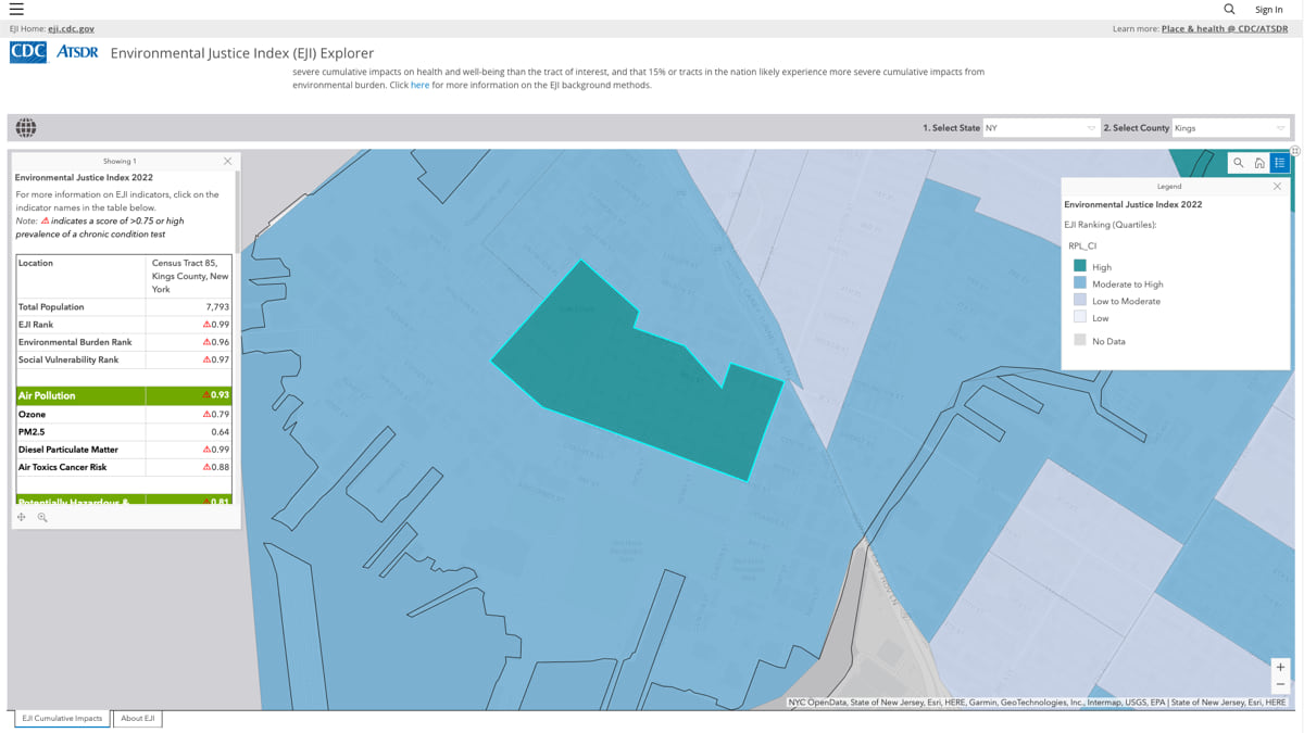
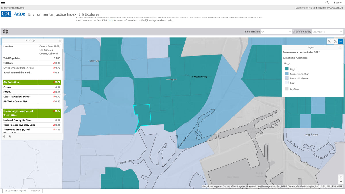
Her concerns echoed long-standing local calls for a fairer environment and were rooted in a new federal mapping tool, the Environmental Justice Index, or EJI, which ranks communities across the US according to environmental health risk. Built by the Centers for Disease Control and Prevention (CDC) alongside the US Department of Health and Human Services’ (HHS) new Office of Environmental Justice, EJI is the first national geospatial tool to measure the cumulative impacts of social and environmental factors, including pre-existing chronic health conditions and built-environmental factors such as proximity to hazardous waste sites. On the EJI Explorer, a map-based portal available at eji.cdc.gov, each census tract in the US receives a single score representing cumulative impacts.
On the EJI Explorer, the neighborhoods along the Cross Bronx Expressway—first proposed in the 1940s by Robert Moses over the protests of locals—not only rank high for toxic air, cancer risk, and poverty but also suffer from a high prevalence of chronic health conditions, like asthma and diabetes, that can worsen with the impacts of air pollution. “Cumulatively,” Levine wrote, “the burden of social, environmental, and underlying health factors in these neighborhoods range from the 90th to 99th percentile nationwide, according to the EJI.”

This is precisely what the tool was designed for, said Benjamin McKenzie, project coordinator for the EJI.
“Part of what we’re trying to do is to raise awareness of how all these factors interconnect,” said McKenzie, an epidemiologist who uses geographic information system (GIS) technology “to study the contextual factors causing or contributing to a disease or negative health outcome, including the social determinants of health that make location a key factor in our well-being.”
The EJI is one of a growing number of government tools that help communities and policymakers pinpoint environmental, social, and health vulnerabilities at the level of a neighborhood, and sometimes a city block. The tools fit into the Biden administration’s environmental justice agenda, which includes Justice40, an executive order that calls for distributing 40 percent of climate, clean energy, and infrastructure investments to “disadvantaged communities,” as identified by the Climate and Economic Justice Screening Tool. The initiative will inform how federal and local agencies spend billions in annual investment from the Infrastructure Investment and Jobs Act (IIJA) and the Inflation Reduction Act (IRA).
Apart from helping implement federal programs, tools like the EJI can empower action at the local level too. Policy makers and state agencies can use the EJI to ensure that the proper percentage of funded initiatives are allocated to those most in need. Community members can use the EJI to point to specific burdens, like high levels of air pollution or toxic sites, that might be affecting people’s health. The tool could also be a boon to public health professionals, helping make it easier to estimate local impacts, especially when personnel and resources are scarce.
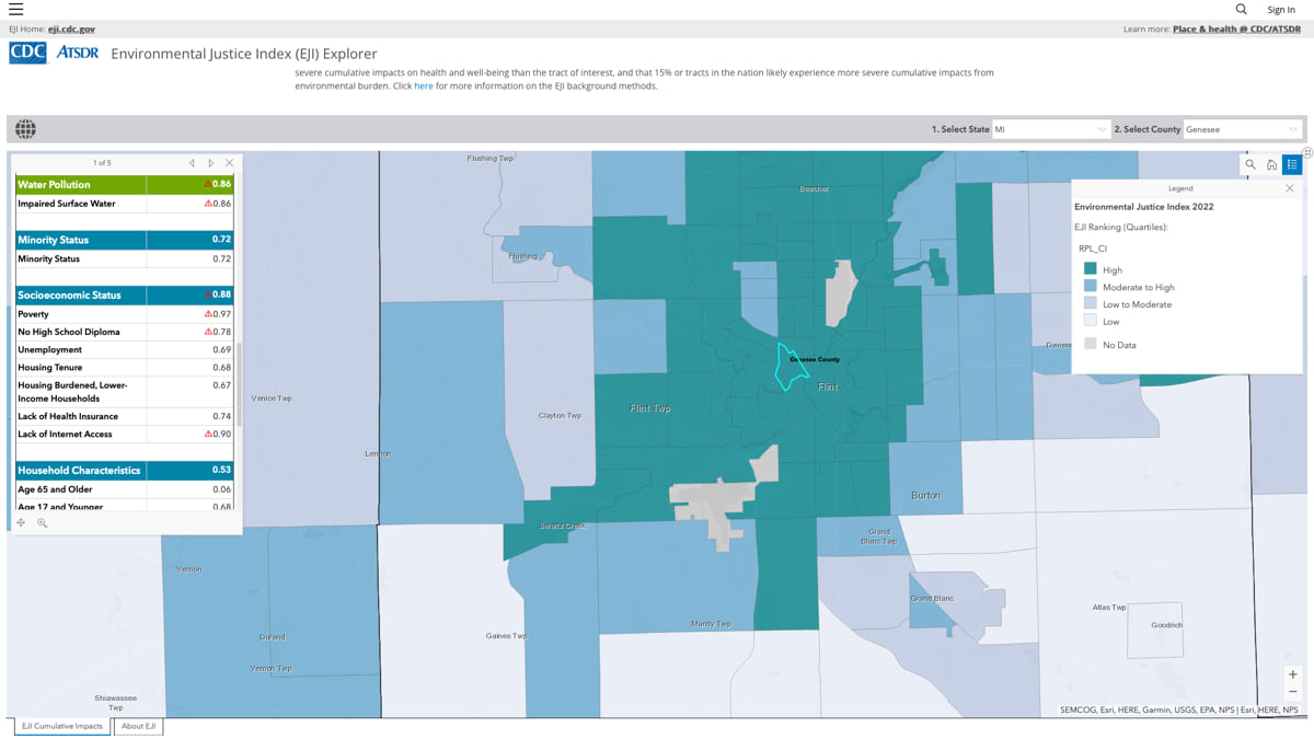
The EJI is different from other geospatial environmental justice tools in one key aspect: for each census tract, a county subdivision for which the US Census collects data, the EJI shows the combined risk people there face resulting from a wide range of environmental, social, and health burdens. The tool shows a single score, based on a percentile ranking system. “Measuring cumulative impacts, as opposed to just a set of scores, is precisely the thing we bring to the table,” McKenzie said.
On the EJI Explorer’s map, DeKalb County, Georgia, where McKenzie lives, census tracts show up as various shapes in shades of blue, with some noticeable clusters. He clicks on one community, for example, a tract in Northern DeKalb County in a deep blue with a score of 0.9. This means that the tract likely experiences more severe cumulative impacts on health than 90 percent of all other tracts in the nation.

“What’s more important,” McKenzie said, “is that you can click on an individual community, and you can actually see what is driving those impacts.”
Crucially, the tool lets users view the map and its score through each of the 36 individual indicators, including factors like proximity to highways, the prevalence of chronic disease, and lack of health insurance. This is critical because it makes the tool flexible enough to answer a variety of general or specific questions without having to use a separate index. Links on a separate page lead to the underlying raw data resources used to create the index. These originate from the CDC, the Census Bureau, the Environmental Protection Agency (EPA), and the Mine Safety and Health Administration.
For years, public health professionals have explored these factors through portals like the EPA’s EJScreen or California’s CalEnviroScreen, or the CDC’s Social Vulnerability Index (SVI). But the EJI’s single cumulative score can more easily illustrate patterns of impacts in ways that represent the complex relationships of a particular community’s mix of stressors. “Those [dark blue tracts] are areas that people can look at and start to focus on at a very high level,” McKenzie said. “That’s valuable for high-level context and comparison.”
He offers the example of two similar-sized communities with similar levels of air pollution.
“In one community, you have people who can afford expensive air filters, medical treatment, medical care; they have access to insurance,” McKenzie said.
In another lower-income community, McKenzie added, “People don’t have the same level of access to insurance, and a lot of people might already have underlying medical conditions.”
The two communities may have the same levels of truck traffic, he said, “but one of them is going to end up having more extreme health effects.”
McKenzie said the EJI, like the SVI, is already helping some CDC researchers answer basic questions at the outset of public health emergencies.
The tool is also helping inform other efforts at HHS, which have made health equity a priority in various regulatory initiatives. The Centers for Medicare & Medicaid Services is incorporating several equity measures in its proposed payment rules for Medicare, hospitals, and nursing facilities. The agency also advises that the EJI can be used to achieve Justice40 goals, along with tools like the White House’s Climate Mapping for Resilience and Adaptation (CMRA) portal and Climate Economic Justice Screening Tool and its associated data layers, to pinpoint and prioritize disadvantaged communities for environmental justice programs.
The EJI is already being used at the local level too. In Cook County, Illinois, officials are using the map to help prioritize support for suburban municipalities in developing its Climate Resiliency Plans. Under the program, priority is given to communities that experience the most severe cumulative impacts to health and may have the fewest resources to build climate resilience.
“I think as a nation, we started to realize that environmental justice is absolutely critical to achieving health equity,” McKenzie said. “So much of our health is impacted by contextual considerations.” The COVID-19 pandemic only brought those factors into sharper relief. “That definitely brought more attention to the fact that we need to be addressing those disparities,” he said.
In recent months, McKenzie and his team have been holding community workshops to share ideas on how to use the tool and to gather local feedback that can help improve the index. Over 900 people have registered so far, says the CDC, and since the EJI went public in August 2022, the website has received more than 110,000 site visits.
“We’ve definitely seen people who just hadn’t thought about the fact that social factors or health factors might play a role in how the environment affects their health,” McKenzie said.
The EJI is already putting new investment on the map. In New York City, Levine and a chorus of local leaders and community members pointed to the air quality risk from MTA’s congestion pricing plan, especially on already-burdened communities. The MTA told the federal government that it would spend tens of millions to mitigate those impacts in the Bronx and elsewhere.
Those efforts helped bring the mitigation plan over the finish line: In late June, final approval was granted by the Federal Highway Administration giving MTA a green light to start the program as early as April 2024. The scenario may still face headwinds: a lawsuit filed by the state of New Jersey in July warns of similarly increased pollution impacts on Bergen County, and notes that while the MTA has proposed $130 million in mitigation efforts for increased congestion in the Bronx, it has offered none for New Jersey.
For McKenzie, the MTA’s moves and a growing conversation around environmental justice underscore the value of tools like the EJI and show why it’s critical to find even better ways to highlight places on the map that have long been forgotten. “Advocates can now use this data to point to that and to say, ‘This is a community that deserves attention,’” McKenzie concluded.
Learn more about how GIS helps advance racial equity, social justice, and sustainable inclusive development.

September 14, 2021 |
May 24, 2022 |
September 23, 2021 |