August 7, 2018 |
August 2, 2019
A cartographer’s take on the human perspective that NASA’s Earth at Night imagery provides.
Each year my siblings and our families gather at my father’s home in Mackinaw City, Michigan and spend the better part of a week procrastinating the inevitable forced structure of the annual family photograph. Pausing the beautiful chaos of the gathering for the brief formality of cramming so many wiggly young cousins into a single frame is … a challenge, though certainly worth the effort once captured.

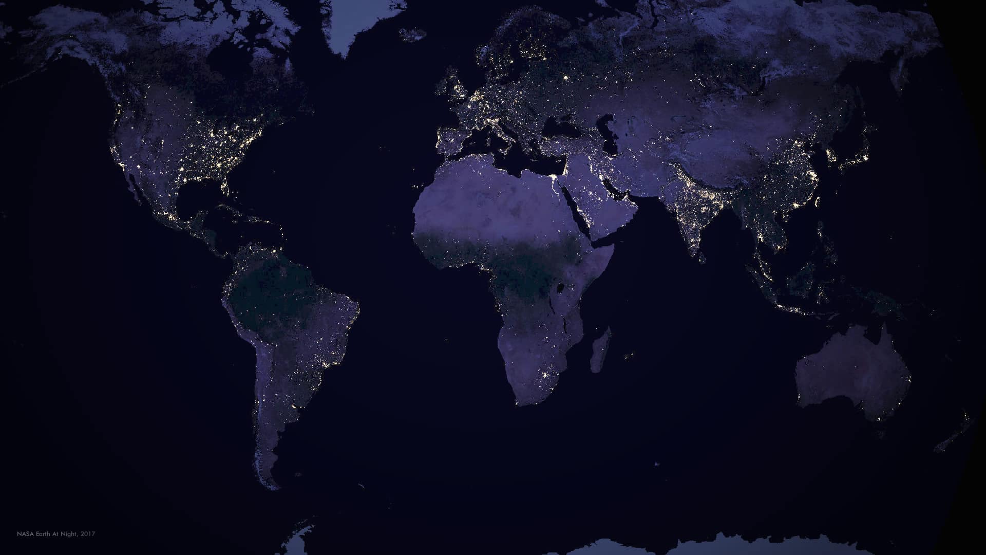
This experience gives me only a small taste of the difficulties of a group portrait. NASA, on the other hand, coordinates a planet-wide portrait—not of mountains and plains and oceans and forests, but of all of us. Its Earth at Night map project captures and merges nighttime satellite imagery into a unified glimpse of current human life on Earth, evidenced by the lights we burn.
Seeing the Night
In April of 2017, I was pleasantly surprised to see an updated release of NASA’s Earth at Night imagery, the first since 2012. For several years I’d admired the dark surface of the earth punctuated with pinpoints and clusters of nighttime light visible from space, so I was delighted to see a new more current version.
It’s more than an image, though. Anyone who’s spent time with it can feel that, intrinsically. Every lightbulb, a proxy for each of us, scratches away a bit of the darkness. In this array of deep blues interrupted by amber and white we see a portrait of our collective self.
In what other way could we so clearly see the echo of seven billion humans on the face of our shared planet? We are a moving people—creatures who continually strive for improvement, vie for resources, flee from danger, and generally spread out on the surface of the Earth. We concentrate in great numbers within brightly lit urban centers and perch along tendrils of connected settlements that link, via thin strands of humanity, cities to towns, towns to villages, villages to outposts. We gather in lush river valleys, tracing the ancient desirability of agriculture along riparian floodplains. We avoid rugged and barren areas such that our absence shouts the geographic form of mountain spines and deserts. We spiral out from cities, perched along transportation lines like spools of holiday lights.
This is one of the reasons geographic visualization is so exciting and surprising—maps are much more than colors and pixels arranged on a canvas.
Static Change
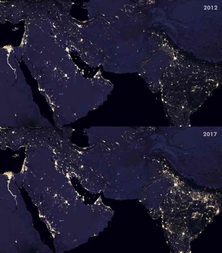
Upon seeing the new Earth at Night imagery, and some beautiful side-by-side comparisons provided by NASA’s Joshua Stevens, I marveled at the extent of change some areas experienced in the intervening five years. My eyes darted back and forth between excerpts of the 2012 and 2017 images, storing a bit of the lights in my working memory and trying to tease out in my mind where lights were coming on or where they were going out. I wondered if a simple change detection tool could show where lights had newly appeared or brightened, and where lights had dimmed or altogether vanished, within a single image.
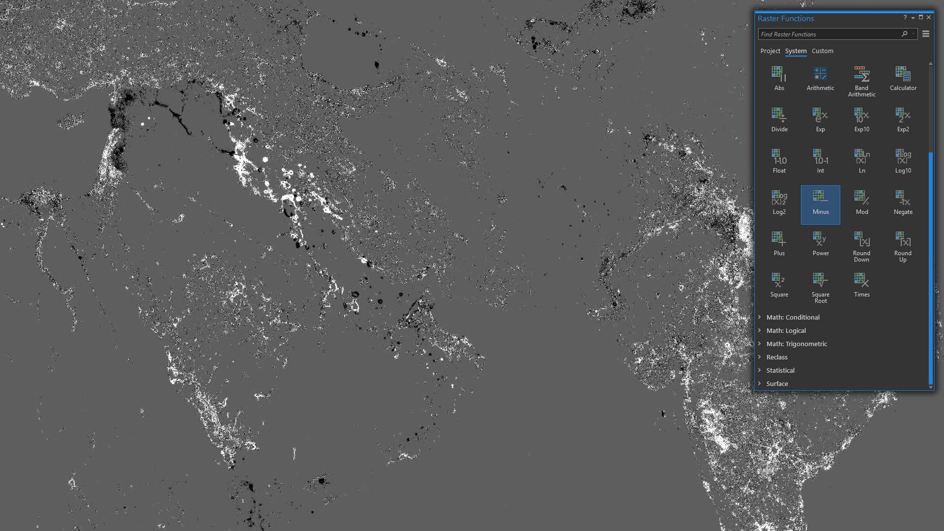
I opened both the 2012 and 2017 Earth at Night images in ArcGIS Pro and started investigating my options in the exceedingly fun and helpful Raster Functions toy box. I spotted a function named “Minus” which told me I could subtract the values of one image from the values of another. Perfect. Seconds later I was looking at a global map of change; black pixels marked areas of darkening and white pixels areas of new illumination.
This was one of those moments where the abrupt clarity of a map takes a geographer by surprise. My eyes widened and I leaned forward in amazement. How could it be this succinct? The ephemeral dimension of time was encoded directly into this map of change, captured in a curious rendering of lights coming on and lights going out.
Here, in a single image, was encoded the movement of our species over a half decade. This relatively new and amazing ability to look down at ourselves in much the same way that we have, for generations, looked up at the stars, provides insights into our motivations, struggles, and migrations, all within the context of our vaporous flicker of time on this earth.
Lights On
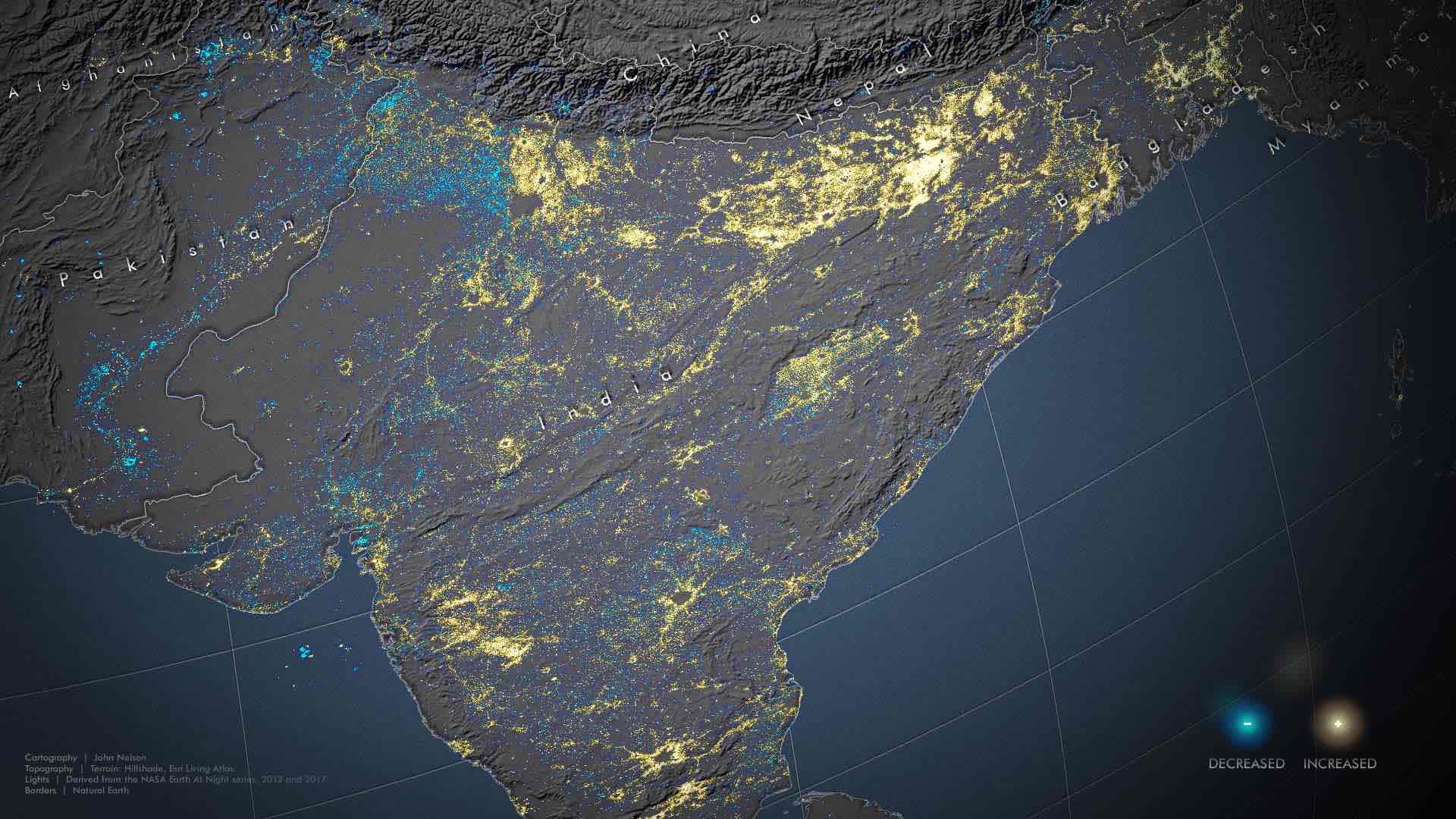
My eyes were immediately drawn to the newly-illuminated stretches of Northeast India. There, in the shadow of the Himalayan range, a vast network of light blazed where there was recently only darkness. This gave rise to questions I could not have thought to ask otherwise. I soon learned there was a massive investment in bringing electricity to the communities of this area. This new light represents a connectedness with the rest of the world and unknowable opportunities for education and improvement, a wave of optimism for millions of people.
Lights Out
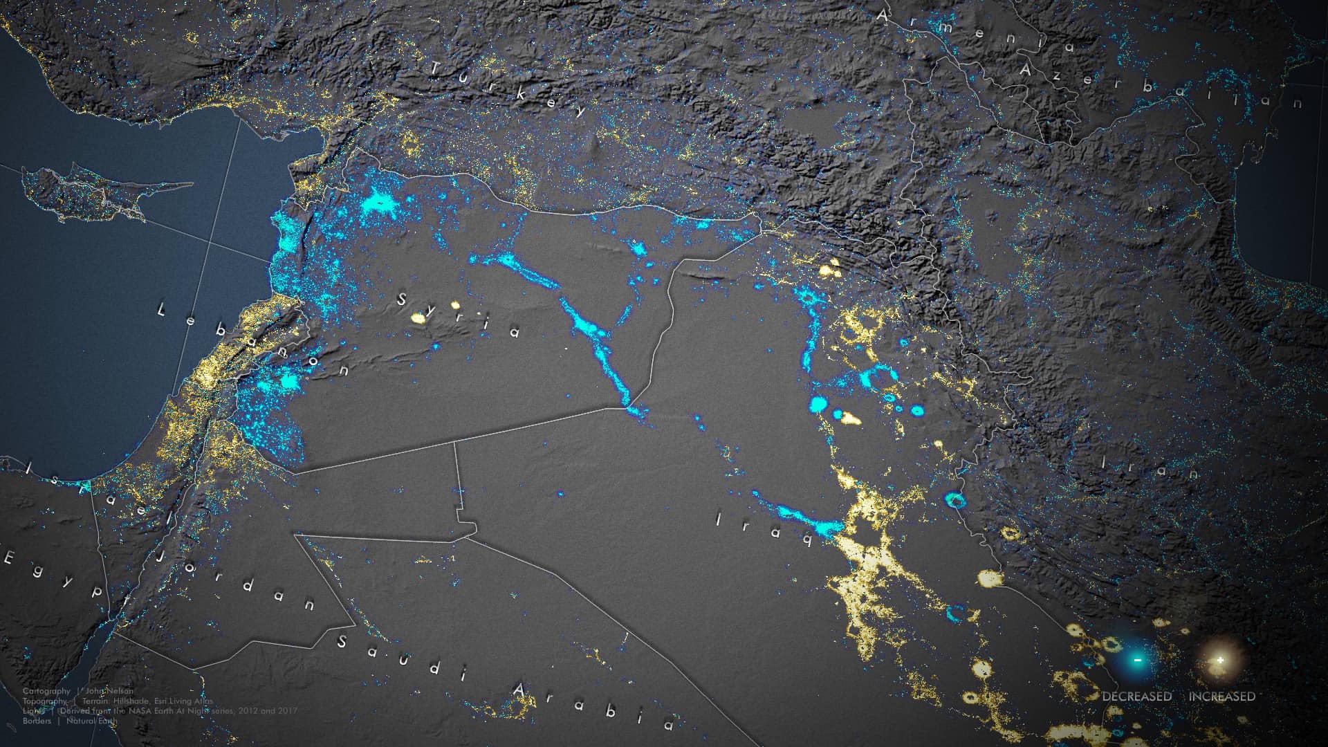
The duality of change, however, is most starkly apparent in the darkening of Syria. In the years between Earth at Night images, the violent conflict of the Syrian civil war has plunged an entire nation into absolute darkness. The night lights of population centers and the transportation systems that connect them have been wiped dark. Neighboring Iraq shows similar signs of conflict in its northwest, countered with massive new illumination throughout the rest of the country.
Other nations evidence the darkening turmoil of conflict or crippling economic contraction. But none so wholly as Syria.
Just Light
Nighttime lights, like nearly any social science phenomenon we track and visualize, serve as proxies for ourselves. Likewise, the response to questions asked of these lights are preceded with the familiar statement, “…it’s complicated.”
Part of the inherently pleasing aspect of this change map is its stark black and white demarcation of on and off. Yes and no. This or that. We crave this simplicity and find comfort in the familiarity of a binary classification. When watching movies with my young children they are quick to ask of a character, “are they a good guy or a bad guy?” Formulaic scripts generally make this a pretty easy answer. But we know that good explanations are much grayer than that.
What of these nighttime lights? Is new light always good? Is extinguished light always bad? We bathe our nighttime environments in artificial light. It could be argued (and has) that any light escaping our environments into space (and sometimes into the awaiting electromagnetic sensor arrays of orbiting satellites) represents a failure of ours to prevent the waste and star-obscuring emittance of light pollution. In fact, much of the reduced illumination of global nighttime lights may actually be a credit to thoughtful active adoption of LED luminaries and more efficient nighttime light strategies.
Some small areas of darkening are intentional efforts to see and reconnect with our starry place in the Milky Way. Wouldn’t we welcome more of this sort of darkening? Are the street and porch lights of expanding suburban developments good or bad? Are the migrating gas flares of newly discovered oilfields good or bad? Are the trawler lights of fishing fleets leaving played out fisheries for new waters good or bad?
It’s complicated.
In the years between NASA’s 2012 and 2017 images, the light of my mother went out. As have others I love. But I’ve also welcomed the small new lights of my daughters. This is life, both good and bad. Extinguished light is evidence of pain and grief, and joy and wonder. New light is security and opportunity, and disruption and waste. Nighttime lights are both joyous and mournful. They paint a portrait of human advancement and brutality, gains and losses, adventure and retreat. They just are.
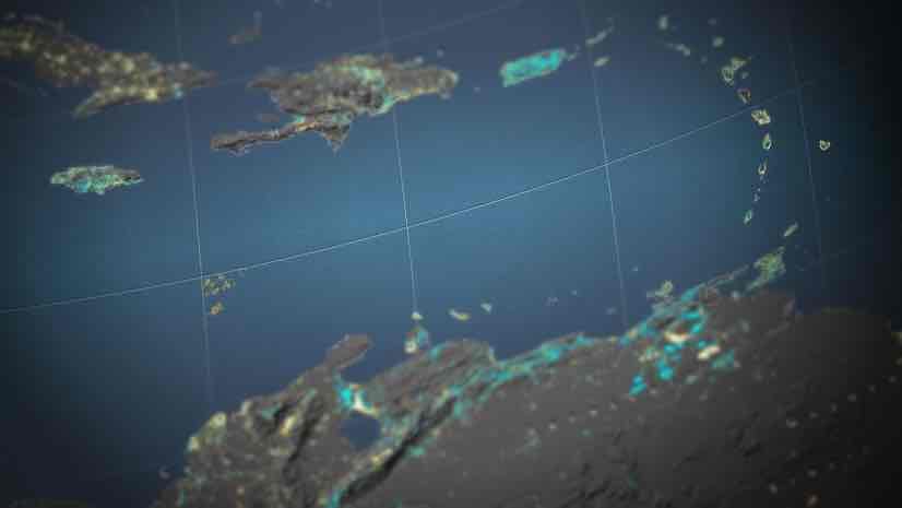
The image at the top of the story gives you a small glimpse of the changes that have impacted Venezuela.

August 7, 2018 |
January 10, 2019 |

May 30, 2019 |