The County Health Rankings and Roadmaps (CHR&R), a program of the University of Wisconsin Population Health Institute with support provided by the Robert Wood Johnson Foundation, measures the health of nearly all counties in the nation and rank them within states. The Rankings are compiled using county-level measures from a variety of national and state data sources.
Counties are ranked within their state on both health outcomes and health factors. Health Outcomes tell us how long people live on average within a community, and how much physical and mental health people experience in a community while they are alive. Health Factors represent those things we can improve to live longer and healthier lives. They are indicators of the future health of our communities.
By ranking the health of nearly every county in the nation, County Health Rankings & Roadmaps (CHR&R) illustrates how where we live affects how well and how long we live. CHR&R also shows what each of us can do to create healthier places to live, learn, work, and play – for everyone.
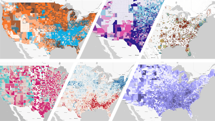
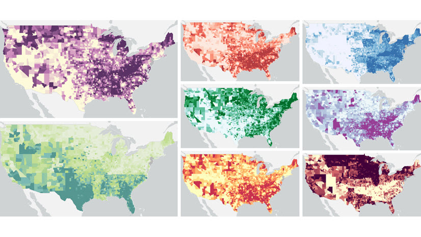
Living Atlas content containing County Health Rankings data debuted in 2018. This popular dataset quickly became a staple in Living Atlas, and a new vintage gets added every year. This means that GIS analysts now have six years of data available for use in ArcGIS products.
However, we are extra excited about this year’s content, for many reasons. First, the new variables this year are so important and timely. Second, we got to work directly with the data team at County Health Rankings this year.
New measures: Voter Turnout and Census Participation
Each year’s Rankings contains new measures that are timely and highly relevant. In previous years, these new measures included COVID-19 age-adjusted mortality, childcare cost burden, and Broadband access.
This year’s new measures are Voter Turnout, the percentage of citizen population aged 18 or older who voted in the 2020 U.S. Presidential election, and Census Participation, the percentage of all households that self-responded to the 2020 census (by internet, paper questionnaire, or telephone). These are both in this year’s layer, along with accompanying web maps (Voter Turnout, Census Self-Response Participation). These web maps are for users who want pre-configured maps to use in an instant app, dashboard, story, or hub site.
We’ve also created an interactive chart viewer app. It includes a scatter plot of the relationship between Census Participation and Voter Turnout.

Working directly with County Health Rankings
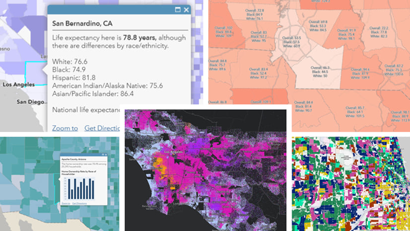
This year, the Living Atlas team was honored to be able to work side-by-side with the data team at County Health Rankings who are based at the University of Wisconsin. We learned about the County Health Rankings Model, the foundation of how different health factors and elements influence how long and how well we all live. CHR&R offers useful reports, community stories, webinars, videos, and many other resources.
- Are you a community leader wondering how to take action? Browse through their amazing What Works for Health tool and Curated Strategy Lists that detail evidence-informed programs, policies, and systems changes that can help address the complex challenges that communities are facing. The Evidence & Policy Analysis team at CHR&R has kick-started your lit review by classifying more than 400 strategies into an Evidence Rating that ranges from Scientifically Supported, to Some Evidence, to even Evidence of Ineffectiveness.
- Are you a data scientist or statistician who wants to see the confidence intervals around these measures in the analytic files? Or perhaps you want to read how the new 2020 census methodology has impacted the data. Maybe you’re a policy researcher who wants to learn the best ways to measure progress and change. CHR&R has high-quality information on all of these topics.
- Are you an individual who wants to learn more about the connections between power, place, and health? Listen and subscribe to the CHR&R podcast: In Solidarity.
Learn GIS skills with tutorials using County Health Rankings
Create a policy map to address health conditions as a way to get started with ArcGIS Online. Take your skills up a notch by trying an intermediate tutorial in which you help improve newborn health.

Browse the Documentation Tutorial Gallery to get hands-on, scenario-based practice with ArcGIS. Stay tuned as more tutorials are developed, tested, and released.
What will you map with County Health Rankings?
Just as with all feature layers in Living Atlas, anyone with an ArcGIS Online Creator account can add this layer to a new map and create a map that meets your needs. Smoking, flu vaccinations, mammogram screenings, low birth weight, and physical inactivity are just a few of the many attributes available. Take advantage of blend modes, layer effects, and new basemaps to make your map shine.
For more details, see the layer’s Description, as well as the long field descriptions for each attribute. Engage with Esri Community’s ArcGIS Living Atlas space to ask other GIS practitioners questions, and share how you’re using this layer.
Maps are a visual way to answer questions. However, great maps actually stimulate more questions. What questions will you answer (and inspire!) with your maps from County Health Rankings data?


Article Discussion: