Maps communicate information more effectively than words ever could. In today’s political and environmental climate, we look to spatial data for answers and direction when facing issues like COVID-19 or racial inequity. But it can be challenging to find and share a custom set of maps without some GIS background. Luckily the Esri Maps for Public Policy site makes this easy for anyone to do in a matter of minutes, covering a wide range of public policy and current day issues. The site offers access hundreds of layers, maps, and more to help tackle the biggest problems of 2020 (and onward).
With so many maps and so little time, you might be wondering what are five maps that you (and probably your coworkers and family) should see to help during these challenging times?
Using the Esri Maps for Public Policy site, I created this collection of five maps covering topics related to racial inequity, the COVID-19 pandemic, and air pollution. Enjoy the links and graphics below, or follow along by opening the link to the collection and finding your own area on each map.
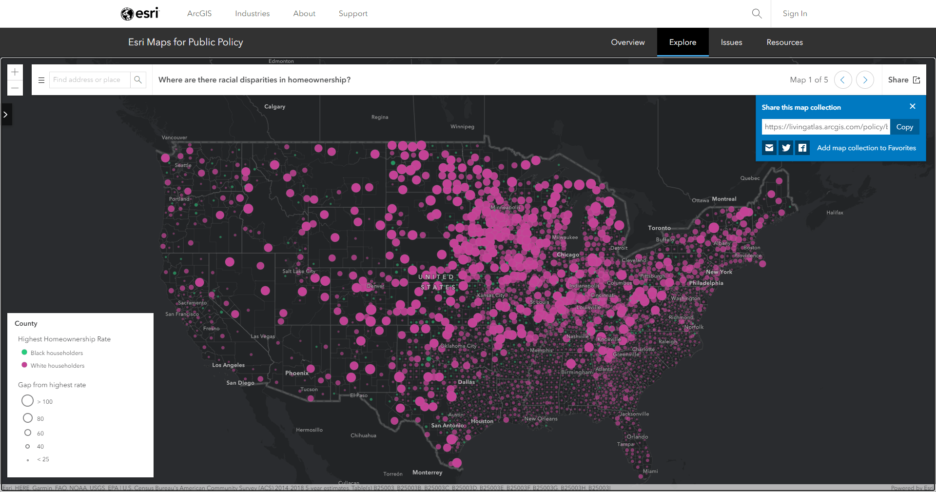
Where are there racial disparities in home ownership?
Racial inequity is a pressing issue that many governments and organizations are trying to combat. Systemic racism shows up in ways that may not have been considered. For example, this first map containing U.S. Census Bureau American Community Survey data shows us that home ownership is not created equal. At a county-wide view, we can see that White householders generally have higher home ownership rates than Black householders. Patterns such as these help us better understand some of the ways that inequity impacts the Black population across the US.
On a positive note, if you search for a city such as Philadelphia, you can see pockets of green circles, which have higher homeownership rates for Black householders. This may show where the paradigm is shifting in a more equitable direction, yet also highlights that we have a long way to go to reach true equity.
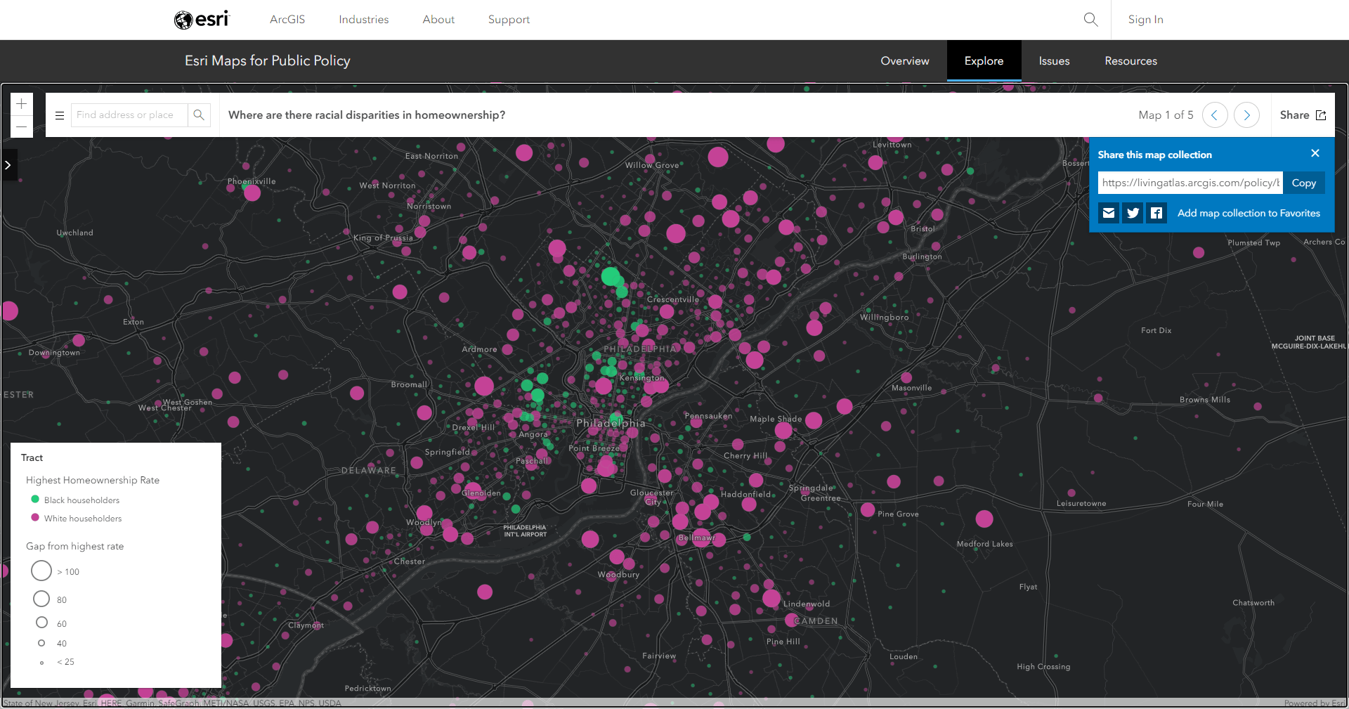
Try searching for your city in the search bar of the collection to see how the pattern of homeownership looks in your area.
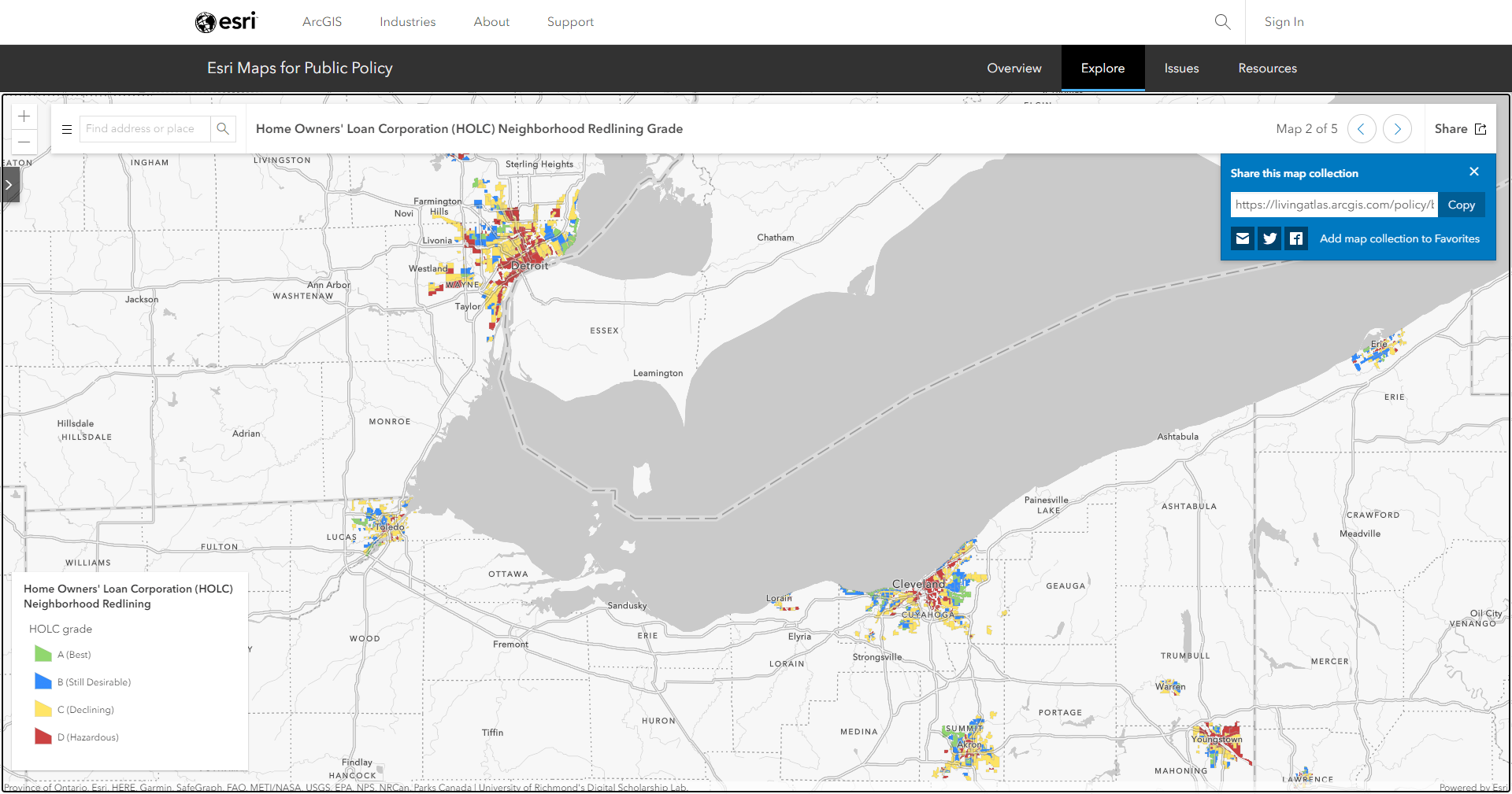
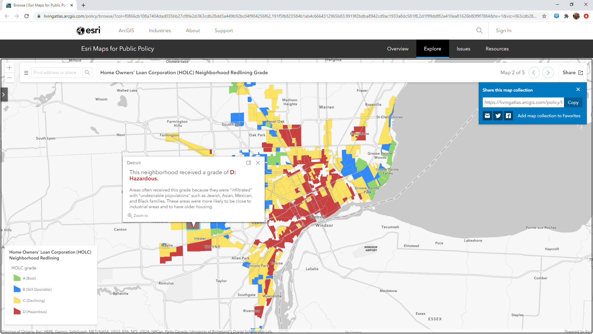
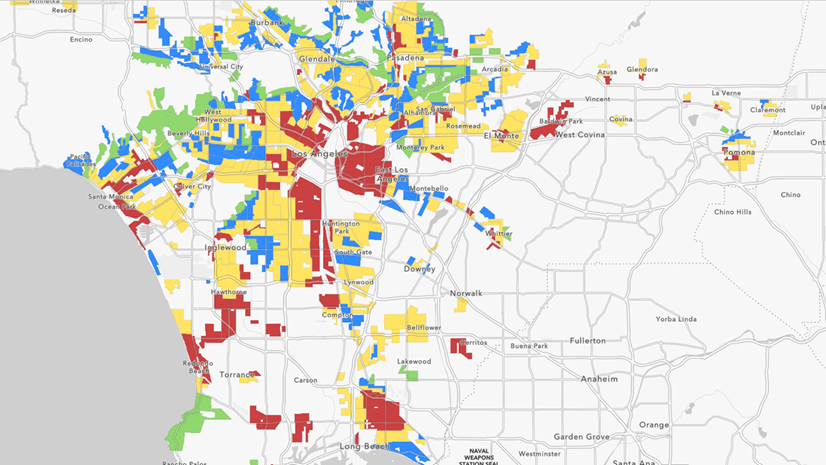
Home Owners’ Loan Corporation (HOLC) Neighborhood Redlining Grade
Another way to understand systemic racism is to look at the past. How have historical decisions and patterns created the unequal opportunities we see today? In the 1930s, the Home Owners’ Loan Corporation (HOLC) was created in the New Deal Era and trained many home appraisers. The HOLC created a neighborhood ranking system infamously known today as redlining. Zoom in to one of the 143 cities shown in this map to better understand how these policies created division and discrimination. This tragic reality of the past has engraved spatial and social patterns that we still see today in the first map we saw.
To learn more about the layer and the background of redlining, visit this blog.
For more information about how to use GIS to analyze racial inequity, check out any of the following resources:
- Racial Equity GIS Hub
- Analyze Racial Inequity During COVID-19
- Community Engagement for Racial Equity During COVID-19
- Racial Equity Community Outreach Solution Released
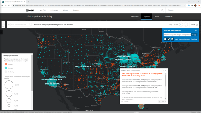
How did the unemployment rate change since last month?
With millions of Americans unemployed due to the pandemic, the next map hits close to home for many. This map is updated each month when the U.S. Bureau of Labor Statistics releases their new unemployment figures at the county level. Early in the pandemic, this map showed us that almost all counties in the US had a sharp increase in unemployment rates. Now that the world is finding ways to function more safely, we can see many parts of the country show improvements in unemployment, which may be a sign of change in a positive direction.
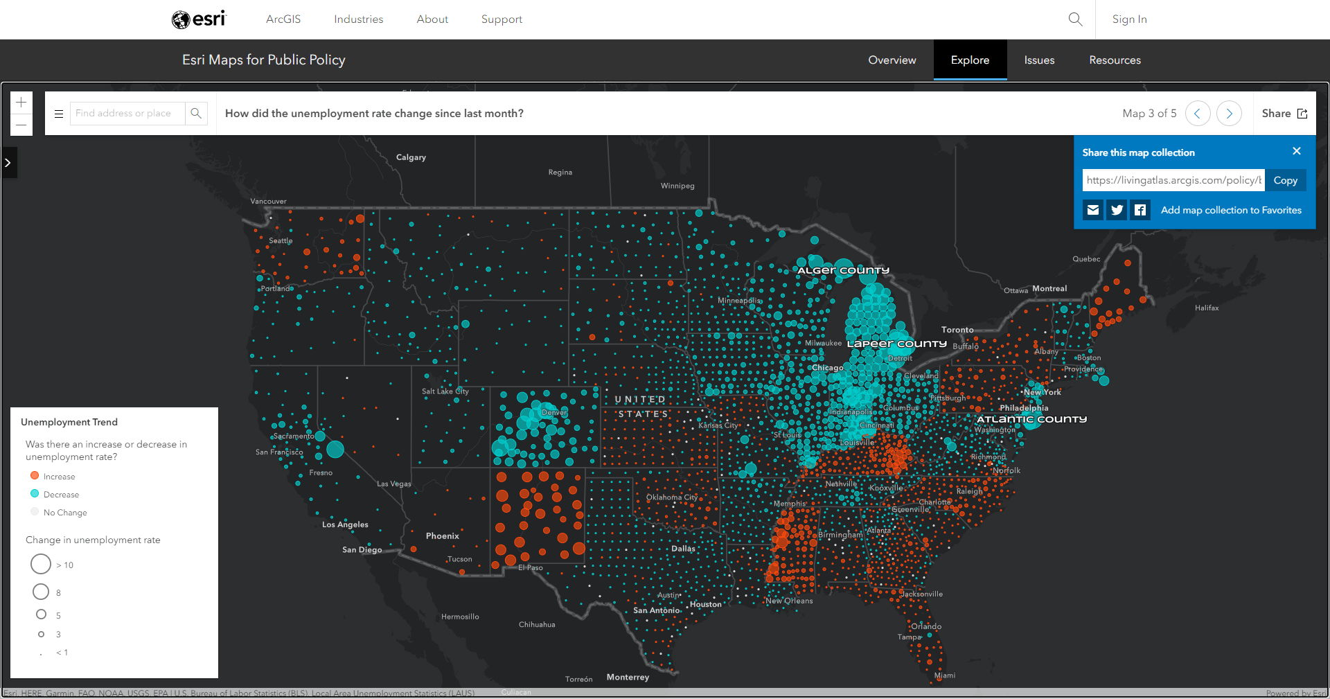
Since the data is updated monthly, you can check back each month to see how the pattern is changing over time.
U.S. COVID-19 County – Mortality Rate
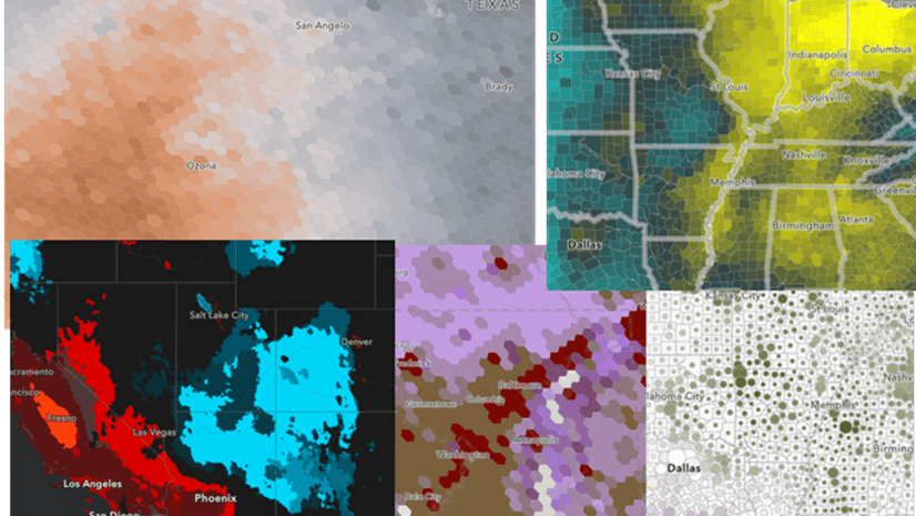
As we all face the current COVID-19 situation together, many people and governments are trying to figure out the impact on the population. Others are trying to determine when there can be a strategy for reopening the world as we know it. This map using data from Johns Hopkins University helps us address both. The color of the map shows us what the current trend of COVID cases means in relation to the World Health Organization’s stages of a pandemic. Areas in purple are still in an epidemic or spreading stage, while the green counties are showing improvements or overall lower rates. The largest circles on this map tell us what proportion of the population is being impacted by COVID. Since this is shown as deaths per 100,000 people, we can see that larger circles have a higher percentage of the population being impacted.
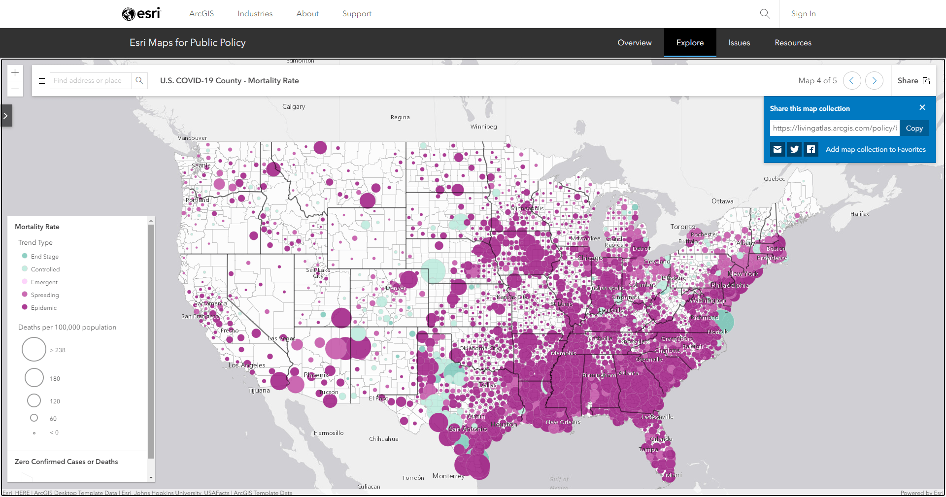
For more information about the trends shown in this map, visit this story map or this application.
Population and Particulate Matter 2.5 (PM 2.5) in the US between 1998 and 2016
Some parts of the country are currently breathing extremely poor air due to wildfires. But how has the air quality been on average over time? Which parts of the country consistently have the worst air quality? How many people are impacted by poor air quality? Answer these questions and more with this map showing annual aggregated particulate matter (PM 2.5) from NASA SEDAC’s gridded surfaces. See which areas don’t meet the World Health Organization standard of 10 micrograms per cubic meter in orange. The largest circles have the most population, indicating a larger human impact.
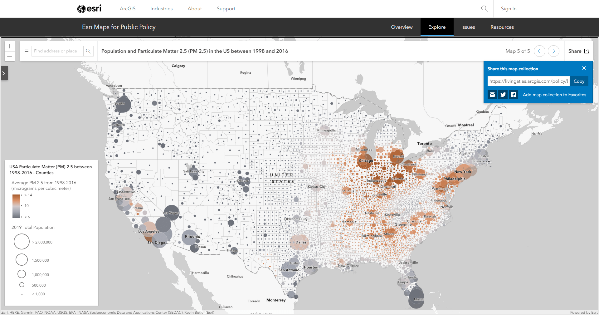
Zoom in to see more detailed patterns down to 50km hex bins. Luckily, even the parts of the country with the poorest air quality have seen overall improvements in air quality, which we can learn more about by clicking on an area.
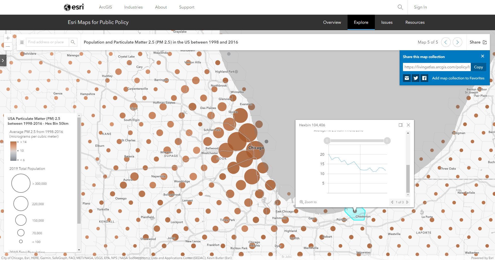
This is just one view of this air quality layer. Check out one of the many different maps about US PM 2.5 values that helps us learn more about the statistical patterns over time and the overall human impact.
To see a similar set of data derived from the NASA input, check out this global version of the map which shows the pattern by countries, administrative 1 boundaries, and 50km hex bins. Visit this story map to learn more.
Create your own collection of policy maps
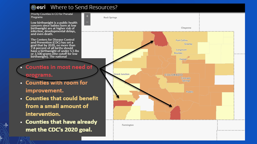
Like we just saw above, the policy site makes it easy to search for your area and then share the entire collection of maps centered to your area of interest. For more maps like these, and to create your own collection, browse the hundreds of policy maps on the Esri Maps for Public Policy site. What is a policy map, you might ask? According to Stephen Goldsmith, former Deputy Mayor of NY:
A policy map clearly shows where there are opportunities to intervene
Use the policy site to get inspired and see how different agencies are using spatial data to help solve today’s biggest policy issues. Create a collection of maps like we saw in this blog, or use one of the many maps and resources to create your own maps aimed toward more informed policy decisions. To learn more about the policy site and how to create your own collections and policy maps, visit this blog.

Article Discussion: