The frequency and severity of wildfires around the world are rising, making the tracking and assessment of wildfire damage a critical issue. However, monitoring these wildfires is made intuitive and seamless with ArcGIS Image for ArcGIS Online.
In Part 2 of this blog series, we explored how you can host multidimensional images in ArcGIS Online. Now, in Part 3, we will review a map that shows the impact of a specific fire in a time series. In order to accomplish this, we first needed to create the multidimensional image that will be hosted in ArcGIS Image for ArcGIS Online for this review. If you completed Part 1, then you created that imagery layer. The multidimensional image hosting process is discussed in Part 2, and then visualized in a web map. This blog will cover how to review the multidimensional imagery layer in a time series to see the wildfire in progress.
This blog is Part 3 of 5 – collectively, this series will analyze one specific wildfire incident and will cover the following topics:
- Create multidimensional imagery
- Host multidimensional imagery layer
- Review wildfire in time series
- Host Landsat imagery layers
- Assess damage
Let’s get started!
Location
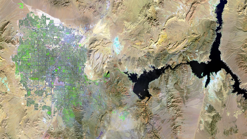
For this study, I chose one of the areas identified as a wildfire hot zone. After some research, the location is around Lac La Valliere near Mistissini, Quebec. In the area southwest of the lake, there is a wildfire that started around June 1, 2023.

Software
Internet browser with access to www.arcgis.com
Data
A multidimensional tiled imagery layer has been created from the output of Part 1. That imagery layer has all three of the input Landsat images contained in a single imagery layer that can be animated to show the wildfire as it happens. This imagery layer has been hosted in ArcGIS Image for ArcGIS Online.
Lac La Valliere multidimensional imagery layer
This multidimensional image show before, during, and after the wildfire strikes the location and can start to tell the story of the damage done to that particular area. Now that you have reviewed the input imagery, you will begin visualizing wildfire damage.
Map
A webmap has been created multidimensional imagery layer will allow us to animate the study area and see the damage as it happens. Also included in the webmap are three individual tiled imagery layers that will be used in the next blog for raster analysis.
1. Sign into ArcGIS Online and then open this web map.
Once the webmap opens, take a look at the layers that have been added to the map. There should be the following layers:
- Active Wildfires in Canada
- Lac La Valliere Wildfire 2023
2. Select the Lac La Valliere Wildfire 2023 layer to begin the review of the wildfire.
Once selected the Multidimensional controls will be enabled on the right side of the map.
3. Select the Multidimensional button. The Current display slice is indicated, and the dimension slider will be active and visible along the bottom of the map.

4. In the Time dimension section of the Multidimensional settings, click the drop-down for Display value to see the other time slices available. There should be three slices for three different dates (10 May 2023, 3 June 2023 & 11 June 2023). This multidimensional imagery layer includes all three of the landsat scenes.
5. Click the Play button on the dimension slider at the bottom of the map to animate the multidimensional layer to view all of the time slices.
There are three time slices and in the imagery, you can only see the smoke on the second slice. However, since this is a tiled imagery layer you can change the symbology of the imagery layer to better visualize what is happening. For this visualization, you will use the Agriculture band combination using the near infrared and short wave infrared raster bands.
6. Select the Style button on the right side of the map to change the style options.
7. Click the RGB – style options to modify the band combination.
8. In the Style options, change the RGB options with the drop-down menus for each color to the following:
- Red – ShortWaveInfrared_1
- Green – NearInfrared
- Blue – Blue
9. Click Done to close the Style options and click Done to close the Style.
The imagery layer will now display in the new band combination.

10. Open the Multidimensional settings and manually change the time slice to each slice. (You can also click and drag the current slice in the dimension slider.)
Notice how the burned area is more visually distinct and the smoke does not obscure much of the landscape. By changing the visible raster bands, you have removed some of the obscuring properties of the smoke.

Time series analysis is a great way to visualize what has happened and through remotely sensed satellite sensors there is a visual record of what has transpired. Multidimensional data is a great way to visualize what happened. Because the underlying imagery used to create this multidimensional imagery contains so many raster bands, the multidimensional data can be used in a variety of ways to visualize what happened to the area during the fire. Map Viewer now has multidimensional settings that can be used to symbolize this data for each time slice and consider the impact of the fire as it happened.
Ready to take the next step?
In Part 3, you were able to see some of the visualization possibilities for deriving new insights into the data with ArcGIS Online, but there is much more that can be found. Visualizing the fire with the Landsat imagery data in ArcGIS Online is just the first step to assessing the damage. I hope these steps helped guide you in creating a map that shows the impact of a specific fire in a time series.
Now that you have visualized the damage, the next step would be to quantify the damage. I encourage you to read the next blog in this series where you will use raster functions, raster function templates, and raster analysis tools to identify the fire damaged areas and quantify them for further study.
Go to Part 4: Host imagery layers


Article Discussion: