This fall the University of Richmond, The Science Museum of Virginia, and Esri worked together to produce a new story focused on the environmental legacy of redlining policies from the 1930s.
This collaboration was born out of new research by the Science Museum and the Digital Scholarship Lab examining the environmental disparities related to redlined neighborhoods. Researchers found the environmental factors like heat islands had a striking relationship to the Home Owners’ Loan Corporation (HOLC) grades. Our teams joined forces to elevate this under told story and explore this relationship further by performing geospatial analysis on environmental data layers in relation to these HOLC grades. These collaborations allow researchers and museum staff to have more capacity and raise awareness about the legacy of redlining today.

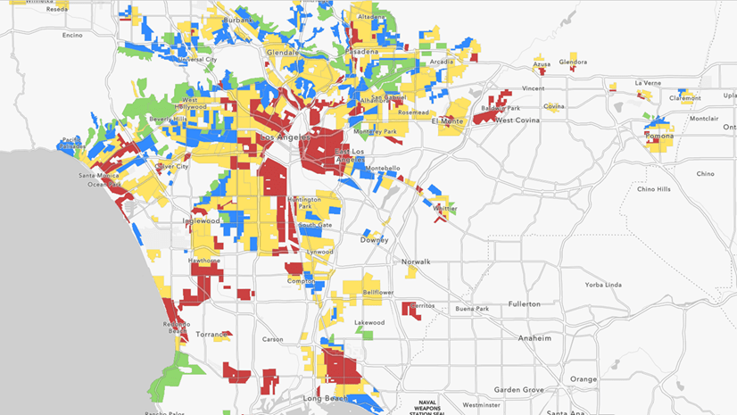
The lines that shape our cities explores how redlining policies from the 1930s and 40s have had an environmental legacy on cities today. The story identifies four cities that haven’t received major redlining coverage and performs novel GIS methods to see how environmental characteristics like tree coverage, impervious surfaces, topography, and heat islands relate to HOLC grades. The story profiles the research of the Digital Scholarship Lab at the University of Richmond and The Science Museum of Virginia.
As part of this Story Map we wanted to create a color-based metric for characterizing two different neighborhoods in Montgomery, Alabama. The following video from the Story Map summarizes the results of our analysis and in this blog we’ll explain in detail our methodology.
Units of Analysis for RGB Imagery
One of the first challenges in exploring the palettes of each neighborhood was to determine the appropriate unit of spatial analysis. While the original HOLC grade polygons were logical containers, they didn’t provide us with a way to look at the range or variation in tones within each neighborhood. To remedy this, we used a more granular regular tessellated grid. We decided on a resolution that was approximately twice the size of a standard city block (200m x 200m). Essentially, this created a low-resolution, very large pixel version of the source imagery.
Unfortunately, this tessellation approach introduced some problems with the unpredictable shape, size, and orientation of the HOLC neighborhood polygons. While exploring ways to get around the alignment issue, the answer was looking us in the face; why use a regular grid to approximate the size of a city block when we can use the physical barriers of the street network to generate actual city blocks. Individual blocks tend to be fairly homogeneous in their land use and vegetation cover in a city, so they made sense as the unit of analysis. This block-based analytical approach was then applied to several of the other cities in the story.

Extracting and Summarizing Imagery Bands
National Agricultural Imagery Program (NAIP) is “leaf on” Four Band imagery that covers the United States. The first 3 bands contain the Red, Green, and Blue values in the RGB color spectrum, which is what we used to calculate the mean values among the pixels inside each of our blocks. To do so, we first broke these three bands out individually, then ran our analysis in the following workflow:
1. Use the Raster Function Extract Bands to separate the NAIP imagery into Band 1 (Red), Band 2 (Green), and Band 3 (Blue) rasters.

2. Clip out street lines within the HOLC boundaries, then merge these with the line version of each HOLC.
3. Create polygons (Feature to Polygon) from these lines to generate polygon blocks and add a UniqueID.
4. Run Zonal Statistics as Table using the Mean statistics type for the Red, Green, and Blue single-band rasters, within each UniqueID block zone.
5. Join each of the mean RGB values back to the polygon blocks and populate three new average color value fields: Red, Green, and Blue.
6. Add an additional text field to store the list of 3 average RGB values to use as a polygon color fill, using the format: “rgb(R, G, B)”
7. Add and calculate a new field for Brightness, which is just the mean (of the mean) of the R, G, and B bands for each block. This will be used in a legend to order the range of blocks in each id according to their relative brightness.
8. Run Identity on the polygon blocks against the original HOLC polygons to re-attach the HOLC grades (A, B, C, D) and individual holc_id values (A1, A2, B8, D4, etc.)
With an RGB attribute value associated with each block polygon, we are ready to symbolize them.
Symbology Using Mean RGB Color Values
The attribute containing the average RGB color values for each block can be read directly in ArcGIS Pro and used to color each block polygon’s fill:
1. Select a Single Symbol for the block polygons.
2. In the Vary Symbology by Attribute tab of the Symbology pane, enable Allow symbol property connections.

3. In the Primary Symbology tab, click on the database icon for the polygon fill, then select the attribute containing the rgb(R,G,B) string value, and click Apply.

Summarizing the colors of blocks in a neighborhood is an interesting way to “fingerprint” the range of colors seen in the imagery – and their variation. As we saw in Montgomery, there is a stark contrast between the lush, dark greens of “A” rated neighborhoods compared to the light greys and browns of “D” rated neighborhoods.

As a final, easy-to-read summary of the color palettes of each HOLC neighborhood, we sorted the RGB values for our “A” and “D” study areas by their brightness, from low to high, to create a custom-made semi-continuous color ramp, inspired in part by the color analysis in the New York Times’ article The True Colors of America’s Political Spectrum are Grey and Green.

Lidar Tree Height Analysis
Colorizing the Lidar
Lidar has become more readily available nationwide through the USGS 3D Elevation Program (3DEP) and is a great data source to extract and model 3D features – including bare-earth terrain models, buildings, trees, or even power lines. For these reasons, Lidar was a great candidate to better understand the differences between tree cover in Montgomery’s HOLC neighborhoods.
The first goal was to create some “drone-like” flyover animations, to juxtapose the presence of trees in different HOLC grades at a bird’s-eye view. To do this, we used the RGB information present in the point cloud to render the 3D points so they appeared as a continuous surface. But what if you don’t have RGB information in your Lidar? Don’t despair! Take a short trip to this Esri blog post to learn how to colorize and transform your drab, colorless Lidar using NAIP imagery in ArcGIS Pro – from a city to an entire state. It’s an easy way to create a “3D basemap” to add real-world context to your projects.
 and by RGB value from leaf-on NAIP imagery (right).")
Classifying Trees
While Montgomery’s Lidar was already classified for vegetation, all is not lost if yours is unclassified and you want to extract vegetation information. In an exciting recent development, the 3D Basemap Solution has released a set of tools to classify tree points in a Lidar point cloud using deep learning. This brings a lot of new utility to existing Lidar datasets, particularly for high-resolution environmental analysis.
By filtering out just the vegetation returns, we created a digital surface model and hillshade from the Montgomery Lidar, as a quick visualization of the tree distribution in different HOLC neighborhoods. To dig a little deeper, we wanted to next look at specific tree heights and counts for each HOLC grade.
Extracting Tree Heights
To put a metric on average tree heights in the different HOLC grades, we used the 3D Basemap Solution to extract individual tree points from the Lidar. In this workflow, a normalized digital surface model was created, which represents the height of objects above the ground. From this surface, the solution uses hydrologic tools to detect “reverse sinks”, which represent the center (top) of each tree and includes individual tree height attributes. These points can then be visualized as realistic 3D models – or analyzed, as we showed by determining the average tree heights in grade “A” versus grade “D” HOLC neighborhoods.

While some individual neighborhoods had greater height differences, the averages across all HOLC grades in Montgomery shows a consistent relationship between HOLC neighborhood desirability and tree height. This is enforced by the neighborhood descriptions of the period, which often use words like “shady” or “wooded” for “A” grades. Almost 100 years after these neighborhood descriptions were written, these environmental disparities persist.

Sharing this Analysis
After processing the imagery and Lidar for this project and then reflecting on the results, we thought the best medium to communicate what we were seeing would be through an embedded video. We wanted to take viewers on a visual journey using Esri’s tools and the data resources that are publicly available to dive deeper into understanding how the vegetation of Montgomery created very specific color palettes that can be correlated back to the HOLC grades.
We began by storyboarding our scenes, writing the narrative, identifying the different transitions or fades and then to put it all together we moved into the video editing software Camtasia. We were mindful to keep with the same look and feel of the Story Map through maintaining the overall structure, similar graphics, and font. We also kept the video under 50 MB so that we could host the video within the story, no small feat with the Lidar addition!
We hope that this blog prompts you to not only read The lines that shape our cities, but that you also try this analysis in your own neighborhood or city because it extends so much further than this one application. What does your hometown look like? We hope you use this workflow to find out!
Continued Reading


Article Discussion: