Recently, I found myself in the company of two of my favourite cartographers John Nelson, and Daniel Huffman, and we got to talking about a shared passion – tiled, binned thematic maps. Binning data allows us to represent it as an aggregated summary which is often far more useful, and understandable as a visual summary. The techniques aren’t at all new, and you’re likely familiar with the most common approach – hex-binning. The Generate Tessellation tool in ArcGIS Pro supports most of the common shapes for binning such as squares, triangles, diamonds and various forms of hexagon including the (newly released at version 3.1) H3 variety as Margaret Crawford has recently discussed in this blog.
But tessellated shapes don’t begin and end with the basic geometric shapes. For instance, Daniel has made maps that use Penrose tiles such as this land cover map of the contiguous US.
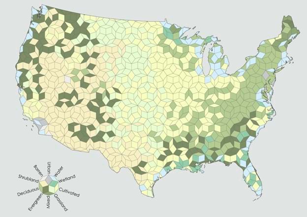
When identifying a cartographic use for this technique I particularly like Daniel’s take: “I can think of no proper cartographic use for Penrose binning, but it’s fun to look at, and so that’s good enough for me.”
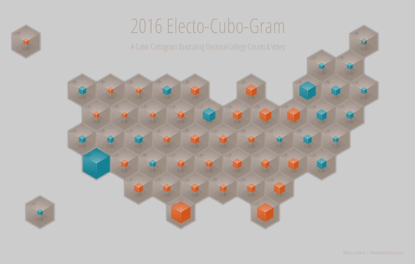
John is also a proponent of hex-binning and has made numerous maps in this style. But even the humble hexagon can be used merely as a structure, or scaffold, for more complex symbology such as his creation of an electo-cubo-gram to show election results (which I then turned into ballot boxes for an example in my Thematic Mapping book)
And in the same book on election mapping I developed a tessellated binned map based on the work of M. C. Escher, the Dutch artist renowned for his tessellated work. I used one of his basic shapes and turned them into mini Trump and Clinton figures that tessellated to illustrate election results based on who had won what and by how much.
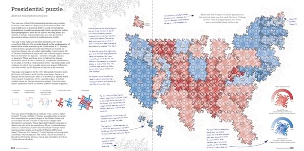
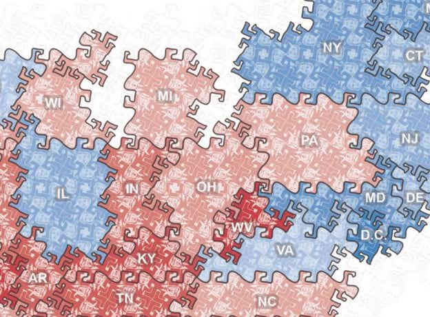
Anyway, I digress, but the point of this is that we each have history with this storied thematic mapping technique. But surely every shape has been found that can be used for tessellating space in a way that completely covers the surface of the map, leaving no gaps? Apparently, no…
The search for tessellating shapes is essentially a branch of mathematics that us cartographers find a convenient use for. Ordinarily we use nice regular shapes that create clear, organized and ordered surfaces for our maps. But a new shape has recently been developed, and this is what had piqued our interest, and conversation.
Most of our cartographic tessellations use what are called periodic monotiles – that is, when placed across a surface they generate a repeatable pattern. You can also find symmetry in these tilings. The counter is an aperiodic monotile where there is no repetition across a surface. Penrose tiling is a form of aperiodic tiling in this respect but it actually uses two different monotiles since you cannot tesselate space using only one of them.
The question of whether a single aperiodic monotile exists that can tesselate space has dumfounded mathematicians for decades but, recently, it appears to have been solved. Non-professional mathematician David Smith, along with academic researchers in the UK and US, believe they have discovered this elusive aperiodic monotile which they have dubbed ‘the hat’ and reported in a paper that describes their proofs.
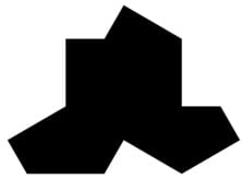
The tile has been described as the einstein tile, not after the famous mathematician and physicist, but because ein-stein translates to ‘one stone’ or ‘one-tile’ (in German). The tile is effectively a polykite that is itself constructed from eight individual kites – triangles that are one-half of an equilateral triangle. The polykite can be tessellated through geometry alone and creates order through disorder – a surface that appears as if it has some sense of order but which does not.
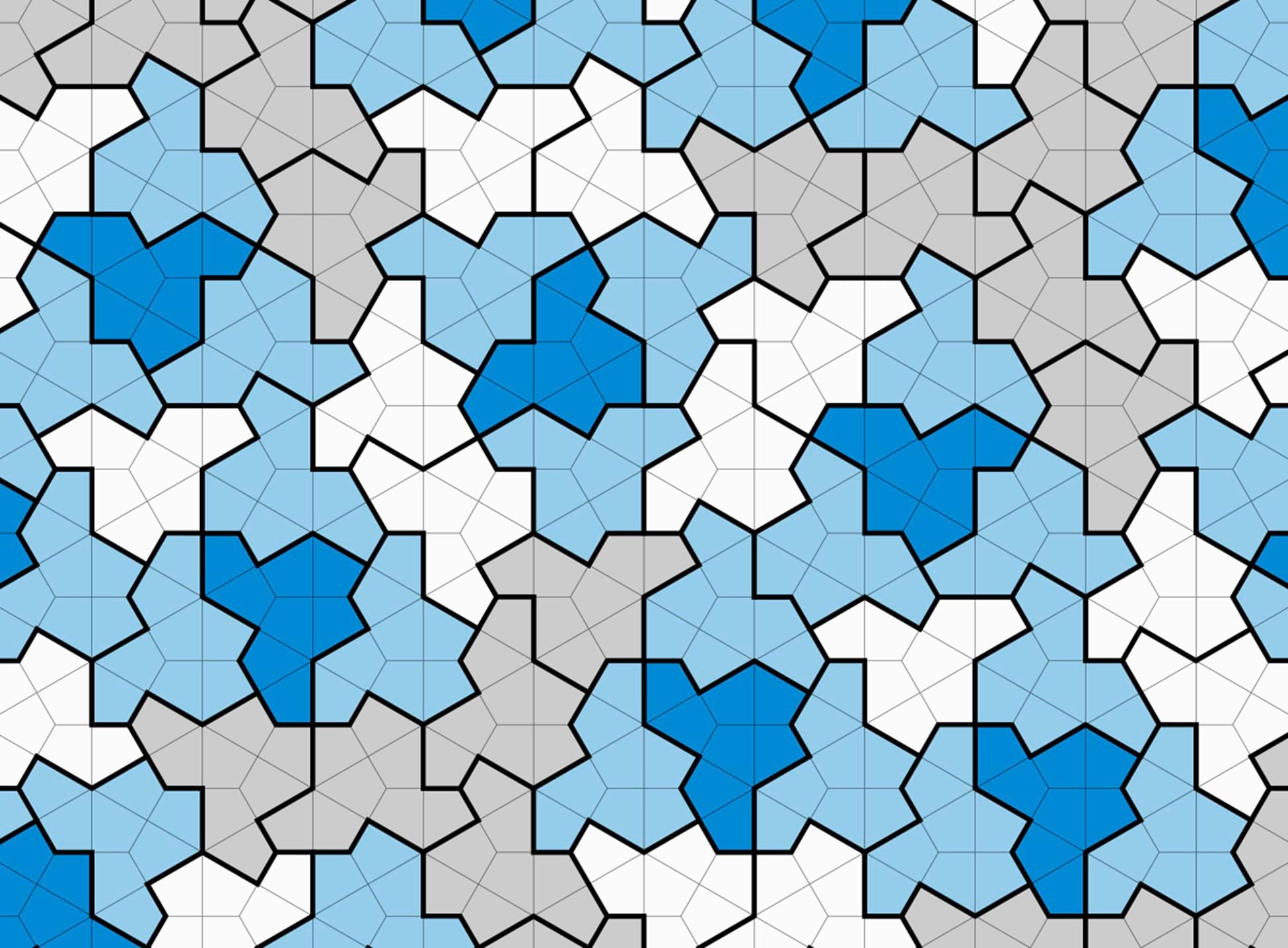
“Eureka! Eureka!” shouted Messrs Huffman, Nelson and Field because when there are new tiles there are new maps to be made. Except there’s no Einstein tile generator in ArcGIS Pro.
However, Smith and colleagues’ work is available under a Creative Commons license and they have helpfully developed an app that generates surfaces of Einstein tiles, including an svg output option. So I downloaded a large surface of nearly 140,000 individual tiles in their tessellated state, added them to ArcGIS Pro as a graphic, converted it to features and saved it as a shapefile. Wait …a shapefile? Yes, a shapefile. I wanted to be able to share the master set of tiles so others can use them in their own work, and for it to work across different projections I needed a way of sharing the file that contains no projection information. Using the shapefile format means I can use a simple hack, and omit the .prj component of the file. That means that whenever you add the shapefile to your map it will retain its geometry rather than being reprojected to whatever your map is using. Once added, you can, of course, use Define Projection to save a version in the projection of your map.
You can download the Einstein Tiles Master shapefile here. You’ll likely want to make a copy of the data, and then use that for your own mapping needs. Once added to your map you’re able to move, and scale the features using the edit tools to fit across the area which you want to eventually tile. You can also select tiles to delete to remove tiles you don’t need, or use tools such as Clip, or use a Spatial Join to select tiles that correspond to the geographical area you’re focussing on, and save the selection as a new dataset.
And then you are in a position to use the new tiles as a way to bin other data. It seemed obvious for this demonstration to honour Einstein’s theory of relativity (also known as his theory of gravity), so here is a simple map layer showing the Isostatic gravity anomaly for the contiguous U.S.
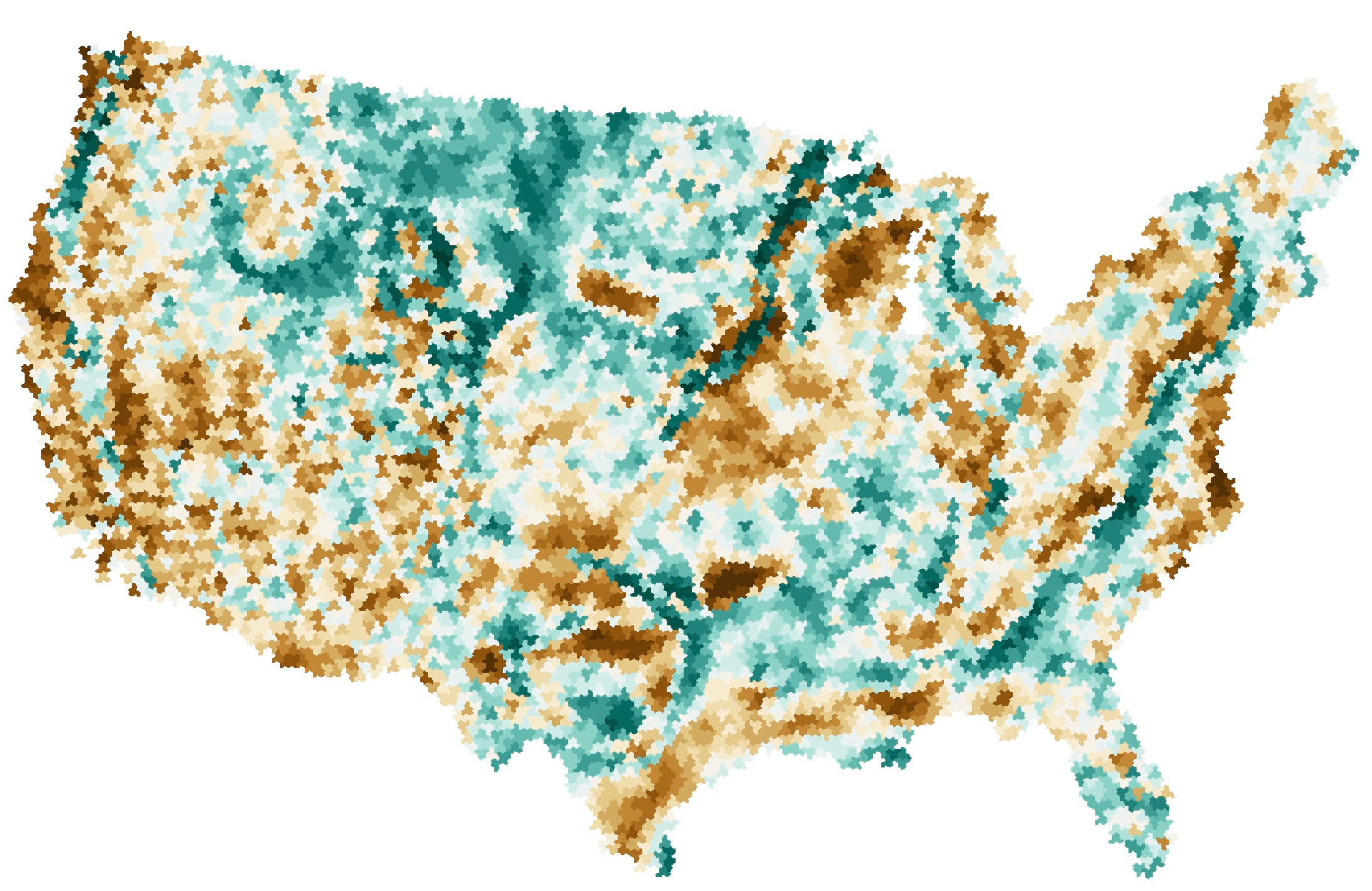
Gravity anomalies exist across the earth because it’s not a smooth surface relative to a perfect oblate spheroid. Because of rugged surface, landforms, non-uniform composition anomalies exist compared to a perfect reference shape. For the U.S. the minimum anomaly is measured as -225 milligals, and the maximum as 105 milligals. In the map below negative values are shown in brown (darker = increasingly negative), and positive values are shown in green. Values from the original raster dataset can be attributed to the tiles in a two-step process. First, use the Feature to Point tool to create a layer of the centroids of each tile. Then use Extract Values to Points to add the raster value to each point, before finally joining the polygon tile features to the point features and making the map.
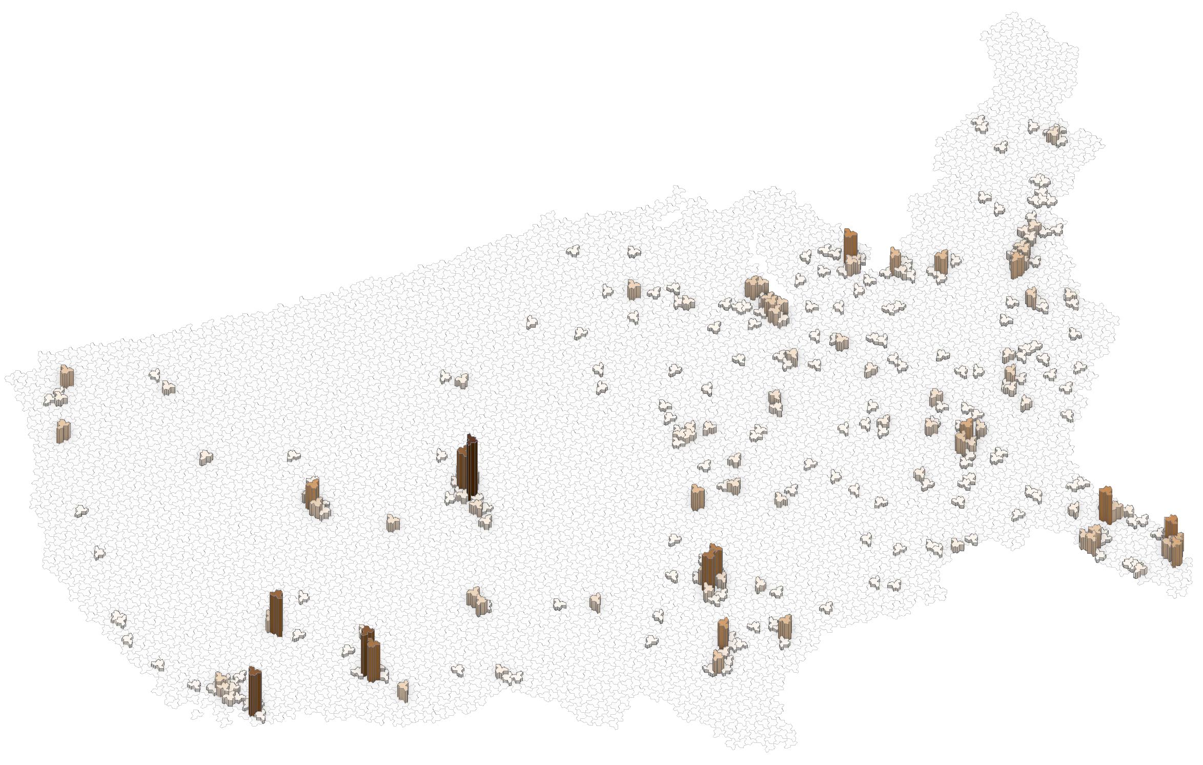
And if you had a coffee and bagel store chain with a relatively interesting name you might have a point dataset and want to see the tiled distribution. That’s a simple process using the Summarize Within tool to create a count of the number of points in each tile which can then be mapped, or even extruded in a local scene.
And here’s a map Daniel created that illustrates US terrain tiled using Einstein tiles with a subtle drop-shadow.
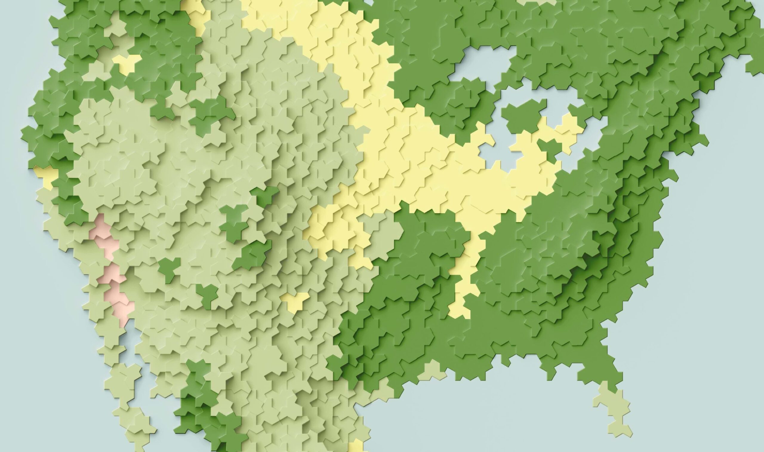
While going to the app and downloading your own svg file is one way to generate Einstein tiles for your mapping purposes we’ve already done that to get you started. Here is a downloadable shapefile.
And the point of all this? Just when you think there’s nothing new to make maps from, something appears that widens the palette of cartographic possibility. The discovery of the einstein tile gives us another shape we can make binned maps with. It’s doubtful it’ll replace the trusty hexagon but it’s different, and fun, and to paraphrase Daniel’s assertion “I can think of no proper cartographic use for einstein binning, but it’s fun to look at, and so that’s good enough for me.”
And just as we were about to post this blog the same authors have gone one better. The einstein tile requires the use of two versions, one of which is a mirror image of the tile shape. They’ve now discovered a shape that requires no mirroring which you can read about here, and which they call the spectre tile. So maybe use the same process as we’ve described here and go and make a set of the new spectre tiles for all your James Bond related binned maps!
Happy tiling!


Commenting is not enabled for this article.