This article was updated in January of 2020, for ArcGIS Pro 2.7.
The United Nations has defined 17 Sustainable Development Goals (SDGs) as a targeted plan for improving the health and prosperity of our world by 2030. These range from quality education to climate action.
The UN aggregates data provided by countries and shares it through an open data hub. This is a powerful resource for anyone who wants to take real action to meet these goals. This blog will walk you through using some of the data from this site in ArcGIS Pro to compare unemployment rates by gender and age.

This is a beginner-friendly tutorial, so if you haven’t opened Pro before, don’t feel daunted. If you get lost somewhere along the way you can download the finished project here. And if you’re already a pro in Pro, you still may be interested in learning about using multiple definition queries.
Find and explore unemployment data
1. Visit the UN Sustainable Development Goals Data Hub.
2. Scroll down and click the tile for 8: Decent work and economic growth.

3. In the Search bar, type unemployment, and in the search results, click the title for Indicator 8.5.2: Unemployment rate, by sex and age (percent).

Tip: If you were unable to locate the dataset, you can view its page here.
Each overarching goal consists of several targets, and the progress towards each target is measured with indicators. The SDG Hub shares indicator data at the country level.
Target 8.5 states: “By 2030, achieve full and productive employment and decent work for all women and men, including for young people and persons with disabilities, and equal pay for work of equal value.” A healthy economy provides work for everyone, but unfortunately, work is often not evenly available among populations.
4. On the right side of the web page, there is a Download button which offers multiple ways to download this dataset. But to use this data in ArcGIS Pro, you can take a shortcut. Under About, click View Metadata.

The ArcGIS Online item details page opens for a feature layer version of this dataset.
5. Click Open in ArcGIS Desktop, and Open in ArcGIS Pro.

6. Open the pitemx file that was downloaded to launch ArcGIS Pro.
Note: Depending on your browser, you may see a pop-up dialog. Choose the option to Open or Open with ArcGIS Pro.

The map shows a stack of concentric circles in the center of every country. This is because this dataset has multiple points for each nation.
7. In the Contents pane, right-click Indicator_8_5_2__Series_SL_TLF_UEM and choose Ungroup.
8. Right-click the layer and choose Attribute Table.
9. Find the Geographic Area Name field. Double-click it’s header to sort on this field.
You can see that each country has multiple records, for different combinations of age and gender.

10. Find the Latest Value field.

Latest Value lists unemployment rates as percentages for the most recent year of data available. It is the most useful field for symbolizing the data, since not all countries have data for all years. Unfortunately, some countries have no data at all. These rows have <Null> values, which appear as small grey circles on the map.
11. Close the attribute table.
12. In the Contents pane, right-click the Indicator layer and choose Symbology.
13. In the Symbology pane, you can see that Latest Value is already selected and determining the size of the proportional symbols on the map.

Here you can make those symbols smaller or larger as you want.
14. Change Maximum size to 90.

A wider range of symbol sizes will make it easier to see size differences on the map.
You can read more about this dataset, including how it defines unemployment in its metadata document. You can find information for all the SDG Indicators at the Metadata repository.
Compare unemployment by gender
Right now, this map looks neat, but is a bit too much to take in. You can see that the south of Europe has larger circles than the north, but there are just too many circles right now, and this makes the map hard to decipher. Next, you’ll filter the data to only show one category at a time.
1. In the Contents pane, double-click the Indicator layer to open its Layer Properties
2. Click Definition Query then click New definition query.
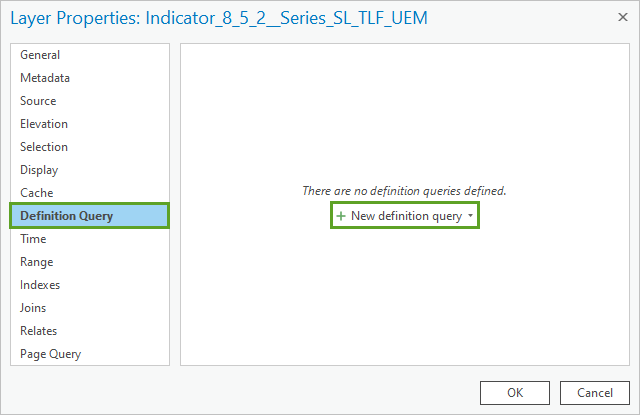
3. A definition query builder appears. Use the drop down menus to construct the following clause: Where Age Desc is equal to 15 years old and over.

4. Click Add Clause.
5. Construct the clause And Sex Desc is equal to Female.
This two-clause definition query will filter your data to only show the records for females aged 15 years or older.
6. Click Apply.

7. On the Layer Properties window, click OK.
Now your map only shows one circle on each country. The largest symbols are in Africa and the Middle East.

But what does this mean? Do these countries have high unemployment rates for men as well?
8. In the Contents pane, click Indicator_8_5_2__Series_SL_TLF_UEM and press F2 on the keyboard to make the name editable.
9. Rename the layer Female.
10. Right click Female and choose Copy.
11. Right-click Map and choose Paste.
12. Rename the top layer Male.

You now have 2 identical layers on your map. The symbology was also copied, which makes these two layers visually comparable: circles of the same size in both layers will represent the same value. Next, you’ll edit the definition query of the top layer so it is filtered to only show unemployment rates among men.
13. Open Layer Properties for the Male layer.
14. Next to Query 1, click Edit.

15. In the second clause, replace Female with Male.

16. Click Apply and OK.
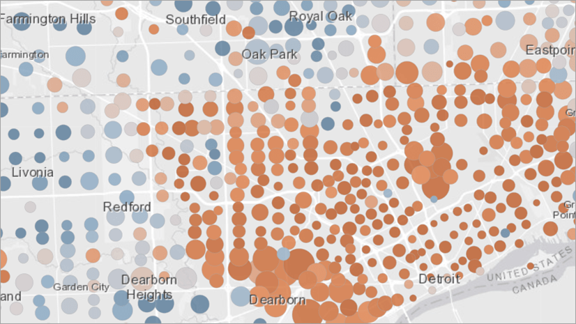
Now you can compare male and female unemployment rates.

This is a more useful map. Now you can better explore how unemployment varies by gender around the world.
But wait a minute – do the bigger circles represent women or men? Is the larger circle always for the same gender in every country? You can’t tell yet because both layers have the same color.
17. In the Contents pane, right-click one of the circles for the Female layer.
18. A color picker appears. Choose Solar Yellow.

The red circles are partially transparent. The yellow circles would match better if they were transparent too.
19. Right-click the circle again, and click Color Properties.
20. Change Transparency to 50%.

21. Click OK.
22. On the ribbon, on the Map tab, click Basemap and choose Dark Gray Canvas.
23. Finally, in the Contents pane, turn off Dark Gray Reference to get rid of the extra labels.
Now you have a map that really pops!

Take some time to explore this map. What patterns do you see? Where are the exceptions and outliers?
In some countries, the rate of unemployment is even between men and women. But it is clear that globally, women face far greater unemployment than men. The difference is especially pronounced in some countries, including Mauritania, Palestine, and Saudi Arabia. In a few countries, like the Baltic states, this pattern is flipped and more women are employed than men.
Compare unemployment by gender and age
There is more to be explored in this dataset. Next, you’ll use multiple definition queries to compare unemployment rates by both gender and age.
1. Download and unzip queries.zip, which contains four expression files.
Hint: Expression files store queries so you can save them for later use or share them with other people. You can save any definition query as an expression file by clicking the Save button.

2. Open Layer Properties for the yellow Female layer.
3. Click the arrow next to New definition query and choose Add definition queries from files.

4. Browse to and select the four expression files: Men.exp, Women.exp, Young Men.exp, and Young Women.exp.
5. Click OK.

6. Once they’ve been loaded, press OK on the Layer Properties window.
7. Load the same queries onto the red Male layer.
You now have 5 queries associated with each layer. The map hasn’t changed yet, because you haven’t changed the active query. All of those extra queries are just loaded up, waiting to be used. You can display them in different combinations to make different kinds of comparisons with your map.
8. In the Contents pane, select the yellow Female layer.
9. On the ribbon, click the Data tab. On the far left, open the Definition query menu.
10. Choose Young Women from this menu to change the active query.

This definition query filters the layer to only unemployment rates for females between the ages of 15 and 24. The expression reads age_desc = ’15 to 24 years old’ And sex_desc = ‘Female’
11. In the Contents pane, rename the yellow layer Young Women.
12. Use the same process to change the active definition query and the name of the red layer to Young Men.

13. Explore the map.
This map shows a different pattern than the previous one. Several countries, especially in northern Europe, have larger red circles than yellow, meaning that among youth, females are more likely to be employed than males.

Next, you’ll do the same comparison for an older age group.
14. In the Catalog pane, expand Maps..
15. Right-click Map and choose Copy.
16. Right-click Maps and choose Paste.
Now you have a duplicate of the map you’ve already created.

17. Double-click Map1 to open it.
18. Rename the maps Youth and Adults.
19. Click the tab of the Adults map to make it the active map.

20. Change the definition queries and layer names of this map so that the bottom layer represents Women and the top layer represents Men.
This map compares unemployment rates between men and women who are 25 years and older. It would be really nice if you could look at this map and the youth map at the same time.
21. Right-click either of the tabs at the top of the map view and choose New Vertical Tab Group.

Now you can view both maps side by side.

22. On the ribbon, on the View tab, click the bottom part of the Link Views button and select Center and Scale.

Now, when you zoom and pan on one map, the other map will follow.
Finally, you can change the colors to make it easier to remember which map is which.
23. Select the Youth map.
24. In the Contents pane, find the Young Women layer.
25. Change the color of this layer to Apatite Blue with 50% transparency.

Now – explore your maps.
Everywhere, youth face greater unemployment than adults. This may be reasonable, since young people are more likely to be in school than in the workforce. Search the map for anomalies.
North Africa has high unemployment rates generally. But the discrepancy between youth and adults is enormous. In 2017 the unemployment rate for young women in Algeria was 82%.

Not having access to jobs early in their careers can be a large hindrance to the economic wellbeing of these youth in the long term.
In many parts of the world, such as Central America, the gender gap for employment is greater for youth.

West Africa is a region with a particularly varied pattern of unemployment rates.

In Sierra Leone, young men are the most likely to be unemployed, and in Gambia, it’s young women. But these patterns are not indicative of the region generally. The causes of unemployment in Burkina Faso are clearly different from those in neighboring Togo. This map can’t tell you what those causes are. But it is an important starting point for asking the questions that will lead to more research and more maps.
For example:
- Are the youth in this country expected to work while studying, or wait until graduation?
- Are young women more employed than young men because they are less likely to be in school?
- How does the quality of employment differ between men and women? Do both genders have equal choice in the work they do? Do they receive equal pay for equal work?
- How is unemployment distributed between urban and rural populations?
- Does this country provide a social safety net to assist people during periods of unemployment? Or are people who might otherwise be recorded as unemployed instead engaging in inadequate forms of economic activity in order to survive?
You can construct more definition queries to make different comparisons across this dataset. For example, you might filter the data to a specific year, to avoid making comparisons between unemployment rates reported several years apart. You can also start to compile related data which can help you answer some of the questions above. For example:


Commenting is not enabled for this article.