Warren Davison is a GIS Analyst for the city of Waterloo, Ontario (and occasional guest blogger; see exhibits A, B, and C). Warren creates stunning maps and generously shares his demystifying process and re-usable resources with the mapping community. Recently, Warren undertook a cartographic challenge to re-create a Richard Edes Harrison classic, pushing the artistic capabilities of ArcGIS Pro to eyewatering extents.
Please enjoy, and find inspiration in, Warren’s guide to the (re)creation of this wonderful map…
…
Introduction
I was recently needing to scratch a cartographic itch and in need inspiration. Thankfully, this challenge was suggested and it gave me just the spark I needed (I really think more of these should exist!).
This map would be the first time I attempted to replicate a map in its entirety as opposed to ‘gently’ lifting aesthetic elements for the purposes of applying them to another map (ex. antique maps, vintage road atlas).
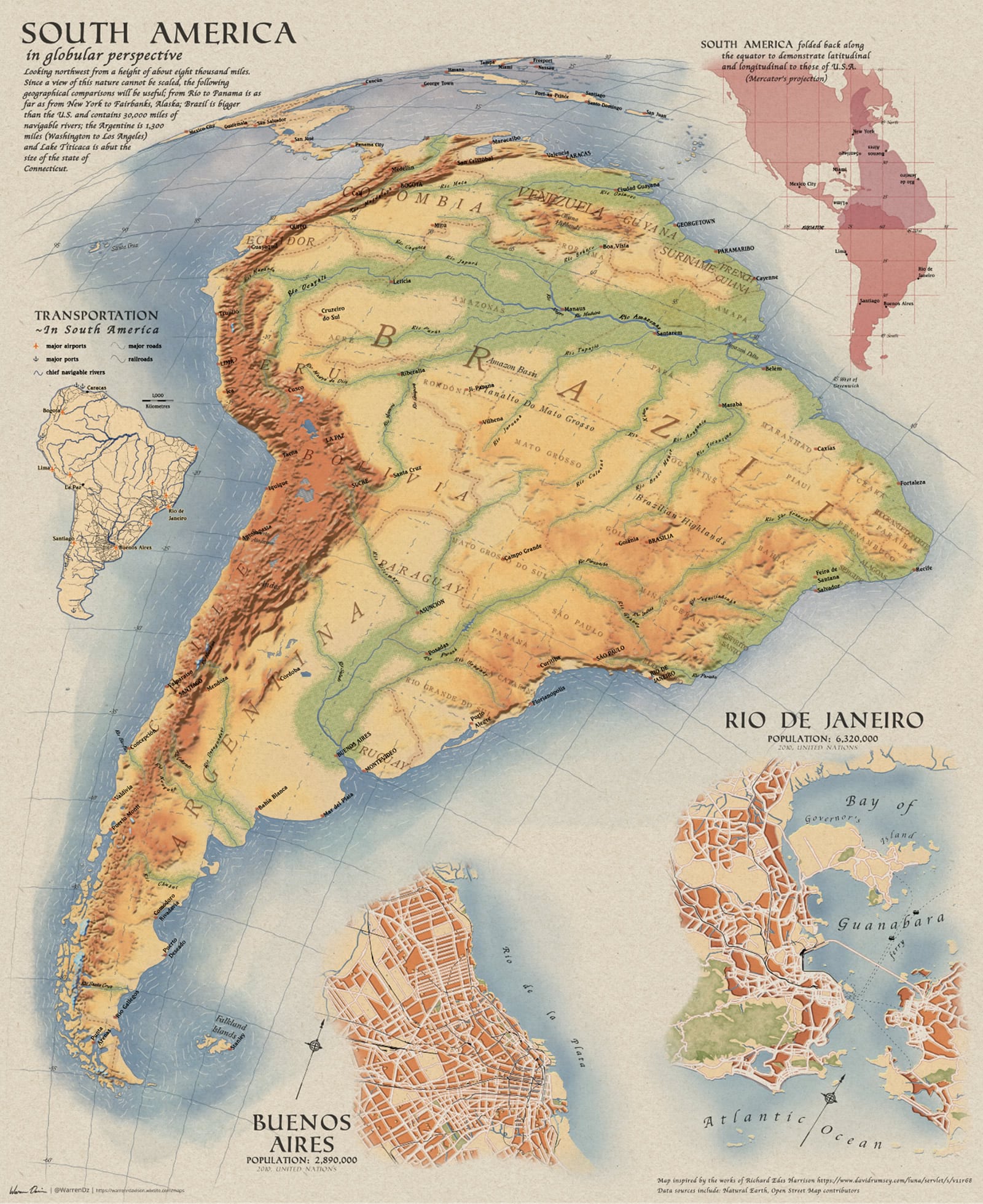
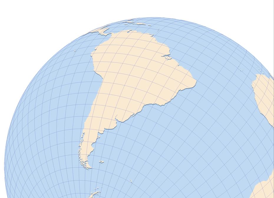
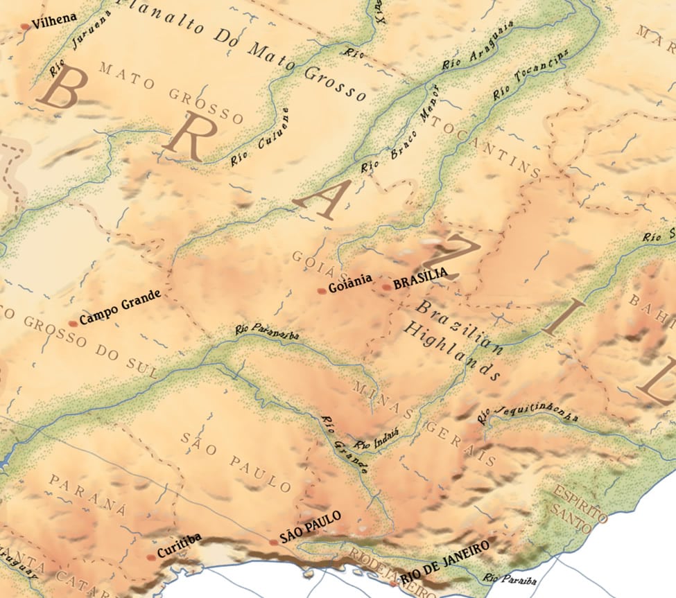
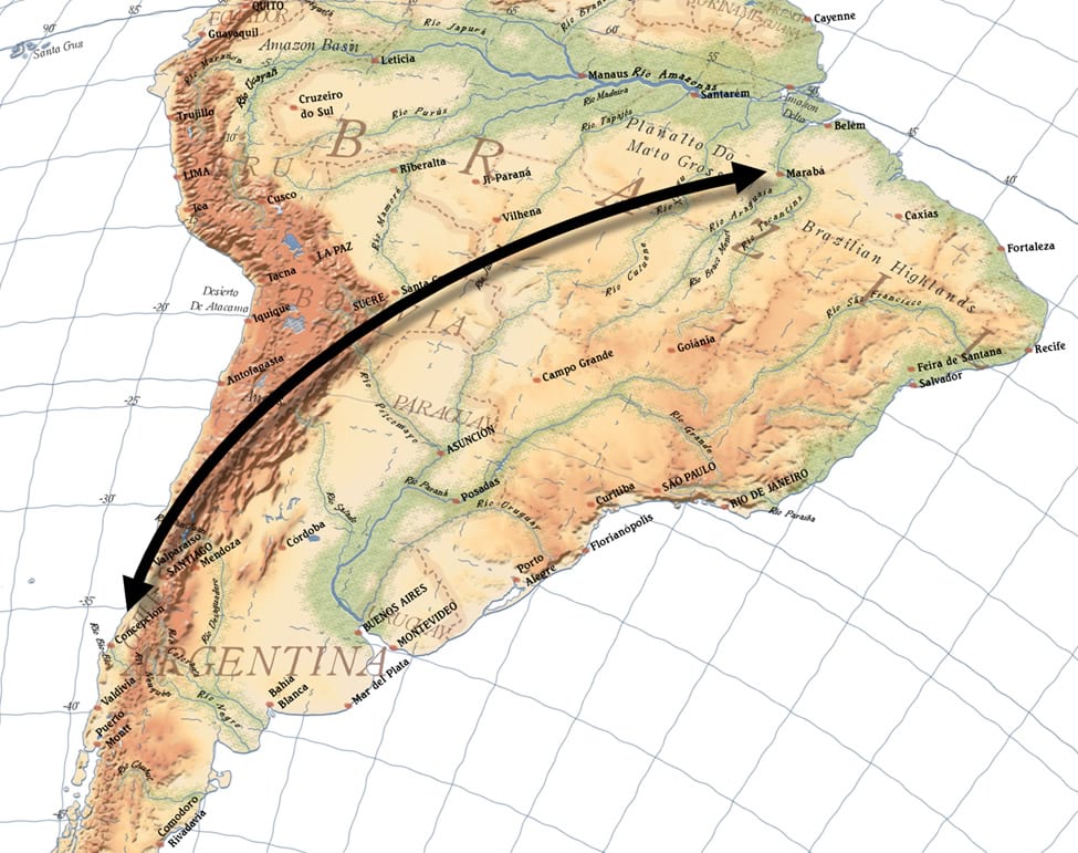
So here it goes, a breakdown of how I replicated Richard Edes Harrison’s ‘South America in a globular perspective’ (The original is always better than the reboot so snug up to the screen and feast your eyes on that map, this post isn’t going anywhere).
Composition
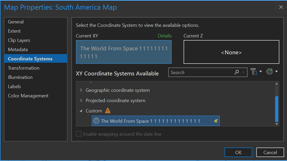
The first step to really selling this reboot is to get the perspective just right. Many of Harrison’s maps, as you’ll no doubt have noticed even after a cursory search of David Rumsey’s Map Collection, are orthographic views of the globe. I rarely have a need to use a projection of this nature but hot dog it really looks neat, and on more professional level, it serves to immerse the viewer in the expanse of the map content.
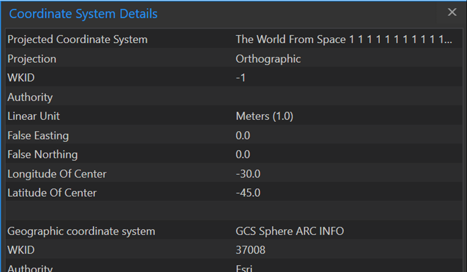
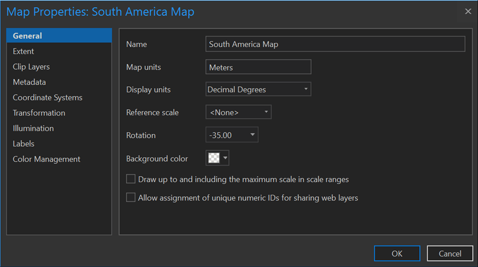
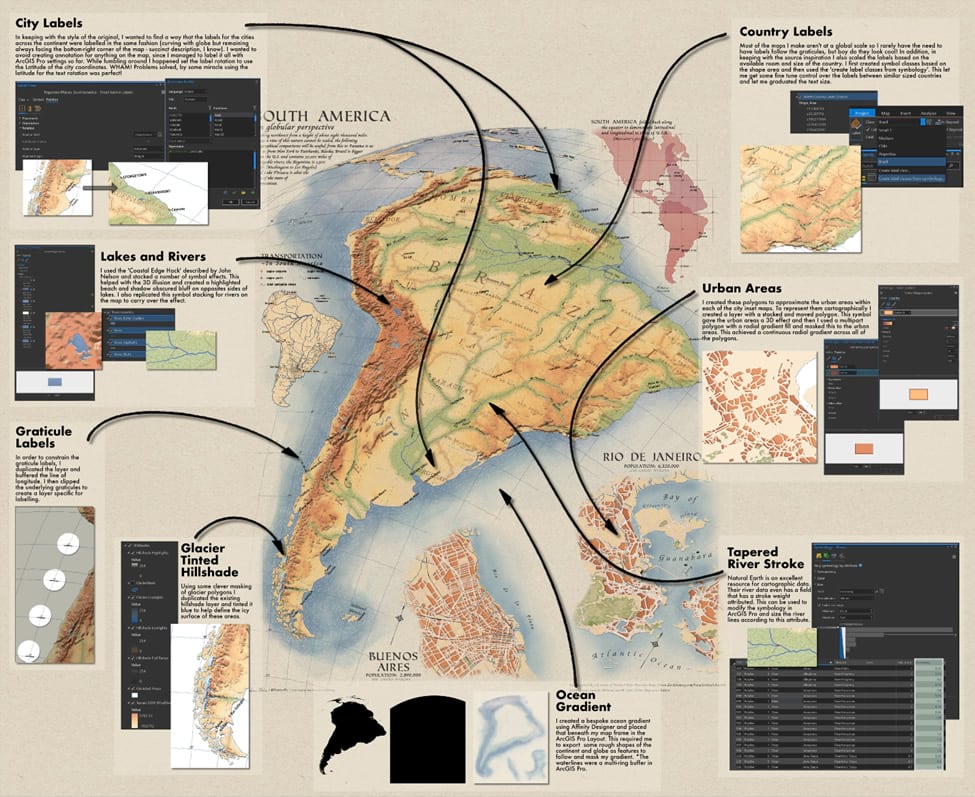
For this map I started with the World From Space projection and ‘expertly’ tuned the Longitude and Latitude of centre to -30 and -45 respectively (only took 13 expert attempts…). I then applied a rotation to the map frame of -35 degrees and I managed to get something close, Nailed It!
Adding Map Layers
Since the map is originally an illustration there was evidently some cartographic license used and it would be difficult to find any datasets that represented the original perfectly. Therefore, in creating my map I happily applied cartographic license atop cartographic license.
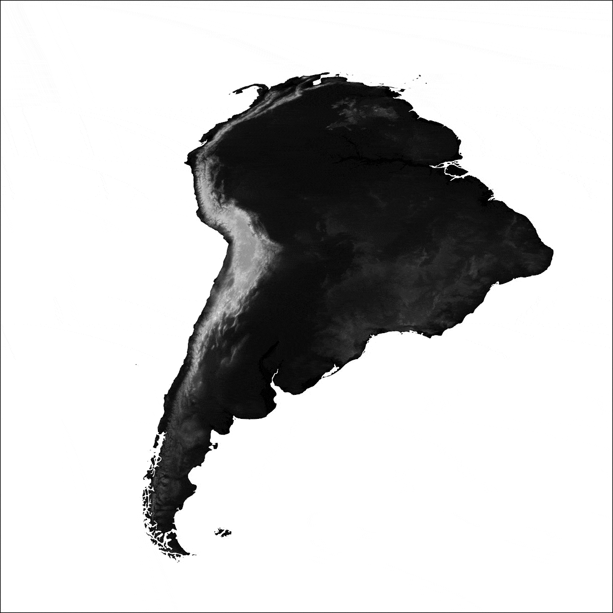
Topographic Relief
The elevation tinting washes beneath the entire map serves as the base layer, this is where I set my sights first. Extracting a South America-sized chunk for the Living Atlas Terrain layer gave me a starting point. From there, I smoothed it to taste using Focal Statistics and created a hillshade layer (Focal Statistics smoothing requires a Spatial Analyst license, but you can get the same results using the “convolution” tool in Raster Functions). I used that hillshade layer a several times to create highlights, shadows, and an overall colour ramp across various portion of the terrain. I also made use of masking controls to create a separate blue-tinted hillshade for glaciated areas (there aren’t many but it the little things that make the difference, right?). All of these hillshade layers are masked by an Ocean polygon and have some level of transparency applied in both the colour ramp itself and the layer as a whole, this helped the various shades blend together (this has to work until blend modes appear in Pro).
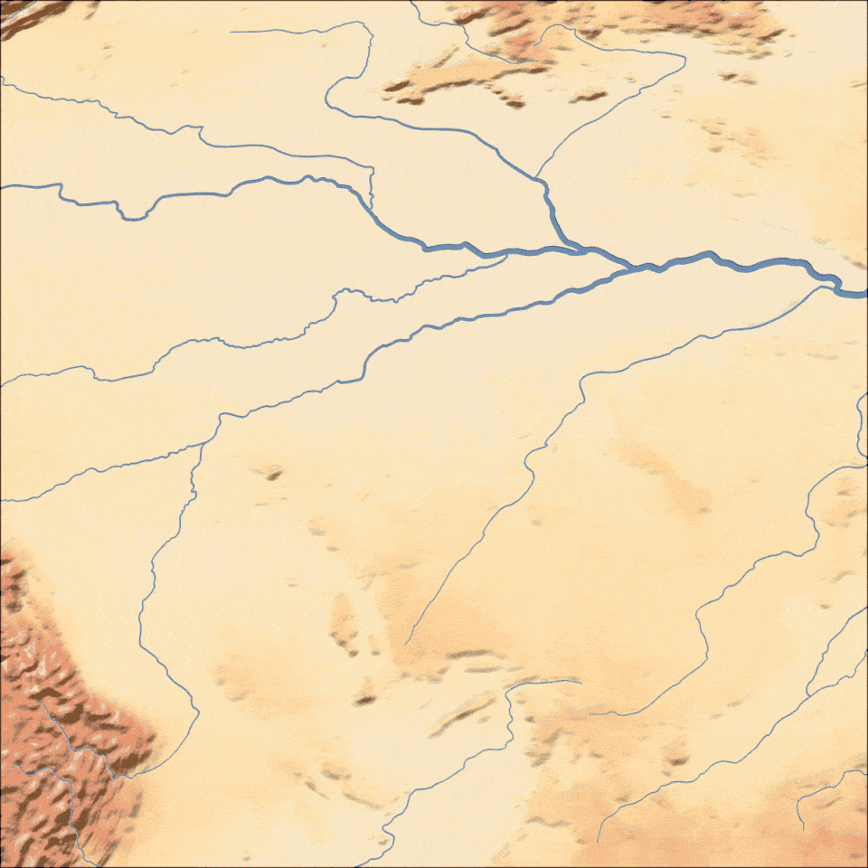
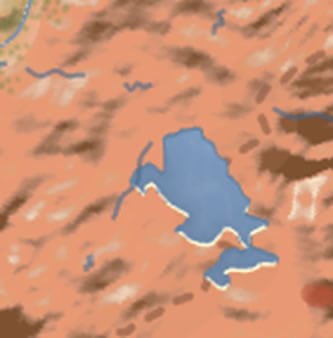
Rivers and Vegetated Landcover
Once satisfied with the base terrain the next most prominent feature of the map was the rivers. These features not only criss-crossed all over the map, but they also helped visualize the topography and largely defined what was labelled as the Amazon basin with the green foliage emanating from their banks.
This is when I rolled up my sleeves and prepared to wield some cartographic license of my own. Using visual cues from the original map, I took a few measurements from the river to the edge of the dense vegetation symbolized on the map to approximate the ‘green reach’ of the largest rivers.
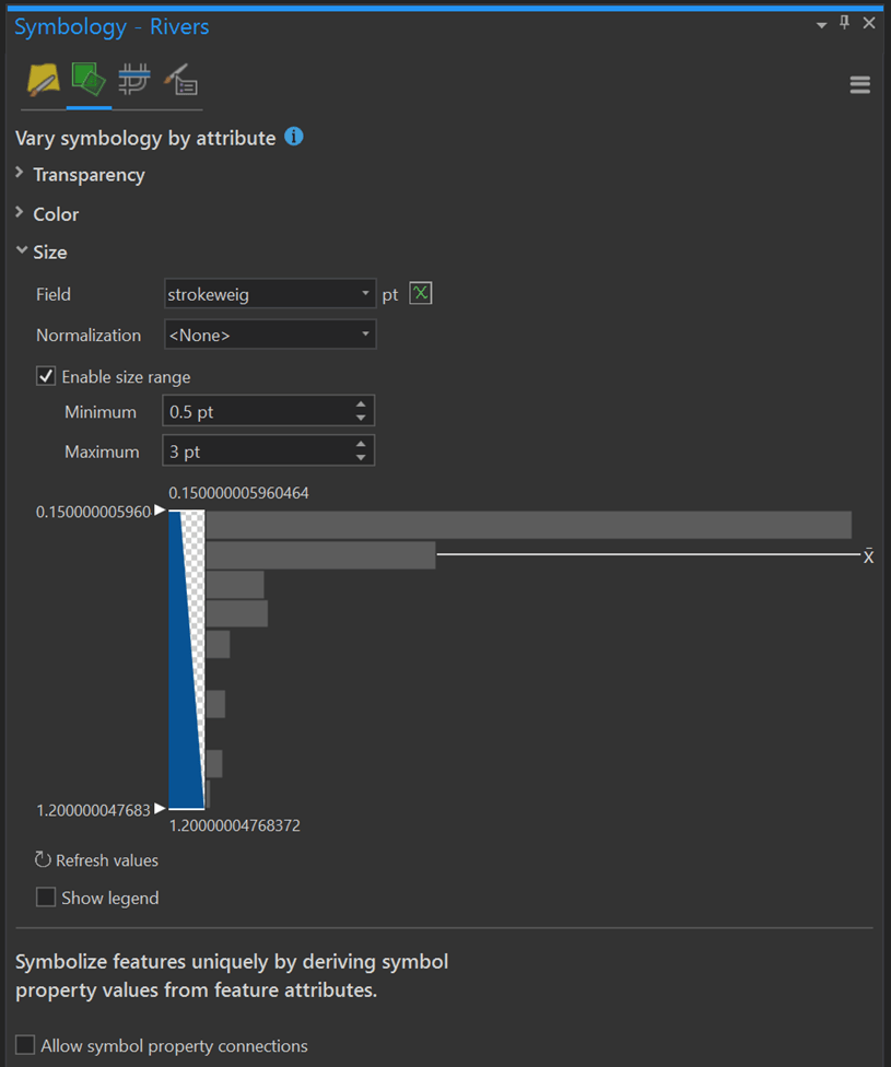
I scaled this ‘green reach’ distance using the value of the Stroke Weight field (super convienent value added attribute) of the river poly lines downloaded from NaturalEarth. I encoded this distance and I used it to buffer the features so upstream rivers had narrow green tendrils and the large downstream rivers had broad swathes of green surrounding them. With a little generalization and smoothing, these are always important steps, I had a polygon that was comparable to the original extents without too much trouble.
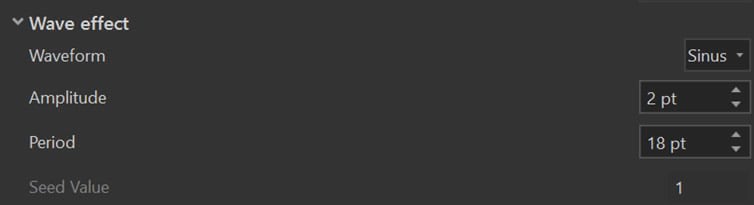
The actual symbol construction for this vegetation polygon consisted of a quick gradient fill (yellow to green) and a random marker fill consisting of a stipple stolen from a post about hand drawn maps that I didn’t read. As a cherry on top, I applied a Wave effect from the Symbol Effects to the polygon boundary. If you haven’t already, dig into and try using these effects! They can help achieve some really neat things and level up your symbol skills, I’m pretty certain that 75% of the layers in the project for this map use at least 2 or 3 of these effects (Wave was a common effect I used to take precise geometry and make it just sketchy enough to appear illustrated by a steady hand).
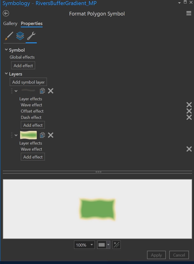
I leaned on the Stroke Weight attribute again to symbolize the rivers and used it to define the stroke width of the features in the symbol settings.
Simple as that! However, a keen eye will also pick out that the banks of the rivers have received an additional subtle treatment. The opposing banks have been defined with a highlight and shadow. Replicating these treatments improves the fidelity of our map and serves to pay homage to the eye-watering cartographic detail of the original.
Fortunately with a few clicks to duplicate the symbol and the application of some Symbol Effect to Move the stroke we can approximate this detail in a snap.
This methodology of stacking layers and applying symbol effects was applied to water bodies and you can get into all details here.
Labeling
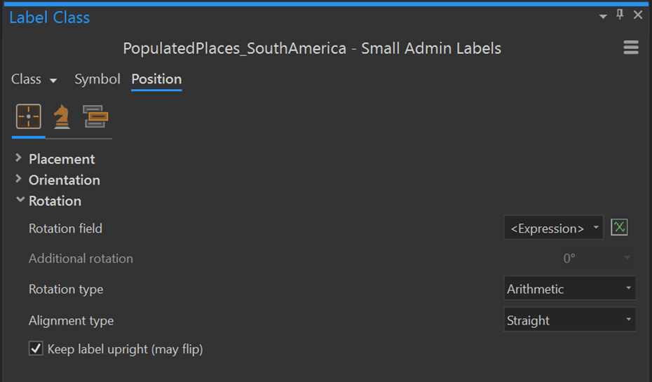
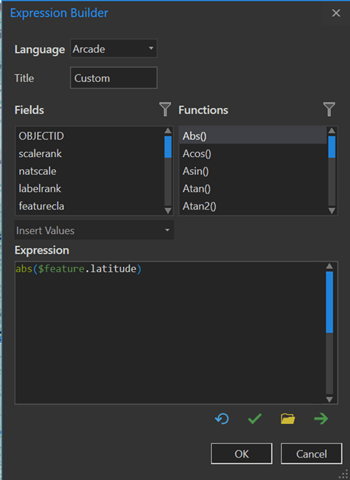
On a general note, I don’t often make maps in orthographic projection, but when I do I make sure my labels follow the graticules (something about it just looks great).
For the city labels, I was stumped for the longest time trying to find a convenient way to label these features that followed the alignment of the original, they appeared to rotate around a point off in the bottom-right of the map. Digging through the label rotation dialog, I plugged in the Latitude coordinate of the cities and by some miracle it was basically perfect! Phew that could’ve been a lot tougher!
Country labels were important has some of the most prominent text on the map. I used the area of the country polygons, again from NaturalEarth, to create symbol classes. Quickly creating label classes from this symbology I left the defaults in the dust and really stretched the font size and spacing to fill the polygons (c’mon default font sizes would’ve been a snore). Having the label classes parsed out by size, versus a wholesale class, meant I retained some fine tune control of various groups of labels should anything get out of control.
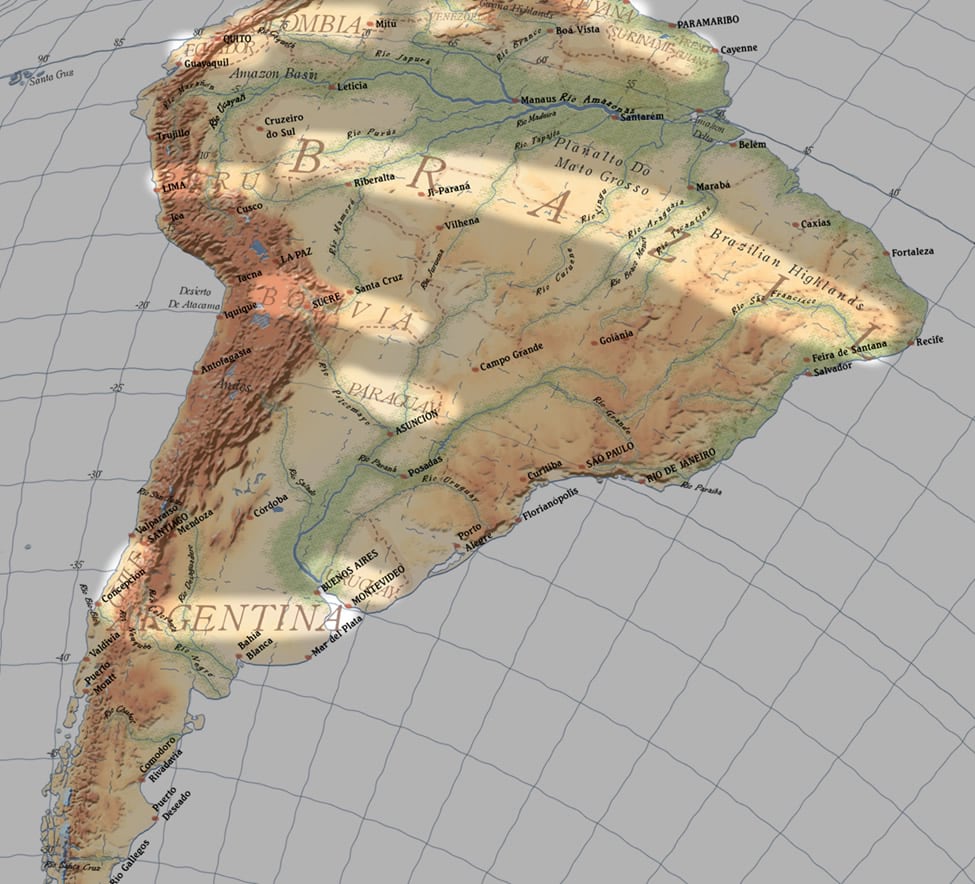
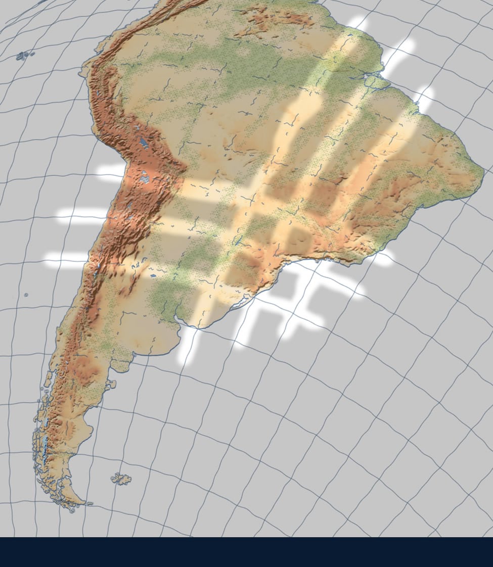
The graticule labels were a little bit of extra manipulation. With a lack of attributes at hand to dynamically definition query the graticules and only label specific segments, as per the original map, I had to do a little work. A quick selection of the grid lines that I wanted to label (the 75W and the Equator), a buffer of a few kilometres, and a clip of the grid lines beneath left me with stubs the perfect size for labels. This constrained where labels would appear and by hiding the symbol for this layer I could stick it over top the existing graticules and no one would be the wiser.
An extra clip separated the land bound graticules from those cast in the ocean allowed me to control their appearance and add some ‘dashiness’ to those over land subduing them slightly.
Layout and Final Touches
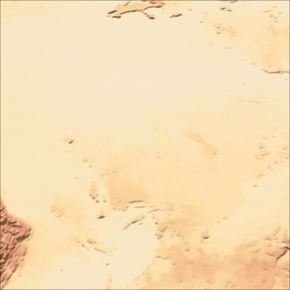
Arguably the final touches really pushed this map over the top. When assembling all of the components, I had created water lines around the coast and had them happily floating semi-transparently over an ocean gradient. They looked great with the combination of dash effects, wave effect, and transparency. But… my compulsion for perfection kicked in and I couldn’t leave it be. For one, the digital rendition of this gradient was far too smooth and I couldn’t figure out how to place and curve the delicate sun glint in just the right place.
I opted to create this gradient outside of ArcGIS Pro in my chosen designer software. I exported the land and ocean boundaries as images and used those as coastline reference. With some water colour brushes, some manual colour gradient, and some blur I created a custom ocean gradient background I
could tuck into my layout beneath all my map layers.
The aged patina was a last little touch for this map and gave it the extra kick in my opinion (also done outside of Pro). With an aged paper texture sitting beneath the map I place a second copy draped overtop with a Multiply blend mode. This ensured that the texture was applied consistently across the entire map and completed the look.
There you have it! That covers all of the major steps and/or methods I used to create the map. It was a really enjoyable exercise for me and a great excuse to stare at an impressive map and learn a few things about how it was created.
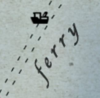
Oh, and don’t forget the ferry boat! C’mon those little details matter.
TLDR:
I recreated a classic map and learned a lot throughout the exercise. Here’s a quick synopsis of some of the tips and tricks I found.
Thank you! Warren


Commenting is not enabled for this article.