As a bit of fun research related to a challenge to make a map in the (achingly beautiful) aesthetic of Richard Edes Harrison, I found myself peering closely at his delicately beveled coastlines (and, as a direct result, peering into the void of my gaping sense of inadequacy) in a couple examples from the wonderful David Rumsey collection.
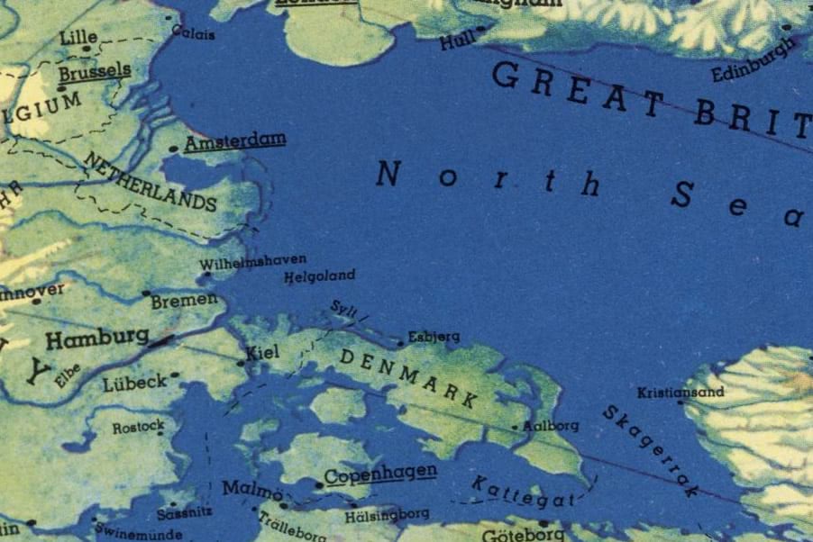
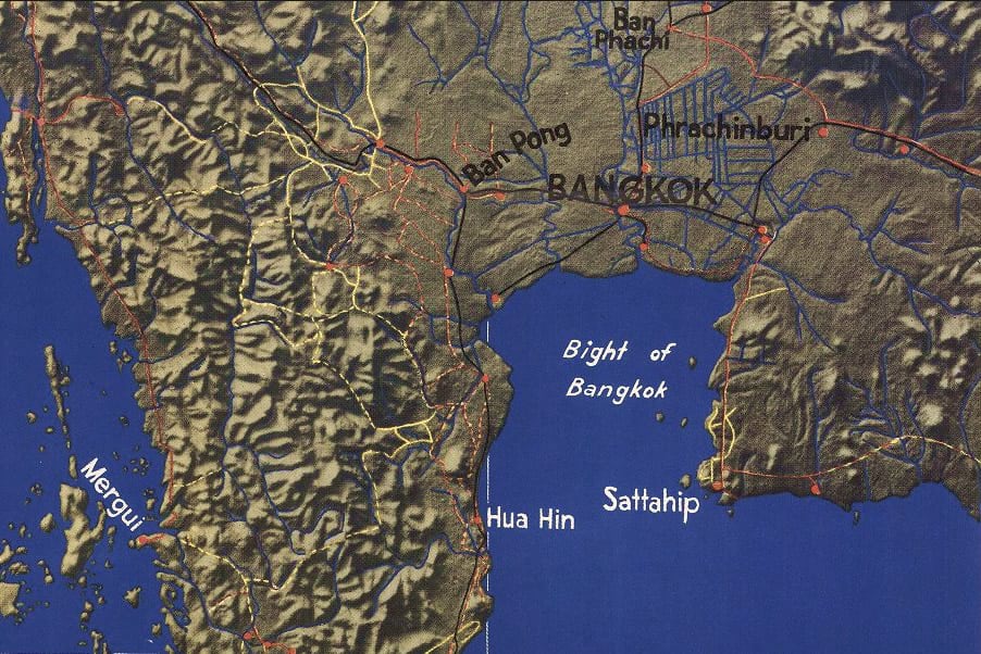
Richard used a subtle technique of a thin dark line along the shaded edge of his painted water bodies, and a lighter coastal band along the opposite shore. The result is an insanely effective bumping-up of perimeter coastal land. In addition to being just plain charming, it works with our visual/attention system because uses relative brightness, not just hue, to differentiate water from land.
We’ll take a look at how to achieve something like this technique in ArcGIS Pro. If your cartographic overlords wonder what sort of sorcery you are up to, just rationalize it as an improvement in cartographic representation meant to harness the visual acuity of brightness for surface water delineation. But we both know it also happens to be charming (which is more important but harder to defend). Roll up those sleeves.
What follows are four deviously simple and practical steps to achieve this beveled coastal effect with your water polygons. The result is like a little reverse illuminated contour around the water. Thereafter I’ll share five additional steps of immense impracticality. Do not head those steps.
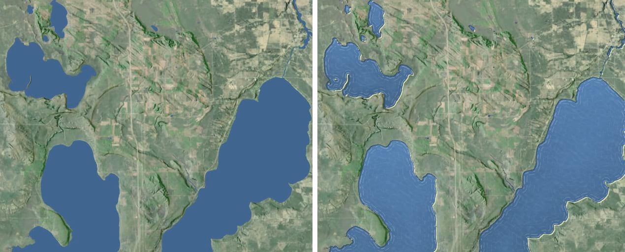
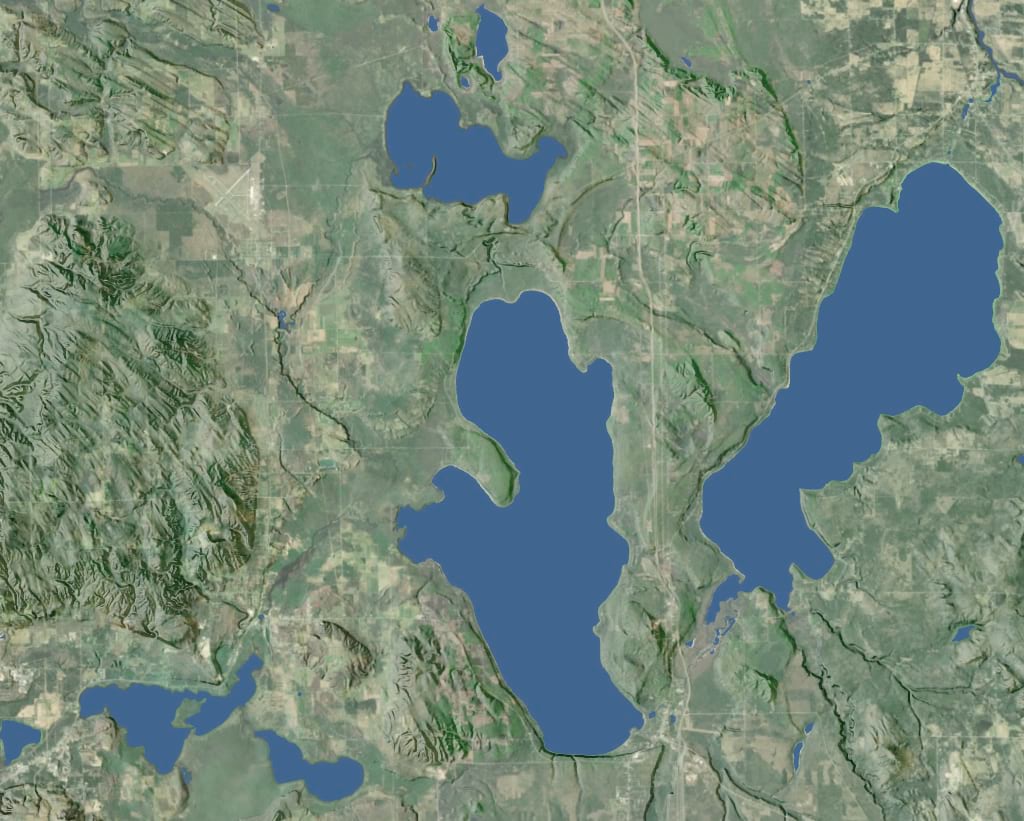
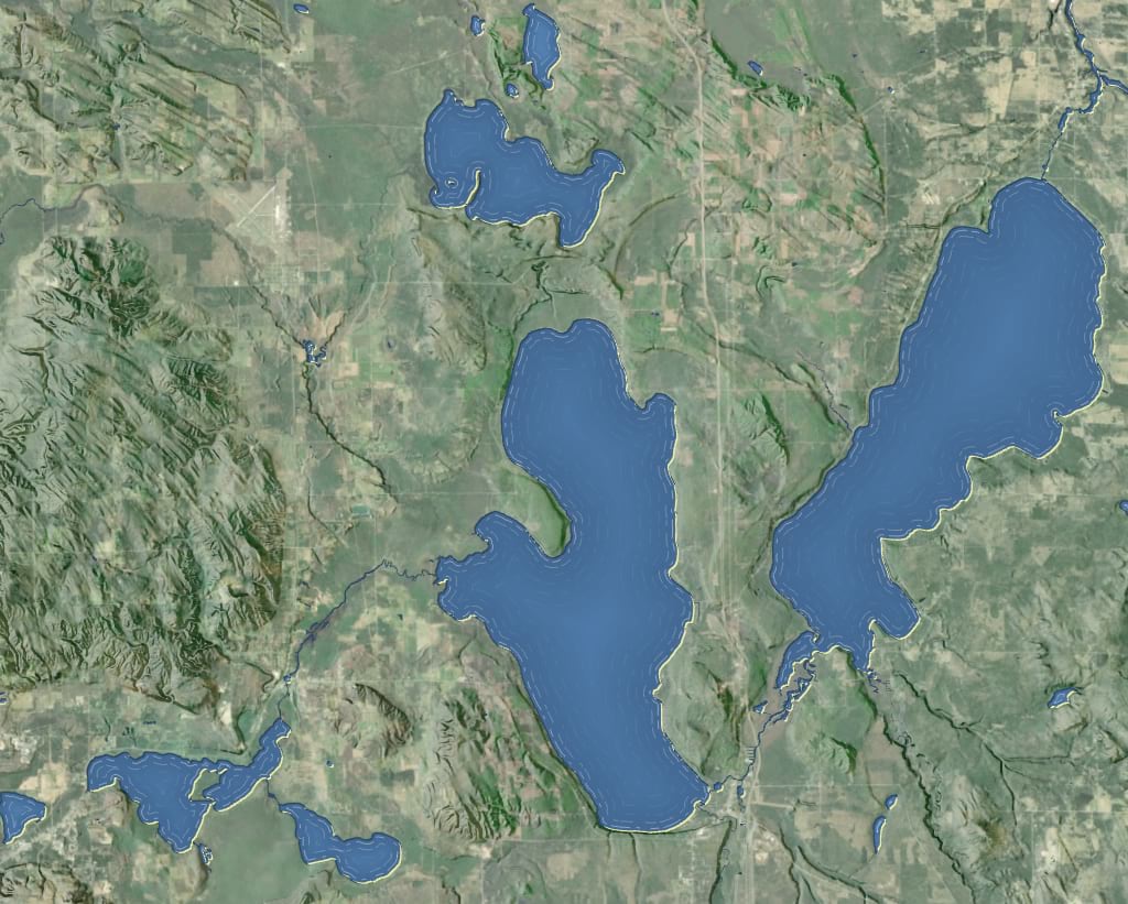
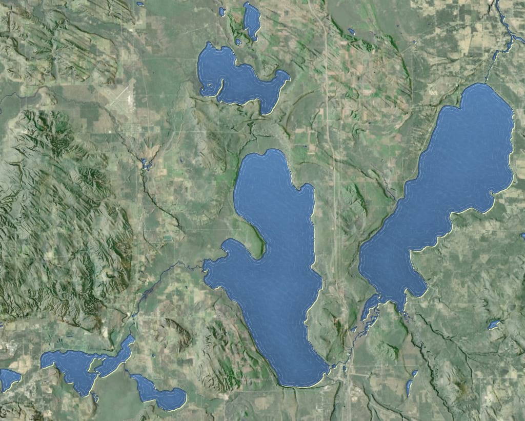
Firstly, we’ll start with some nice refreshing water polygons. I grabbed this handy set of inland lakes in the state of Michigan from their excellent open data portal. In the symbology panel (we’ll be spending a lot of time in the symbology panel) I’ve given the lakes a medium blue and no stroke (you can smite, not just uncheck, any symbol layer by going into the “structure” tab which is the little wrench).
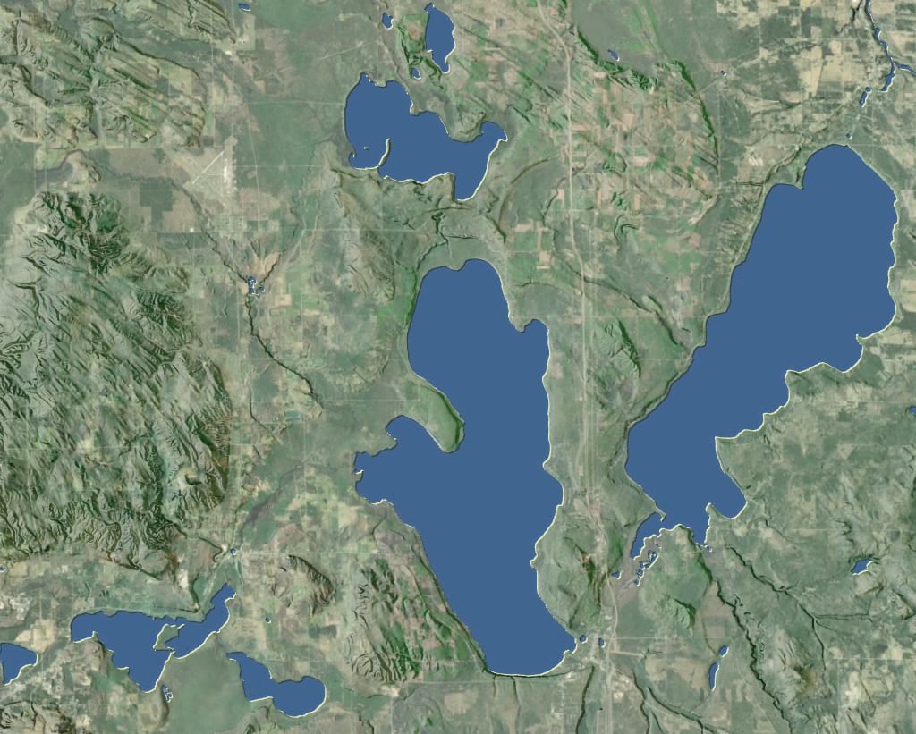
Looks about like you’d expect.

Let’s get this devious hack rolling. The gist of it is we are going to use a negative offset to constrict the lake polygons in one pixel. Then we’ll make copies of the lake polygons, re-color them, and nudge them one way then another to create coastal strips without spilling over onto land.
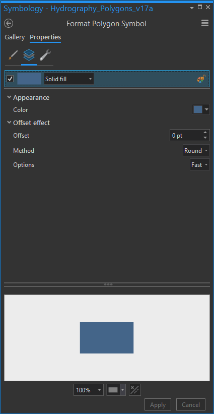
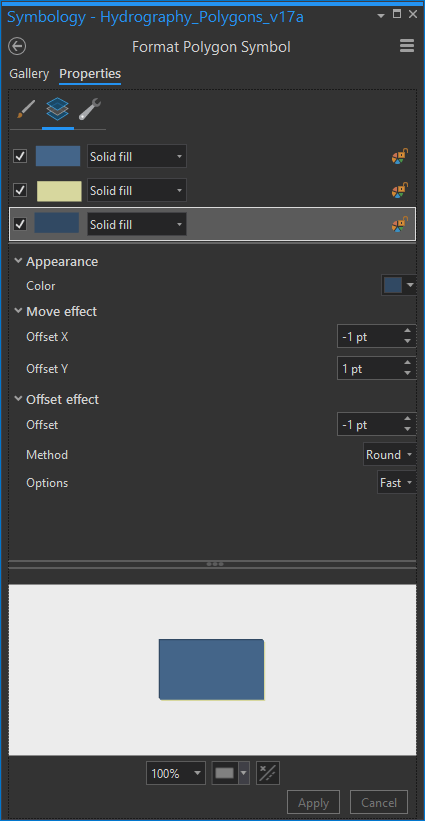
1. Negative Offset
See the little “offset” parameter there in the solid fill options? Give it a -1. This snugs it in a pixel in all directions.
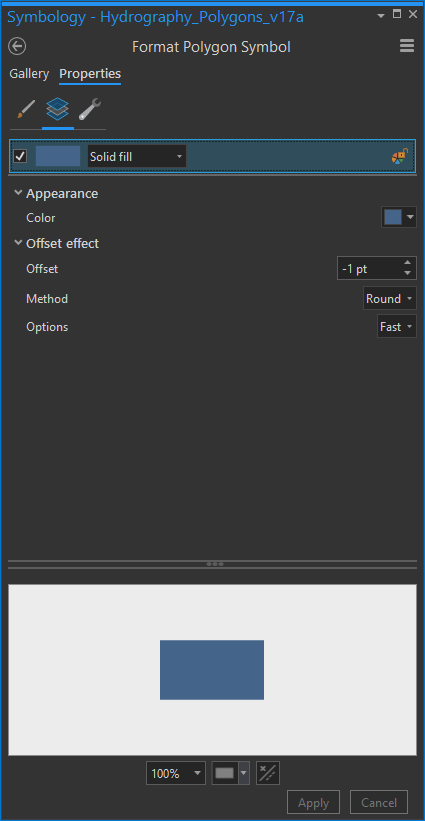
Mainly this is to get our water fill out of the way a bit so you can see the coastifying layers next.
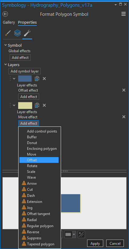
2. Nudge to Make a Beach
In the “structure” wrench tab, duplicate the water layer (little clipboard icon). On the bottom layer, remove the “offset” effect. Add a “move” effect and an “offset” effect. I know, you just removed the offset, but in this case order matters so make sure the “move” appears atop “offset”.
Back in the “layers” tab (little icon of stacked blue boxes), change the color to something sandy, or at least a lighter version of your water’s color. Move it down and to the right one pixel (x 1, y -1).
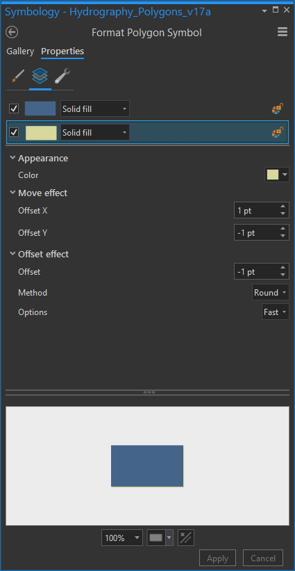
Look, you made a beach! And in so doing you have dramatically increased the value of all properties along it.

3. Nudge to Make a Bluff
Similar to the previous step, in the structure tab, duplicate the beach layer. Back in the layers tab, give this new layer a darker version of your water’s color. Move it up and to the left (x -1, y 1).
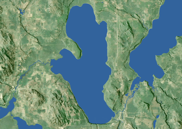
Sweet, you’ve created a bluff! The shaded side of the lakes have a little lip of shadow and the sunlit sides have a dazzling little strip of sand. Those lakes are so much more en-thing-ified now. Isn’t that great?
Oh no! in our hubris we’ve flown too close to the sun on our wings of wax and all the finer water features have been crushed into singularity-oblivion by the negative offset! We are surely doomed to fall into the sea and peri—oh no, wait, I have an idea.
4. Add Fine Water Layer
In the structure tab, duplicate the shadowy bluff layer you just made. Drag it to the bottom and delete the move and offset effects (or just set them to zero).
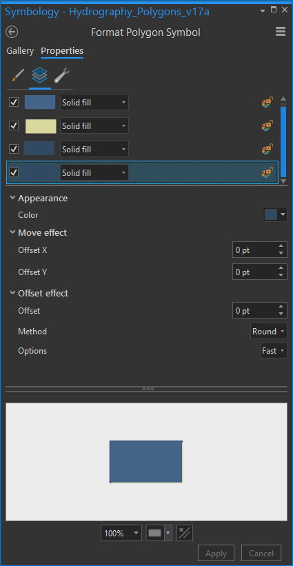
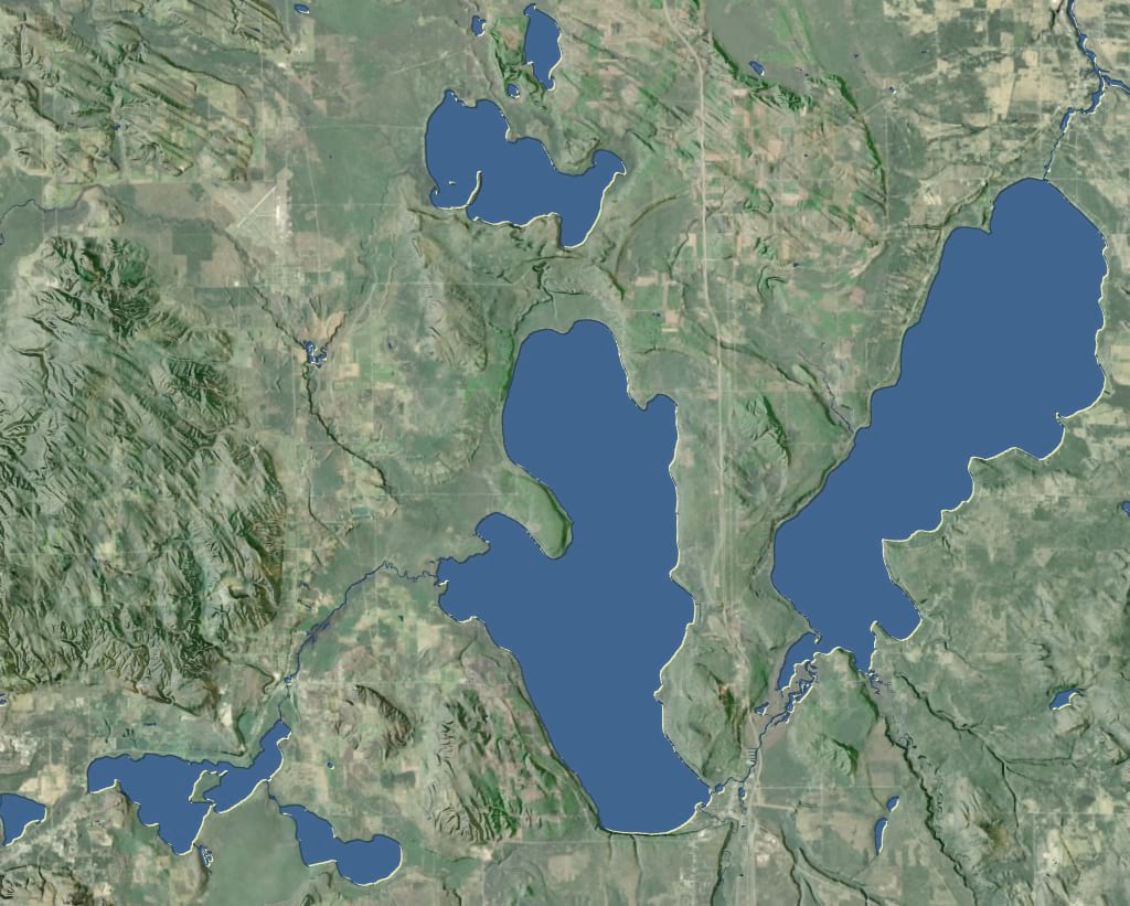
Oh good, all the little canals and waterways are back. This is a little safety layer that sits beneath the devious coastline hack and shows whatever fine water features that had been crushed away by the negative offset.
Ok, that’s it. It’s over. Go home. Go.
.
.
.
Are they gone? Ok, if you’re still here it means you are a mapper with the gumption to go the extra mile (or five). Sometimes going the extra mile means unapologetically stuffing all sorts of accoutrement into a symbology. Let’s get accoutrementing…
5. Waterlines
Yes, waterlines! They were cool in 1890 and they are cool today. Why is it that this technique went the way of handlebar mustaches and penny farthings? Well guess what, I’ve been to Portland, and they are not forgotten. So let’s make a splash.
In the symbology panel’s structure tab, add a stroke layer. Back in the layers tab, give this stroke a semi-transparent white (or shoot, whatever color suits you) color and make it thin. Then…drumroll…give it a negative offset of a few pixels. Make sure the “method” is set to round (which is much more forgiving) and the “option” is set to accurate. Then do this a bunch more times (shoot, I made like eight of them), each stroke layer getting a larger negative offset (here’s a tool I made to calculate the increasing offset distances if you are interested). Can’t hurt to make each ring a little more transparent, too. This is way better than monkeying with pre-generating multiple-ring buffers.
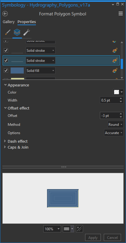
Goodness, that’s nice. Classic and classy.

6. Choppy Waterlines
What a placid body of water. Let’s whip up a bit of turbidity, shall we? Turn that business of waterlines and make it a party? Well guess what, that lake on the right is named Mullett Lake, so let’s rock this.
Check out the “dash effect” options. Choose a dash style, but then replace those numbers with a string of random numbers, each separated with a space (this is how you make a randomish dash effect; how many pixels on, how many pixels off). Give each stroke layer its own random set of numbers so you avoid illusion-busting patterns.
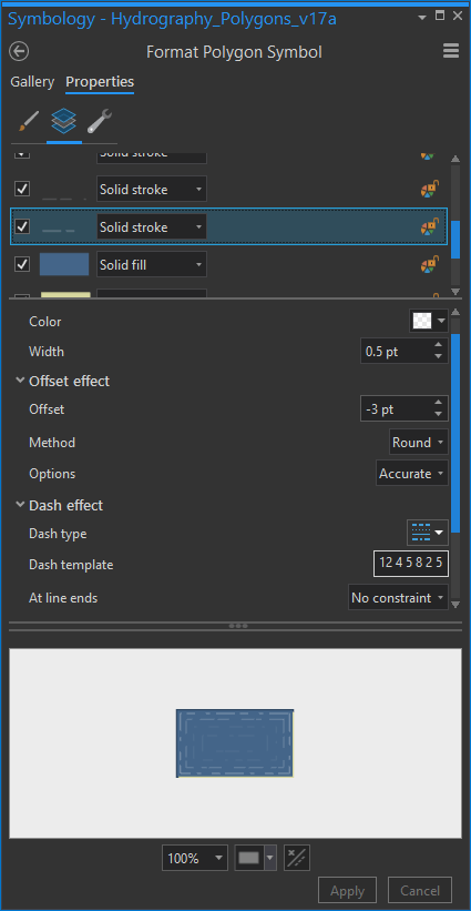
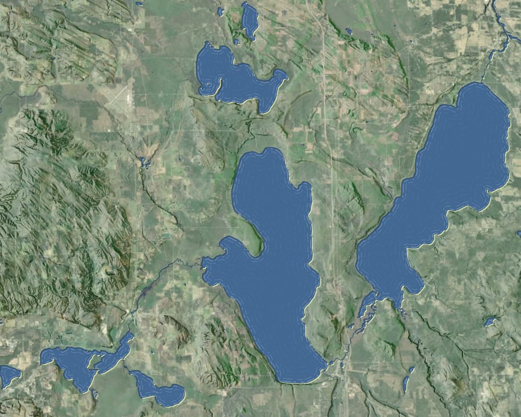
Heyyyyyyy, looks like there is some wind activity on these lakes. Batten down the hatches, these waterlines are more like wave lines. A nice little touch, and that what extra miles are all about.
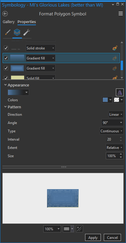
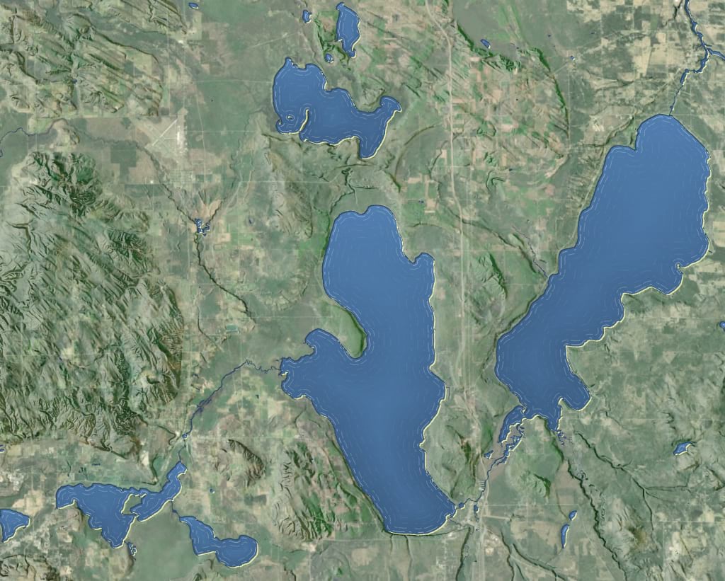
7. Buffer Gradient
Just look at that flat water, though. Let’s give them a boost with a faint coastal gradient. Instead of a “solid fill” choose “gradient fill”. Keep the water’s original color as the outer color, but give the inner color a little bit more lightness (click the color box, at the bottom of the palette there is a little button called “color properties…” –this is an awesome button). Play with flipping the light/dark order so see what looks best to you. For some reason I like the dimensionality that a dark coastal buffer gives the lakes, even though it’s the opposite in real life.
Higher “interval” values make a smoother gradient while lower values produce a more banded appearance. Up to you. And don’t forget to keep that -1 offset, so you don’t cover up the original coastal effect from the more practical early steps.
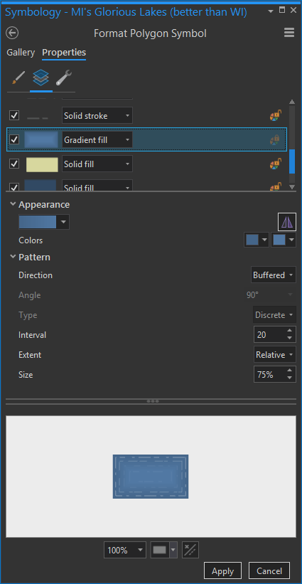
Ohhh, those are some tangible lakes. A nice touch.
8. Specular Gradient
Here’s a subtle hack that will certainly breathe a bit more reality into your water features. When I fly over big bodies of water, the reflective brightness of the surface is varied because of the constantly shifting angle between my eyes and the reflecting sun. You can get an echo of this effect with a little vertical gradient layer.
Duplicate the gradient layer. With the topmost gradient layer, choose “linear” instead of “buffered” and choose “continuous” (smooth) rather than “discrete” (banded). Keep the light water color as-is, but make the other color fully transparent (again, go into the “color properties” in the color’s dropdown). Give it a 100% size, and play with whatever angle gives you the most realism. Here’s what my menu looks like…
And here’s the subtle specular reflection effect you get…
9. Water Texture
Do not do this step. But if you do, use this image of water texture (right-click, save link as) I made. In the structure tab, add a new fill layer. In the layers tab, make this a “picture fill” rather than the default solid fill. Point to the image you just saved. It’s a mostly-transparent PNG with just the slightest waviness pattern. Set the quality and size to the same as mine.
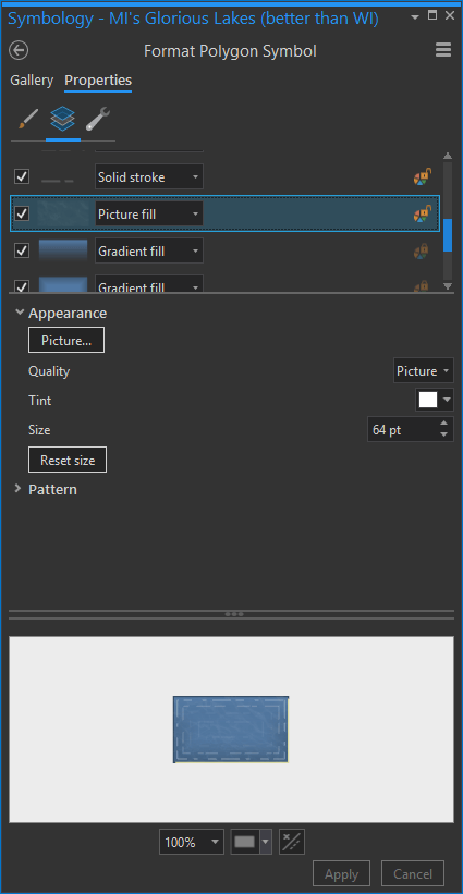
Check out that disturbingly-realistic-though-still-cartographic water.
And that’s it! Thanks for coming along on this watery adventure. I hope you’ve gained some confidence in what’s possible with symbol layers. Any number of these steps (offset coastline hack, waterlines, gradients) can be helpful on their own, and in any combination. It isn’t about getting cool looking water, though that’s nice. It’s about trying new stuff and getting confident with the thrill of playing with layered cartographic effects. There’s no end to the fun.
Would you like to…dive in…and just start using a pre-made style in ArcGIS Pro? OK! Here it is.
Splashy Mapping! John

Commenting is not enabled for this article.