…This is a guest post written by ArcGIS user and cartographic enabler, Warren Davison…
Inspiration
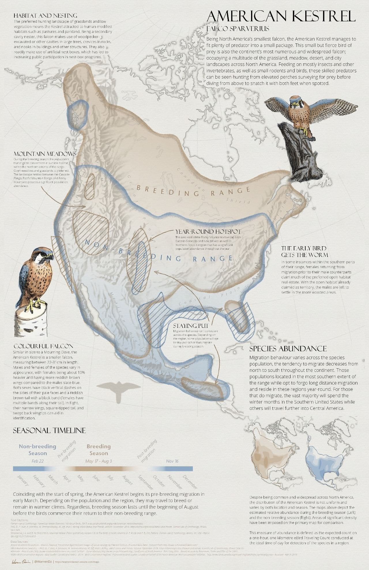
I made a map about the American Kestrel inspired by my grandfather. The map itself was not my ultimate objective, but, rather, a vehicle for exploration and research. Diving into my grandfather’s carvings and researching his subjects would be the goal. I hoped to come away with the experience of reflection and creation.
How To
Map Flair
I started with the idea of creating a map that was a hybrid between a magazine centerfold and a colour plate from a field book or textbook. These are the types of resources I had available and I liked how these looked and felt. I aimed to create some resources that would lend some of this nostalgia and artistic flair to my map. Crisp and clean digital lines just weren’t going to work for this map so I scanned strokes that I created using nearly every writing implement from the ‘everything’ drawer, for use later on in ArcGIS Pro (here’s more info on creating hand-drawn textures for use in maps). I filled a sheet with a variety of samples that I’d be able to use in creating the map. This would be plenty enough to meet the minimum flair requirements for this map.
I wasn’t thinking clearly as all these strokes may have taken 20 minutes to draw, but they took hours to scan and clean-up in GIMP (a free image editing software). I’d love to see that afternoon of tedious labour be of use to others, so grab your flair here and get mapping.
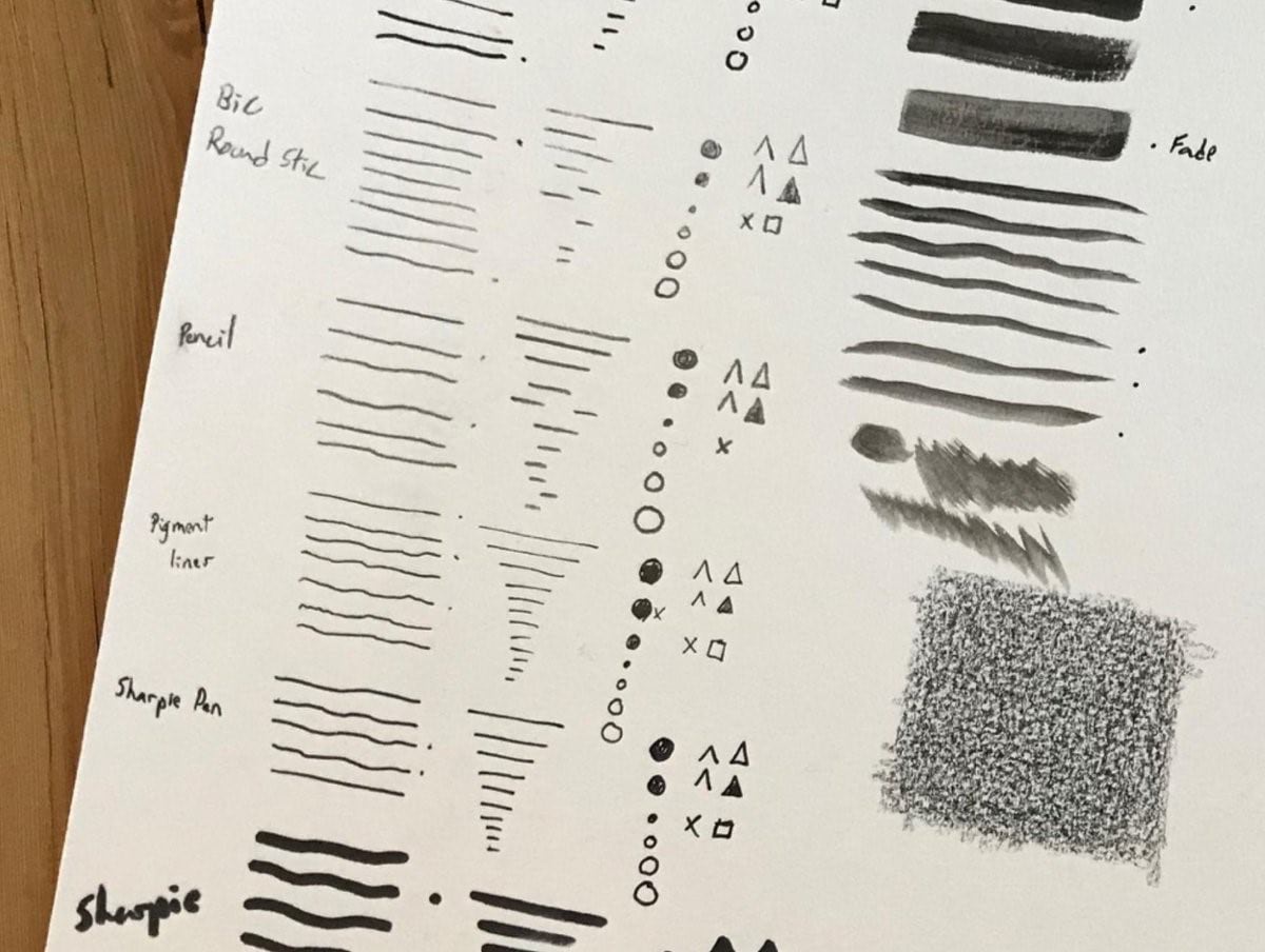
Should you wish to dive into hand-making these sorts of textures for yourself, I found a few steps helped when prepping stokes that had significant variability, like painted strokes. I did this bit in GIMP, but you could use Illustrator or Photoshop or whatever you prefer.
- Cut out a segment of the stroke.
- Prepare that segment (convert to white and apply any desired transparency).
- Before saving it as a final image asset, duplicate and flip (or mirror) the segment, joining it together. This ensures that when ArcGIS Pro eventually repeats the image along line geometry the image segments will blend seamlessly together.

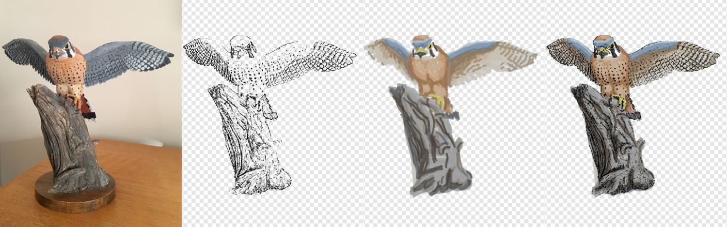
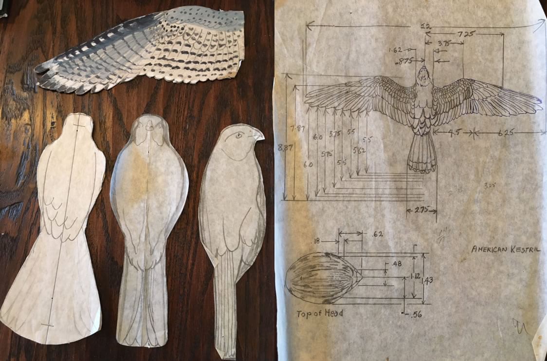
Another key element of the map was the ‘illustrations’ of the falcon within the marginalia. The illustrations and additional text were hallmarks of the textbook and field guide aesthetic I was referencing, and I wanted to incorporate this in my map. The bespoke pen, ink, and watercolour illustrations were all throughout my research material and I wanted to morph photos of my grandfather’s carvings into this style and adorn my map with them.
I’m beginning to experiment with design software more often for both maps and illustrations, so with the use of several filters, a crash course in layer blend modes, and some marker brushes, I got something that hit the mark. Conveniently this also was way better than I could do with an actual brush. Not only did these ‘illustrations’ make perfect content for my map surrounds but they also allowed me to spends hours studying the pieces and gave me a way to meld my grandfather’s carving with my cartography.
Base Map
Keeping with my theme, I made the choice to keep my map very simple and subtle. I didn’t want the map to compete with the illustrations but rather offer some context and support the facts in the map surrounds. I probably could have used a simple coastline but I thought it would be important to depict the landscape as it pertained to the habitat of the American Kestrel. Depicting the topography also meant that I would have an excuse to use a gorgeous manual shaded relief by Ellen Kuzdro, available in the Shaded Relief Archive, to illustrate the terrain. This hand-drawn hillshade image is georeferenced and ready to land right in your mapping project.
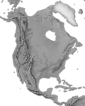
The manual relief really elevated the map—yeah I went there—and added a priceless nostalgia factor akin to a decade old National Geographic article. Landform region labels added from the Living Atlas were used to denote some major landscapes visible in the hillshade and provide additional context. Aside from these layers, subtlety was key and a slight coastal gradient was the finishing touch to help distinguish land and lift the continent above the graticule.
Map Data
The primary content of the map was created from eBird Status and Trends data. This incredible dataset comes from an active birding community that has contributed over half a billion observations. Stewards of this dataset then combine and conduct analysis to produce many information products that are used in science and research efforts.
For my map, I made use of the Abundance Maps, the Range Maps, and the Abundance regional stats. I joined the abundance statistics to the Bird Conservation Regions in order to get polygons with data values. These datasets are now available as rasters, making the process much easier.
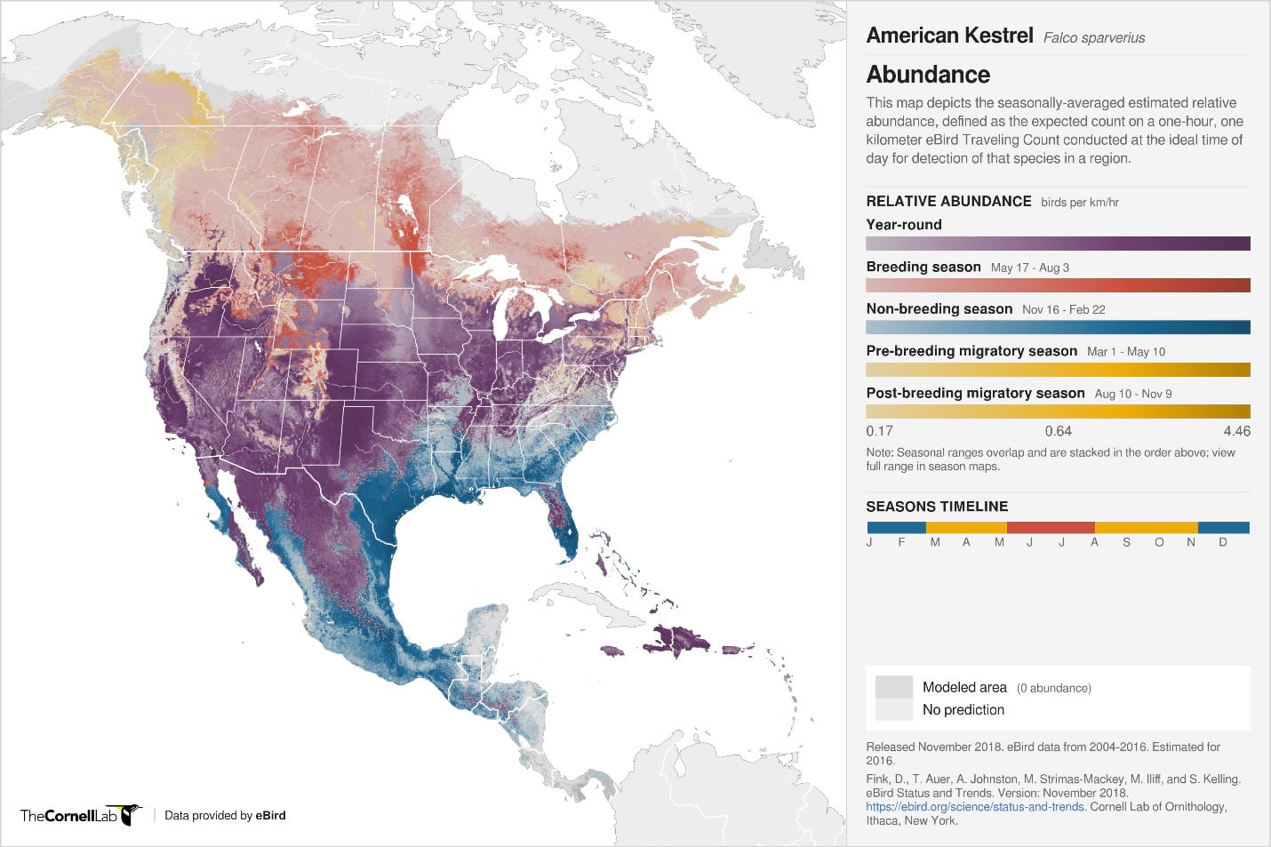
The data was much too detailed for my purposes and underwent several steps of geoprocessing. As I learned in the Cartography MOOC, sometimes generalizing your data is crucial to effectively communicating with your map, and this was especially true at the scale of my map. I generalized and smoothed these polygons until they were amorphous and blobby but told the same story as the accurate analysis results from the eBird datasets.
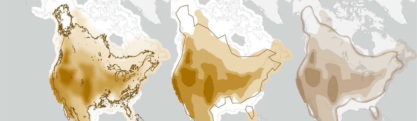
I repeated the generalization and smoothing on the datasets for each season and included these as insets maps for visual comparison. I then overlaid the areas of highest species abundance on the primary map with a pencil crayon thatch (using a “Picture stroke” for the border and hatch lines in Pro’s symbology panel) to illustrate where abundance was highest between seasons and allowed for in-situ comparisons. The areas of abundance urged me to explore more of the eBird habitat data and diving deeper into research to understand why some areas of abundance occurred. These focal points would eventually became the anchor for several text call-outs that I feel enriched the map with information and enhanced the overall story while populating the map with additional marginalia.
Here is the completed map…
Final Thoughts
Iterating between map and research summarizes much of my experience. The process was equal parts learning about this falcon and making a map that told the story. I was constantly jumping back into the data and research to learn more and then communicating my findings through the map. The process ended up being slightly more haphazard than the meticulous research my grandfather had done in preparation for carving the falcon, but I’d like to think that the experience was just as equally satisfying. I’m incredibly proud of the results and deeply satisfied with the entire experience.
Thank you for reading. Hopefully this has inspired you to dive right into creating something and embark on your own map adventure. If you’d like to learn more about the integration of my grandfather’s carving and this map, please check out this Story Map.


Commenting is not enabled for this article.