The following comes courtesy of guest blogger & cartographer Warren Davison, of Waterloo, Ontario. Warren creates beautiful maps and has a gift for sharing their creation process. If you like his map (and his how-to), then check out another of his posts, describing how to make a vintage-looking survey plan.
. . .
If you’re keen about data and maps like me, then there’s a chance you record the GPS tracks of whatever physical activity you do when you’re not looking at, analyzing, or making maps and data. So why not now do some cartographic exercise? It’s a lot less tiring, and you can turn all those hard earned kilometers (or miles) into some stunning maps!
To start, get a hold of all that data that you’ve logged. Download it from your device, or whatever service you use, and create yourself a feature class with all the tracks.
As with any sort of personally-identifiable data, consider if you (or those you may work for, etc.) are comfortable sharing it, or the cartographic results. In this case, I’m definitely ok with sharing!
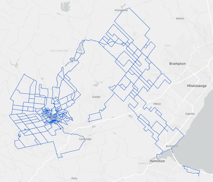
Feel free to pause a moment here and just marvel at the extent of your physical feats, I’ll wait…
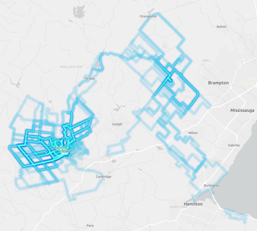
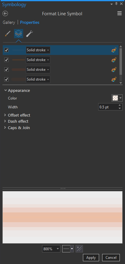
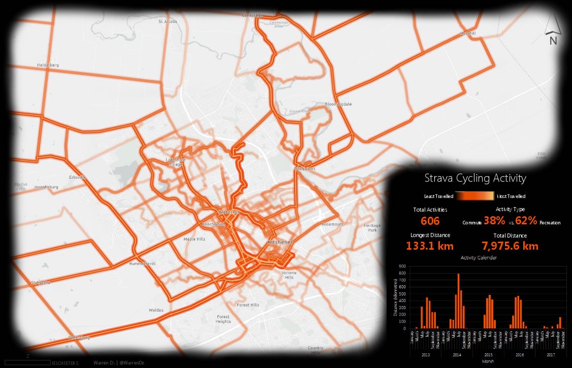
Alright, however cool it may feel to finally see all that activity on a map, there’s a lot more we can reveal aside from just the expanse of your conquests, vast or otherwise. So let’s dial things up a notch and make use of the symbology features of ArcGIS Pro to reveal where I rode my bike most frequently. I incorporated John Nelson’s lightsaber-like Firefly line effect (choosing the “Kenobi” colors) and made a few tweaks to the transparency to accommodate the overlapping nature of my activity tracker data (since I typically left from, and returned to, the same place and often made use of similar routes). I bumped up the transparency on the layers in the symbol so that single lines that were never overlapped were nearly completely transparent and overlapping lines created an additive opacity (values below).
Kenobi (colors, weights, and transparency)
FFFFFF 0.5pt 85%
00FFC5 3pt 90%
00C5FF 6pt 90%
004FC7 8pt 95%
005CE6 12pt 98%
Click to apply that symbology and cue up your best Lightsaber noise, VROOOOOOM! The data is starting to reveal some of the patterns within; it’s becoming clear which segments are most frequented.
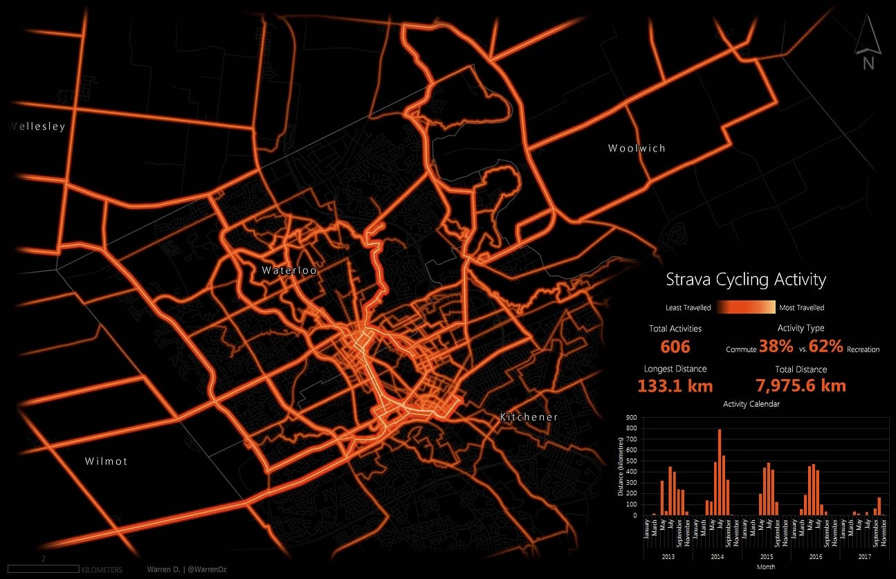
All that remains now is to put the data into a smart looking layout to show off the data. I decided that since my representation of the data was a somewhat of a pseudo heat map of activity and didn’t actually quantitatively describe my cycling activities I’d provide some contextual stats as layout elements. This ultimately became a report type map that gave an activity ‘Year-in-Review’ (or multiple years in my case).
Next, I decided to abandon the Kenobi Lightsaber in favor of the Strava heatmap orange and put the data on a black background to crank up the contrast.
Strava heatmap orange (colors, weights, and transparency)
FFBC8C 0.5pt 85%
E65C00 3pt 90%
E63D00 6pt 90%
E64D00 8pt 95%
E62600 12pt 98%
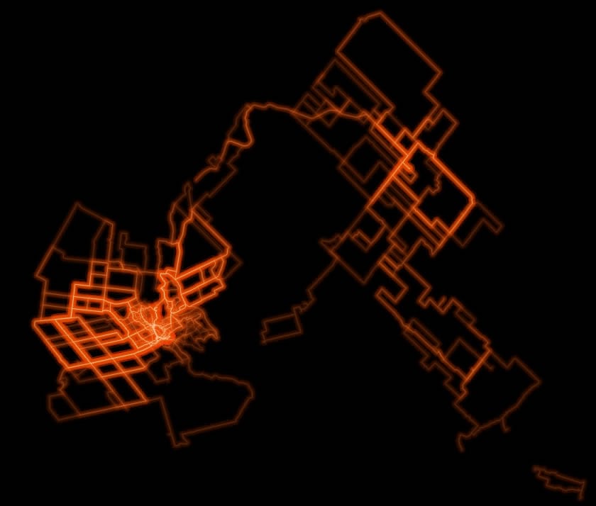
I then added a road network for reference, focused the layout on a specific locale of activities and masked the layout with a handy vignette that I stole to subtly fade the edges of the layout to black. I modified the vignette to mask out the area where my statistics were to be placed. Here it is with a light basemap to help illustrate the vignette effect.
The final touch was to add some summary statistics that I ran on the data and a color ramp legend inspired by some artisanal handcrafted ones I’d found here.
As a final note I’d just like to point out that this map, aside from cycling everywhere to create the data, was really easy to make. The final product was really just the result of implementing a bunch of little hacks, tips & tricks, and a little bit of effort, within the great symbology capabilities of ArcGIS Pro.
Thank you for giving me a chance to walk through how I’ve created this map. And all the best in your own adventures! Warren.


Commenting is not enabled for this article.