Type knockouts are an optional, advanced, and fancy step in map-making, but one that will really take your labels to the next level.
This tutorial is the third post in a four-part series about map text in ArcGIS Pro. You can find all tutorials here:
- Part 1: Labels
- Part 2: Annotation
- Part 3: Knockouts and Map Notes
- Part 4: Layout Text
This tutorial was tested and updated on October 3, 2022 with ArcGIS Pro 3.0.
To follow along, open Darwin.ppkx to the map named Annotated Map. If you want to know how we got to this point, check out the previous tutorials.
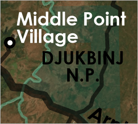
What are knockouts? They are used to make text more legible when it is forced to cross over lines and other features.
Without knockouts:
With knockouts:
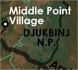
The trick is to arrange all of your text so that no knockouts will be necessary. But of course that’s usually impossible. In the Darwin map, I did all right—I only have three labels that I find problematic (Djukbinj N.P., Tabletop Range, and Garig Gunak Barlu N.P.). I’ll make knockouts for those three labels only.
Select the labels that require masking: Djukbinj N.P., Tabletop Range, and Garig Gunak Barlu N.P. (or use your own)
Open the Feature Outline Masks geoprocessing tool.
For Input Layer, choose GroupAnno\NationalParksAnno.
For Margin, set the size of the knockout. You may need to experiment. I settled on 1 pt.
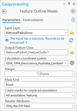
After running the tool, a new polygon layer is added to your map. It forms a buffer around two of your labels.
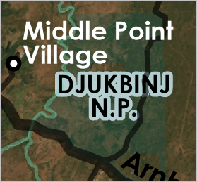
Run the tool again using GroupAnno\PlacesAnno to create a mask for the third label. Remember to change the name of the Output Feature Class.
In the Contents pane, turn the feature outline mask layers off. You don’t want to see them. You just want to use them as an invisible feature that will mask the road layer underneath.
In the Contents pane, select the Roads layer. On the ribbon, click the Feature Layer tab and open the Masking menu.
Check the boxes for the feature outline mask layers.
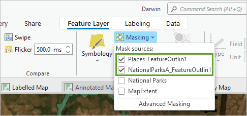
And now the magic has been applied. Roads will not draw anywhere where there is a mask.
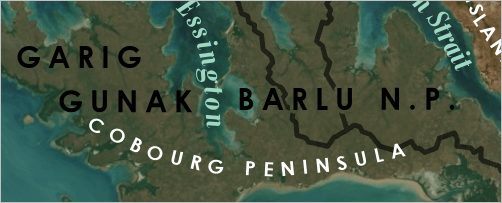
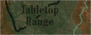
I used annotation masks in a slightly different way elsewhere on this map, this time to create a kind of stencil text. Read on to find out how.
In Darwin.ppkx, open the map named Key Map.
This is the key map (also known as the inset map or locator map). It looks like this on the layout:
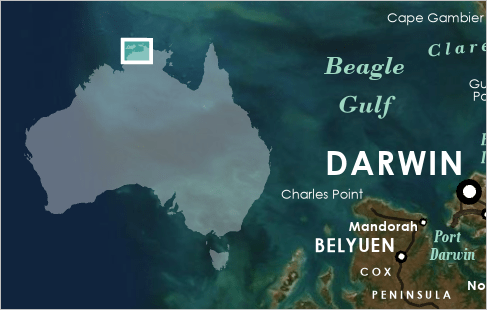
I want to label this continent as Australia. But it seems silly to make labels and convert them to annotation when there’s only one label, doesn’t it? Instead, I’ll skip the label step and move directly to annotation.
On the ribbon, click the Insert tab.
In the Layer Templates group, there are a bunch of Map Notes that you can insert into your map. Expand this gallery and click the last option: Text Map Notes 1:250,000. This adds an empty annotation layer to your map.
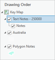
On the ribbon, click the Edit tab and click Create.
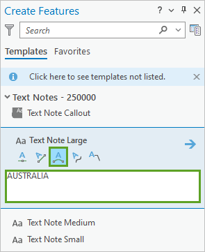
In the Create Features pane, click Text Note Large and click the Curved Annotation button.
In the text box, type AUSTRALIA.
Click the map to draw a curve. Generally speaking, you want to keep annotation curves as simple and gentle as you can.
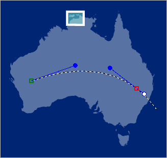
Double-click to finish.
The curve disappears. You can’t see any AUSTRALIA text. That’s because the scale of the annotation is too small compared with the scale of the map. The text is still there—and highlighted—it’s just tiny.
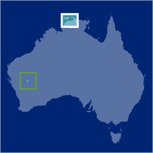
Select the annotation feature and open the Attributes pane. Change the font to Century Gothic Bold. For size, type 5000. I also chose center alignment.
Note: Instead of choosing such a large font size, you can instead run the Update Annotation Reference Scale tool at 1:85,000,000.
Click Apply, then click the Symbol button to access more properties. I changed the Letter spacing to 50%.
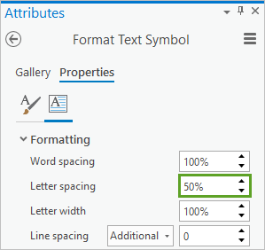
Use the Edit Vertices tool to get the curve of the text just right. Don’t worry about the color of the text, because you’re not going to show it. Instead, you’re going to use these letters like a cookie cutter.
Save your edits and open the Feature Outline Masks tool. For Input Layer, choose Text Notes – 250000, and keep the Margin at 0 Points.
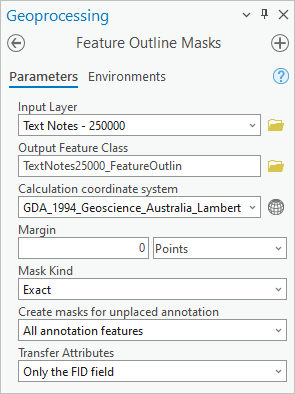
After running the tool, you’ll have a new polygon layer on your map that looks exactly like your annotation layer. Turn them both off.
In the Contents pane, select the Australia layer. On the ribbon, click the Feature Layer tab.
In the Masking menu, check the box for TextNotes250000_FeatureOutlin.
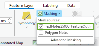
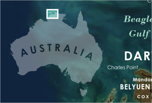
And now the white land layer has holes cut out of it just like a stencil that spells AUSTRALIA.

Which I think looks just swell on top of the basemap in the layout.
You’re almost done with this map of Darwin. My next post will complete the project with layout text. You can find the full series here: Map text in ArcGIS Pro.



Commenting is not enabled for this article.