I love making StoryMaps. They’re a great way to present maps alongside narrative text, charts and graphs, and multimedia.
I do NOT like looking for stock photos. I’ve found many other ways to break up long blocks of text in StoryMaps, often using existing content blocks that are accessed straight from the StoryMaps Builder.
Seven simple ways to break up text
- Embed cards
- Buttons
- Separators
- Graphics of horizontal color blocks
- Graphics of big statistics, or Key Performance Indicators (KPIs)
- Graphics of simple icons
- Graphics of conceptual diagrams
The first three are natively available within the new ArcGIS StoryMaps builder. The last four, easily added as images in a story, are simple graphics you can build in a program such as Word and PowerPoint – no fancy Photoshop skills needed! Let’s expand on each of these by drawing examples from these two StoryMaps: Student Loans or Mortgages? Young Adults Can’t Afford Both, and Women in National Parliaments.
Embed Cards and Buttons
When adding context and explanatory text around your maps, it’s very common to link to various sites and documents. In addition to adding a link within paragraph text, there are two other options you might like: embed cards and buttons.

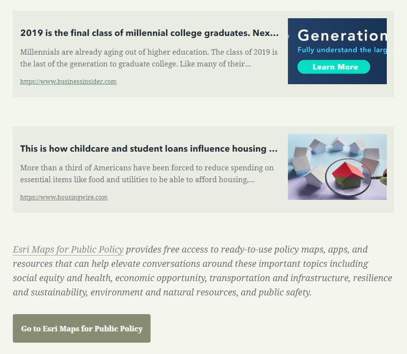
Embed cards are great when you really want to highlight the source, document, or website that you’re linking to. They take advantage of the website’s metadata and display the site’s description and image, although you can still edit within the story. Buttons are a great way to call attention to a link while still maintaining the color scheme of your story.
Here’s an example that uses embed cards for related links, and then ends with a button taking the reader to Esri Maps for Public Policy to explore more maps on the topic at hand:
And here’s an example of using a button to call out a source in a more impactful way than simply linking to it within the paragraph text:
Separators and Horizontal Color Blocks
Use separators straight from the StoryMap builder to add a subtle break in between different sections of your story. The exact look of the separator will vary based on the theme you have chosen.

If you want a more obvious break between sections, one trick is to add a long, horizontal color block as an image. I sometimes create a single-color rectangle shape in PowerPoint, the length of a typical slide. If you want to get fancy, you can play around with shadows and gradient effects. Save the color block as a .png image, and add it in to my story. If your image is over 1920 pixels in width, you will see an option to add it in as a “large” image:

Graphics
Graphics are a simple way to add visual interest to your stories. Here are three ways to do this, from least to most effort:
Statistics or Key Performance Indicators (KPIs)
Do you have a statistic or number that you want to call attention to? Create a text box in PowerPoint, change the color of the text box, and the font to white (or a light color that you’re already using). Save this text box as a .png image, add to story. Voila!

Whenever you burn text into an image like this, I recommend putting that same text in the alt text section of that image’s properties. That way, those with a vision impairment who depend on screen reader assistance technologies will still be able to consume your information.
Simple Icons
Just as easily as you can add a rectangular shape or text box, you can add a whole bunch of icons – representative symbols that are computer-generated rather than photo-generated. Word and PowerPoint come with a lot of icons, and thenounproject.com is another great source. It’s as simple as: change the color of the icon, save as a .png image, add to story. Here’s an example of a backpack icon that I used in a section discussing alternatives to student loans:
Conceptual Diagrams
Can you represent what your text is discussing in some kind of visual diagram? These often make a great graphic for your story map. Here’s an example in which I combined multiple icons to create a visual representation of my topic:
Here’s an example of taking advantage of PowerPoint’s SmartArt, which provides lots of templates for flowcharts, processes, and relationships. I then go on to discuss all four of these concepts in detail in four different paragraphs underneath this diagram within my story.

More Tips for Creating a Polished, Professional Story
Using only two to three colors throughout your story will make it look polished and unified. When creating graphics such as the horizontal color blocks, KPIs, icons, or diagrams, use the same colors throughout the whole story. You can even use your organization’s branding colors by customizing the accent color in the design panel. Take the branding of your story one step further by adding a logo.
ArcGIS StoryMaps allows you to tell the stories of your maps in a clear, compelling way. While photos can certainly enhance your story, they are not the only way to create a visual separation, as there are many other strategies to break up long blocks of text. If you do want to use stock photos, make sure you are not breaking any copyright rules.

Commenting is not enabled for this article.