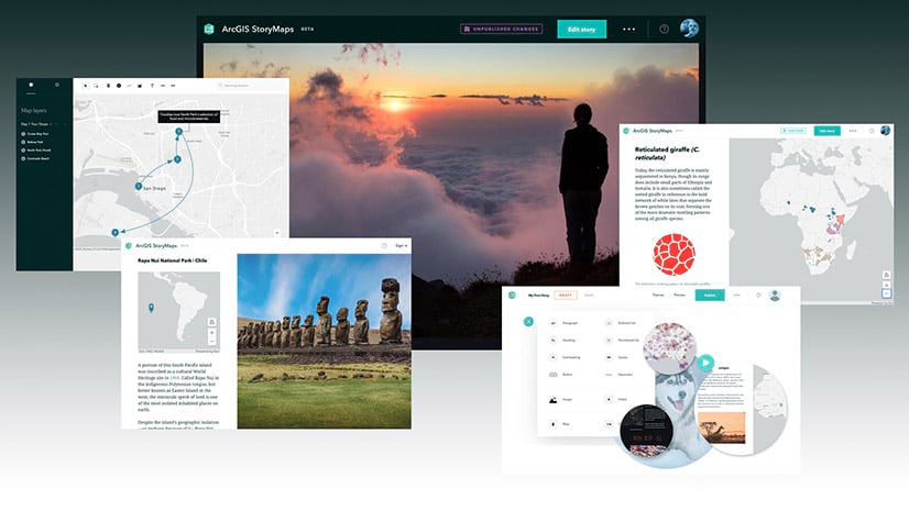
In early April, my colleagues and I released a beta version of our newest storytelling tool, ArcGIS StoryMaps. The release came with a request for you, our authoring community: Please take the beta for a spin and provide as much detailed feedback as you can, so that we can craft a product tailored to meet your exact needs.
In the weeks since, we’ve been eagerly reading through every question, comment, and suggestion that’s been added to our GeoNet space, relying on them to inform decisions about product design and development priorities. Sifting through these first, second, and third impressions from beta testers has been incredibly motivating, to say the least.
But it’s not just tester feedback that has us excited—more rewarding than anything is seeing the wonderful content you all are making while the new StoryMaps is still in its infancy. Not only have you managed to craft narratives that are both informative and delightful, but you’ve made a lot of them! To celebrate your inspiring work, we wanted to share a few of the beta stories that really set our Slack channels abuzz with excitement. In no particular order, here are six beta stories we love (and why).

1. Measuring Success | Blue Raster
We’re always telling new storytellers about the importance of having a consistent visual language; this story accomplishes that with flying colors. Bright, coordinated colors, to be exact. From the thin multicolored banners, to the repeated strip of key indicators, and even the color ramps on the web maps, every visual element in the story is designed to match the others—and the Sustainable Development Goals branding, too.
The story’s sidecars are especially effective, using the color of the progress indicator to inform cartography. The legend, which is handily located in the narrative panel for easy reference, ties the whole block together beautifully. This unified aesthetic not only makes a story look more professional, but it helps immerse someone in the content they’re reading; a win-win if there ever was one. (For more on the how any why of creating visual harmony, see no. 4 in this series of storytelling tips.)
____________________

2. The Kings’ Road | Mike Schoelen
Another one of our often-shared pieces of advice is to create a clear cadence or rhythm in your story (see tip no. 3). You can do this by arranging your content in a structural pattern that is repeated throughout the story. In doing so, you give your audience a nice fluid reading experience that lets them settle in and enjoy the ride. This summary of a four-day hike through Peru’s mountains does just that.
Schoelen creates a section of the story for each day of the hike, using a handful of different content blocks to establish a cadence. Each day starts out with a chart of the elevation change throughout that leg of the journey, along with a web map of the route. He provides a brief explanation of what lies ahead, then uses a series of images to draw the reader into the scenery of the Andes. The result is an easy, engaging read that’s sure to trigger some wanderlust in any hiking enthusiast.
____________________

3. Catoctin Mountain | Hudson Geography
Speaking of hiking, this next story takes a different, but equally effective approach to encouraging folks to hit the trails. The story’s author puts greater emphasis on the trail maps themselves, featuring them in the media panel of a sidecar and providing helpful information, photos, and related web content in the scrolling narrative panel.
What made this story especially fun for us is the creative use of express maps—StoryMaps’ new, simple mapmaking feature. The story’s express map shows the locations of a few key landmarks in the national park while utilizing some new annotation tools.
The author added arrows to the map to indicate the direction of the mountain slope, so would-be-hikers have an idea of where they’ll need to expend a little extra energy. They also added some helpful bits of text to the map with more details about what to expect. Being able to make basic, contextual maps in just a few minutes is exactly what we had in mind for express maps, and seeing them used in such a creative way makes us do a little happy dance at our desks.
____________________

4. The Bridges of New York and San Francisco | Rachel Eu
Another reason we can’t stop talking about express maps is their redesigned pop-ups. While crafting your map, you can easily add and adjust pop-up titles and descriptions, and even add a photo that will appear on hover. It’s a small feature, but we think it makes a big difference for the experience of both a story author and reader. If you’re skeptical, just take a look at this next example.
Right off the bat, you’ll find two express maps with points representing various bridges in New York City and San Francisco. Hover over a point (or tap on it if you’re reading on a tablet or phone) and up comes a pop-up with an eye-catching image of the bridge it represents. Eu has even taken her pop-ups to the next level by consistently configuring them; each one displays the year the bridge opened and the average amount of traffic that crosses the bridge daily. The result is a pair of maps that are surprisingly fun to peruse, and that look just as professional as the rest of this expertly crafted story.
____________________

5. Join EDSO | Sara Dougherty
If, when we first started thinking about next-generation StoryMaps, you’d asked the team whether we thought a county sheriff office would ever use StoryMaps as a recruitment tool, we probably would have stared at you quizzically. We might have said it was possible, but not very likely. We also would have been wrong.
Not only is there a story encouraging applicants for a position with El Dorado County Sheriff (EDSO), but it’s made with great consideration for the story’s target audience. Dougherty starts off the piece by explaining the appeal of working for EDSO, then moves into reviewing some of the perks of living in that corner of the world. Once she’s got her readers sold on the idea that this is a promising career move, she gets right down to business explaining the application process, and uses the new button block to add a clear action for interested applicants. What comes after that is a series of FAQs and additional information for those who might want more details.
It could have been tempting to put the call to apply at the end of the story map, but by putting it where she did, Dougherty smartly provided an action at the point where it was most relevant. She knew that the big questions she needed to answer before recruiting candidates were why and how to join EDSO. The next important thing was to get candidates to actually apply. Once that was established, she could go into the remaining nitty gritty details for those who wanted to learn more.
Effectively prioritizing your content is vital to the success of any communications effort, which is why my teammates and I derive so much joy from seeing members of our community get this right. It’s even better when it occurs in a story map whose subject we could never have imagined. (If you’re looking for advice on how to prioritize content in your own story, this article should help.)
____________________

6. Two Kiwis in the Wild Wild West | Rory McPherson
Like the EDSO story, the final story I’ll discuss here makes clever use of the new button capability in StoryMaps. I’ll talk more about that in a second, but first, let’s all take a second to appreciate how effectively McPherson has used multiple sidecar panels for laying out his planned travels. While the narrative panel lists off each stop on the journey—along with photos that underscore the allure of each destination—the media panel gives you a focused view of the route through each of these destinations. All combined, it does a really nice job of bringing a reader along for the journey, virtually.
At the end, though, McPherson goes the extra mile. Not wanting to miss any must-see destinations, he’s added a button that links out to a form made with Survey123. Anyone with travel recommendations can easily submit them there. A web map at the end of the story even displays these suggestions for anyone else who might be traveling in the area. Seeing this crowdsourcing effort come full circle in the story puts a big smile on our faces—if you want to do this in your own story maps, this tutorial walks you through the process.
____________________
There are dozens more excellent beta stories I could highlight in this post—narrowing it down to just six was a challenge. If you’ve made a story with the ArcGIS StoryMaps beta, make sure you share it with us! The team is on Twitter at @EsriStoryMaps, and we’re watching #StoryMapsBeta like a hawk.
Also, we recently made some significant updates to the beta, so if you haven’t tried it yet, or it’s been a while since you were last in the builder, you definitely should go take a look—you can learn more about testing the beta here. Don’t forget to let us know what you think!


Commenting is not enabled for this article.