If you’ve been following along with this series, you already know how ArcGIS Tapestry data can be used to understand community dynamics and demographics – people’s lifestyles, their spending patterns, and household composition.
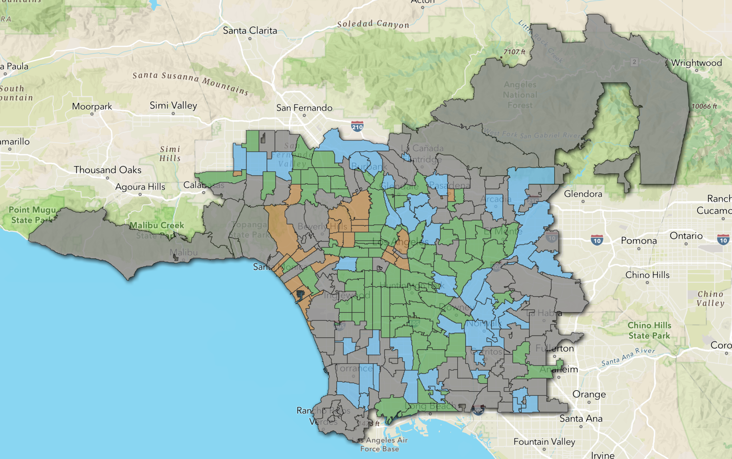
But getting to know who your customers are is only half the challenge. The real insight happens when you start asking where to find more of them, which is where suitability analysis can help. In this article, we’ll walk through how ArcGIS Business Analyst Pro’s suitability analysis lets you identify a successful area for fundraising and create a ranked, scored map of your best potential markets – all in one workflow.
This article is the third in a series aimed at diving into the world of ArcGIS Tapestry using ArcGIS Business Analyst Pro, an extension to ArcGIS Pro. If you missed it, check out ArcGIS Tapestry in Business Analyst Pro: Identify target markets and ArcGIS Tapestry in Business Analyst Pro: The basics to learn more.
How does suitability analysis work?
At its core, suitability analysis is about finding places that resemble our best-performing locations or audiences. In Business Analyst Pro, this means combining multiple variables – demographic, behavioral, and geographic – into a single map layer that highlights the areas that best match our ideal conditions.
The process starts by defining what “suitable” means for our specific goal. Imagine we work for a statewide conservation nonprofit looking to expand our reach to sustaining donors: our goal is to identify priority neighborhoods for fundraising outreach based on high concentrations of Tapestry segments known for civic engagement and discretionary income, within state boundaries, and outside areas already targeted by other outreach efforts. Each of these inputs becomes a factor in our analysis.
It’s important to note that when choosing variables, we’ll need to use numeric variables – for example, “2025 City Greens (K6) Tapestry Adult Population (Esri).” Categorical variables, such as “2025 Dominant Tapestry Segment (Esri),” can’t be ranked or weighted, so they can’t be used as criteria in our model.
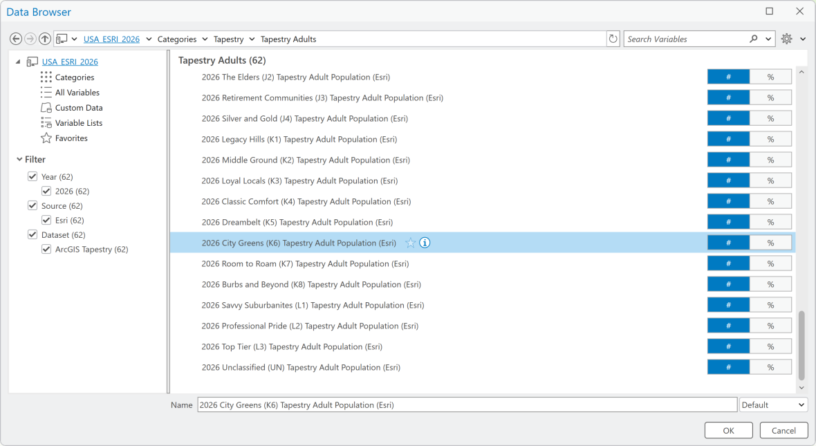
From there, variables are standardized and ranked so they can be compared on the same scale. This step is critical because our inputs likely come in different units, such as percentages, counts, or indexes, and need to be normalized before they can be meaningfully combined.
Once standardized, each variable is assigned a weight to reflect its relative importance. Not all criteria contribute equally, and weighting allows us to emphasize what matters most. In this fundraising outreach scenario, Tapestry alignment might carry more weight than geographic proximity to existing donors, but both still factor into the final score.
The weighted variables are then combined to create a composite suitability score for each geographic unit, allowing us to identify and prioritize areas with higher scores, as these most closely match our ideal conditions – in this case, places most likely to yield new donors with a genuine connection to conservation.
Something that makes suitability analysis uniquely powerful is its flexibility. You get to adjust the criteria, refine weighting, and iterate quickly to test different scenarios, turning the analysis into a dynamic decision-making process with actionable results rather than a one-time output.
Where does ArcGIS Tapestry fit into suitability analysis?
In the previous article, we used Tapestry to identify which neighborhoods had the highest concentration of our target segments. These represented the communities most likely to benefit from a mobile health clinic.
Suitability analysis takes that logic a step further: rather than simply flagging where our target segments are located, it helps us evaluate and rank candidate areas based on a combination of criteria, with Tapestry as one of several inputs. Think of it as moving from “who lives here?” to “where should we focus, given everything we know?”
For a statewide conservation nonprofit trying to expand its donor base, that distinction matters. We already know our most reliable donors tend to cluster near a major wildlife preserve, and that these households have strong ties to the outdoors, conservation-minded values, and the discretionary income to allocate resources to them.
Suitability analysis lets us take that profile, translate it into Tapestry segment population or household counts, and bring those counts into the same model as other factors that paint a holistic picture of our potential donor base. Each input is weighted by importance, and the result is a prioritized map of ZIP codes across the state where the right conditions converge – not just demographically similar areas, but the ones where our time and resources for outreach can be used most effectively.
The exciting thing about suitability analysis is that the workflow is designed to calculate the most suitable location for our needs—and we define what “suitable” means. As such, there are infinite customization options for this workflow and many ways to incorporate ArcGIS Tapestry data.
While suitability analysis is often used for site selection in the real estate market, or resource allocation in the public health space, its malleability invites other uses as well. For example, imagine we work at a nonprofit that relies on donor contributions to fund a wildlife sanctuary. We want to reach out and solicit support from people who are likely to donate to our organization.

How will we find these mythological potential donors? Well, we know that we currently receive the majority of our individual contributions from people in one ZIP code: the ZIP code where the sanctuary is located. We reason that, if we can find people who are similar to our current donors, we can perhaps tap into a new pool of funding.
We have two things going for us: we know who our best donors are, and we have access to demographic data that will guide us to find more of them. ArcGIS Tapestry data and suitability analysis are the perfect tools for this challenge. Using Tapestry data does more than map demographic data points—it lets us assess our donors as more three-dimensional characters, and we can focus on locating others in our state with the same values, resources, and interests. At the end, we’ll have a ranking of each ZIP code in the state, based on how similar they are to our “best donor” qualities. Let’s dive in!
Who are our donors?
So how do we figure out which areas in our state contain populations similar to our current donors? We’ll start by quickly mapping all the ZIP codes in our state using the Generate Standard Geography Trade Areas tool. This layer is handy for the rest of the analysis, so name it something eye-catching like Minnesota_ZIPs.
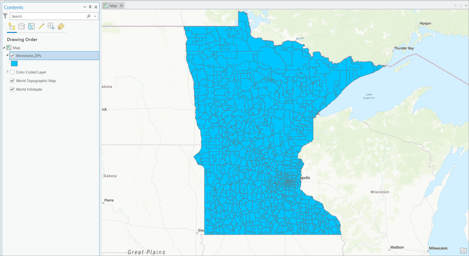
Now we’ll run an infographic to learn the most important bit of information: which Tapestry segment predominates in the ZIP code where the sanctuary is located. On the Map tab in the Inquiry group, click Infographics, then click the ZIP code where the sanctuary is located.
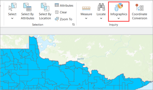
In the infographic window, change the template to Tapestry Profile. This infographic displays key demographic indicators—such as population and income stats—as well as a breakdown of the most predominant Tapestry segments in the area.
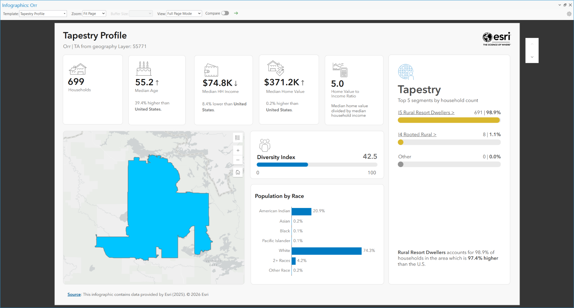
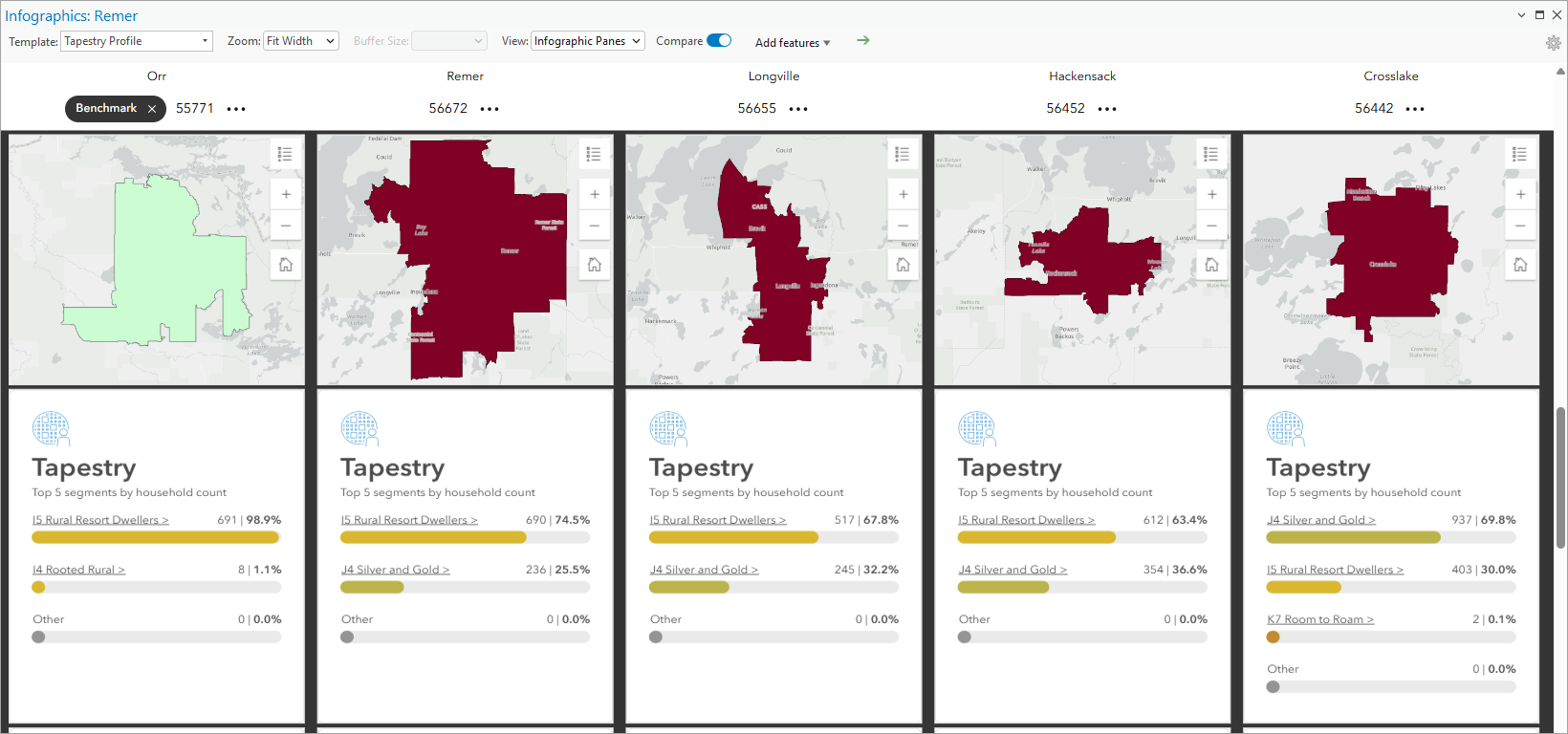
From the infographic, it is easy to see that almost every household in this area is part of the I5 Rural Resort Dwellers segment. A quick look at the ArcGIS Tapestry data documentation for the segment reveals helpful insights:
Neighborhoods in this segment are distributed throughout the country and are concentrated in resort locations and areas with seasonal recreation. With approximately half of the population aged 55 and over, the senior age dependency rate is high. Nearly half of households are comprised of married couples without children. While most of this segment is rural and remote, some communities are within commuting distance (though often long commutes) of major urban job centers. Residents tend to have skilled jobs in construction and manufacturing. Rates of self-employment and government employment are higher than average, and there is a notable veteran population. There is a high number of second homes used for recreation, with one in three housing units designated for seasonal or occasional use.
Where are other possible donors?
Armed with a clear idea of what our donors are like, we can now seek areas that are demographically similar using suitability analysis and its target site feature. Once we launch the workflow from the Business Analysis menu and create a suitability analysis layer to work in, our Minnesota ZIP codes are now “candidate sites” for the analysis.
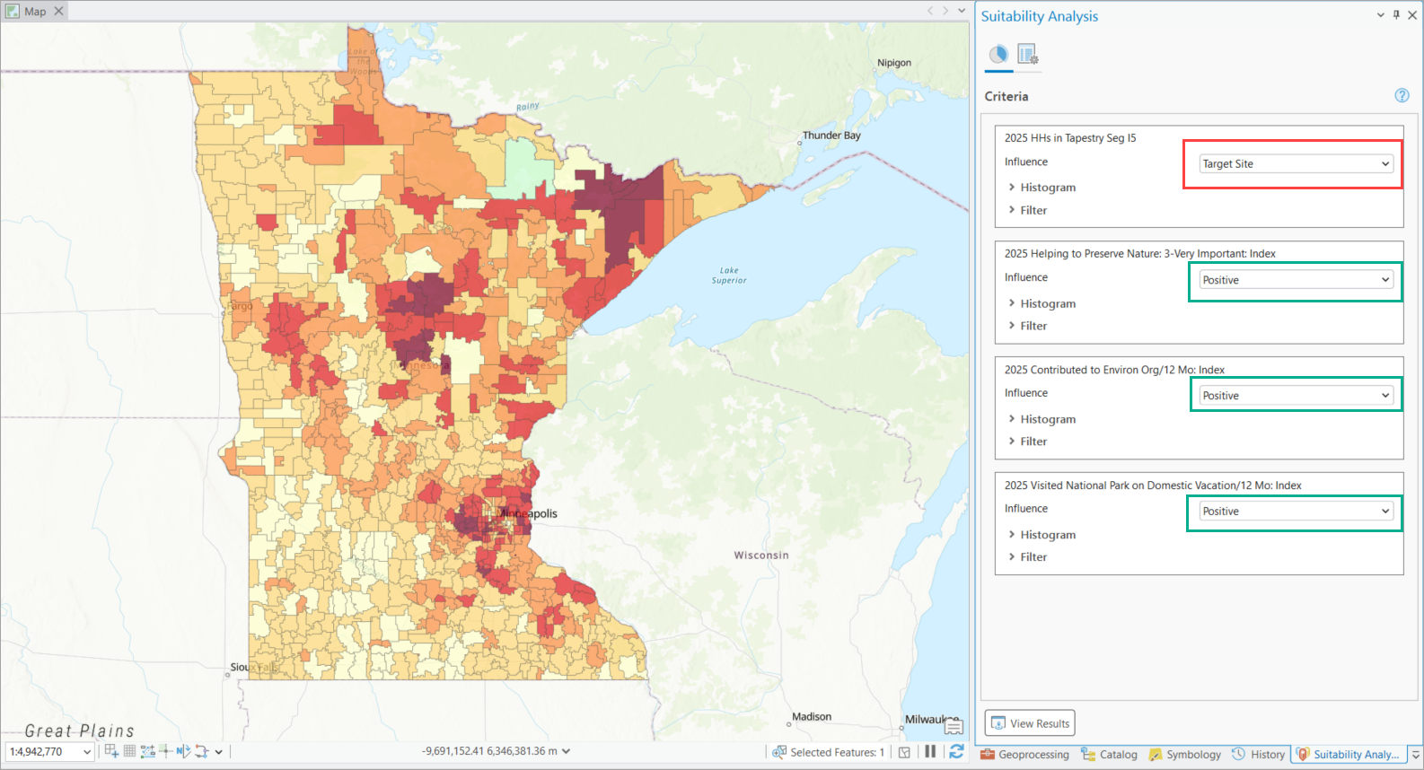
Now we’ll add criteria that determine the “suitability” of each ZIP code for our fundraising drive. The juiciest nugget is the knowledge of the Tapestry segment we’re looking for, which encapsulates all sorts of qualities the describe a “type” of person we’re looking for. In addition, we’ll add three index variables to ascertain areas with unusually high nature nonprofit contribution potential:
- Tapestry segment I5 (count)
- 2025 Helping to Preserve Nature: Very important (index)
- Contributed to Environmental Organization Last 12 mos (index)
- Visited National Park on Domestic Vacation (index)
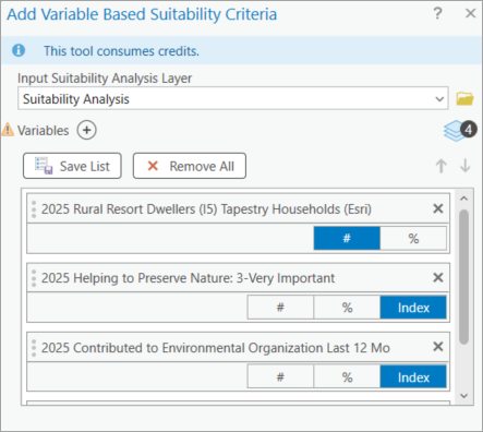
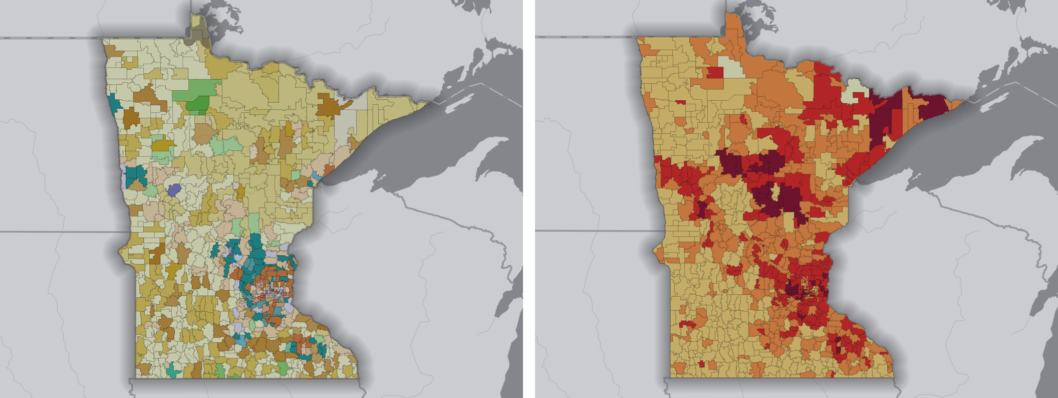
Right away, the map shows a breakdown of these criteria throughout the state, ranking each ZIP code by how much of the criteria it contains. This is good intel! But we’re going to make it even more useful by setting our home ZIP code, the one where we know we’re doing well in our fundraising efforts, as the target site.
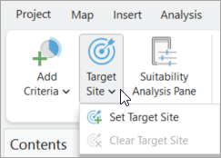
Once we set the ZIP code as the target site, we see a very red map, indicating a great number of counties with similar traits to our home ZIP.
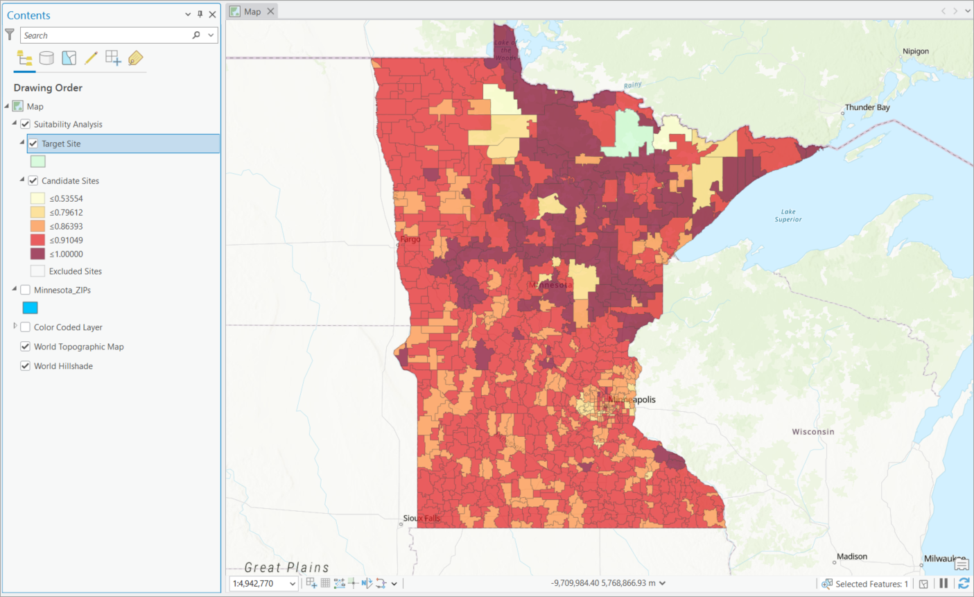
The map shows that in the north of Minnesota, there are plenty of spots with populations similar to the one we do well with. But what if we want to up our chances of raising donations for the wildlife refuge? We can do this by changing the target site’s influence to find the same amount of Tapestry households with I5 as our target site, but higher amounts of the other variables.
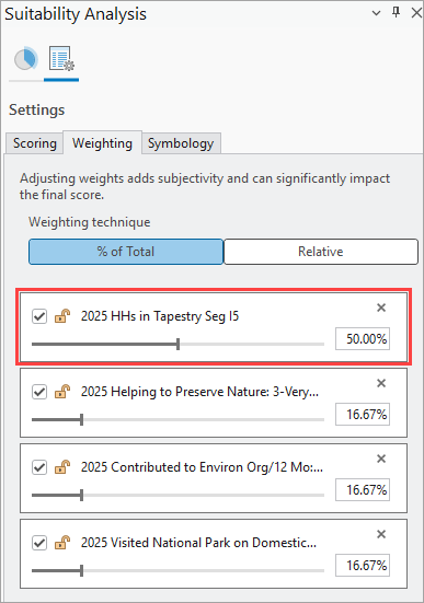
To make sure we’re focusing on finding our target Tapestry segment, let’s pop over to the suitability analysis Settings tab and adjust the weighting, so that the Tapestry variable is weighted the heaviest, at 50%.
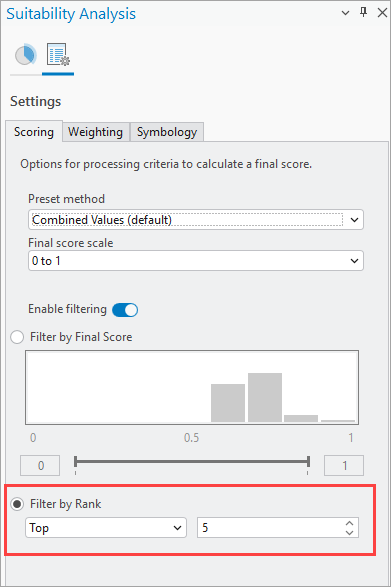
While we’re here, we’ll also go into the Scoring section and enable filtering, so we see only the top five ZIP codes in the analysis:
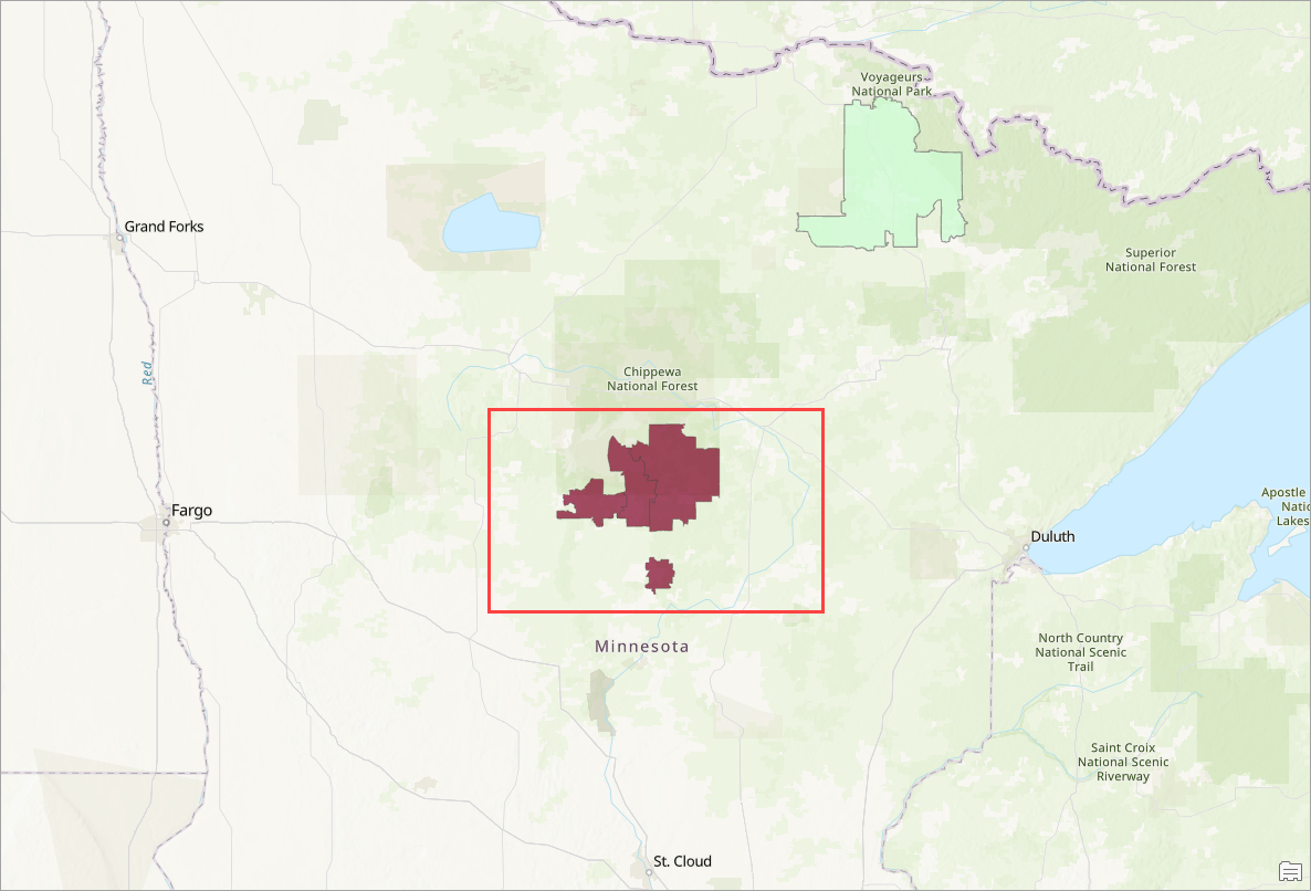
The map now displays the five ZIP codes that contain large numbers of households that are part of the I5 Tapestry segment, and good demographic indication that they’ll be amenable to donating to the preserve. There are a cluster of ZIP codes in the north-central part of Minnesota that would be good to target:
To learn more about these areas in a flash, we’ll use the ArcGIS Pro Infographics tool again to view a profile of the locations. A comparison of locations in the cluster of ZIPs, with our target site added in as the benchmark, reveals many useful insights, including the Tapestry makeup of these areas. It might behoove us to also tailor our outreach style to the J4 Silver and Gold Tapestry segment as well, given that this segment makes up a considerable share of our potential donor base by household count.
A Tapestry-focused suitability analysis has provided our wildlife preserve with ample fundraising opportunities and a sharpened focus for outreach. ArcGIS Tapestry data offers a unique mix of demographic, lifestyle, and spending insights that assure us that we’re extending giving opportunities to the right people.
This article uses ArcGIS Business Analyst Pro 3.7, as well as the ArcGIS Tapestry, Esri Market Potential, and Esri Updated Demographics datasets.
Resources
To continue your Business Analyst journey, visit the following resources:
- Business Analyst product overview page
- Review pricing and purchase Business Analyst
- Business Analyst resources page
- LinkedIn user group
- Business Analyst Web App video channel
- Business Analyst Pro video channel
- Business Analyst on Esri Community
- Business Analyst Web App login page
- Email the team: businessanalyst@esri.com



Article Discussion: