In the weeks leading up to the 2020 U.S. presidential election, I introduced a map style that visualizes electoral swing using data-driven multi-part symbols in the ArcGIS API for JavaScript (JS API). I recently updated the app to use data from the 2020 election. I also added a slider, allowing you to explore all presidential elections from 2004-2020. Click the image below to open the app and explore the data.
In my previous post, I describe the reasoning behind the style and the technical details showing how to create the app. Read the section entitled How the map was made to learn how the symbols were constructed and the code required to drive each symbol layer’s size and color by data values.
I’ll spend the majority of this post exploring and summarizing the 2020 data while demonstrating how this mapping style provides more detail than you see in traditional swing maps.
Traditional swing maps
One of the more popular ways to visualize swing is to use arrows indicating the direction of the shift (left is more Democratic, right is more Republican). I created a version of this map style using the JS API.
Expand to view the code used to style this layer
new UniqueValueRenderer({
  valueExpression: `
    var all20 = $feature["rep_2020"] + $feature["oth_2020"] + $feature["dem_2020"];
    var all16 = $feature["rep_2016"] + $feature["oth_2016"] + $feature["dem_2016"];

    var demShare16 = ($feature["dem_2016"] / all16) * 100;
    var demShare20 = ($feature["dem_2020"] / all20) * 100;

    var repShare16 = ($feature["rep_2016"] / all16) * 100;
    var repShare20 = ($feature["rep_2020"] / all20) * 100;

    var othShare16 = ($feature["oth_2016"] / all16) * 100;
    var othShare20 = ($feature["oth_2020"] / all20) * 100;

    var repChange = repShare20 - repShare16;
    var demChange = demShare20 - demShare16;
    var othChange = othShare20 - othShare16;

    return Decode(Max(repChange, demChange, othChange),
      repChange, "republican",
      demChange, "democrat",
      "other"
    );
  `,
  valueExpressionTitle: `Predominant party shift 2016-2020`,
  uniqueValueInfos: [{
    value: "democrat",
    label: "Democrat",
    symbol: createArrowSymbol({
      color: new Color("rgba(60, 108, 204, 1)"),
      rotation: 45
    })
  }, {
    value: "other",
    label: "Other",
    symbol: createArrowSymbol({
      color: new Color("rgba(181, 166, 0, 1)"),
      rotation: 0
    })
  }, {
    value: "republican",
    label: "Republican",
    symbol: createArrowSymbol({
      color: new Color("rgba(220, 75, 0, 1)"),
      rotation: -45
    })
  }],
  visualVariables: [
    new SizeVariable({
      valueExpression: `
        var all20 = $feature["rep_2020"] + $feature["oth_2020"] + $feature["dem_2020"];
        var all16 = $feature["rep_2016"] + $feature["oth_2016"] + $feature["dem_2016"];

        var demShare16 = ($feature["dem_2016"] / all16) * 100;
        var demShare20 = ($feature["dem_2020"] / all20) * 100;

        var repShare16 = ($feature["rep_2016"] / all16) * 100;
        var repShare20 = ($feature["rep_2020"] / all20) * 100;

        var othShare16 = ($feature["oth_2016"] / all16) * 100;
        var othShare20 = ($feature["oth_2020"] / all20) * 100;

        var repChange = repShare20 - repShare16;
        var demChange = demShare20 - demShare16;
        var othChange = othShare20 - othShare16;

        return Max(repChange, demChange, othChange);
      `,
      valueExpressionTitle: "Shift in percentage points",
      minDataValue: 0,
      maxDataValue: 40,
      maxSize: 40,
      minSize: 2
    })
  ]
});

This map displays an arrow for each county representing the party with the largest positive change in votes as a percentage of the turnout from the previous election. Arrow color and direction indicate either a predominant Republican, Democrat or third-party shift in percentage points. The arrows are CIMSymbols (scaleable, customizable, vector markers). The type of arrow and its size is determined by Arcade expressions.
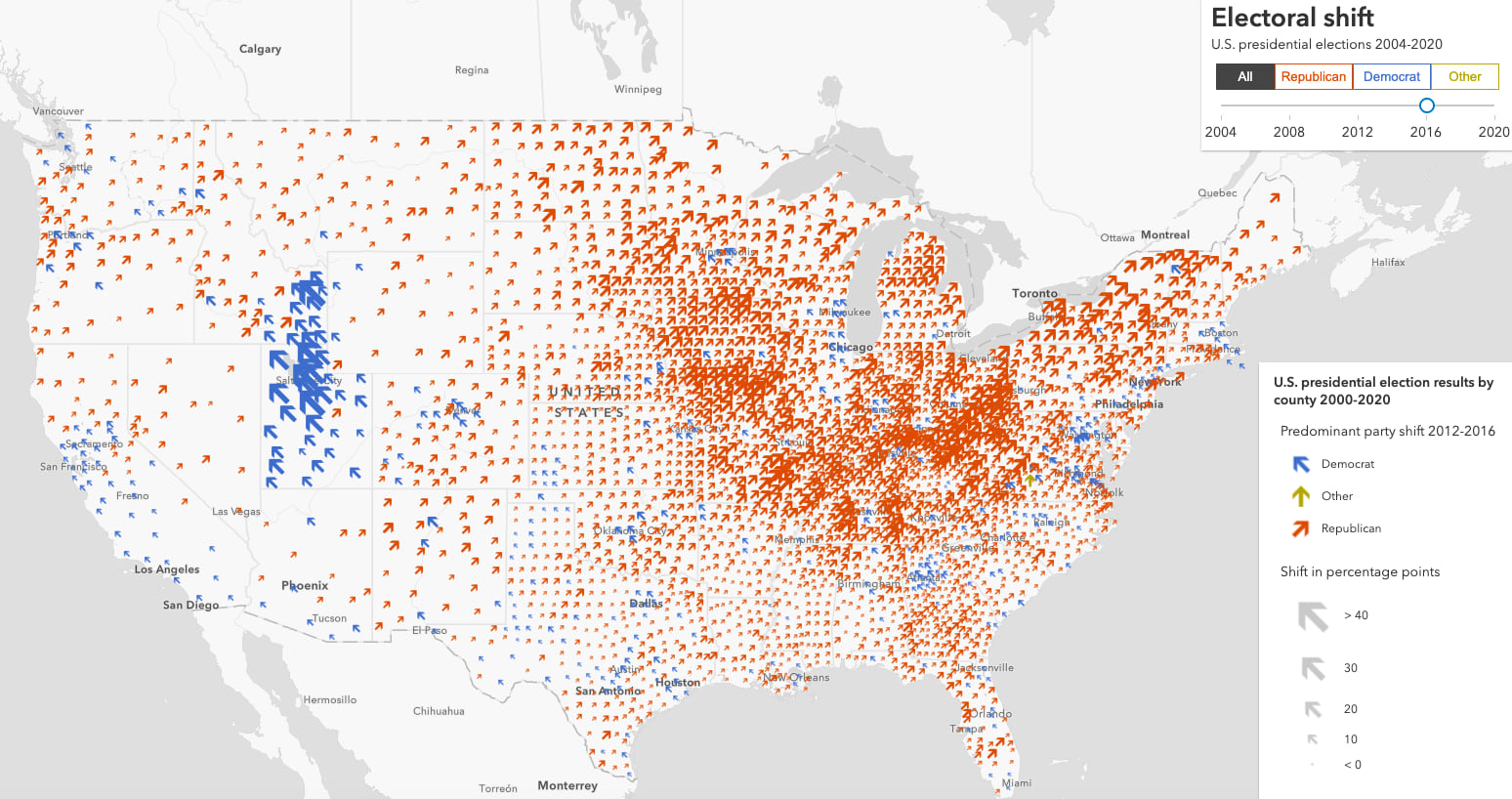
I also added a slider that allows you to explore the predominant party shift in each election from 2004-2020.
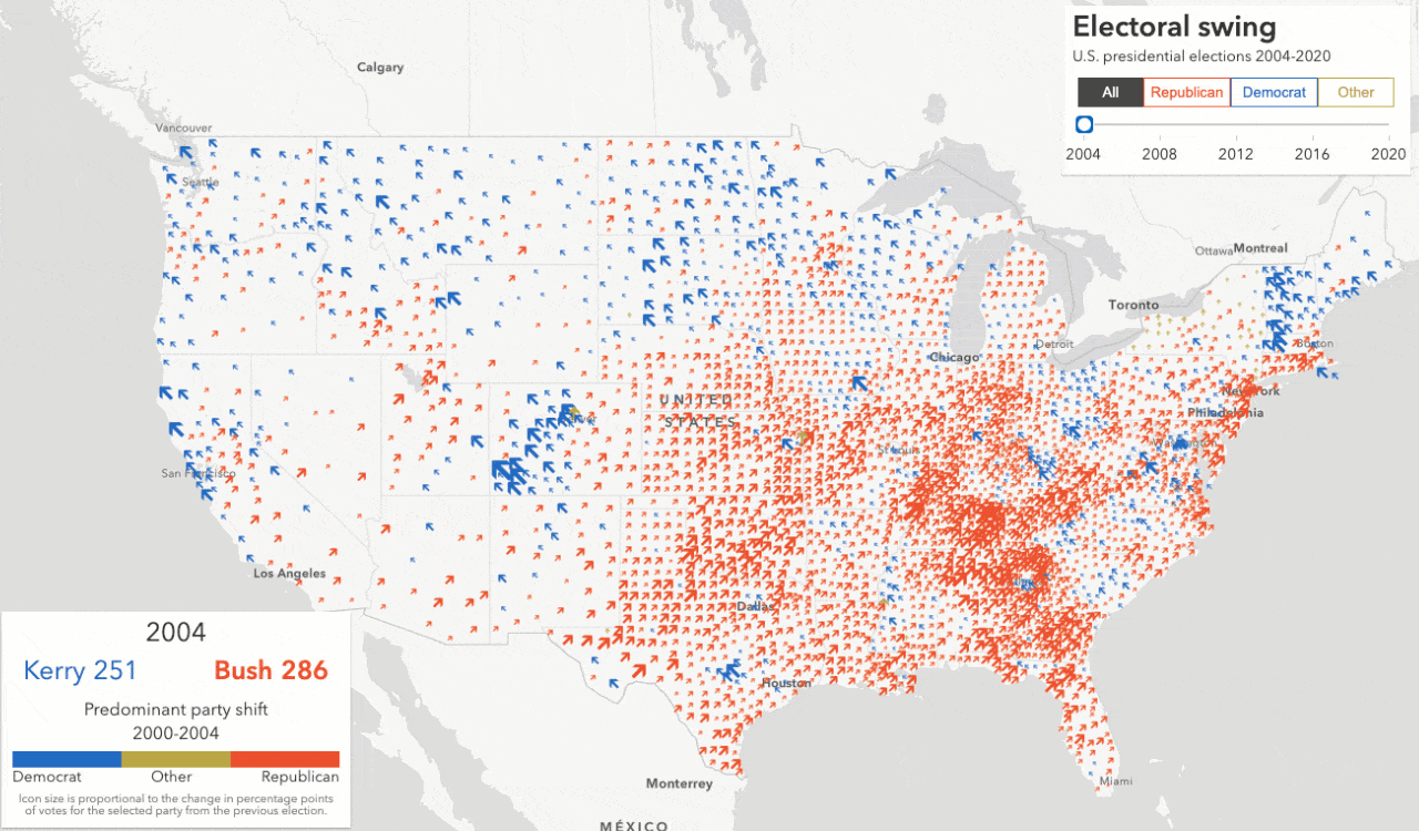
The 2016 map immediately caught my eye because of the overwhelming presence of yellow, notably in eastern Idaho and Utah. It clearly shows a greater shift in votes for third party candidates than in a typical election.

After looking up 2016 swing maps from several news organizations, I was surprised to see that nearly all of them showed a map that looked like this.
This map is significantly different. It appears that voters in Utah counties shifted overwhelmingly to the left. However, the complete data show third-party votes not only out-gained Democratic votes, but some counties reported more total votes for third parties than Democrats.
 than for the Democratic candidate (Clinton)")
The problem with visualizing swing
I love the arrow-style swing map, but it has some problems, which I address below.
1. Multiple parties may experience positive shift in the same county
First, showing the predominant shift hides any shift in votes for another party. The fact that Utah shifted so much to the right in 2020 leads the reader to believe there was no positive shift in votes for any other party.
In fact, all Utah counties (and almost every other county in the country) had an increase in Democratic votes. For that reason, I also added options for exploring how the percentage of votes shifted in each election for each party.


I created the legend using the renderColorRampPreviewHTML method in the JS API and the Histogram widget. Check out my post describing how to make your histograms legendary to learn more about creating custom legends using the Histogram widget.
2. Size may not indicate meaningful shift
The size of each arrow in the maps above indicates the size of the shift in percentage points. In the 2020 map, counties in Utah and the Rio Grande Valley are immediately obvious. While they did experience the largest shift, the map doesn’t show how much that shift factored in the result.
For example, Arizona swung Democrat in 2020 from Republican in 2016, but the arrow sizes in the traditional swing map are small for Arizona, making them less prominent even though the shift in Maricopa County was significant enough to flip the state blue.


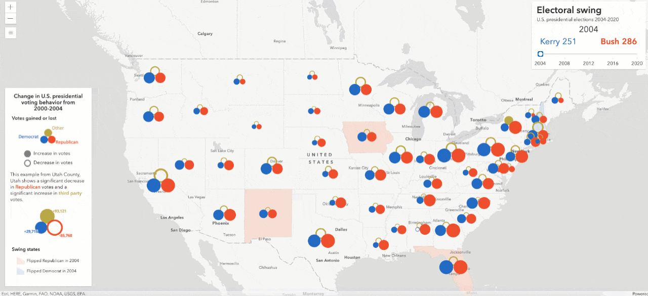
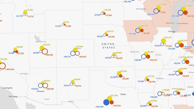
Electoral swing for each party in one map
The Electoral Swing map with composite symbols helps resolve some of the issues described above.

In a single view, you can see whether each party shifted positive or negative in the state or county level. Hollow circles indicate where a party lost votes. Solid circles communicate where a party gained votes.

States shaded with blue indicate a state that swung Democrat in 2020. This provides additional context to the composite symbols, indicating whether the swing in votes resulted in flipping a state’s electoral votes from the previous election.

County symbol sizes are normalized by the total state vote. This indicates which counties individually are more influential in determining how a state allocates its electoral votes. In the following image, Maricopa County is more prominent since it contributes more votes than any other county in Arizona.

Counties in the Rio Grande Valley are less prominent because they contribute fewer votes than other larger counties in Texas.
 are less prominent because they contribute fewer votes to the state total than other more populous counties.")
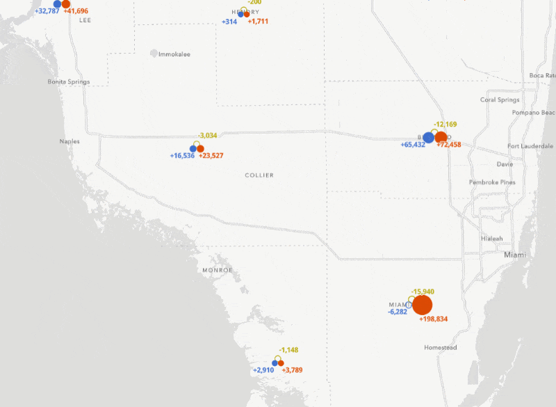
Swipe to view total votes per party
Use the Swipe widget to view how the change in votes compares to the result. For example, Biden significantly underperformed in Miami-Dade County, Florida, even though he earned the most votes in the county.
Explore the data
The following summarizes areas that saw a significant shift in votes between parties from the 2016 election.
Flipped states
Five states states flipped Democrat from Republican in 2020. They showed very similar patterns, though with varying numbers and margins. Expand the state name below to learn about how each voted.
Arizona
Biden won Arizona by only 10,457 votes. The popup below shows both Democrats and Republicans had significant increases in turnout. Ultimately, Biden out-performed Clinton in 2016 by nearly 5 percentage points, which was enough to propel him to win Arizona’s electoral votes.

As you zoom in, you can view patterns on the county level. While there were increases in both Democrat and Republican votes in every county, Maricopa County reported the most votes, where Biden won by a margin of 2.2 percent of the vote.
Click image for an enlarged view of the map


Georgia
Biden won Georgia by a similar margin as his victory in Arizona – only by 0.2 percentage points. The popup below shows nearly 600,000 more voters voted Democrat than in 2016, enough to improve the Democratic candidate’s share of the votes by nearly 4 percent.


As you zoom in, you can view patterns on the county level. While turnout increased for both parties in nearly every county, Fulton County (Atlanta) and its neighbors saw more significant increases in Democratic votes. In Gwinnett County, for example, Biden gained nearly 8 percent of the vote from 2016 (+75,000 votes). Trump lost 4.6 percent of his votes in 2016 despite him gaining nearly 20,000 votes overall.
Click image for an enlarged view of the map

Michigan
Biden won Michigan by a margin of nearly 3 percentage points. The popup below shows Biden added 3.3 percent of the state’s votes to the 2016 Democratic share.


As you zoom in, you can view patterns on the county level. Despite higher turnout on both sides, several populous counties shifted signifantly more toward the Democratic candidate in 2020 compared to 2016. Trump improved his share of the vote (+0.9%) in Wayne County (Detroit), but Biden did better (+1.7%). And Biden padded his totals in Kent, Oakland, Washtenaw, and Macomb Counties, while Trump’s share of the vote decreased in those locations.
Click image for an enlarged view of the map

Pennsylvania
Biden won Pennsylvania by a more comfortable margin of 81,660 votes (1.2 percentage points). The popup below shows both Democrats and Republicans improved their share of the votes from 2016.


As you zoom in, you can view patterns on the county level. Montgomery (Philadelphia suburbs) and Allegheny (Pittsburg) Counties saw the largest increases in votes for Democrats. While most counties in Pennsylvania shifted more Democrat than Republican in 2020, those two counties had the highest impact.
Click image for an enlarged view of the map

Wisconsin
Biden won Wisconsin in 2020 by a slightly smaller margin than Trump did in 2016, only 20,000 votes.


Biden can thank the voters in Dane County (Madison), and Milwaukee, where he won by huge margins. Biden also out-gained Trump in Waukesha County, a county Trump still won by 20 points, by adding 24,000 votes to his total – well more than his margin of victory in the state.
Click image for an enlarged view of the map

Other states
Other states showed interesting swing patterns, but didn’t actually result in flipping the state to the opposing party in 2020.
Florida
Biden gained nearly 800,000 votes in Florida, but that didn’t improve the share of the Democratic vote from 2016 (48 percent). Trump added more than 1 million votes from his 2016 total, allowing him to win the state by a healthy 3 percentage points (his margin of victory was less than 1 percent in 2016).


As you zoom in, you can view patterns on the county level. Perhaps the biggest factor in Trump’s larger margin of victory was in Miami-Dade County. While Biden still won more votes than Trump there, he actually won fewer total votes than Clinton did in 2016. That, plus Trump adding nearly 200,000 votes to his 2016 total, contributed to Trump gaining 12 percent of the county’s vote from his 2016 share.
Click image for an enlarged view of the map

Minnesota
Clinton won Minnesota by only 1.5 percentage points in 2016. Biden managed to win it by 7 points.


As you zoom in, you can view patterns on the county level. The counties in the Twin Cities area contributed the most to securing a strong Biden victory in the state.
Click image for an enlarged view of the map

Texas
Some polls showed Texas being a very close race, yet Trump still won the state by more than 600,000 votes (a margin of 5.6 percent). Despite the win not being that close, Biden still out-gained Trump, improving his share of the vote by 3.2 percentage points. Trump’s 5.6 percent margin of victory in Texas is narrower than any other winner in Texas since 1996.


As you zoom in, you can view patterns on the county level. While there was a strong Republican shift in the Rio Grande Valley, Harris County (Houston) saw the largest Republican gains. All metropolitan areas (including Harris County) had larger increases in Democratic votes. It still wasn’t enough to award the state’s electoral votes to Biden.
Click image for an enlarged view of the map

Conclusion
I love both styles of swing maps. Each has their pros and cons.
The predominant swing map with arrows makes it obvious which party gained the most ground from the previous election. However, it buries details about where the shift came from and places too much importance on less influential counties. It’s also impossible to know who won each state’s election at a glance.
The composite swing map makes it obvious who won each state’s election, which swing counties were more influential in the result, and it shows each party’s performance (swing and result) all at a single glance. The main drawback is that this map can show too much information, making it confusing to the user.
So which style is better? I suppose that depends on your audience. Both styles prompt me to ask questions and explore different stories. Once you understand how to read both maps, and understand the limitations and strengths of each, you will also find yourself asking more questions and getting lost in the data. And that’s a good thing.
Feel free to download the code and try this style with your own data.


Article Discussion: