The U.S. presidential election is only one month away, which means we’ll see a lot of maps showing the results of polls, projections, and ultimately results. One of the most common election variables to explore is swing.
Electoral swing measures the change in votes for one or more political parties between two elections. The following map shows a traditional swing visualization for the 2012-2016 U.S. presidential election using the ArcGIS API for JavaScript (ArcGIS JS API).

Expand to view the Arcade expression used to create this map
var rep12 = $feature.PRS_REP_12;
var rep16 = $feature.PRS_REP_16;
var dem12 = $feature.PRS_DEM_12;
var dem16 = $feature.PRS_DEM_16;
var oth12 = $feature.PRS_OTH_12;
var oth16 = $feature.PRS_OTH_16;
var all12 = Sum(rep12, dem12, oth12);
var all16 = Sum(rep16, dem16, oth16);

var rep12Share = (rep12/all12) * 100;
var rep16Share = (rep16/all16) * 100;
return rep16Share - rep12Share;
While this map is interesting, it fails to provide context to the swing. For example, there was a significant decrease in Republican support in Utah and Idaho, but those states still overwhelmingly voted Republican in 2016. Did they swing more democratic or did third party votes play a more significant role in the outcome of the election?
These questions led to the creation of the following app, which visualizes the swing, or change in votes for each party, on a state and county level.
Electoral swing for each party in one map

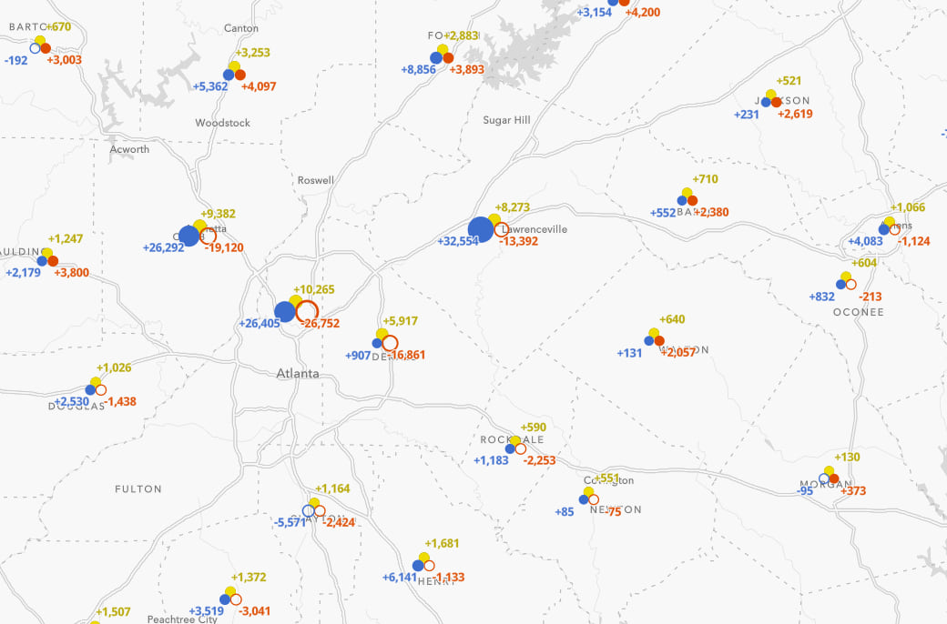
Each state and county in this map is assigned a composite (i.e. multi-part) symbol with three symbol layers: a red circle or ring for Republican votes, a blue circle or ring for Democrat votes, and a yellow circle or ring for other votes.
A filled in circle represents an increase in votes. A ring, or hollow circle, represents a decrease in votes from the previous election.

As you zoom in, a label will appear next to each symbol layer indicating the actual change in votes represented by the symbol. At a glance, you immediately see where gains in one party coincide with losses in another.

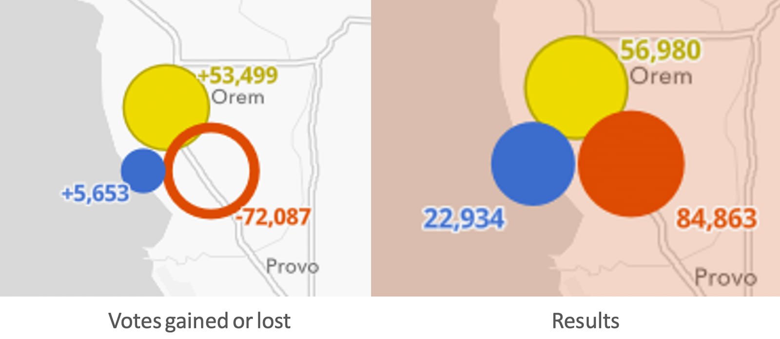
For example, Utah County, Utah shows a significant decrease in Republican votes and a significant increase in third party votes, with a slight increase in Democratic votes from 2012-2016.

The swing here appears to be significant. Interestingly, this county didn’t shift from right to left as the first map in this article suggests. Rather, it shows a shift from right to center. But how much did that swing matter?
Add context with swipe
I added a Swipe widget to allow the user to explore two views of this data.

The left view shows the change between both elections, and the right view shows the actual results. This allows people to view electoral swing in the context of how much that swing actually resulted in a shift in electoral votes.
While the change in Utah County was large, the third party votes didn’t result in flipping the state, let alone the county because support for the Republican party is so strong there.
Download or clone the code used to create this app to try this technique with your own data.
The remainder of this post explores some of the data and provides details on how this map was made.
Explore the data
Once the map was done, I couldn’t help but spend time exploring various parts of the country and seeing the shift on state and local levels. The shift was stark in many states, not just those that flipped parties in 2016.
Swing states
For the purposes of this section, I refer to swing states as the states that actually flipped parties from 2012 to 2016. States that nearly flipped, but didn’t, aren’t considered.
Six states states flipped Republican from Democrat in 2016. They showed unique patterns describing why they flipped. Expand the state name below to learn about how each voted.
Florida
Florida was one of three states (the others were Nevada and Texas) that saw an increase in voting for all three categories. You would think this would equate to a Democratic win considering the state voted Democrat in 2012. However, Republicans added a whopping 439,000 votes to their 2012 tally in 2016. This was enough to overcome the increase in Democratic votes, allowing Trump to win the state by 1 point.


As you zoom in, you can view patterns on the county level. Note while there was a larger increase in Democratic votes than Republican votes in large cities like Miami and Orlando, most other counties saw a decrease in Democratic votes. Republicans gained votes in almost every county of the state. The accumulation of these smaller gains was enough to flip the state.
Click image for an enlarged view of the map

Iowa
Iowa voted Trump by a margin of nearly 10 percentage points. The popup below shows this was due to a 20 point drop in Democratic votes and a significant increase in Republican votes.


As you zoom in, you can view patterns on the county level. Note that there was a near universal increase in Republican votes and decrease in Democratic votes. Not one county appears to be a major factor in the swing.
Click image for an enlarged view of the map

Michigan
Trump won Michigan by a very slim margin of 11,837 votes (0.2% points). More voters swung to a third party candidate here than they did Republican.


While Trump gained Republican votes in nearly every county, the lackluster turnout in Wayne County (Detroit) probably had more to do with his win than the Republican gains in small counties. Democrats lost nearly 79,000 votes in Wayne County, while 22,000 people opted to vote for a third-party candidate.
Click image for an enlarged view of the map

Ohio
Trump won Ohio by a healthy margin of 454,983 votes (8.5% points). While votes for the Republican candidate increased by 4.5% from 2012, it’s hard to overstate the impact the lower Democratic turnout likely had on the outcome.


As you look at individual counties, urban areas such as Cleveland, Dayton, Cincinnati, Akron, and Columbus saw a major drop in both Democratic and Republican votes.
Click image for an enlarged view of the map

Pennsylvania
Trump narrowly won Pennsylvania by 1.1% of the vote. Unlike Michigan, Ohio, and Wisconsin, this had more to do with a larger gain in Republican votes than a poor showing for the Democratic party.


As you look at individual counties, urban areas, with the exception of Philadelphia, actually showed more support for the Democratic party. Similar to Florida, the widespread support in all counties led to the Republican win.
Click image for an enlarged view of the map

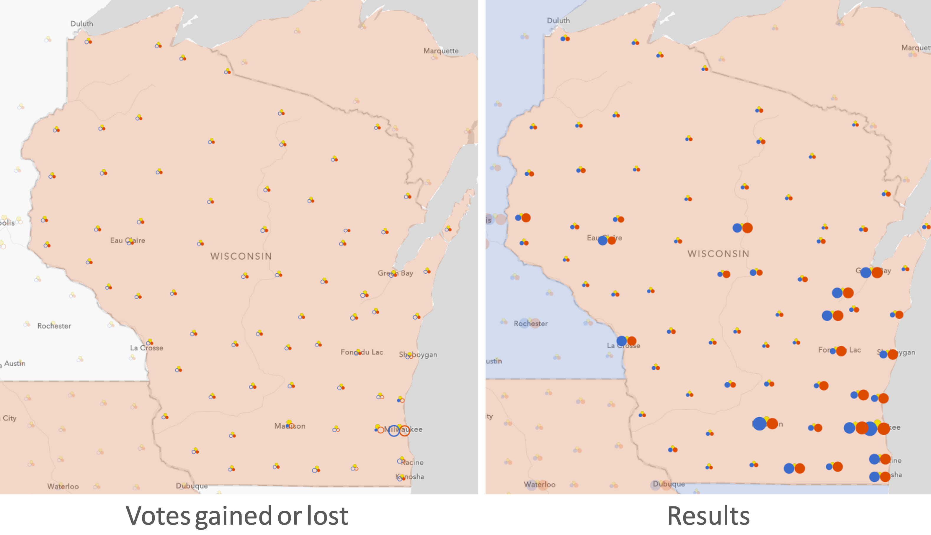
Wisconsin
Trump won Wisconsin by less than 1% of the vote. Yet only 1,500 more votes were cast for the Republican candidate in 2016 than in 2012! Clearly the lack of Democratic support and a huge increase in third-party votes were the primary reasons for swinging this state Republican in 2016.


Look no further than Milwaukee, where Democrats saw a loss of more than 43,000 votes compared to 2012.
Click image for an enlarged view of the map
Other states
Other states showed interesting swing patterns, but didn’t actually result in flipping the state to the opposing party in 2016.
California (and Oregon and Washington)
California has been a Democratic stronghold for a long time. You wouldn’t think so simply by looking at the swing map on the left. Despite the more that 2 million votes (30% drop) Democrats lost in the state, Clinton still won by a margin of 28 points.


Both Republicans and Democrats saw a significant loss of votes in 2016 throughout the state.
Click image for an enlarged view of the map

Texas
Like Florida, Texas saw a huge increase in voter turnout for all parties in 2016. It is the only state where Democrats gained more votes than all other parties. Despite the more than 16% increase in votes from 2012, they still lost the state by 9 percentage points.


On a county level, the increase in Democratic votes is clear in large cities and along the border. While Texas has traditionally been a solid red state, it appears to be trending blue even in a year when Democratic strongholds, such as California, saw a lack of enthusiasm to vote.
Click image for an enlarged view of the map

Utah
Utah is one of the strongest Republican voting states in the country. That’s why you shouldn’t read too much into a major drop in votes for Republicans. Despite Republicans losing half (yes, a 50% drop) the votes from 2012, voters still chose the Republican candidate by a margin of 19 percentage points.


Those lost Republican votes didn’t shift Democratic though. The majority of swing voters either opted not to vote at all, or vote for a third party instead. Third party votes nearly outnumbered Democratic votes. Third party gains were an enormous, but ultimately not a significant, increase from 2012.
Click image for an enlarged view of the map

How the map was made
This map was made using data-driven composite CIM symbols in the ArcGIS JS API. In a May 2017 blog article, John Nelson described this style of symbology as “multi-part graduated symbology”.
The main difference between Nelson’s symbols and those I use in the electoral swing visualization is the usage of filled versus empty symbols to indicate positive and negative change. The credit goes to my colleague Mark Harrower for inspiring this idea of using hollow symbols to represent negative values.
CIM symbols
CIM (Cartographic Information Model) symbols are customizable, multi-layered, scalable vector symbols that allow you to create complex multi-variate data-driven visualizations.
The renderer is normally responsible for overriding symbol properties based on data values. But renderers and visual variables can’t override the properties of individual multipart symbols like a CIMSymbol. If the basic primitives in the ArcGIS JS API renderers won’t cut it, then CIM is the way to go for full customization.
Depending on the geometry type, CIM symbols can be more complicated than how I present them. For the purposes of this article, the CIMSymbol is composed of two major parts:

Note there aren’t high level properties of the CIM symbol like color, size, etc. All the significant configuration happens on individual symbol layers.
Symbol layers
A symbol layer is a component, or part, of a symbol. You can configure its shape, color, texture, size, position, etc. Each circle of the electoral swing symbol is a symbol layer.

While you only see three symbol layers at a time, the electoral swing symbol actually contains six symbol layers. Three are simultaneously active, and the other three are dynamically hidden based on the feature’s data.
Expand to view how to configure the ‘Democratic votes gained’ symbol layer
const symbolLayer = {
  type: "CIMVectorMarker",
  enable: true,
  primitiveName: "democrat-positive-votes",
  frame: { xmin: 0.0, ymin: 0.0, xmax: 17.0, ymax: 17.0 },
  anchorPoint: { x: 0.5, y: 0 },
  anchorPointUnits: "Relative",
  markerGraphics: [
    {
      type: "CIMMarkerGraphic",
      geometry: {
        rings: [
          [
            [8.5, 0.2],
            [7.06, 0.33],
            [5.66, 0.7],
            [4.35, 1.31],
            // additional vertices
            // to complete the circle
          ]
        ]
      },
      symbol: {
        type: "CIMPolygonSymbol",
        symbolLayers: [
          {
            type: "CIMSolidFill",
            enable: true,
            color: [60, 108, 204, 255]
          }
        ]
      }
    }
  ],
  scaleSymbolsProportionally: true,
  respectFrame: true
};
At first glance, this snippet can be a lot to digest, especially considering it is just one of six symbol layers that compose a single symbol.
I will deconstruct the symbol layer to its various parts to describe how to build the symbol layers powering the electoral swing visualization.
Primitive name

The primitiveName uniquely identifies the symbol layer by name. It is crucial when you need to override a symbol property based on a data value. The primitive overrides section below describes how to dynamically override symbol properties.
On a fundamental level, it makes it easy to identify what you intend the symbol to represent. The following graphic shows the primitive names I assigned to each symbol layer.

Frame

The frame defines the bounds of the symbol layer’s geometry in relative screen units. The symbol layer geometry is defined in the markerGraphics property.
In this case, each symbol layer (circle or ring) is defined in a 17×17 square.

Anchor point

The anchorPoint defines how the frame of the symbol layer is anchored relative to the geometry of the feature. This can be in screen units or relative units. The relative units allow you to anchor the frame as a proportion to its placement over the feature geometry.
In the image below, I set a relative anchorPoint of {x: 0.5, y: 0} for both Democratic symbol layers because I want the anchor (or feature geometry) to be located 50% to the right of the frame.

Because Democrats are described as “left wing”, Republicans as “right wing”, and other voters generally as “centrist”, I chose to layout the symbol layers to match those directions using the anchor points described in the image below.

Why not use X/Y offsets instead of anchor points?
Initially I used offsetY and offsetX in the symbol layer properties to adjust symbol layer placement. But one offset distance doesn’t work well with symbol layers of various sizes.

To overcome this issue with offsetX and offsetY, you would need to write primitive overrides for each to describe how much to offset the symbol based on the size of the symbol layer.
In contrast, the anchorPoint ensures the symbol layer sizes are scaled from the anchor point so you never have to worry about adjusting symbol layer offsets based on data values.
Marker graphics

The markerGraphics property allows you to define the geometry and symbol of the graphic representing the symbol layer. I only define one circle graphic for each symbol layer.
Geometry
The geometry property of the marker graphic defines the shape of a vector symbol using coordinates within the bounds of the frame. In this case I create a circle.

See the full geometry definition of the circle I use in the app.
Symbol

The symbol configures the style of the graphic. This contains one or more symbol layers for defining how the graphic should look to the user. For the *-positive-votes symbol layers, I add a solid fill as shown in the image above.
For the *-negative-votes symbol layers, I add a stroke symbol layer to have the appearance of an empty circle.

Notice that I also set the scaleSymbolsProportionally property to true. This scales the thickness of the stroke as the symbol gets larger to make it prominent if the number of negative votes is large in comparison to other symbol layers.
Because defining a symbol layer can be arduous, and since all six symbol layers share many of the same properties, I created a helper function to simplify the configuration.
Primitive overrides
At this point, you may have noticed there is still no connection between the symbol layers and the data. We didn’t even define default sizes for each symbol layer. Thanks to primitive overrides, we can use Arcade expressions to dynamically change many symbol layer properties from data values.
Create a primitive override object
Primitive overrides are defined in the primitiveOverrides property of the symbol.
The only symbol layer property I’m interested in overriding is size. To override the size of a symbol layer, I need to reference its primitiveName and the propertyName.

If there is an increase in votes for a party, I want to display the corresponding symbol layer with the fill symbol at a size proportional to the positive change in votes and hide the hollow symbol layer.
Likewise, if there is a negative change in votes, the hollow symbol layer will display based on the absolute value of the change in votes.
Place the Arcade expression returning a new size in the expression property of the valueExpressionInfo object.

Use Arcade to dynamically override size
The primitive override Arcade expression does three things to determine a new size for the symbol layer:
Expand to view the full Arcade expression used to override symbol layer size
var votesNext = $feature.PRS_DEM_16;
var votesPrevious = $feature.PRS_DEM_12;
var change = votesNext - votesPrevious;
var value = IIF( change > 0, change, 0);

// assign sizes to data values
// interpolate between stops
var sizeFactor = When(
  value >= 500000, 40,
  value >= 100000, 30 + ((40-30)/(500000-100000) * (value - 100000)),
  value >= 50000, 5 + ((30-5)/(100000-50000) * (value - 1)),
  value >= 10000, 1 + ((5-1)/(50000-10000) * (value - 0.5)),
  value > 0, 0.5 + ((1-0.5)/(10000) * value),
  0
);

// adjust size based on scale
// symbols grow as you zoom in
// symbols shrink as you zoom out
var scaleFactorBase = ( referenceScale / $view.scale );
var scaleFactor = When(
  scaleFactorBase >= 1, 1,  // 1
  scaleFactorBase >= 0.5, scaleFactorBase * 1,  // 0.6
  scaleFactorBase >= 0.25, scaleFactorBase * 1,  // 0.45
  scaleFactorBase >= 0.125, scaleFactorBase * 1,  // 0.3125
  scaleFactorBase * 1  // 0.1875
);

return sizeFactor * scaleFactor;
Calculate a new data value
The following snippet from the expression demonstrates how to calculate the change in votes between the two years for the democrat-positive-votes primitive.
// 2016 Democrat votes
var votesNext = $feature.PRS_DEM_16;
// 2012 Democrat votes
var votesPrevious = $feature.PRS_DEM_12;
var change = votesNext - votesPrevious;
// size will be zero if there wasn’t
// a positive change in votes
var value = IIF( change > 0, change, 0);
Pay particular attention to the IIF(change > 0, change, 0) line. This determines whether the symbol layer will be visible. If there is a positive change in votes, then the difference will be used in the size calculation. If there was a negative change, then the size will be zero and the symbol layer will therefore not render.
This line is slightly different for the democrat-negative-votes symbol layer:
var value = IIF(change < 0, abs(change), 0);
This will use the absolute value of the difference in votes for the size calculation and return zero if there was an increase in votes.
Translate data values to size values
Because the value returned from the expression should represent a size value in screen units we need to properly translate data values to sizes.
The following snippet assigns sizes to specific data values and interpolates all sizes relative to the stops.
// assign sizes to data values
// interpolate between stops
var sizeFactor = When(
  value >= 500000, 40,
  value >= 100000, 30 + ((40-30)/(500000-100000) * (value - 100000)),
  value >= 50000, 5 + ((30-5)/(100000-50000) * (value - 1)),
  value >= 10000, 1 + ((5-1)/(50000-10000) * (value - 0.5)),
  value > 0, 0.5 + ((1-0.5)/(10000) * value),
  0
);
Adjust sizes based on view scale
Since one set of sizes doesn’t fit at all scales, I use the following code to grow symbol sizes as the user zooms in and shrink them as they zoom out.
var scaleFactorBase = Round( referenceScale / $view.scale, 1 );
var scaleFactor = When(
  scaleFactorBase >= 8, scaleFactorBase / 6,
  scaleFactorBase >= 4, scaleFactorBase / 3,
  scaleFactorBase >= 2, scaleFactorBase / 1.7,
  scaleFactorBase >= 1, scaleFactorBase,
  scaleFactorBase >= 0.5, scaleFactorBase * 1.2,
  scaleFactorBase >= 0.25, scaleFactorBase * 1.2,
  scaleFactorBase >= 0.125, scaleFactorBase * 2.5,
  scaleFactorBase * 3
);

return sizeFactor * scaleFactor;
Once each primitive has an override based on its corresponding data values, the visual will show nice, scalable multipart vector symbols that dynamically size based on data values and the scale of the map.
Working with size
The following describes some of the decisions that went into choosing how to scale features based on data values.
Legend considerations
There’s no doubt a complex visual needs a legend, especially when it involves multipart symbology. However, you may have noticed that size is not adequately described in the legend of this app.

In traditional print cartography, the legend would need to be more descriptive. The intention of the legend is to help the map reader read the values of individual features.
I intentionally decided to avoid a description of the size range in the legend because the size of county symbols and the size of state symbols actually have slight differences. However, the fundamental assumption with size remains true for both layers: larger means more.
Since the legend can’t communicate size effectively, I added labels and popups to display exact values. As you zoom in, labels appear with the values represented by each symbol part. The popup adds context to the raw values with additional information about the results of the election.
Size range (states)
The size of state symbol layers are based on the total number of votes. Since electoral votes in the United States are based on population, a higher number of votes indicates states with a larger population and therefore more electoral votes. So icons in California and Texas should be larger than those in the midwestern states.

It should be noted that it is theoretically possible that a high voter turnout in a smaller state may result in a larger symbol than a neighboring state with more electoral votes, but low voter turnout.
Size range (counties)
The size of a county’s symbol is based on the county’s total votes as a percentage of the total state votes. Jim Herries, suggested this awesome approach because in the United States not all votes are created equal. Since electoral votes determine the winner of the election, the overall value of an individual’s vote differs in allocating electoral votes for each state.
Therefore, a county with 3,000 votes in West Virginia has more influence in determining how electoral votes are distributed in that state than a county with 3,000 votes in Florida, simply because West Virginia has fewer people than Florida.
That is why the sizes of icons in Delaware and New England are much larger in size than equivalent county totals in other states. They are more prominent because results in those counties has a higher probability of flipping a state’s electoral votes from one party to another.

Choosing a size range
Choosing an appropriate size range for symbols is difficult. Each decision comes with benefits and tradeoffs. The correct decision depends on the story you want to tell.
I initially bounded the high data values and scaled features with a value of 0 votes to 0 pixels. This made the counties with more influence in determining electoral votes stand out on a state by state basis.

But that approach comes with a tradeoff. It takes away from seeing the results of all areas at once. Setting a larger minimum size helps identify rural patterns since the accumulated total of their votes can still significantly impact a state’s electoral votes.
I opted to make the minimum size larger since the accumulation of results from small counties was influential in some swing states.

Conclusion
I find this visualization fascinating. At a glance, you can see where gains in one party coincide with losses in another. I keep learning new stories as I explore how patterns shifted in different parts of the country. I look forward to updating this app with 2020 data as it becomes available.
Since another election is approaching (and more will follow in the years to come), I made this app configurable so you can try it with your own data. Simply clone this repo and follow the configuration steps in the README.
Give these composite symbols a try and share your maps!

Article Discussion: