ArcGIS Dashboards provide an easy way to communicate vital spatial information to those who need it. Alongside, ArcGIS Living Atlas of the World contains a wide range of authoritative spatial content from trusted data sources. Pairing these two together allows us to quickly create informative maps, and with the introduction of Data Expressions within ArcGIS Dashboards the possibilities are continuing to expand.
In the blog Introducing Data Expressions in ArcGIS Dashboards, my colleague Vivek Malleshappa explains how you can now use an Arcade FeatureSet to pull additional data into your dashboards. This is extremely powerful for two main reasons: you don’t need to own the layer, and you don’t have to add the layer into your map. Combining this functionality with the rich amount of content within Living Atlas opens new doors for dashboard creation. You can add context about the population, environment, infrastructure, and so much more. You can even add new elements to your existing dashboards without making any alterations to your web maps.
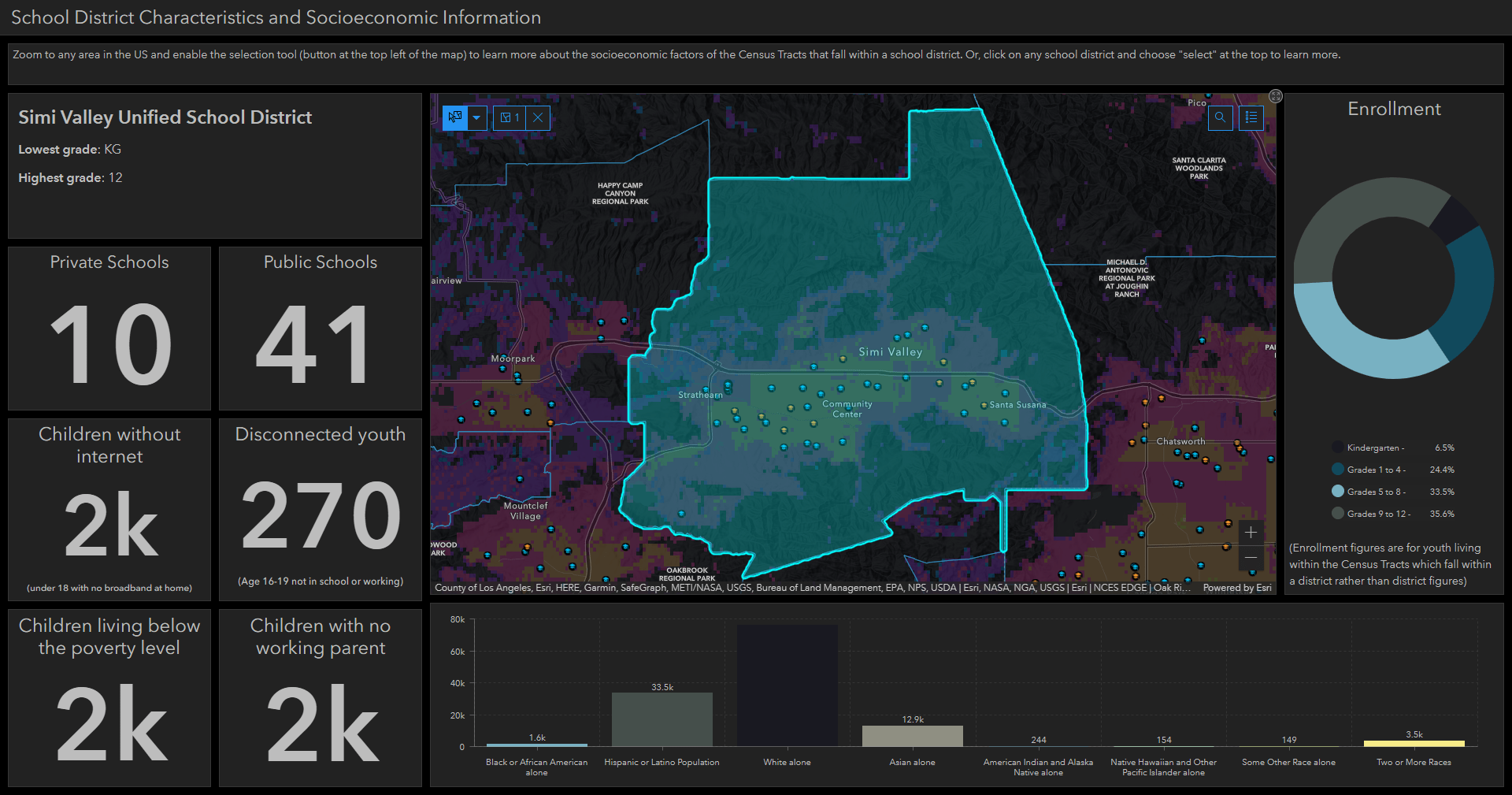
Here’s an example dashboard showing school districts in the US along with socioeconomic characteristics related to the population living within that school district. You can use the select tool on the map to learn more about the schools in a district, see the racial profile of the population living within the district, or gain insight about how many children are facing hardships within that district. You can see how the various indicators change from district to district, providing a comparison of the community characteristics.
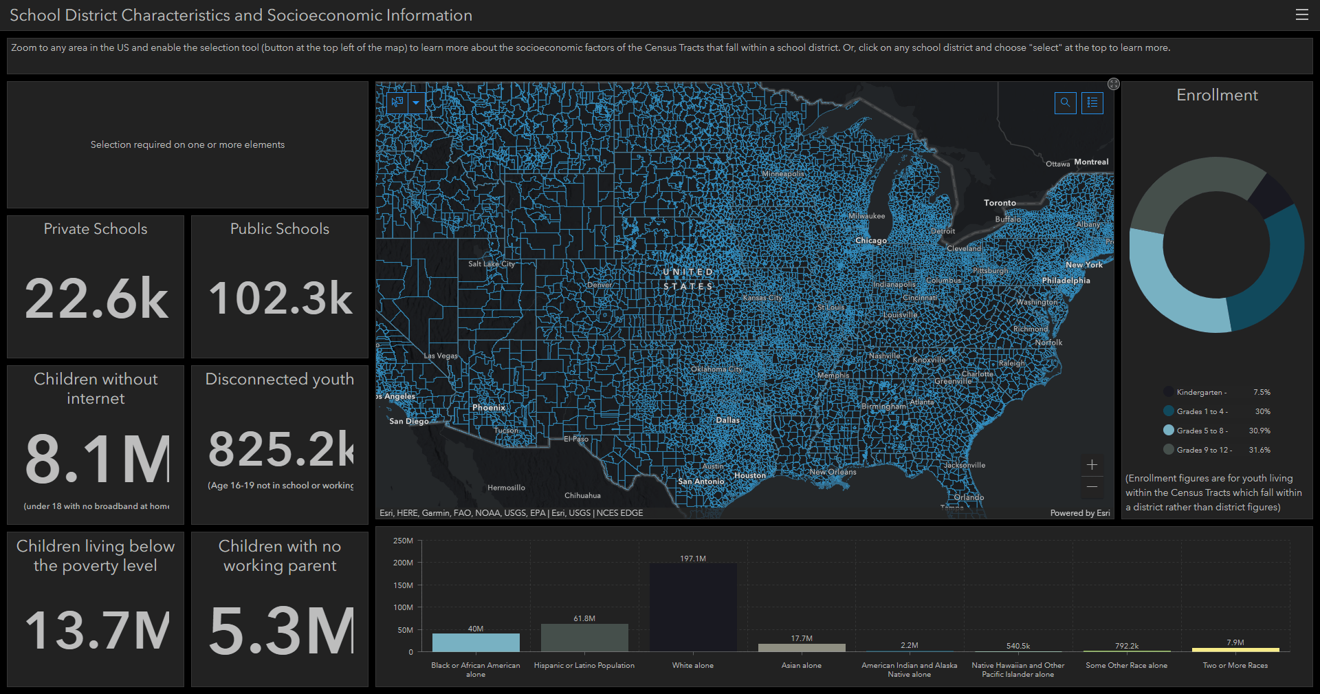
The (not so) secret is that this entire dashboard was created using Living Atlas content: the districts, the schools, and the demographics shown in the indicators. The real secret is that the map itself doesn’t contain any of the demographic layers. All of the socioeconomic indicators in this dashboard were brought in using Data Expressions to access the tabular and spatial information from four different Living Atlas layers:
- ACS Context for Child Well-Being – Centroids
- ACS Race and Hispanic Origin Variables – Centroids
- ACS Poverty Status Variables – Centroids
- ACS School Enrollment Variables – Centroids
With a few lines of Arcade (which you can copy from this blog), you can access the data from a public hosted feature layer from ArcGIS Online just as you would normally build dashboard elements from the layers in your maps.
Here’s what you need to access data from a layer:
- The item ID of a public layer you want to access data from
- The layer ID from the REST endpoint of the layer
Let’s run through an example to see how you can find these two things.
Find layers in Living Atlas
To find the information listed above, you’ll first need to find a layer containing the information you want to bring in. One way to do this is to search/browse content from the Living Atlas website and filter the item type to only find “Layers”. To narrow down the search to hosted feature layers, you can type the phrase type: “Feature Service”.
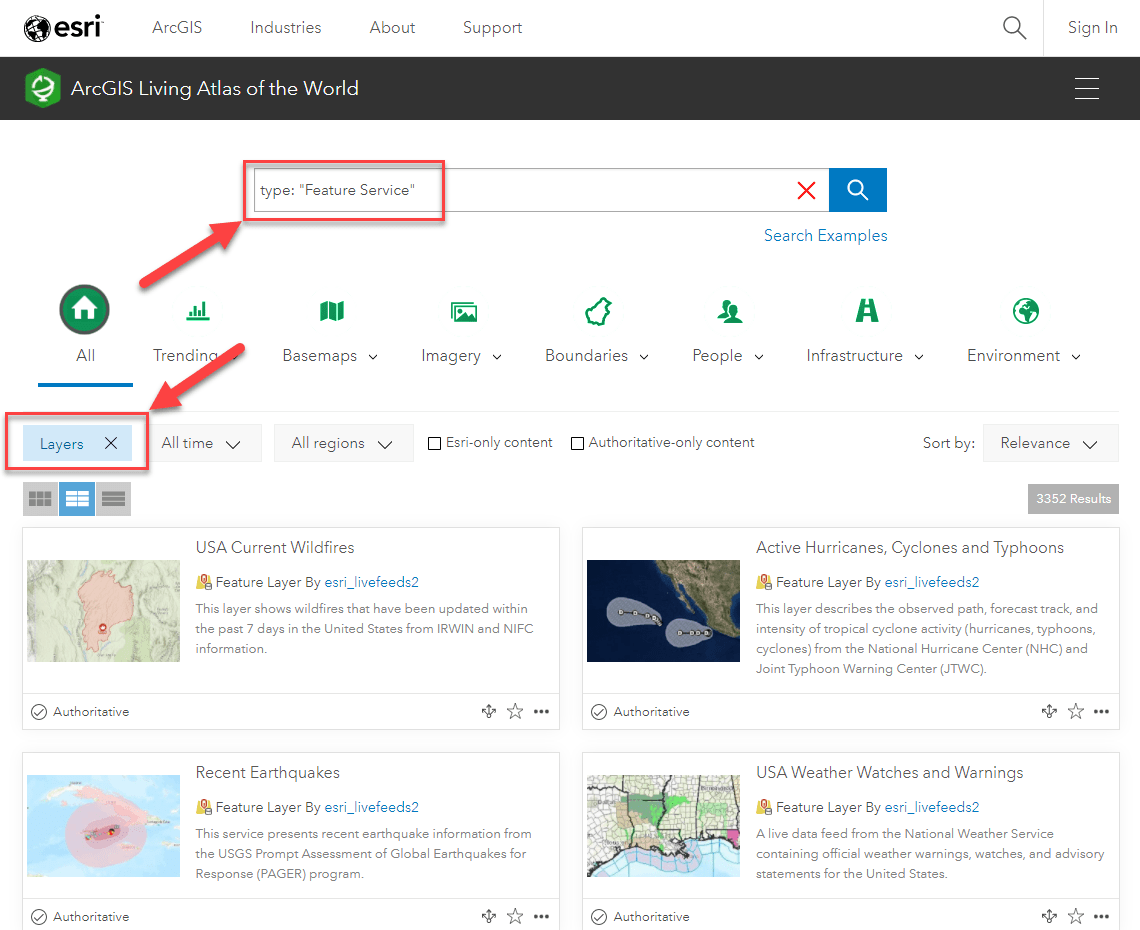
Click this link to get directly to this search.
You can browse through the various categories or use a search phrase to find content related to your interests. For my example, I wanted to explore how school districts differ throughout the country. To do this, I used the search phrase above and added “current ACS” before it. I then selected the “People” category to narrow down my search further. This brought me to a wide range of freely available layers containing the most current American Community Survey (ACS) data available from the U.S. Census Bureau.
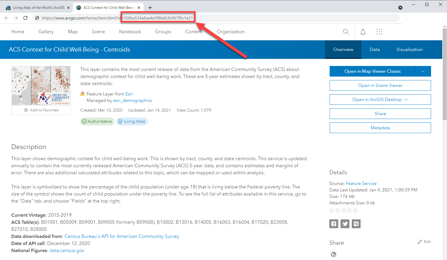
Within this collection of layers, I found topics related to education, at risk populations, and more. One layer that is particularly suitable for this dashboard is the ACS Context for Child Well-Being layer which contains attributes from many different ACS tables regarding the youth population in the US.
To learn more about a layer, the Item Details page offers us an in-depth view into what is available. The description for each Living Atlas layer will provide metadata about the source, and the Data tab shows us the data table and which fields are available in the layer.
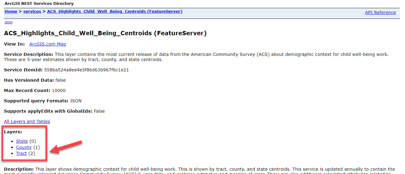
Once you have found a layer you want to use, the item ID can be found in the URL:
Scroll down on the page to find the service URL and open it to see the layers:
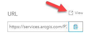
For our example, one of the things I want to include are attributes from the Census Tracts layer, so I’ll use layer 2:
Now that we have the two things we need to add a layer, let’s show how to add it into the dashboard.
Use Living Atlas layers in your dashboards using Data Expressions
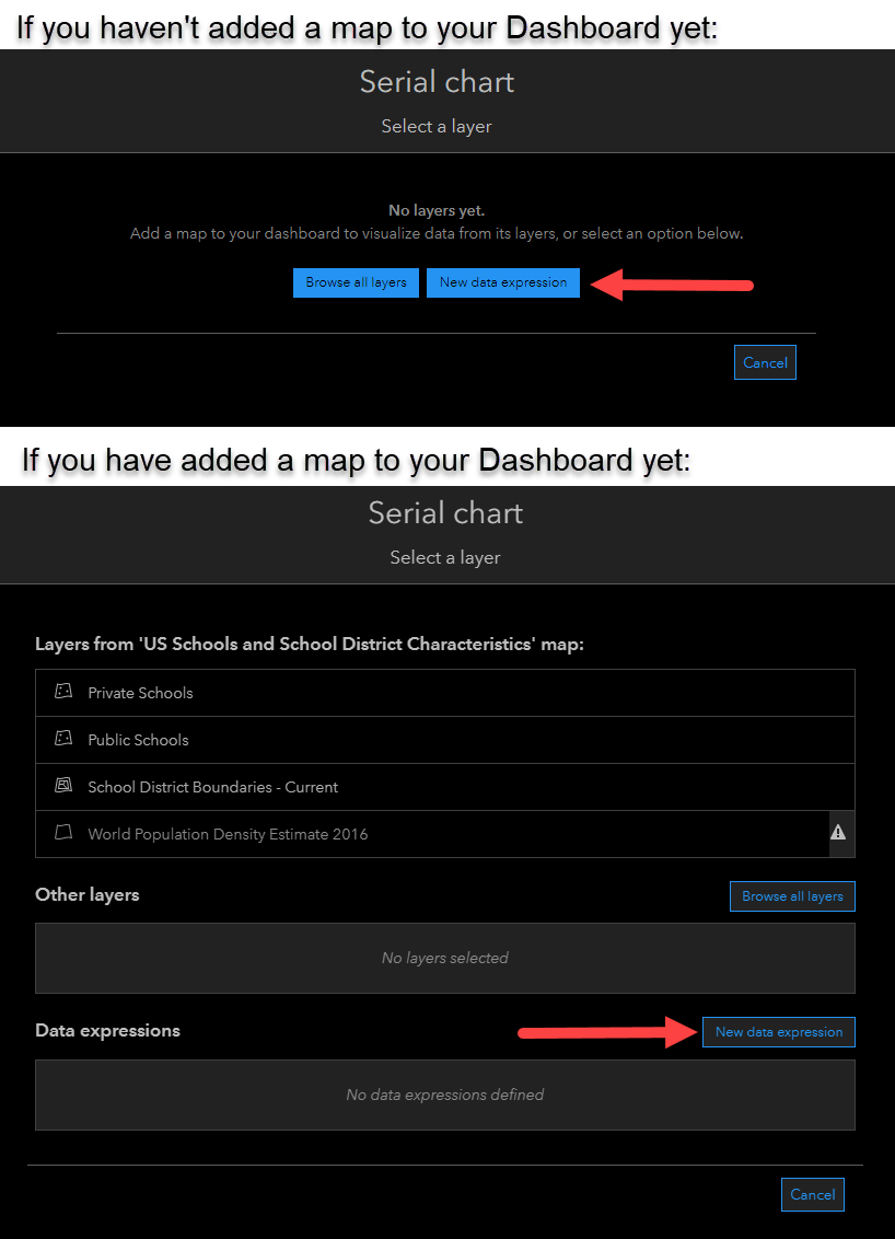
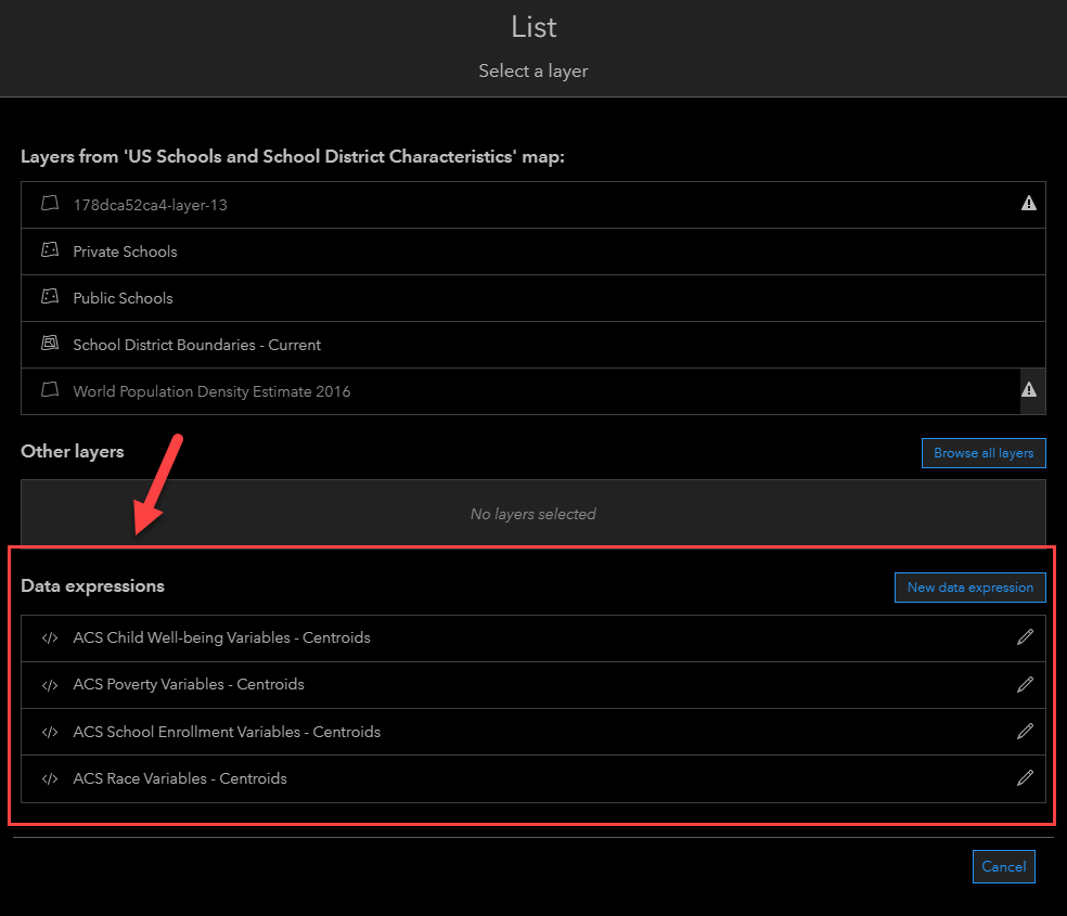
For each layer you want to access, you’ll create a Data Expression for that layer. You can reuse Data Expressions, so once you only have to write the expression once. To do so, add an element to your dashboard and choose to add a Data Expression instead of a layer from your map.
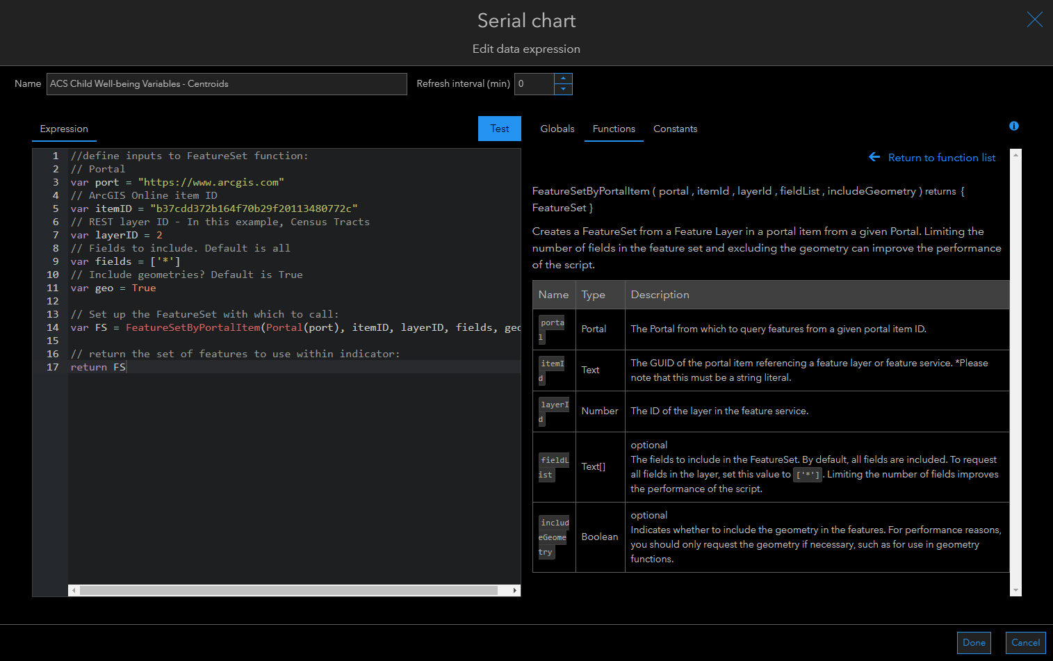
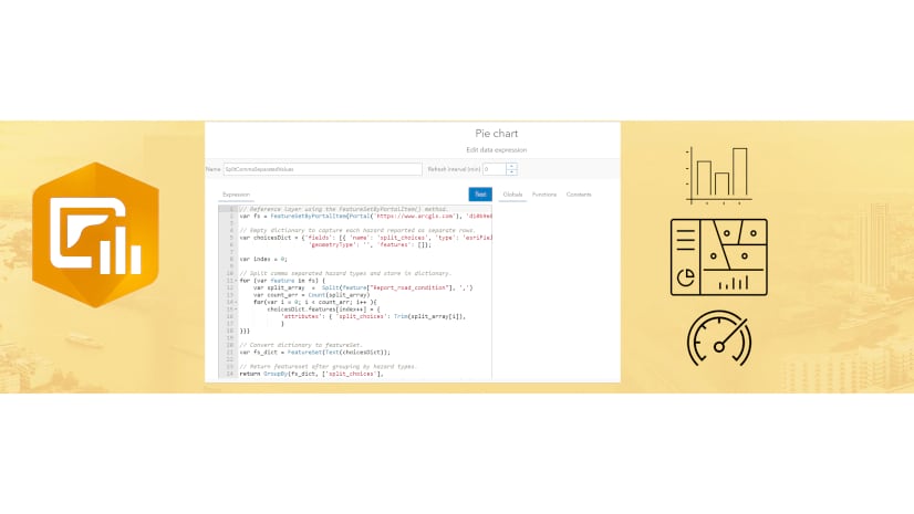
You’ll then use the FeatureSetbyPortalItem function to access the layer. The interface has built-in help for how to use this function (seen on the right in the screenshot below), but you can also copy the code snippet below.
This expression defines the portal (usually https://www.arcgis.com), the item ID you found earlier, and the layer ID you found earlier. Optionally, you can define the specific fields you need and if you need the geometries or not. By default, the dashboard will call to all fields and will bring in the geometries.
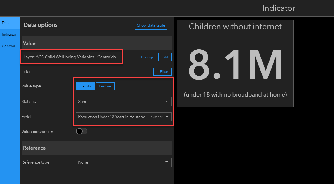
Now that the dashboard knows which layer to access, you can build indicators or charts into your dashboard as you would with any other layer. In this example, I want to filter the Census Tracts by the school district boundaries in order to see how many children have no broadband internet at home. This is a field from the layer I just brought in, so I can configure as normal.
I’ll follow the same process to bring in the other three ACS layers from Living Atlas. You can even re-use a Data Expression for multiple indicators/charts by accessing your Data Expressions the same way you access layers from the map.
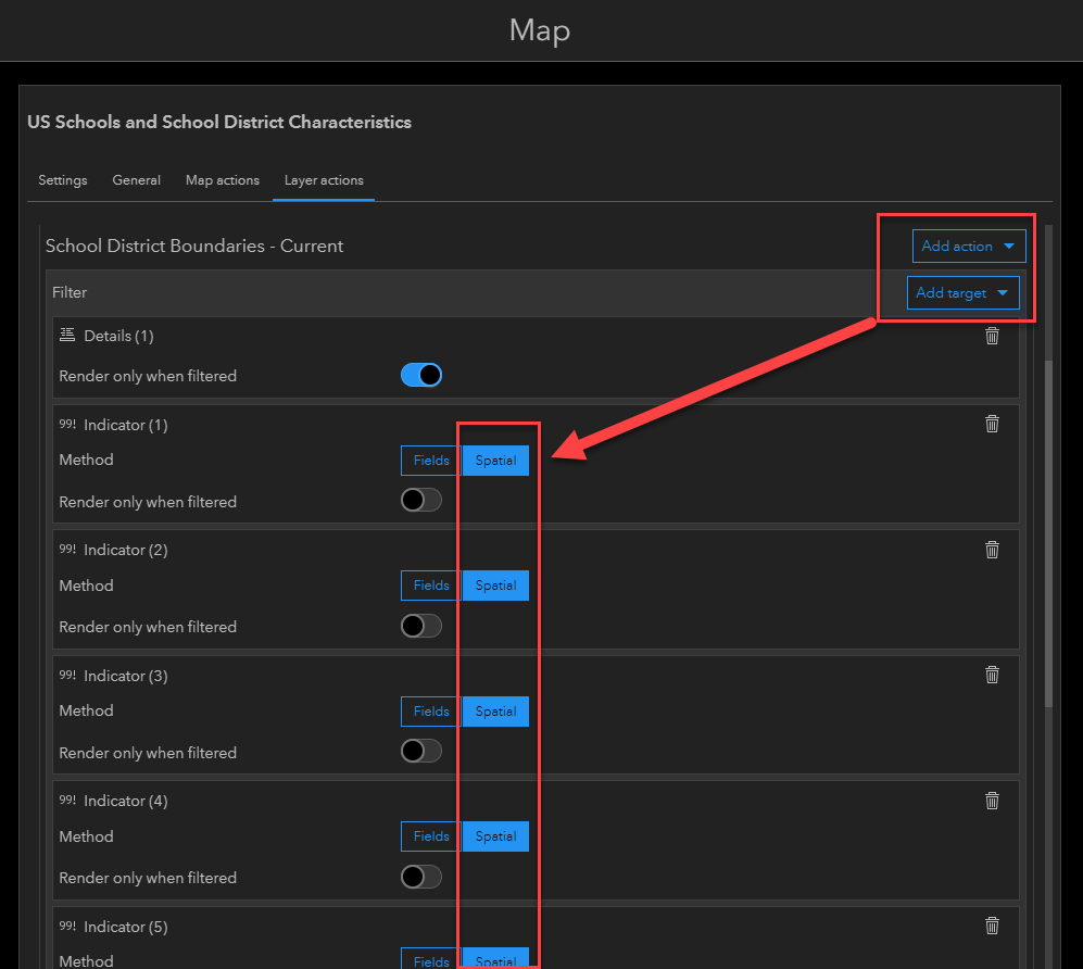
To finish this dashboard, I want the numbers to all change when someone selects a district. I set up the a spatial filter within the Layer actions of the map. This will filter the values by the Census Tracts that fall within the district.
Now, when someone clicks on a district, they get a comprehensive view of the socioeconomic factors of the people who live within that district. We can see the racial breakdown of the people who live there, the enrollment of students living within that district, as well as factors related to at-risk students:
This is just one example of how you can use Living Atlas layers within a dashboard using the new Data Expressions. You can create your own filters and indicators for your purposes from the wealth of content which is at your fingertips in Living Atlas.
Considerations/Tips and Tricks
As you apply this method to your own dashboards, here are a few things to keep in mind in regards to performance and Living Atlas content:
- While they are complimentary, data expressions and Arcade expressions written to provide advanced formatting of list and indicator elements are not the same. They utilize different Arcade profiles. Data expressions are designed to help you access data from a layer outside of your dashboard, so you will be returning a set of features instead of a dictionary of properties.
- If you run into issues, make sure your expression is returning a FeatureSet. Note that the GroupBy() function returns a FeatureSet, or you can use the FeatureSet() function to convert a dictionary into a FeatureSet.
- While data expressions are a convenient alternative to republishing data, they are not a replacement for data processing workflows. Certain operations in data expressions can be expensive and severely impact your dashboard’s performance. Refer to detailed documentation on the recommended best practices.
- Depending on their complexity, Arcade expressions can introduce processing overhead to your dashboard, thereby impacting the end user’s viewing experience. If you are using a layer with millions of records that need a spatial query, you may consider an alternative data processing method.
- Only use what you need. Only access the fields you need and don’t use geometries if you don’t need them. These can increase the query sizes and could slow down the performance.
- When creating Data Expressions, imagery layers are not supported. In general, hosted feature services are the preferred service type.
- Some layers from Living Atlas require a subscription or credits. These will have a special badge on the item so that you know if this is the case. If you use one of these layers in your dashboards, you have the option to enable them so that the end user will not be prompted for a login. Instead, your account will be used to give access to the end user. For more information, visit this help document.
Additional Resources
Blog: Introducing Data Expressions in ArcGIS Dashboards
Documentation: Understand data sources – Data expressions
Documentation: Create a data expression
Documentation: Data expression best practices
Article Discussion: