One of the main jobs of a dashboard is to give an audience information quickly and easily. Seeing numbers and text is useful, but without context, they can be meaningless. There are many ways to provide context to your elements, and with the ArcGIS Dashboards Beta, we have introduced support for Arcade expressions, opening a whole new avenue of conditional formatting.
Using an Arcade expression, you can now define your own logic and apply a variety of different formatting techniques to draw attention to important values, events, and situations. Let’s go through how we can use this technique in an earthquake monitoring dashboard like the one below.

In this dashboard, we have an indicator (top left) showing the count of earthquakes in the last 24 hours. With Arcade, we can define relevant logic and format the indicator to communicate only the information that matters. In this case, we want to see when there has been an increase or decrease in activity, but since minor fluctuations are perfectly normal, we really are only concerned with significant spike in activity. Here’s how we can do this.
1. Set up the indicator
First, we need to set up our data. In your indicator, we want to get a count of earthquakes within the last 24 hours as well as set up a reference with a count of earthquakes between 24 to 48 hours ago.
a. In the Data tab, from the Statistic drop-down, choose Count to get a count of your earthquake.
b. Apply a filter to only get a count of earthquakes less than 24 hours old.
c. Enable Reference and again, get the count of earthquakes.
d. Apply two filters. The first, for earthquakes greater than or equal to 24 hours old and the second, for earthquakes less than 48 hours old.

2. Calculate the percent change
Now that we have both the counts of the last 24 hours and the 24 hours before that, we can do a percent change calculation using Arcade to see what the increase or decrease was between the two time periods.
We do this by creating a new variable with the calculation (see below).
var percentChange = Floor(100*($datapoint.count - $reference.count) / $reference.count, 1);
3. Declare the thresholds
With the percent change calculation written, we now want to declare our thresholds. Like we said, we only care about significant spike activity and not minor fluctuations, so we want this to be reflected in our formatting. We’ll set two thresholds, one for when there has been a 5% increase or greater compared to the previous period and one for when there has been a 15% increase or greater.
var threshold1 = 5;
var threshold2 = 15;
4. Format based on conditions
All that’s left is to set up our indicator’s formatting when the conditions we set are met. We can set up three formats; one for when there is no significant increase, another for when there is significant increase, and the last for when there is an extreme increase.
When there is no significant increase in earthquakes, we’ll return the following:
In this format, the indicator will simply display the count of earthquakes in the last 24 hours, like the indicator below.

When there has been a significant increase in earthquakes, we’ll set the following to return:
With this, if there has been a significant increase in earthquakes, our indicator text will now be red, and text will be added to the bottom stating the percent change from the day before. In addition, we’ve made it so that an icon also appears beside the count by configuring the “up” icon below the Arcade editor. To learn more about using icons in indicators with Arcade, see this article.

Finally, when there has been an extreme increase in earthquakes, we’ll return the following:
In this case, if there has been an extreme increase, our indicator will turn red and a warning icon will appear beside the count to bring quick attention to the change.

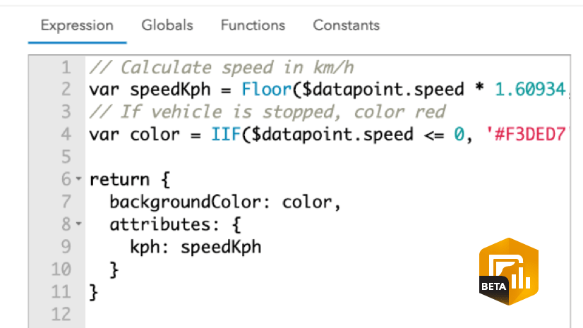
Your final expression will look something like this.

Take this technique and apply it to your own data to see how Arcade can be used in your dashboards to set up conditional formatting. Check out the advanced formatting documentation for more information on defining properties in your elements. You can also make a copy of this dashboard to see the expression and the rest of the dashboard’s configuration.
The Dashboards team at Esri is excited to see how you use Arcade in your own dashboards to set conditional formatting. If you can, share your innovative dashboards with us using #ArcGISDashboards.


Dashboards have many controls. Please be more explicit about where this expression is input. I’m assuming it goes under Value – Data Expression but cannot really be sure.