ArcGIS Dashboards enable users to convey information at a glance via highly configurable visual elements such as maps, gauges, and indicators. One key ingredient in creating compelling dashboards is well-structured data that is suited for visualization. For example, you may need a new field to hold a calculation or a modified string. Or perhaps you need to collate data that is spread across multiple fields or layers. These small data refinements can be challenging, especially when you don’t own the dataset.
To overcome challenges like these, the latest release of Dashboards introduces an exciting new capability named ‘data expressions’.
What are data expressions?
Data expressions are Arcade expressions written to return a FeatureSet. The returned FeatureSet is then used as the data source for one or more dashboard elements. By leveraging Arcade’s ability to perform mathematical calculations, manipulate text, evaluate logical statements, and so on, they offer dashboard authors a whole new set of capabilities for configuring informative and robust data visualizations. Dashboard elements backed by a data expression can participate in the full dashboard interactive experience.
Adding a data expression
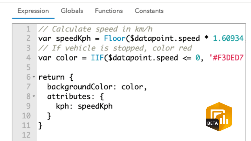
A data expression can be added from the ‘Select a layer’ screen when you add a new data-driven element or change the layer for an existing element. The ‘Select a layer’ screen has a new section for data expressions.

On the ‘Select a layer’ screen, clicking on the ‘New data expression’ button opens the Arcade editor. You can add a name for your expression and optionally set a refresh interval if you are working with regularly updating data. You can type your expression in the editor area and hit the ‘Done’ button to save it. Note that the ‘Data expressions’ profile does not support global variables. Instead, you will be using the Arcade FeatureSetByPortalItem() function to access feature layers.

Examples
Let’s look at a few common visualization challenges and how data expressions can help.
1. Data that needs restructuring
Often, when data is created or collected, it is not optimized for visualization. Take, for example, survey data from a survey with multiple-choice questions. Below is a sample data table capturing the output of a survey that asks road surveyors to input one or more road condition hazards.
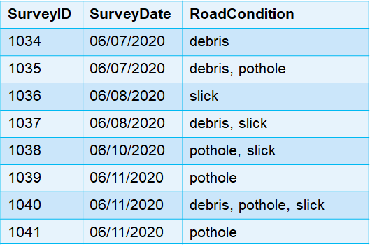
Creating a pie chart with slices derived from the RoadCondition creates an ineffective chart. What we really want to know is the number of reports by each hazard type i.e., pothole, debris, slick.

Let’s add a data expression so that each hazard type is captured in a separate row.
The resulting FeatureSet is a simple summary of counts by hazard type.
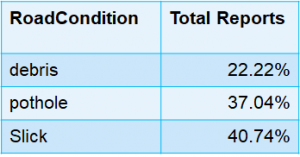
You can then swap the pie chart’s data source with the data expression to provide a better overview of the data.

2.Working with raw data
A common visualization challenge is when your data is transactional, but you want to show summary statistics in elements like the List. Below is a table with raw observational data water quality data collected across the state of Maryland.
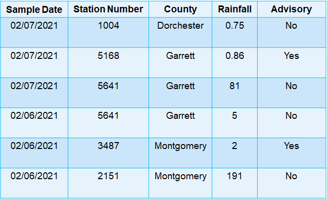
A list element from this dataset shows individual observations but does not provide insights into the dataset as a whole.

Using the following data expression, you can return summary statistics. And because the Arcade GroupBy() function allows the calculation of multiple statistics in a single function call, you can request statistics by county for total sites, average rainfall, and total water quality advisories.
The data expression generates a FeatureSet that provides statistics by county.
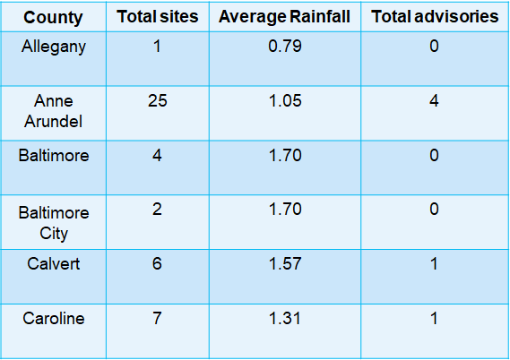
Once the data is summarized and acting as the list’s data source, you can add further informative value by configuring an expression for advanced formatting. What is shown below is just one example of what is possible.

3. Calculating metrics from values across columns
In this example, you can see how data expressions can be used to calculate metrics from data that is spread across multiple fields in a layer. The below expression is using sample data for COVID-19 for the state of California. Let’s calculate the Case Fatality Ratio (CFR) which is simply a ratio of confirmed COVID-19 deaths to cases. Deaths and cases are stored in two separate fields in the dataset, which is a common way of organizing data. We will calculate CFR for two points in time – the latest date and 7 days prior.
The resulting metric can be visualized in an indicator element.

Conclusion
These are some examples of how data expressions can help you build effective Dashboards. Stay tuned for more blogs on the many innovative uses of data expressions. Additional sample expressions are available on GitHub. You can also contribute your own expressions to the repository to share them with the rest of the user community. Also, check out the ‘Data expressions’ group to explore the Dashboards used in this blog.
We would love to see how you incorporate data expressions into your dashboards. Please share them with us on Twitter and LinkedIn using #ArcGISDashboards.


Hi Vivek, these examples are great!
I’m trying to figure out a way to create a FeatureSet in Dashboard that would grab features from an existing polygon layer and dynamically calculate area (in acres) for each feauture into a new field. Is this possible, and do you know of any examples you could point me towards?
Thanks for your help!
Hi, great topic,
Can we expect that globals will be accessible in the data expression editor in the future? In the demo video they clearly are.
Thank you,
This is incredibly helpful. For example 1, what if I have a survey over multiple years. I’d like the dashboard to default to all years data, but also allow users to apply a year filter. Can I accomplish both?
Hi,
how do you do the example 2.
I have followed your example. And I am not having the same type of visualization.
Do you have available the expression code for it?
cheers
Pedro
It would be great if you could show examples of how to include geometry in an expression that summarizes data or pulls data together from multiple sources so that the flash, zoom to, pan to, and show popup actions could be used.