
August 19, 2021 |
Este Geraghty, MD, MS, MPH, GISP |
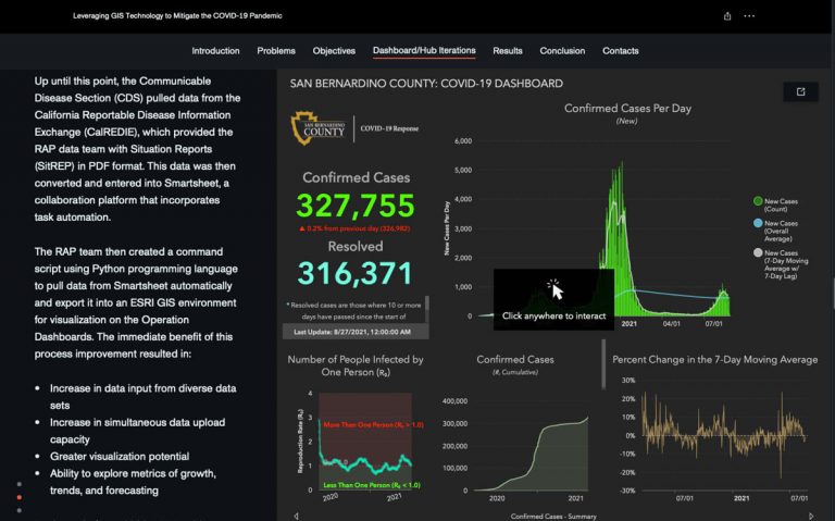
The Research, Assessment, and Planning (RAP) team at San Bernardino County Department of Public Health (SBCDPH) in California monitors the health and well-being of more than two million residents in the country’s largest county by area. Already a big job before the COVID-19 pandemic, the work became more challenging when office shutdowns and stay-at-home orders affected all 25 programs that deliver services to people facing heightened needs. In addition to continued support of the programs that rely on daily analysis, the RAP team also developed one of the state’s first COVID-19 tracking hubs using geographic information system (GIS) technology.
The county also understands the value of a geospatial lens for public health programs beyond tracking the pandemic. One recent project investigated the reason for a nearly decade-long decline in participation in the county’s Women, Infants and Children (WIC) program. Analysts created a smart map showing how far and how people must travel to reach their local WIC clinics, enabling officials to determine better placements for the sites to improve accessibility.
The initiative is part of a larger countywide goal to be more transparent both internally and with the public about how data informs decisions. Lap Le, statistical analyst at SBCDPH, explained how his team uses geospatial technology to analyze people and places and communicate the decision-making process.
“We have all this data, and it’s the primary driver in terms of an evidence-based approach to making decisions to positively affect the community,” Le said. “But at the same time, we also need to provide the data so that the public can understand what is driving those kinds of decisions.”
For more than 35 years, the WIC program in San Bernardino County has provided families with access to healthy foods, nutrition education, and community resources as part of the larger federal program. Since 2013, the number of program participants among eligible residents has been steadily declining, with a sharp drop in participation starting in January 2020 due to the COVID-19 pandemic.
When Le and his team began their WIC analysis, they started by interviewing clinic staff who believed one of the key barriers to participation was people’s ability to easily get to the clinic either by foot or public transportation.
Le explained, “At the ground level, when you talk to the clinic staff, they already understand where the needs lie. But we needed some solid evidence to justify certain moves or relocate clinics.”
Team members decided to map where current and past program participants lived throughout the county in relation to the clinics. They used GIS to display the aggregated data on a map. This allowed them to quickly understand where most of their participants lived without revealing street addresses or other confidential data.

Serene Ong, GIS analyst II for SBCDPH, explained that their next step was designed to test the hypothesis they had gathered from clinic staff. “Then we thought, ‘Okay. Is it easy or difficult for these participants to get to our clinics?’ So we created visual buffers on the map that indicated half-mile and one-mile walking distances around each clinic.” They also added a map layer that displays all the bus routes in the area to understand whether participants who lived further from each location had the option to take public transportation to their appointments.
Ultimately, the county used the information to tailor decisions about where WIC clinics should be located to best serve the needs of the community. “Our analysis is what drove the decision to move some of the clinics to a denser location and then remove certain clinics where there’s less of a need,” Le said.
Ong hopes that the next phase of the project will include mapping the density of potential participants for the program so that WIC can do a better job reaching communities that need these services.
Both Ong and Le joined SBCDPH in 2019, shortly before the COVID-19 pandemic began. One of their first projects together was creating an interactive dashboard to share information about the spread of the virus in the county.
Like many other local governments throughout the US, county officials were initially getting daily updates via a PDF document. The analysts used GIS to aggregate the information, pulling data from the California Department of Public Health’s Reportable Disease Information Exchange CalREDIE database to automatically update the dashboard daily. The team supplements state metrics with county-specific data.
“When the dashboard was first published, other counties wanted to have discussions about our workflow, how we update the data, and how we structure all the components,” Ong said.
Since the beginning of 2020, the dashboard has grown and changed significantly to better serve its users. “We get a lot of feedback both internally as well as from the public, so we’re always improving and making innovations to the dashboard to make it more user-friendly and interactive. It’s our goal to keep making it better for everyone,” Le said. One example is the addition of a schools tab where users can view what’s going on in each school district.
Through their experience creating and optimizing the COVID-19 dashboard, team members have been able to apply lessons and best practices to other data projects within the county. They’ve created dashboards for various programs and taught teams how to interact with the data themselves. “Now, instead of having each of the program stakeholders making requests, we can anticipate needs and have the data readily available,” Le explained.
The county uses smart maps and dashboards for a range of projects—from addressing vaccine hesitancy to improving efficiency for inspectors in the field. According to Le, county officials were initially hesitant to display any data visually. “Eventually, we made a few maps to show them how useful it is in terms of data display and representation instead of just using tables and charts. When it’s convenient or when it’s doable, we always use a map to represent our data, just to make it easier to interpret. Initially, there was a lot of pushback.”
Le paused and then added, “But we convinced them otherwise.”
Learn more about how health and human services professionals apply GIS.
Author note: The RAP team would like to offer special thanks to Chris Aquino, Anthony Arce, and Michael Castro for their invaluable contribution including scripted automation and streamlining of the processes necessary for the daily updates of the county’s COVID-19 and vaccination dashboards. And notably, the RAP team thanks Jake Campbell for his leadership and guidance to success in leveraging Esri technology to mitigate the COVID-19 pandemic.