
November 27, 2018 |
January 18, 2019

Data for decision making has long been the purpose and design of a geographic information system (GIS). In fact, ‘Data for Decision’ is the title of a documentary video created in 1967 that highlights the pioneering work of Roger Tomlinson, the father of GIS.
Much has changed since the early days of government-funded systems designed to guide only the very large public policy discussions. GIS tools and data are fundamentally more accessible and intuitive, a development that has expanded the use of GIS beyond the specialist.
“There’s a greater belief among a larger group of people that data can be useful to understand current conditions and accomplish change,” said Jim Herries, an applied geographer at Esri.
While few people have the time to become a data scientist, those willing to try mapping and spatial analytics can create information products that capture attention and lead to further queries.
“We always say that a good map answers a specific question, but a great map inspires three more,” Herries said. “Questioning the map is the key to discovery, and it happens so quickly and interactively these days. Someone can ask to see data in a new way or to adjust a key indicator and we can all see how the map reacts when anchored around a new goal.”

Maps Reward Careful Examination
A map can reveal patterns and point to areas in need of attention. However, turning a simple map into an intelligent map requires asking the map carefully considered questions.
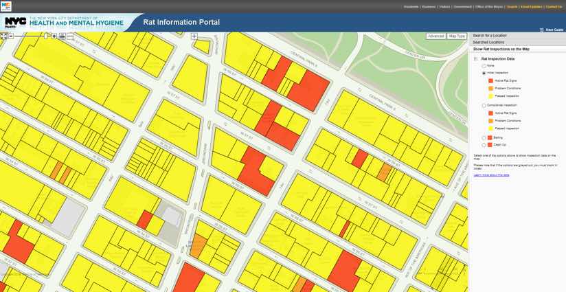
For example, when New York City officials unveiled an open data portal, they encouraged citizens to start creating maps. Many citizen-made maps looked at rat reports compared to restaurant locations.
Rats naturally occur near bigger populations. Normalizing for population densities helped the city reveal restaurant clusters that were outliers. By investigating additional data, they found that the biggest cause of more rats in the outliers was poor trash removal practices, leading to actionable information.

Revealing Otherwise Hidden Patterns
While data collected and shared by the federal government is a crucial resource for local communities, the importance of local data should not be overlooked.
Data must be looked at as a natural resource. Local governments need to investigate and exploit this resource because from the data comes knowledge, and knowledge guides policy decisions.
Too often anecdotal information carries the conversation, but it contains biases and is often wrong. This was the case for the mayor of a small city in West Virginia who was exploring local data in the epicenter of the opioid crisis. The mayor was certain that the opioid problem followed the same pattern as crack cocaine and meth in his community—with distribution and consumption in warehouses and rowhouses.
When data on overdoses were geocoded, the mayor fell silent, because the hotspot was in his neighborhood. Seeing it made him reflect on a friend of his son who overdosed and casualties he heard about at church. Up to that point he had relied only on anecdotal evidence.
Other US cities, such as Tempe, Arizona, are gaining ground on opioid overdoses by sharing data openly. A near real-time map-based dashboard of opioid-related emergency response calls in the city helps responders and policy directors understand what’s happening and prepare data-driven responses.

Engaging Citizens through Apps and Maps
Field data collection applications that can be used on any tablet or smartphone are a central component to modern GIS. Modern templates and tools make it simpler to create easy-to-use apps. The apps serve as a two-way dialogue between citizens and government, showing community input on a shared map.
In Florida, for example, interactive maps provide effective communication with the public. Nine Florida counties created ballot initiatives to add a penny-on-the-dollar sales tax to be spent on capital improvements. Officials at Leon County, home to Tallahassee, made a story map of all proposed projects to show what could be built where with the added tax income.
The initiative passed in Leon County with a 5:1 ratio while in the other counties it failed by a 1:5 ratio. The next year the other counties communicated the tax the same way, through an interactive map that related proposed projects to places people know, and the taxes passed.
Communities are quickly realizing they can use apps—such as story maps, open data websites, and location-based surveys—to create connections and improve our understanding.
When a city’s field workers from police, sanitation, and parks departments collect information about things that aren’t right—trash in the street, streetlights that are out—it creates a live actionable information system.

Policy Maps for Citizens, Officials, and Data Scientists
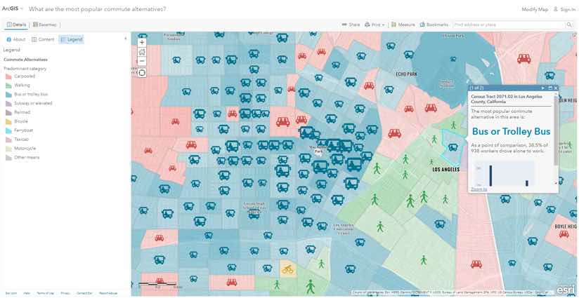
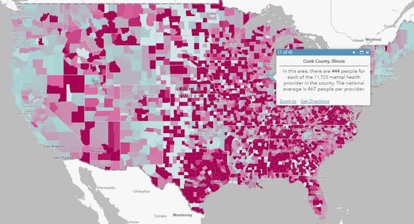
Esri holds a unique position with municipalities because most governments use geospatial tools to improve the delivery of services. The Esri Maps for Public Policy initiative packages many previously shared items as themed bundles. Contents include maps, data, templates to create configurable applications, analysis examples, lessons, and more.
“We’ve gone to great extents to curate data in our ArcGIS Living Atlas,” Herries said. “The Esri Maps for Public Policy initiative exposes these resources in a more intuitive way, helping non-GIS professionals identify and acquire data, and learn from data we provide as well as their own.”
The Esri cartography team’s initial vision is to take known good maps and to share them with a single link so that GIS users can put them to immediate use.
In addition to its use informing governments and citizens, GIS is rapidly becoming a go-to tool in the field of data science. As the field grows, it will require greater collaboration and sharing between practitioners to bring about a more knowledge-based society. Esri Maps for Public Policy aims to provide some guidance toward that progression.
“Putting dots on a map often possesses our users, because making a map is seen as the sizzle,” Herries said. “GIS creates much more than maps, it lets you dive into the data to explore context and create understanding.”
Visit Esri Maps for Public Policy to explore community perspectives, data resources, case studies, best practices, learn lessons, and more. Topics to explore include: social equity and health; economic opportunity; transportation and infrastructure; resilience and sustainability; environment and natural resources; and public safety.

November 27, 2018 |

January 11, 2018 |

August 28, 2017 |