

August 5, 2025 |
John Beck | Public Safety
At any given time, an estimated 250,000 people in Seattle and other parts of King County, Washington, don’t know where their next meals will come from. Here, as in many urban communities, compounding factors determine who has access to fresh, healthy food and who does not. Race and income impact food insecurity, and communities with this vulnerability tend to be clustered by zip code.
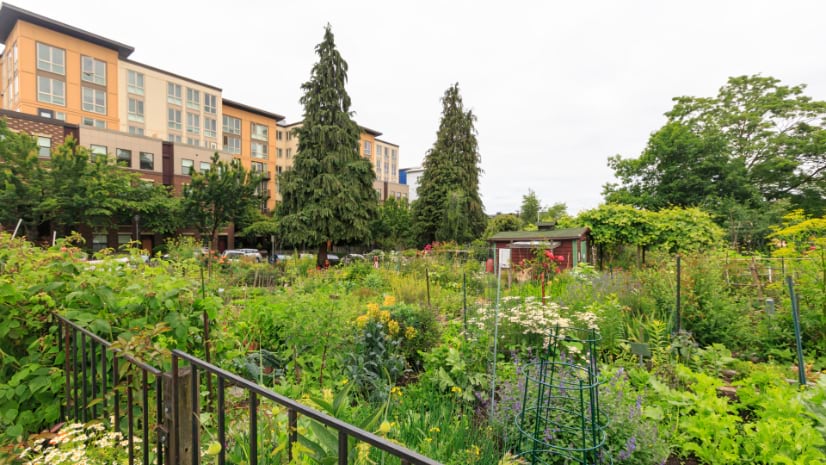
Seattle’s Food Action Plan, a long-range strategy for unblocking barriers to food security, looks beyond traditional programs to help residents put fresh food on the table. Fruit orchards, community gardens, and other projects on public land are a growing part of the solution.
Yet, turning the plan’s aspirations into real, sustainable outcomes—healthy, vibrant communities—requires clarity and precision. That’s where community organizers get help from smart mapping tools like Seattle’s Racial and Social Equity Index (RSE), powered by geographic information systems (GIS) technology.
Combining the RSE Index with additional data-rich maps, departments can answer essential questions to more effectively address hunger: Where are the communities most vulnerable to food insecurity? What food programs are already in place to fill in gaps, and where are they located? Where is public land available that could be used to expand food production? Equally important, where can new public investments make the greatest difference?
As an additional benefit, access to GIS provides nonprofits and other community organizations up-to-date information about Seattle’s Urban Food Systems (UFS) Program and local food production. Partners use the data to locate resources, determine food availability, coordinate services, and prevent waste. Until recently, this information was available only to city staff.
“I’m really hopeful because I see what can happen when we have meaningful and effective collaboration between community groups and government working together to co-create solutions and change through our policies and programs,” said Bridget Igoe, food policy adviser for the City of Seattle.
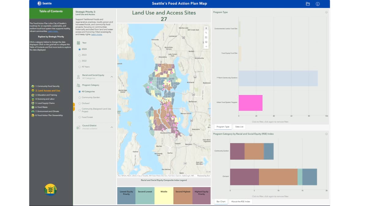
Seattle’s UFS Program is one of many programs in the city that collect and monitor GIS location data for better planning and decision-making. UFS’s Food Action Plan Map incorporates RSE index data on race, ethnicity, and socioeconomic and health disadvantages to identify equity priority census tracts. The map also shows where food is grown, where it’s distributed, and where gaps still exist.
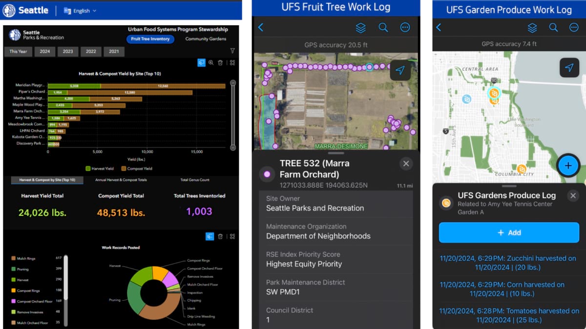
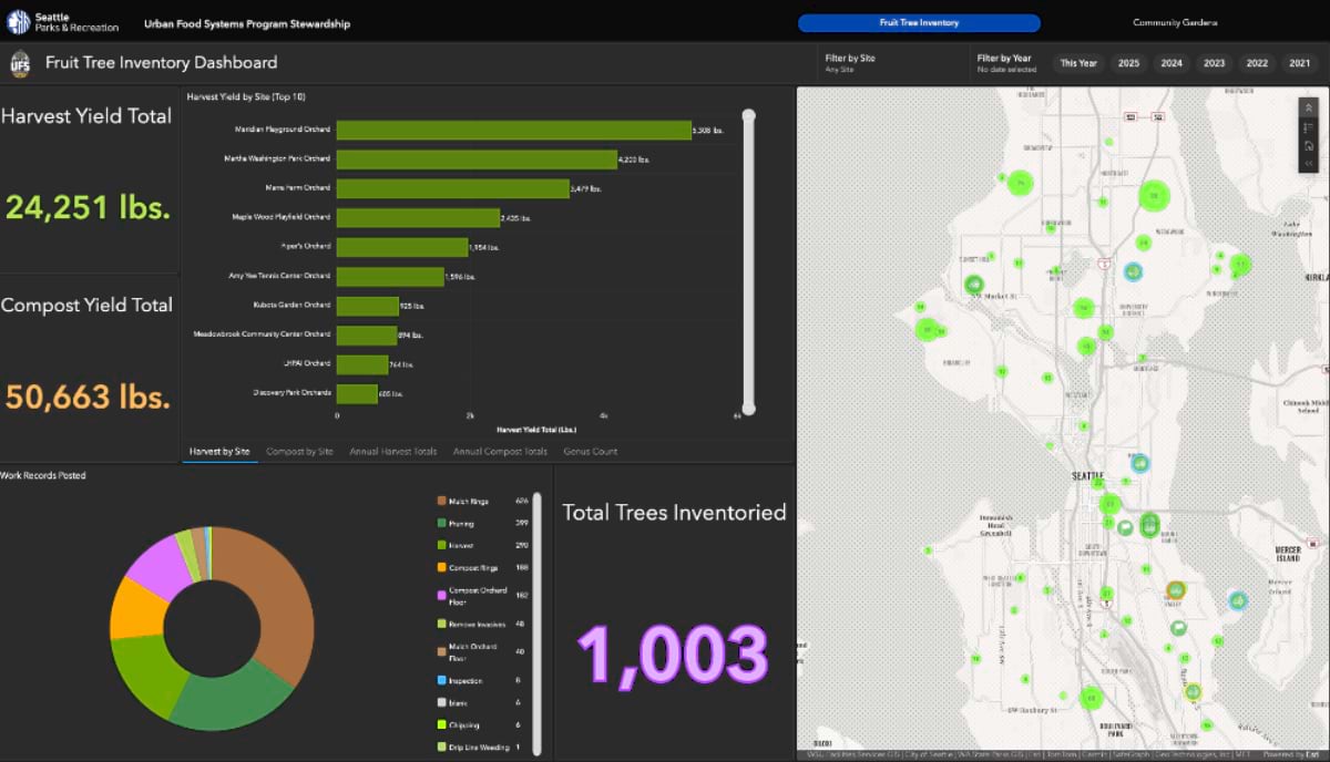
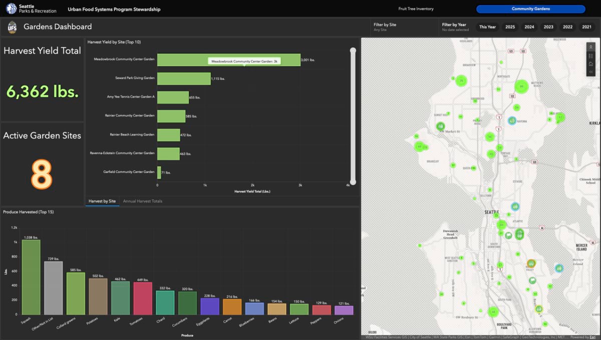
A second GIS resource, for greater visibility into the local-food supply chain, is the UFS Program Stewardship dashboard. It provides detailed inventories on food harvested from community gardens and more than 1,000 fruit trees flourishing on public land. Local food pantries distribute fruits from the orchards. Grab-and-go produce bags that include culturally relevant foods for Black and Indigenous residents are available free at Delridge Farmers Market.
Creation and implementation of the dashboard made a significant impact on how UFS communicates information to its stakeholders and communities at large.
“It changed everything,” said Paris Yates, UFS program manager. “We now have a live system that anyone with access can use without having to ask for the information.”
What makes the Food Action Plan Map especially valuable is its visual representation of where food programs and distribution sites appear in proximity to neighborhoods that have endured the greatest historic and ongoing disadvantage.
The patterns should change over time as community data, cross-departmental teamwork, and authentic community partnership combine to make equity in service delivery real. “In this way, the map becomes a picture of both progress toward food security and lingering gaps,” said Jordan Ng, the GIS analyst who worked with Yates to build the platforms that track program stewardship, maintenance activities, food harvest, and equitable service delivery.
With the Food Action Plan Map now active and new data compiling for an accurate assessment of food production, city staff and community partners have the insights they need to continue refining their outreach strategies. They also hope the data will help improve coordination among agencies for quickly moving perishable food to people who need it.
The RSE Index draws on three layers of data: race and ethnicity, socioeconomic disadvantage (income and education), and health outcomes (for example, obesity, asthma, and life expectancy). Combining these indicators enables Seattle’s Office of Planning and Community Development to provide a tool for advancing equity not just in food programs but also across city government.
No longer is equity an abstract principle. Today, it is a measurable, decision-shaping component that moves project teams from intention to data-informed choices.
City staff can use the index to establish standard processes for identifying service gaps, improving outreach, and ultimately connecting residents with the resources they need. That might mean help paying utility bills, access to clean energy programs, or support navigating the legal system.
A range of Seattle’s service delivery teams now rely on the RSE Index:
The RSE Index has strengthened cross-departmental collaboration, particularly between the GIS team and the long-range planning team. Together they help teams across the city ensure that decisions about investments, outreach, and policy are grounded in high-quality data reflecting community demographics and experiences.
Seattle’s approach to equity within service delivery has become a model for other communities. Instead of starting from scratch before every decision, city teams begin with a common view—based on maps and data—that tells the story of how quality of life and basic needs differ by neighborhood. The goal might be food on more tables, protection from flooding, or simply keeping the heat on in winter. The starting point is a map showing who needs the most help and where they live.
As Jordan Ng put it: “GIS helps us tell the story of why this work matters.”
Learn how cities are using GIS to advance racial and social equity. See how a city can integrate social equity analysis to make investments aligned with the severity of needs.