There’s certainly a lot of conversation about bias in the news, but our map is totally objective. The map doesn’t say the wall is a good idea or a bad idea. It simply shows the real world.
Josh Susong, news director at The Arizona Republic
September 28, 2017
The border between the United States and Mexico has long been in the news, but few know what it looks like. The newspapers in the USA Today Network that regularly report on the border undertook a large-scale mapping effort, using cutting-edge technology, to bring the entire corridor to light.
The mapping and reporting provide an objective accounting of some of the challenges—both physical and socioeconomic—of President Trump’s proposal for a border-long barrier.
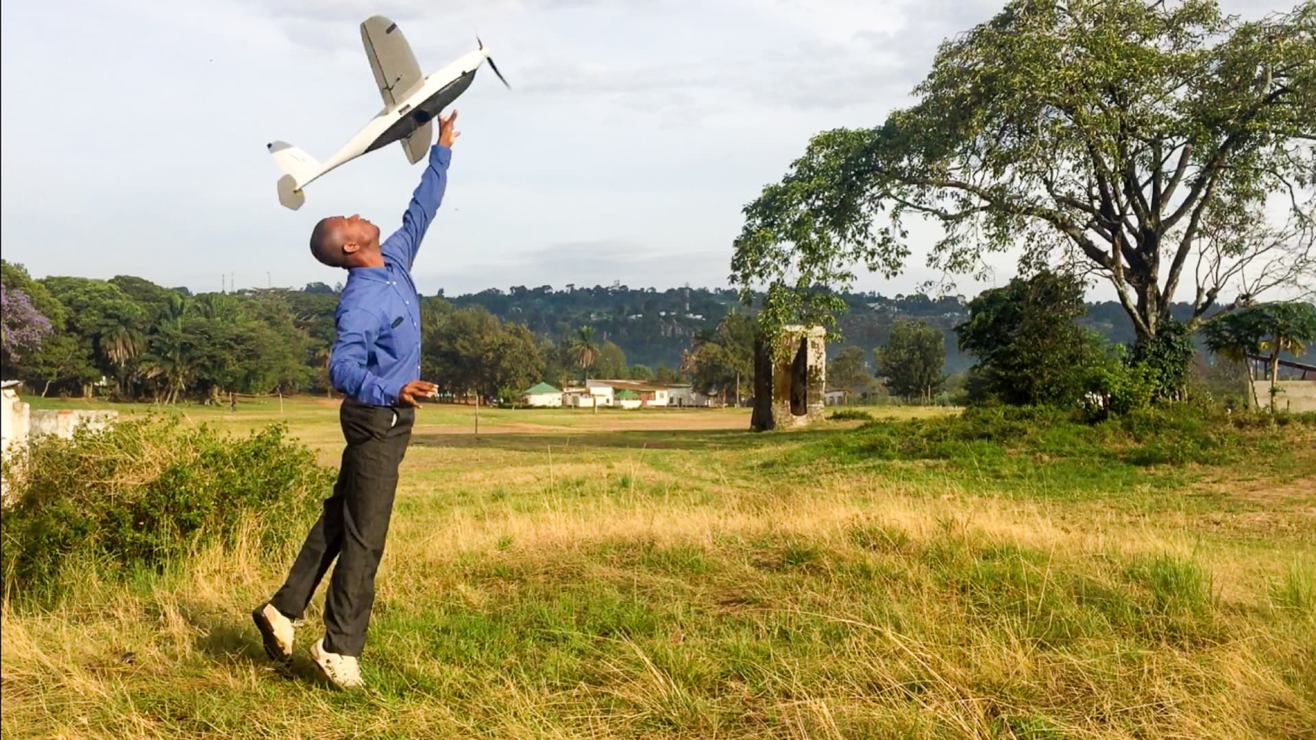
USA Today fielded a large team of more than 30 reporters and photojournalists as well as supporting editors, data and mapping experts, software developers, and graphic artists. Together they created the most comprehensive freely-available view of the entire 2,000-mile border.
The USA Today multimedia special report, “The Wall,” is an in-depth narrative about the US-Mexico border that includes interactive maps, video interviews, and behind-the-scenes podcasts with reporters. People can immerse themselves in the geography of the border to understand its complexity.
“We found, as the proposed wall is being discussed, that not a lot of good information exists,” said Nicole Carroll, editor and VP News, The Arizona Republic, and Southwest Regional Editor, USA Today Network. “We wanted people to see on a map where the fence exists, and what it looks like in video, so they could make their own conclusions.”
There’s certainly a lot of conversation about bias in the news, but our map is totally objective. The map doesn’t say the wall is a good idea or a bad idea. It simply shows the real world.
Gathering data
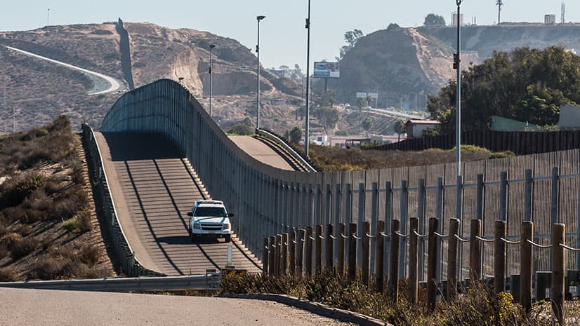
The reporting team flew the entire border in a helicopter, capturing both video and Lidar data. They also drove the complete stretch to uncover stories and to record current conditions. Close visual scrutiny verified each segment of the existing fence, where it starts and stops, and what type of fencing was built.
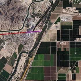
The effort to map border fencing started with a series of 82 PDF maps that the federal government provided to the University of Texas at Austin under a Freedom of Information Act request. The university published the PDFs online, which gave the project team details that they could verify, although not in a very user-friendly format.
A mapping team was formed to compile and query spatial data that included a data reporter along with researchers and journalism students from Arizona State University. The PDF maps allowed mapping specialists to create a feature class of fencing within a geographic information system (GIS), stitching the 82 individual maps onto one map. They could then add more context in the GIS, such as streets, aerial and satellite imagery, topographic (3D) data, and property data, along with their observations.
“Being able to see all the data on a map helps it all click together in your brain,” said Shea Lemar, GIS Project Manager at the School of Geographical Sciences & Urban Planning, Arizona State University, and the mapping expert on the project.
After the map view was created of where the fencing should be, the journalism students sat down and watched 40 hours of full-motion video that the USA Today Network shot along the entirety of the border. The students scoured the entire border, looking at the fencing and adding details in the GIS. They also helped to condense the 40 hours of footage into a seamless end-to-end pass of the whole border, eliminating repeat passes and footage captured outside the border.
“Sometimes they could see the fence [from the border footage], and other times the fence was a good 400 feet away,” Lemar said. “If they couldn’t see the fence, they would flag the area so that a reporter could go there.”
Reporters used GPS to verify the start and stop points of any segments that weren’t captured on video, entering that data into the GIS to build an accurate map.

Objective reporting
“The Wall” project builds on decades of border expertise from The USA Today Network newspapers, the Palm Springs Desert Sun, The Arizona Republic, the Las Cruces Sun-News, the El Paso Times and the Corpus Christi Caller-Times.
“While other news organizations might parachute in on the story, we live here,” Carroll said. “Not only do we feel it was our role to provide this information, I really felt it was our responsibility to do this project.”
The goal was to present the border exactly as it stands and allow individuals and officials to explore every foot themselves so that they could come to their own conclusions about the viability of building a border wall.
“There’s certainly a lot of conversation about bias in the news, but our map is totally objective,” said Josh Susong, news director at The Arizona Republic, and one of the editors who led the project. “There’s no commentary, no slant, no particular point of view, except the point of view of the aerial footage. The map doesn’t say the wall is a good idea or a bad idea. It simply shows the real world.”
After 2,000 miles, takeaways are nonpartisan: The border is not just a line, but a kaleidoscope of unique places, problems and people.
Answering questions
The US has fenced roughly 650 miles of the border, which leaves 1,350 miles without any barrier.
Short steel barricades, meant to stop vehicles only, make up almost half of the existing fencing. That means that about 80 percent of the existing border is accessible to those traveling on foot.
A twisting stretch of the border along the Rio Grande River in Texas poses considerable challenges. The turns along this border stretch were so tight that the helicopter pilot had to increase altitude in order to capture all the bends in the river. Some barriers exist in this area, but they are set back far from the river and the floodplain, which leaves pockets of land on the “wrong side” of the fence.
Reporters also obtained property databases from all the counties that front the Rio Grande. By exploring that data in GIS, they analyzed properties within 500 feet of the border. The analysis revealed that more than 4,900 properties sit within 500 feet of the border, and any wall along that route would disrupt thousands of properties in a state where almost all land is privately owned.
“Nine years ago, the government started taking action to seize land under eminent domain to build fences, and ultimately filed more than 300 cases,” Carroll said. “About 80 of those cases are still in litigation. If you have to litigate against 4,900 pieces of property, you can imagine how long that would take.”
Longstanding record
“The Wall” project contains a great deal of content, including 15 stories, 20 hours of aerial footage, 14 mini documentaries, 10 podcasts, and the immersive virtual reality experiences. While this material covers many angles, there is more to be told.
“We will always be able to say that before any border wall prototype construction contracts had been awarded, before any border wall prototypes or actual walls were being built, we gathered this permanent record of up-close imagery for every foot of the border,” Susong said.
This record is available for anyone to navigate and compare should any wall construction start.
“The Wall” project also serves as an example of today’s data-centric reporting that uses digital tools to explore, decipher and present details. The outcome gives readers an innovative means to see the different angles of the stories for themselves
“I have heard repeatedly, ‘Thank you, this is what journalism should be,’” Carroll said. “We’re really pleased to be getting that feedback.”
Learn more about how imagery aids decision making and about the many maps, apps, and data layers available in the Living Atlas of the World. Learn how smart mapping makes mapping easier and more impactful.

September 27, 2017 |
August 30, 2017 |
August 16, 2017 |