A type of infographic used to depict Napoleon’s disastrous invasion of Russia is today helping corporate executives understand how and where people move.
In an unusual juxtaposition of old and new, the 150-year-old flow map is enjoying a business awakening in the age of digital transformation and smarter, faster decisions.
Unlike many of today’s business tools, the flow map originated in the 19th century, invented by a French civil engineer named Charles Minard who created what has become an iconic map of Napoleon’s 1812 incursion into Russia. In stark shapes and lines, it depicts where the French troops traveled and how many of them succumbed to battle, weather, and illness during the army’s advance and retreat.
Like most useful information tools, Minard’s map offers a wealth of insight at a glance. Now, busy executives are repurposing the medium of flow maps to explore decidedly lighter topics—including consumer habits and how to connect with customers.
The process of analyzing human movement has undergone a digital transformation, and modern location intelligence technology is now making that insight ever more precise.
A New Use for a New Age
The implications for this form of visualization can be significant, and they stretch across sectors—from retailers to corporate office planners to out-of-home advertisers.
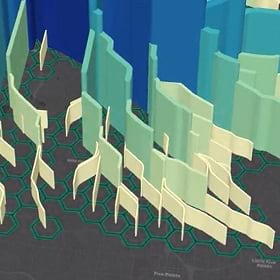
Here’s a look at what a modern-day flow map looks like, in a 14-second animation:
What it shows is the human equivalent of tracking rainfall through a river system. As more people use a given road, the height of the spine on the map grows. Feeder streams connect to tributaries, which empty into arteries, which lead to a destination—in this case, a mall.
The destination could be any place. For example, a clicks-to-bricks retailer might examine several empty storefronts to see how much traffic each attracts at certain times of the day. Likewise, a corporate real estate planner might examine a new office park to see how traffic flows during rush hour, and where professionals go for lunch.
This brand of location intelligence drives capital investments and strategic decisions across the business world today. [For a look at how leading companies like Apple use location intelligence, read this e-Book.]
Drawing Data from the IoT
The data comes from the Internet of Things (IoT)—connected devices like cars, phones, and fitness trackers. Instead of identifying individuals, IoT data is anonymized to create a broad picture of where people move.
Powering this NextTech is a geographic information system (GIS), the software that understands where people are moving within geographic areas and connects that movement to points on a map.
Esri’s Jim Young calls this movement human weather. In a recent WhereNext article, he wrote:
Just as businesses benefit from traditional weather information—by routing supplies around natural disasters, positioning field crews to mend damaged infrastructure, and even predicting how a heat wave might affect sales—a broad range of business activities can benefit from data on human weather.
The marketing industry, particularly out-of-home (OOH) advertising, already benefits greatly from human weather data. But as Charles Minard proved more than a century ago, some pictures tell a story more readily than others. Placing human weather data on a modern-day flow map like the one in the animation reveals at a glance how people move through the built environment, and could spur a major advance for the OOH advertising industry.
The industry is already resurgent. Innovative firms like JC Decaux are employing digital tools to better connect advertisers with target audiences. Adding flow maps to that analysis could lead to more precision in terms of where to place advertising and what rates to charge for each location.
For advertisers, retailers, and real estate planners, it’s a modern twist on a medium that first proved its value two centuries ago.
The Esri Brief
Trending insights from WhereNext and other leading publicationsTrending articles
December 5, 2024 |

June 23, 2026 |
March 3, 2026 |
March 17, 2026 |

April 7, 2026 |

June 2, 2026 |