As we work towards a greener, more environmentally sustainable world, tackling one of the largest sectors of Greenhouse gas (GHG) emissions, transportation, is no easy task. In the U.S., the transportation sector generates the largest share of greenhouse gas emissions at 27%. Greenhouse gas emissions from transportation primarily come from burning fossil fuel for our cars, trucks, ships, trains, and planes. Over 90% of the fuel used for transportation is petroleum based, which includes primarily gasoline and diesel.
There are a number of potential opportunities to reduce GHG emissions in the transportation industry such as fuel switching, improving fuel efficiency in vehicles, improving operating practices, and reducing travel demand. This blog will focus on data and maps needed to switch to alternative fuels.
Using alternative fuels that emit less CO2 than fuels currently being used can help reduce GHG emissions and as well as air pollution. Alternative sources can include biofuels; hydrogen; electricity from renewable sources, such as wind and solar; or fossil fuels that are less CO2-intensive than the fuels that they replace.
Knowing where existing alternative fueling stations are and where to plan future alternative fueling locations are important questions that will be need to answered in order to have a successful roll-out of alternative fuel switching.
That’s where the recently released Alternative Fuel Stations layer comes in.
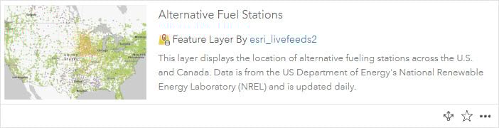
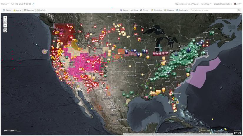
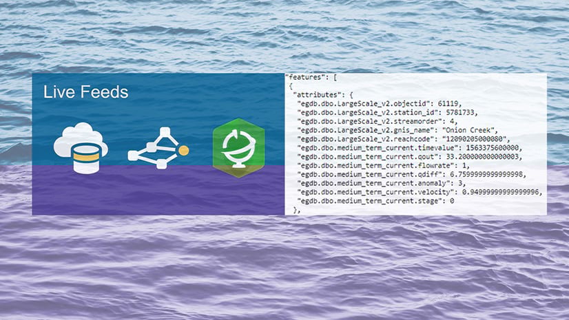
The alternative fuel stations layer is a live feeds layer that displays the location of alternative fueling stations across the U.S. and Canada. Alternative fuel stations include fuel types by Biodiesel, Electricity, Ethanol, Hydrogen, Natural Gas, Propane, and Renewable Diesel.
Data comes directly from the US Department of Energy’s National Renewable Energy Laboratory (NREL) Alternative Fuel Data Center’s API. Sourcing the layer’s data directly through their source API enables this layer to be update daily, so you can get the most recent station locations and updated attribution in order to map or perform more accurate analyses.
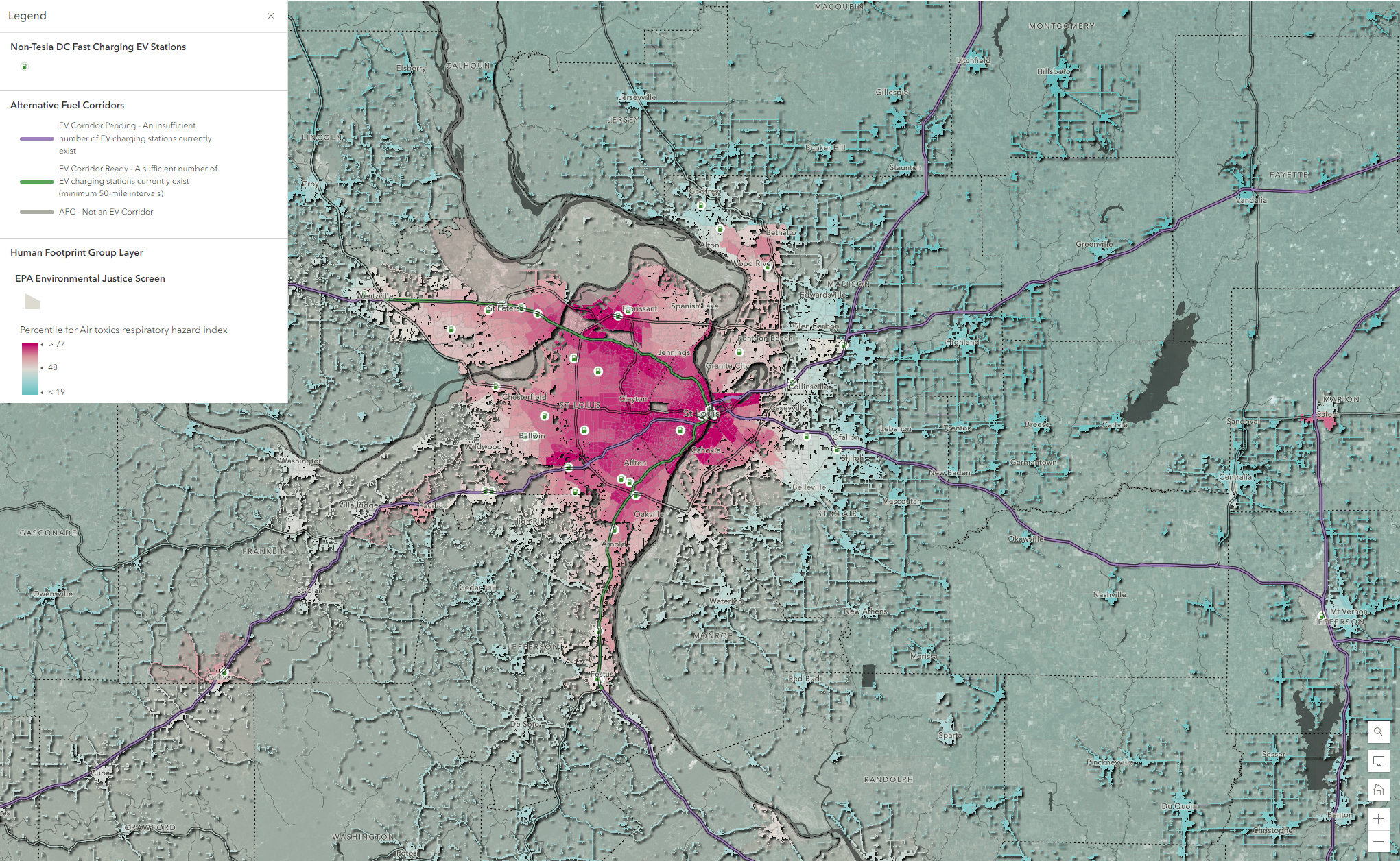
The alternative fuel stations can also be used in conjunction with the Alternative Fuel Corridors layer, a dataset that allows users to view a national network of alternative fueling and charging infrastructure along national highway system corridors. These alternative fuel stations/corridors layers together can help tell the story of where prioritization of federal, state, and local government funding is aimed for alternative fueling.
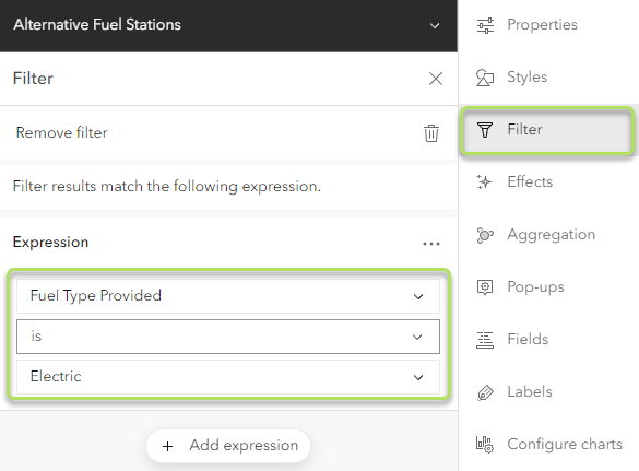
Interested in a specific fuel type?
The alternative fuel stations pop-up by default will show you the specific attribution for the type of alternative fuel at any given station. In addition, the field aliases and long field descriptions are provided to help you understand fields that might otherwise not be confusing.
But if you want to only map only one fuel type, such as ‘Electric’, simply filter the field ‘Fuel Type Provided’ to be ‘Electric’.
What are the use cases for this data?
In order to determine the use case of any dataset, it is important to ask questions about what the data can answer. This dataset can answer a number of questions such as:
- Where are alternative fuel stations?
- Where is the density or cluster of certain types of alternative fuel stations?
- What types of locations are these stations located at?
- Where are there gaps in service / “deserts” in coverage for certain types of fuel alternatives?
- How many cars/people/households per station?
- How many EV charging ports and at what charging level are available at any given location?
- Where are areas where disadvantaged communities are not being served by alternative fuel stations?
- What is ratio/proportion of EV or other alternative fuel stations relative to the population/ housing units/ those who drive/ multi-unit housing units/ income levels etc?
- How many households, businesses, schools, churches are within 10 minutes of this station?
- How many alternative fuel stations can I reach in 10 minutes’ drive? 30 minutes? 2 hours?
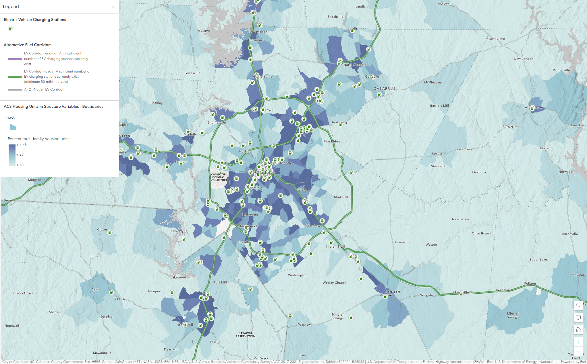
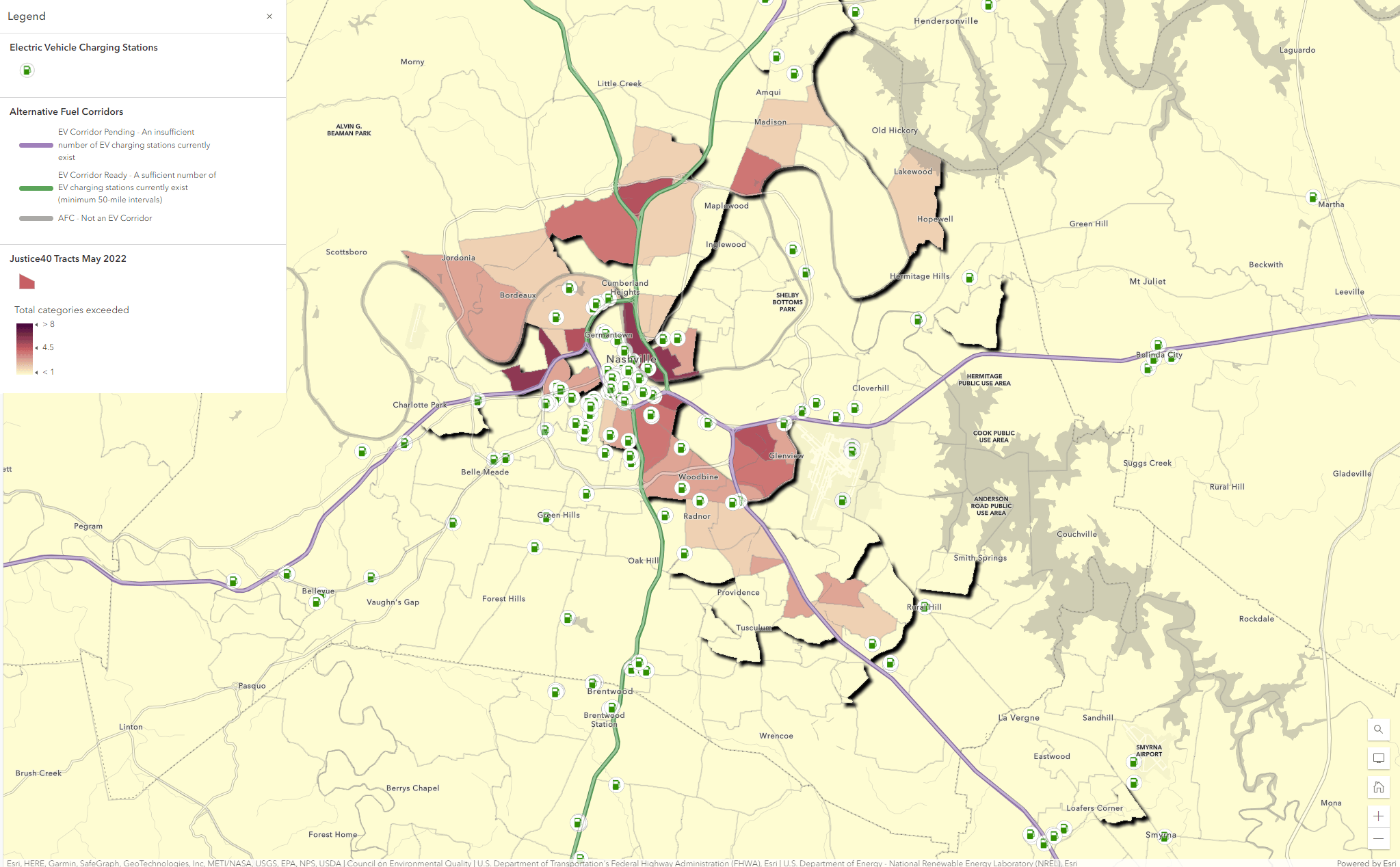
Below are a few examples of maps you can make with this data that answer some of the above questions. Click on the images below to visit these maps.
Where are EV charging stations and high percent of multi-family housing units?
Where are EV charging stations in relation to Justice40 Disadvantaged Communities?
Where are areas with poor air quality and level 3 DC fast charging EV Stations?
How will you use these layers?
The alternative fuel stations layer amongst many other layers in the ArcGIS Living Atlas of the World can be used to create thought-provoking maps, perform analyses to solve complex problems, and as well telling interesting stories. Whether you just want to know where certain alternative fuel stations are/ are not, what the demographic characteristics are around these stations are, or how many stations you can reach within a certain drive-time, these layers can help answer these questions and many more. Start using this layer, start asking questions, and start mapping and analyzing alternative fuel stations today!
Looking for inspiration on how to use this layer?
View this collection of ArcGIS StoryMaps on electric vehicle charging. This collection delves deeper into the electric alternative fuel stations and how EV Charging is being implemented across the U.S.


Article Discussion: