COVID-19 Modeling in ArcGIS Pro
At the beginning of April, Esri released the CHIME Model tool for ArcGIS Pro in the COVID-19 Modeling toolbox. The tool is an implementation of Penn Medicine’s COVID-19 Hospital Impact Model for Epidemics (CHIME) and allows analysts to understand when, where and how large the peaks may be in COVID-19 hospitalizations, and to visualize how social distancing could help flatten the curve. Over 3,500 downloads later, we’ve now added an exciting new tool to the toolbox – the COVID-19Surge (CDC) tool. This tool is an implementation of the CDC’s COVID-19Surge spreadsheet-based tool which provides similar insights to assist hospitals, cities and regions with resource planning. It can also incorporate strategies that involve varying interventions over time, which is particularly helpful at this time when states are considering – or even starting to – reopen.
COVID-19Surge (CDC)
COVID-19Surge (CDC) uses epidemiological modeling to estimate future hospitalizations (non-ICU, ICU and ICU with ventilator) based on current and historic case levels, and epidemiological variables. Excitingly, this tool allows you to simulate the effect of adding or removing an intervention, or even of gradually decreasing the extent of interventions over time.
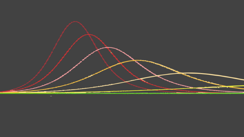
Using hypothetical data, Figure 1 shows how removing an intervention with an effectiveness of 50% (i.e. social distancing that was causing a 50% decrease in transmission of COVID-19) has the potential to cause a second wave if it is completely removed too early. The gray shaded area on the chart shows the time span of the intervention.

Of course, we know it’s likely that we won’t just suddenly go back to our normal lives. Using consecutive interventions in the tool, we can model the impact of the gradual decrease of intervention effectiveness, and even vary this by location, for example to account for different policies across counties in a state. Figure 2 shows a hypothetical scenario, where intervention effectiveness is gradually decreased from 50%, to 29%, to 0%, at different time periods. You can create this chart yourself by following the steps detailed in the Example Workflow section of the COVID-19Surge documentation.

Comparing Hospitalization Estimates
As many analysts know, a model is only as good as the data and assumptions that go into it. One model may have strengths where the other has weaknesses, one may have a tendency to overestimate and another to underestimate, or one may have data requirements that are harder to obtain than others. Confidence in model estimates rises when we can run different models and see similar results. Likewise, running several models and seeing different results may demonstrate how sensitive the model estimates are to the input data and modeling techniques.
In ArcGIS Pro, you can directly compare the outputs of the CHIME Model tool and the COVID-19Surge tool. The toolbox documentation provides tips on how to prepare your data so you have equivalent inputs to use in each tool. Each tool provides the same output feature classes, maps and charts for simple comparison. Once you have a result from each model, or two results from the same model, you can use the Capacity Analysis configurable app to get your results into the hands of decision makers. The app shows two hospitalization scenarios side by side, allowing them to be interactively compared to show when and where capacities are reached for each scenario.
Resources
We can’t wait to hear how you make use of the new tool! For questions, comments and support, please visit the COVID-19 GeoNet community. References and other resources for COVID-19 Modeling in ArcGIS Pro are listed below:
- CDC’s COVID-19Surge
- Penn Medicine’s CHIME (COVID-19 Hospital Impact Model for Epidemics)
- Esri’s COVID-19 Modeling toolbox
- Esri’s COVID-19 Modeling toolbox documentation
- Esri’s COVID-19Surge (CDC) tool documentation
- Esri’s CHIME Model tool v1.1.2 documentation and video
- Esri blog – Models and Maps Explore COVID-19 Surges and Capacity to Help Officials Prepare
- ArcGIS blog – Understanding what it takes to flatten the curve
- Definitive Healthcare: USA Hospital Beds data from the Living Atlas – note that although this data is a good starting point, or replacement in the absence of no hospital bed data, accuracy is not guaranteed.
- Imperial College Report – Impact of non-pharmaceutical interventions (NPIs) to reduce COVID19 mortality and healthcare demand


Article Discussion: