Modeling the curve
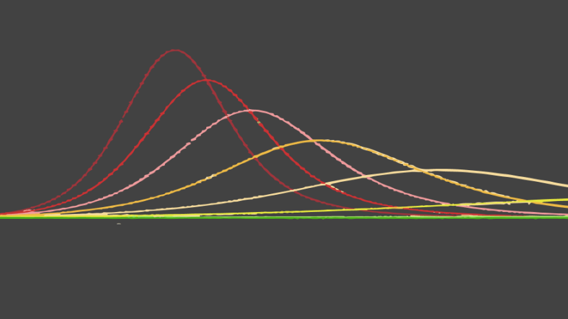
By now, we’ve all heard about flattening the curve. The idea, depicted by the conceptual diagram in Figure 1, is that by taking steps to slow the spread of COVID-19, virus transmission will decelerate, the burden on hospitals will be reduced, and fewer people may contract the disease. Visualization of this concept helps to convince citizens and policy makers that social distancing and other interventions to slow the spread are the best strategies to help them reduce the burden on their local healthcare systems. But these conceptual diagrams only help to guide our policies – they do not help to quantify how effective the policies will be. Understanding what these curves actually look like in a certain location, based on current and historic disease and hospitalization patterns and potential interventions, is possible using epidemiological modeling. By modeling real curves, we can simulate and quantify the impact of policy interventions before they are made, to better understand the long-term impact. One such model is Penn Medicine’s CHIME (COVID-19 Hospital Impact Model for Epidemics), which has been implemented as the CHIME Model tool in ArcGIS Pro.

The CHIME Model tool helps policy makers, hospital administrators and others understand when, where and how large the peaks in COVID-19 related hospitalizations will be. By altering the model parameters, we can understand the impact of different levels of interventions even before we make those decisions. Two alternative modeling scenarios from the tool can be compared using the Capacity Analysis configurable app – showing what interventions are necessary to flatten the curve and what different scenarios mean for hospital resources. A state might use the app to compare how a more severe stay at home order will ease pressure on hospital capacity. Or a hospital administrator might use it to understand the different impacts of best- and worst-case recovery scenarios on future bed usage. Presenting different COVID-19 modeling scenarios in this app puts interactive results in the hands of non-technical audiences, helping decision makers visualize exactly what it takes to flatten the curve in a specific location.
")
Modeling your own curve
This section provides you with the knowledge and resources necessary to model the curve using your own data, then effectively communicate the results of the analysis.
The CHIME Model tool for ArcGIS Pro is contained within a downloadable toolbox and featured in the COVID-19 GIS Hub. In the third version of the CHIME model tool, we’ve made enhancements so that the output feature classes work seamlessly with the new Capacity Analysis configurable app, available for ArcGIS Online or ArcGIS Enterprise. More information about the tool is available in the Esri blog, and a workflow using the tool with data from Florida is shown in the video below.
Before running the tool you’ll prepare your data with total population, number of current hospitalizations, unique ID, and hospital/ICU/ventilator capacity fields. Then you’ll design the model parameters for the two scenarios you’d like to compare. These model parameters can be constant or can vary by location (driven by a varying field).
Run the CHIME Model tool (version 3, updated 4/17/2020) twice, once for each model scenario. You can consult the CHIME Model video or documentation for guidance on how to run the tool. Most importantly, ensure you check the parameter Add Additional Web App Fields in Summary to use the model results in the Capacity Analysis Web App. To use this parameter, you’ll need to provide Unique ID, Total Bed Capacity, Total Ventilator Capacity, and Total ICU Bed Capacity fields, and the Summary Output Feature Class can’t be a shapefile.

With the Summary Output Feature Class from each model in a map in ArcGIS Pro, publish the map as a Web Layer of layer type Feature. When publishing it is advised to change the Time zone to the computer time zone in the Configuration tab of the sharing pane. If the time zone is left as <None>, the service will assume the date fields are in UTC, so the dates may appear incorrect in the app.
In your portal, save the published layer in a new map. Navigate to the Capacity Analysis configurable app, and Create a Web App using the new map. Configure the Left Panel and Right Panel maps to use the layers from each of the scenarios, then save and launch the app.

An example* of the Capacity Analysis app has been created using Florida COVID-19 hospitalization data by county, derived using the data shown in the Florida Department of Health dashboard from 04/03/20 and enhanced with hospital and ICU bed capacity data from Definitive Heathcare. In the absence of ventilator capacity data, ventilator numbers have been imputed as 1.7 times the number of ICU beds. The CHIME tool was run once with 29% social distancing and again with 50% social distancing, values that are guided by the low and medium intensity social distancing strategies from Imperial College research, following the Covid Act Now model. All other parameters used default values for demonstration purposes.
Evaluating policy options using the app
In this fictional scenario, we created a Capacity Analysis app for Florida counties* to show policy makers what level of social distancing is necessary in the state to reduce the burden on the hospital system. The first thing we notice when visualizing the results in the app (Figure 5) is a drastic difference in the peak hospital beds required in the 90 days modeled– from around 78,000 beds when social distancing is 29%, to 33,000 beds when social distancing is 50%. Critically, this means that the hospitalization capacity is exceeded with the 29% scenario, but not with the 50% scenario. We also see a significant lag in the peak in the 90 days modeled when 50% social distancing is applied – changing the peak from the start of June to the start of July.

Changing the Variable drop-down to ICU Patients, we notice that even with 50% social distancing, the ICU capacity is exceeded by May 31st(Figure 6). We can view the exact date by sliding the time slider – notice the indicator on the upper right corner of each map changes from grey to red once the capacity is exceeded.

As the slider moves, the symbology is updated to show the capacity on the current date. The Map Legend pop-out tells us that the color changes from grey to red with increasing hospital stress, and the size increases by number of patients above capacity. Clicking on a single county point on the map, for example Sumter county, we see data pertaining to the status of hospitalizations on the current date, plus information about the maximum number of patients on the worst day and the number of days the capacity is exceeded. The chart is also filtered to show the capacity and predicted demand only for this county (Figure 7).

The results of the CHIME tool presented in the Capacity Analysis app have provided a convincing argument for policy makers in this fictional scenario – increasing social distancing measures from low to medium intensity in Florida could in many locations mean the difference between hospital, ICU and bed capacity being exceeded or not. Using this app as a method of visualization, analysts can more effectively communicate results to better inform policy making and resource planning.
Resources
Here are some resources you can use to learn more about the CHIME model and COVID-19 modeling:
- Penn Medicine’s CHIME (COVID-19 Hospital Impact Model for Epidemics)
- Esri’s CHIME Model geoprocessing tool
- Esri’s CHIME Model documentation
- Esri’s COVID-19 GIS Hub
- Esri’s COVID-19 Geonet community
- Esri blog – Models and Maps Explore COVID-19 Surges and Capacity to Help Officials Prepare
- Definitive Healthcare: USA Hospital Beds data from the Living Atlas – note that although this data is a good starting point, or replacement in the absence of no hospital bed data, accuracy is not guaranteed.
- Imperial College Report – Impact of non-pharmaceutical interventions (NPIs) to reduce COVID19 mortality and healthcare demand
- CDC Report – Community Mitigation Guidelines to Prevent Pandemic Influenza — United States, 2017
*The Florida Capacity Analysis example app is for demonstration purposes only. These are NOT official models for the State of Florida.


Article Discussion: