In mid April, Esri released Capacity Analysis, a new ArcGIS Online configurable app template to help organizations visualize how interventions to the spread of coronavirus disease 2019 (COVID-19), such as social distancing policies, help flatten the curve and reduce the burden on our healthcare systems.

In an era where geospatial professionals have access to dozens of configurable apps and one-size-fits-all software with seemingly endless out-of-the-box tools, the Capacity Analysis app is just one example of why custom web app solutions and templates are valuable solutions in helping users explore data.
The need for custom apps
Building custom web apps as opposed to using more generic tools has three main benefits for the end user: focus, simplicity, and full control over UX/UI.
Focus. While the ArcGIS Online map viewer and ArcGIS Pro provide seemingly limitless tools for analyzing, exploring, and visualizing data, they don’t have the same level of focus as a custom app. Focus provides clarity to the end user, reduces the need for extensive documentation, and improves overall understanding of the story behind the app.
Simplicity. This is closely related to focus. The ArcGIS Online map viewer already provides many tools for exploring your data. These include filters, dozens of styling options, and analysis tools. While having multiple options gives you greater flexibility, exploring with only one of these methods is often more effective than others. Going simple and providing access to only the best tool for exploring a particular attribute in a dataset keeps things simple for the user.
Full control. Perhaps the biggest benefit of building a custom solution rather than using out-of-the-box tools, is the developer has full control over the user experience and UI.
The benefits of a template app
Template apps provide all the same benefits as custom web apps with the added benefit of being scaleable so you can reuse the same focused, simplified UI for similar use cases. They can also be reused by others with similar needs. That’s why Capacity Analysis was converted to an app template. It can be used by any local, county, state government, or health organization to understand their ability to meet the demand for COVID-19 patients.
You can read more about getting started with configurable app templates here.
App overview
The remainder of this post will show how Capacity Analysis was designed and built following the principles just mentioned.
The focus
Capacity Analysis was specifically designed to help experts understand and communicate how variances in social distancing policies and variances in compliance to those policies reduce the strain on hospital capacity on a day-by-day basis in the event of a pandemic like COVID-19. This data could be on the state, county, or hospital level.
The layers used in this app are generated from ArcGIS Pro’s COVID-19 Modeling Toolbox, based on Penn Medicine’s CHIME (COVID-19 Hospital Impact Model for Epidemics) and the Centers for Disease Control and Prevention’s (CDC) COVID-19Surge.
Users can use the Capacity Analysis app to compare the differences between various outputs from these models. Read the following blogs for step-by-step introductions to learn how you can use these tools to explore your own data using the Capacity Analysis configurable app.
- Understanding what it takes to flatten the curve
- Estimating COVID-19 Hospitalizations Using the New CDC COVID-19Surge Tool
Sure, you can explore your data in a dashboard with maps showing change over time, or in the ArcGIS Online map viewer. But those tools lack the focus a simplified app could provide.

A simple user experience
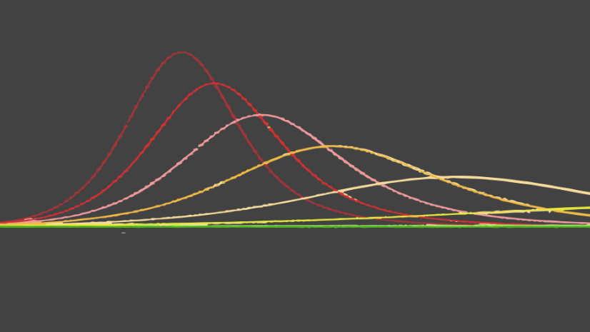
The following chart from the CDC communicates in a powerful way how timely intervention can reduce hospital stress during a pandemic. It’s simple and effective because it shows two vastly different outcomes in a single view.

We wanted to make the Capacity Analysis app similar in simplicity by allowing users to spatially explore how demand for hospital beds, ICU beds, and ventilators reduces when social distancing policies are followed.
This is effectively done with a simple UI that gives the user two basic controls: a dropdown menu for selecting a variable to explore, and a slider to observe how the demand for the selected variable changes over time.
When the user selects a new variable or moves the slider, the visualization updates, communicating whether current hospital capacity numbers would be able to handle demand given a later peak date.
Full control over functions and layout
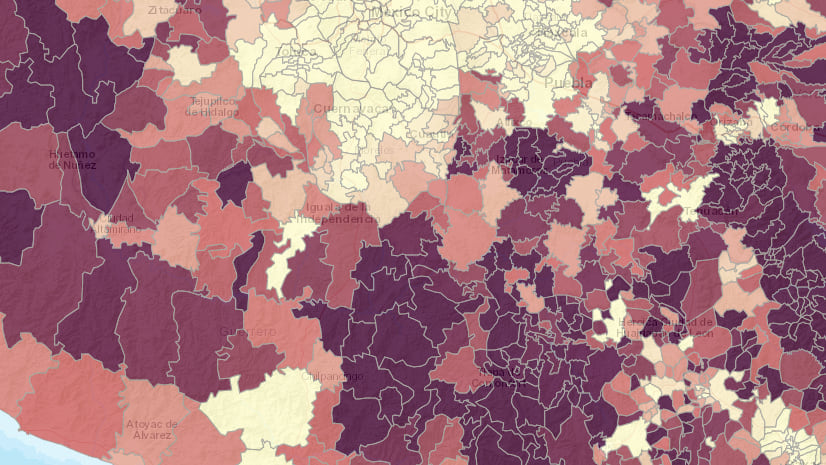
After exploring various ways of comparing and contrasting the output data, we decided it was most effective to display the familiar line chart of overall hospital demand over time below two side-by-side maps of two separate model outputs. Each view has a colored border matching the corresponding line in the chart.

This makes it easy to compare two different scenarios. For example, the map on the left (orange line on the chart) shows how many ICU beds would be required on June 11 in Florida (this is test data) if 29% of the population follows social distancing recommendations. The map on the right (blue line in the chart) shows the required ICU beds by geography if 55% of the population observed social distancing.
Changing the selected variable or the slider value simultaneously updates the renderer of both layers and the chart to indicate the projected demand for the selected variable on the given date.
Having this level of interactivity synced between a chart and two views is not available in ArcGIS Online. So a custom app was the only solution that could achieve this.
Data Exploration through visualization
In web mapping, data exploration takes the form of querying statistics, displaying popups, changing filters, extents, or updating the renderer of the layer.
The primary method of exploring data in the Capacity Analysis app is updating the renderer using a slider. Each time the slider value updates, the renderer changes.

The symbology is straightforward. A continuous color ramp is used to color each feature based on the percent capacity the hospital is expected to be operating at on a given day. Gray means all is good; the hospitals are operating below capacity. Orange means hospitals have reached 100% capacity. Red indicates hospitals are stressed to 200% capacity or higher.
The size of the symbol indicates the order of magnitude a feature’s hospitals are over capacity. Therefore, the size communicates the total number of patients expected to demand treatment in a hospital and potentially not have access to a hospital bed.

Invite interactivity with fast performance
As you move the slider and view the icons change color and size, it may appear the app is updating the visual properties of a renderer. In reality, the renderer’s color and size visual variable properties are static. Having a constant reference for color and size is important when comparing two similar datasets, especially when they involve change over time.
Both layers have the exact same renderer applied. That makes it easy for the user to observe differences between each layer.

Each time the slider updates, the underlying data attribute changes. Rather than store daily values for each attribute as a separate row in the layer, the ArcGIS Pro CHIME tool outputs the projected values for each day as a list of pipe-separated values — one value for each day. This ensures all the data is attached to one geometry and we don’t have duplicate points representing the same geographies.

Each position (or index) of the list indicates the number of days since the start of the model. For example, the sixth value in the web_chosp field is the number of hospital beds expected to be used by COVID-19 patients on the sixth day from the start of the model’s output.
The app uses Arcade expressions to parse the appropriate value from the selected attribute for the given slider position.
const getPercentCapacityExpression = function ({
  variable,
  day
}) {

  // EXAMPLE FIELD NAMES FOR PROJECTED NUMBERS
  // web_chosp - Projected number of hospital patients
  // web_cicu - Projected number of ICU patients
  // web_cvent - Projected number of ventilators required
  const countsField = analysisParameters.variableFields[variable].COUNTS;

  // EXAMPLE CAPACITY FIELD NAMES
  // oc_hos_num - Total number of available hospital beds
  // oc_icu_num - Total number of available ICU beds
  // oc_vnt_num - Total number of available ventilators
  const capacityField = analysisParameters.variableFields[variable].CAPACITY;

  return `
    $feature.${countsField};
    $feature.${capacityField};
    var hospitalized = Max(0,Number(Split($feature.${countsField},'|')[${day}]));
    var capacity = IIF($feature.${capacityField} < 1, 1, $feature.${capacityField});
    return (hospitalized / capacity ) * 100;
  `;
};
Each time the user moves the slider handle, the app updates the renderer with the new Arcade expression based on the slider thumb position.
layer.renderer = {
  type: "simple",
  symbol: {
    type: "simple-marker",
    outline: {
      width: 0.5,
      color: [200, 200, 200, 0.5]
    }
  },
  visualVariables: [{
    type: "color",
    valueExpression: getPercentCapacityExpression({
      // hospital beds, ICU beds, ventilators
      variable,
      // slider position
      day
    }),
    valueExpressionTitle: "Hospital Stress",
    stops: [{
      value: 0,
      color: "#bababa",
      label: "under capacity"
    }, {
      value: 100,
      color: "#f4a582",
      label: "100% capacity"
    }, {
      value: 200,
      color: "#ca0020",
      label: "> 200% capacity"
    }]
  }, {
    type: "size",
    valueExpressionTitle: "Number of patients above capacity",
    valueExpression: getOveragesExpression({
      // hospital beds, ICU beds, ventilators
      variable,
      // slider position
      day
    }),
    minSize: 2,
    maxSize: 32,
    minDataValue: 1,
    maxDataValue: 2050
  }]
};
This method of using separated values in a single field is very similar to having a client-side table join. Having all the data in one attribute allows the GPU to only process the geometries once, making the app more performant. You can then update a reference to the new data value for each slider change without discarding and re-rendering geometries.
This method allows the renderer in both layers to update at up to 60 frames per second without the eye sore of flashing because all the data already exists on the GPU. Since the geometry is already rendered, the color and size of the icons just need to update based on the data value parsed from the Arcade expression.
The Mapping large datasets on the web blog and Update a renderer’s attribute JS API sample go into more detail about this method of data visualization.
Conclusion
Because of its usefulness to governments and hospital administrators in assessing policy effectiveness, the Capacity Analysis app was converted to a configurable app template so it can be used by others to explore two outputs from the ArcGIS Pro COVID-19 Modeling Toolbox for geographies relevant to them.
Capacity Analysis is an example of why you should always consider using templates or building custom web applications in a focused, simplified manner for data exploration and client-side analytics, even in highly volatile emergency situations like a pandemic.
Resources
Check out the following resources for more information about the CHIME model and how to create focused interactive apps.
App development resources
- Mapping large datasets on the web
- Update a renderer’s attribute
- Generate Arcade expressions for data exploration web apps
- Creating visualizations manually
- Visualization best practices
CHIME and COVID-19 resources
- Understanding what it takes to flatten the curve
- Estimating COVID-19 Hospitalizations Using the New CDC COVID-19Surge Tool
- Penn Medicine’s CHIME (COVID-19 Hospital Impact Model for Epidemics)
- Models and Maps Explore COVID-19 Surges and Capacity to Help Officials Prepare
- ArcGIS Pro CHIME Model
- Capacity Analysis example app

Article Discussion: