We are halfway through the year, and the June release is one everyone looks forward to! With this release of ArcGIS Business Analyst Web App and ArcGIS Business Analyst Mobile App, we bring you more ways to analyze, more control over what you see, and deep data to fuel every decision from local neighborhoods to markets spanning an entire continent.
ArcGIS Business Analyst is Esri’s location-based market intelligence application designed to help you make smarter decisions for market planning, site selection, and customer segmentation. Any ArcGIS Online user with a Creator user type or above has access to ArcGIS Business Analyst Web App Standard with their license and can launch the app from the app switcher to get started with ArcGIS Business Analyst.
If you’d like to learn more or want to try ArcGIS Business Analyst Web App, sign up for a 21-day free trial.
Highlights of this release include:
- More precise POI search for sharper market insight
- New buffers around line features: Insights and analysis along every route
- More control over your analysis: From insights to sharing across the organization
- Turn questions into insights faster with the Business Analyst assistant
- Infographic updates
- Stay current with refreshed data and geographies
- ArcGIS Business Analyst Mobile App
- ArcGIS Experience Builder: Business Analyst widget
More precise POI search for sharper market insight
There are several updates to points of Interest (POI) in this release, adding new ways to search and filter POI to help you focus on the businesses and places that matter most to your organization.
Open hours filtering
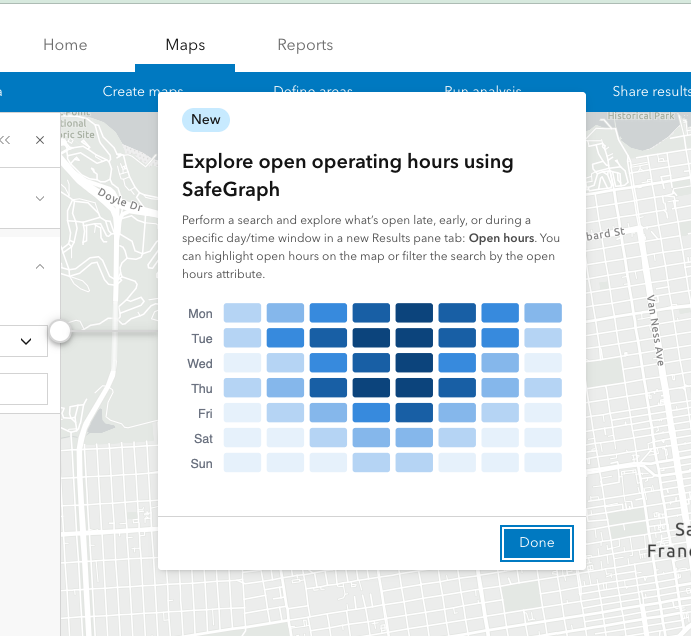
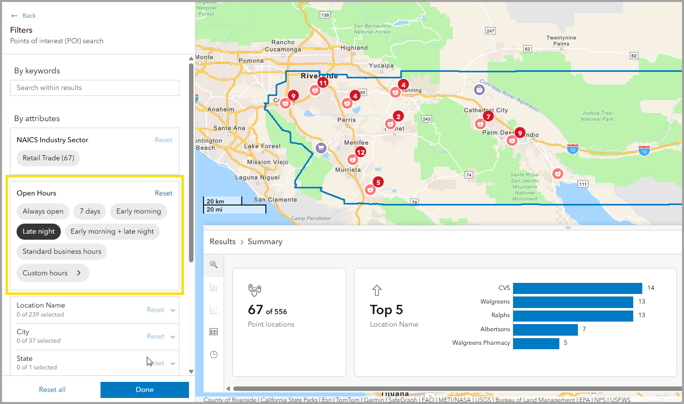
Introduce time and context into your analysis. This update adds the ability to analyze points of interest based on actual operating hours when using the SafeGraph POI data source. You can now filter POIs by preset options, such as open late night or early morning.
This capability brings a whole new level of context to your search. For example, maybe you need to quickly find pharmacies that are open late for emergency medicine needs in a city or county. Simply switch to the SafeGraph data source, then use the keyword search shortcut for pharmacies in your area of interest. In the workflow pane, show filters and click Late night to immediately update the map to show only businesses open between 10 pm and 3 am.
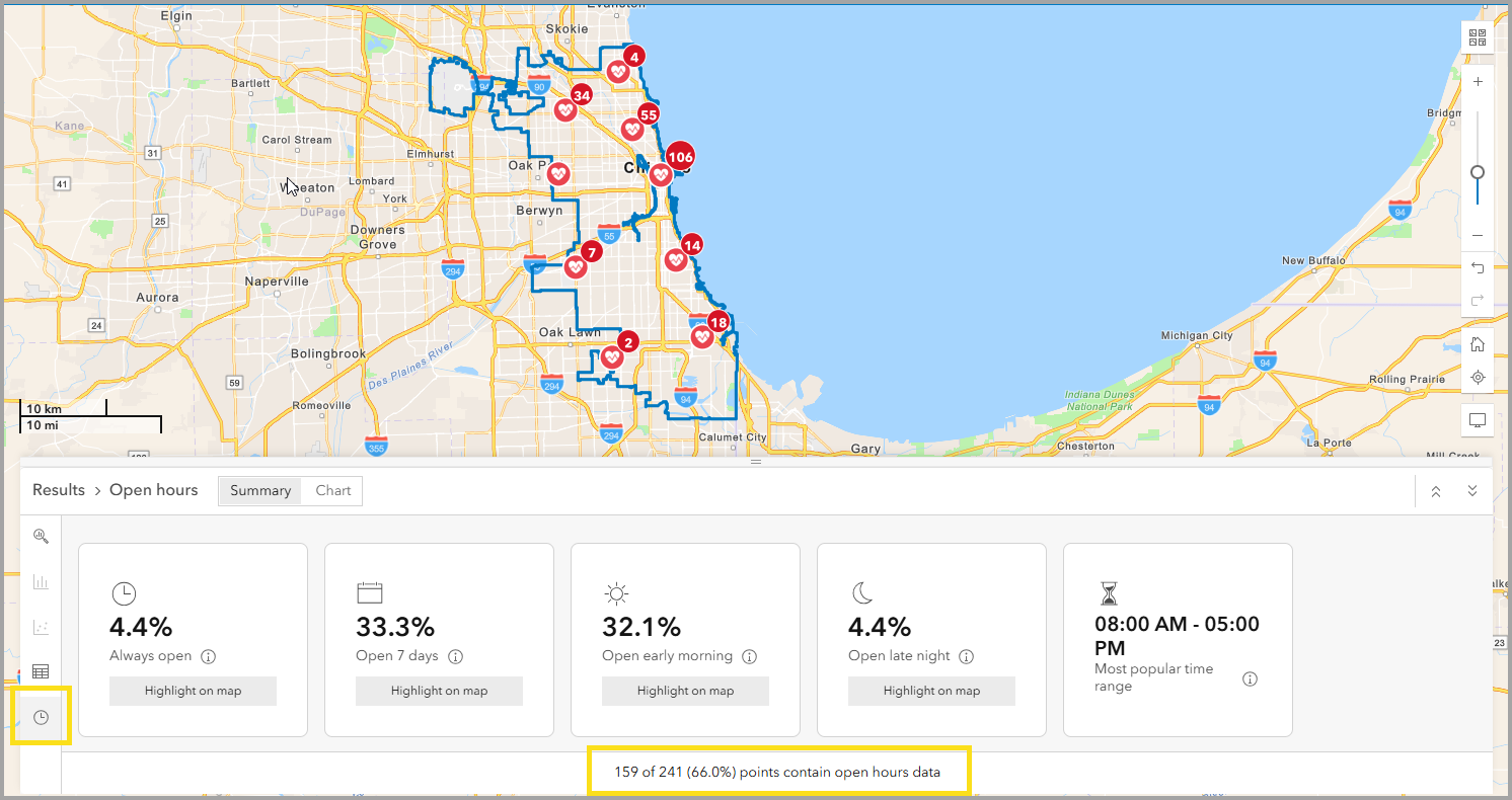
The Results pane has new visualizations to support open hours exploration. In the example below, urgent care centers are shown in the Chicago area on the map. The open hours view in the Results pane shows an overview of POI operating hours, including the total percentage of locations with open hours information.
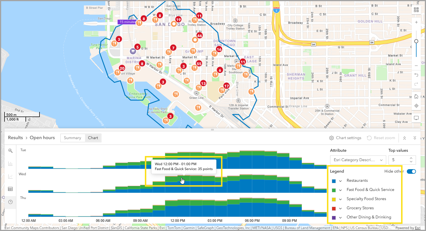
The results pane offers different visualizations for your analysis needs, including summary, tabular, and chart views. The view for Stacked bar is especially useful when exploring results that include multiple categories. The example below shows results for different types of restaurants within a 15-minute walk time of the San Diego Convention Center. Hover on the bar chart to see details about the number of points in each category.
The exciting new open hours capability with SafeGraph data will deliver even more advanced analysis with the added dimension of time to your points of interest. For more information, read the new blog: Explore open hours using POI search in ArcGIS Business Analyst Web App.
Quick search options
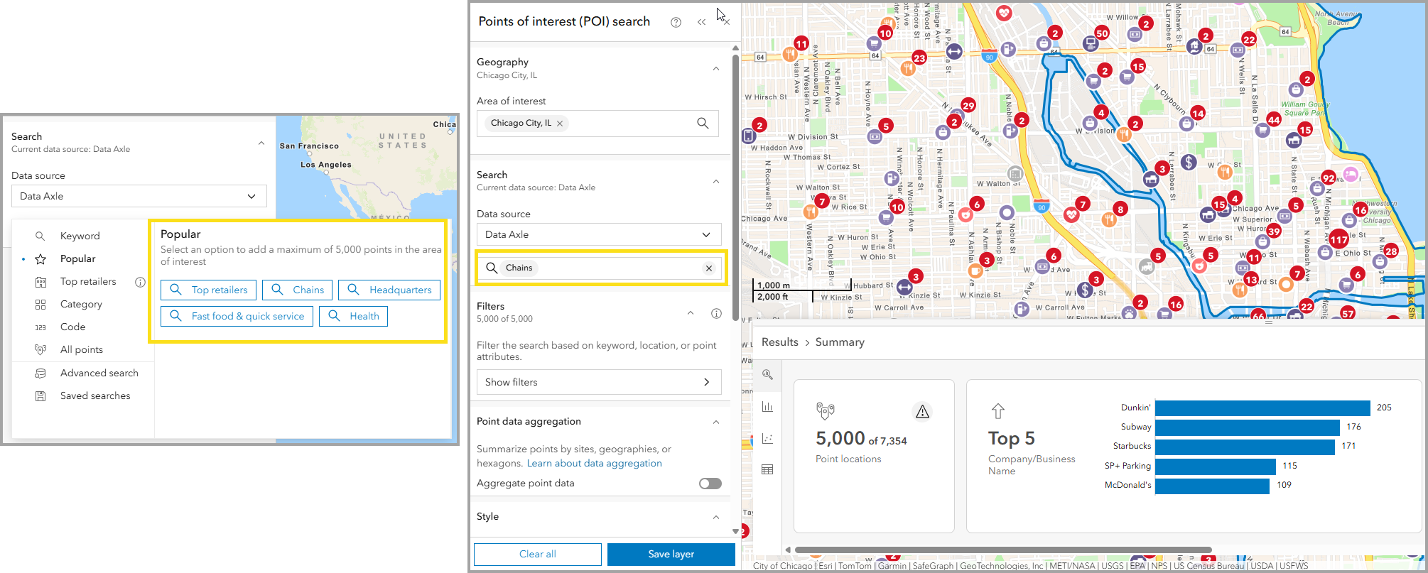
The new popular search options provide faster access to common points of interest searches.
When opening the search window, you will notice a new option to browse POI by Popular, helping you start with commonly used advanced searches instead of having to build from scratch. The Popular tab reveals POI such as chains, headquarters, fast food and quick service restaurants, and health-related locations. These results differ depending on the POI data source used.
Use these search options in POI search, nearby analysis, and void analysis. In the nearby analysis workflow, retail has also been added as a featured point list option.
Expanded top retailers coverage
The top retailers list was a functionality added to POI search in October 2025. This curated list catalogued the top 25 U.S. retailers by sales volume. With the June 2026 release, this list is doubling, now offering the top 50 U.S. retailers. This expansion provides broader coverage of the brands that shape local retail markets, including parent companies and their regional subsidiaries.
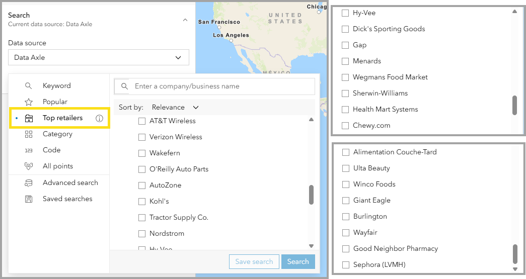
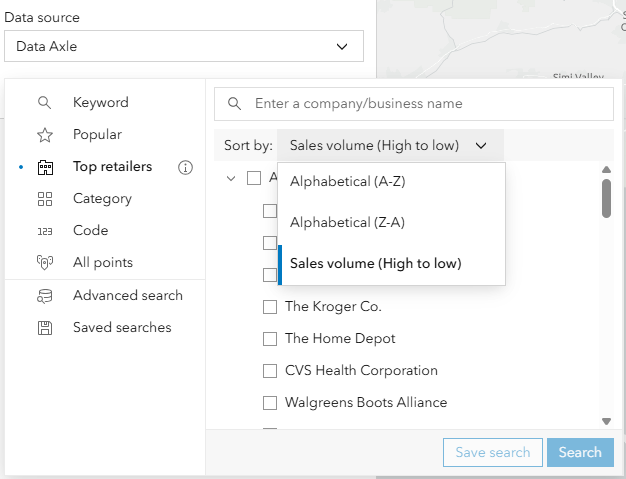
Even more top retailers mean even more insights. Use the Sort by drop-down menu to help you organize the list by sales volume (largest to smallest sales volume) or alphabetically. With these filters, you can identify anchor tenants, understand where major brands operate or are absent, and support site selection and competitive analysis with a clearer view of high-impact retail activity.
This expanded coverage has several applications for different industries. Real estate analysts may use the filters to demonstrate 7‑day livability by identifying access to essential services beyond standard business hours. Public safety personnel can map late‑night activity corridors to better understand where people gather after hours and optimize resource planning. Retail professionals can identify underserved early‑morning or late‑night markets by finding where demand exists, but competition is limited.
Updated Esri Categories
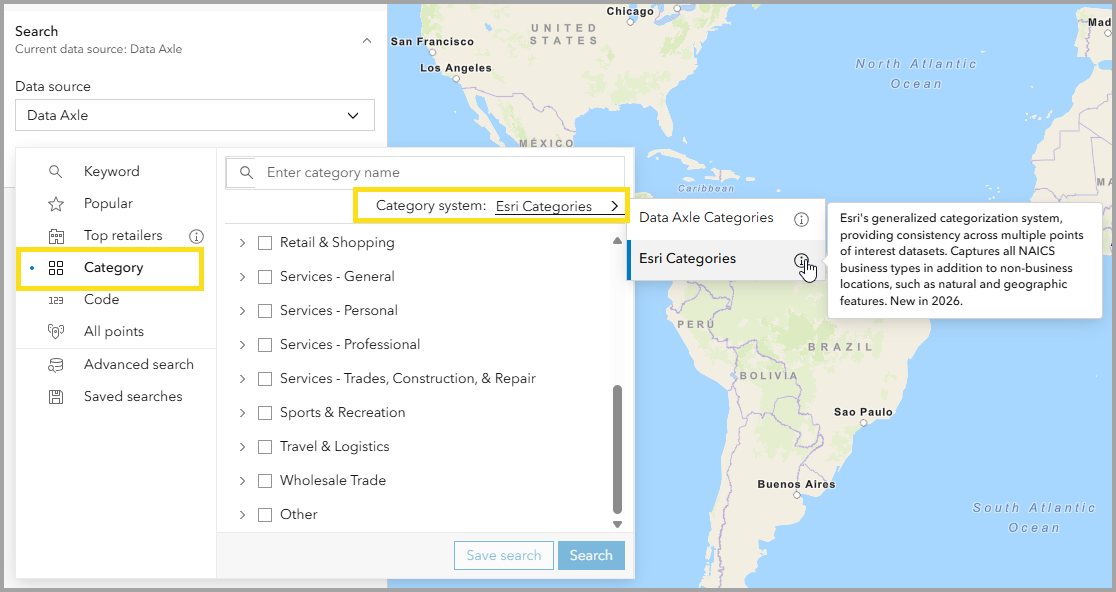
A new category system, Esri Categories, was released in February 2026. In the June 2026 release, this system has an improved structure for more seamless navigation. For example, the Services category has now been broken into common groups such as General, Personal, or Professional.
Additional POI filters in infographics nearby panel
When using POI data in an infographic’s nearby panel, additional attributes are now available for filtering, so you can focus on the businesses, services, or locations that are most relevant to your analysis.
New buffer line features: Insights and analysis along every route

With this release, you are now able to create distance-based buffers around line features, such as roads, transit lines, and corridors. This enables organizations to understand the demographics, spending patterns, and community characteristics that exist along routes or should we say “lines” that matter most to your organization.
For retailers, uncover who travels along the corridors leading to your store, not just who lives nearby. For city planners, gain deeper insight into the communities surrounds a proposed highway or transit expansion. The answers may be more revealing than expected; you’ll be able to gain an accurate picture of the demographics and consumer patterns that will be critical to your decisions.
More control over your analysis: From insights to sharing across the organization
Clearly see what matters and hide what doesn’t with a more flexible Results pane

When performing analysis, getting the most impactful insight as quickly as possible is key, and the Results pane is where that happens. With this release, the Results pane now gives you more control over what you see and how you see it, so you spend less time trying to uncover the results and more time making powerful decisions.
Filter out the noise by simply showing or hiding individual summary cards that focus only on the results most relevant to your analysis. Whether you’re working through a complex site evaluation or a quick demographic snapshot, the Result pane summary continues to provide the insights you need.
Take control of what’s on your map with basemap reference control

If you have ever put together a polished map for a presentation only to find reference labels such as city names and road labels cluttering the view, this is the update for you!
With this release, you now have full control over the visibility of basemap reference layers directly within the map tools. You can either show them when you need to see your surroundings on the map or hide them when you want your data and analysis to take center stage. The result is a presentation-ready map that is both visually clear and analytically purposeful for your organization.
Turn your analysis into a compelling ArcGIS StoryMap

Continuing the StoryMap workflow improvements from the February release, sharing your analysis with stakeholders is now faster and more intuitive than before. Sites shown on the map are now automatically added to your story, common tasks require fewer steps, and you can make edits to a single site or update all sites at once. With these changes, you spend less time on manual work and getting your analysis to the stakeholders that need it quickly.
Note: This is only available in ArcGIS Business Analyst Web App Advanced
Turn questions into insights faster with the AI assistant
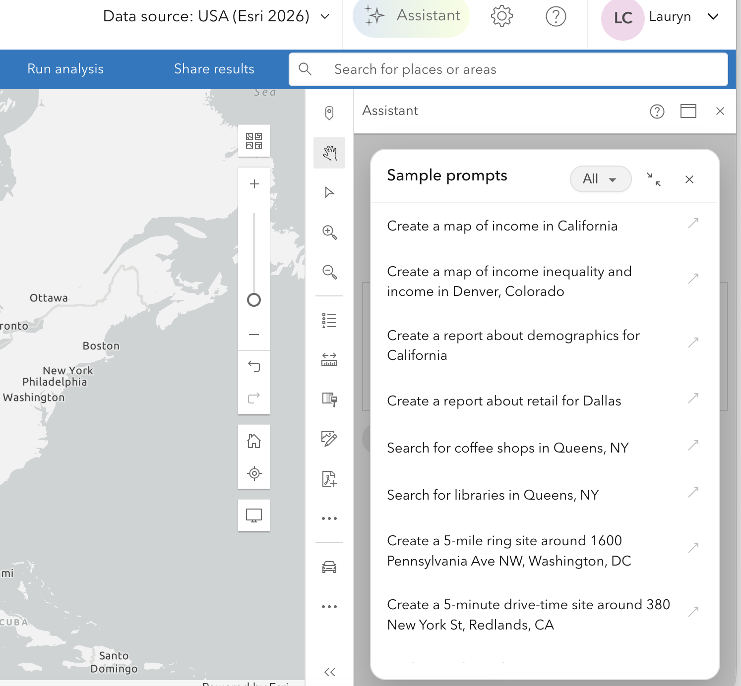
Goodbye beta, hello general availability! That’s right, Business Analyst assistant has graduated from beta and is now in general availability. With this update, we deliver a refreshed interface. There is a new and improved prompt gallery to kick-start your queries.
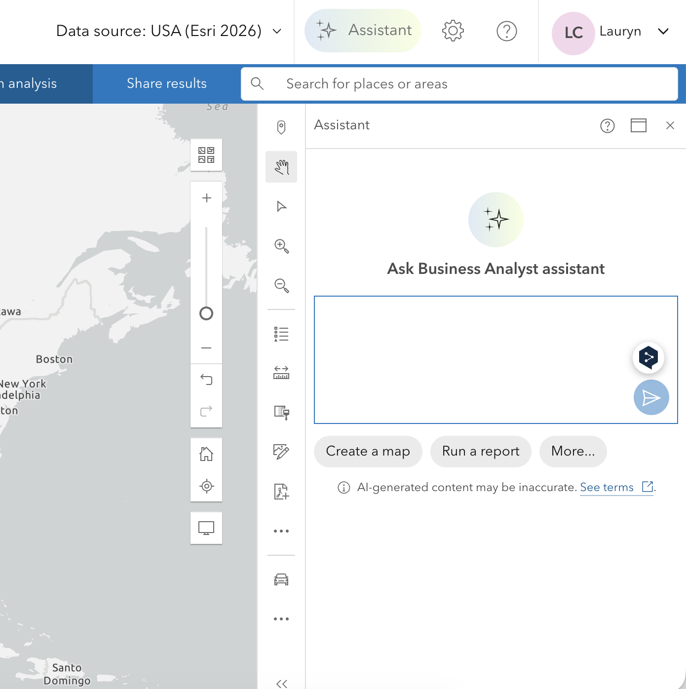
The assistant is also smarter, helping you move from a question to real insights with less effort. With improved reasoning, the assistant better understands your intent even for complex, real-world questions and can guide you through the right tools and workflows without requiring step-by-step instructions. Explore the updated guided tour to see more of what the assistant is capable of in the June 2026 update.
Infographic updates
Modernize your reports: A new era for insights
You may be familiar with the new report style in the form of a toggle button when you run reports. This was introduced in February 2025, and since then, all reports have been updated in a modern design to improve accessibility. You can now find Esri Standard reports in the form of tabular infographics. When you run reports, the toggle button is gone: you can only run modern reports. When you build reports, you are redirected to a new Tabular tab in the infographics builder.
It is highly recommended to migrate your custom reports to the tabular format.
To support this transition, the infographic builder now includes additional advanced text and table capabilities, such as the ability to reference the first or last buffer in multi-feature reports and new dynamic fields including My subtitle, Latitude, and Longitude. Other data sources will move to the new report style over time with future data updates.
To learn more about the new report style, read the updated blog article: What are Tabular infographics in ArcGIS Business Analyst Web App.
New infographic templates
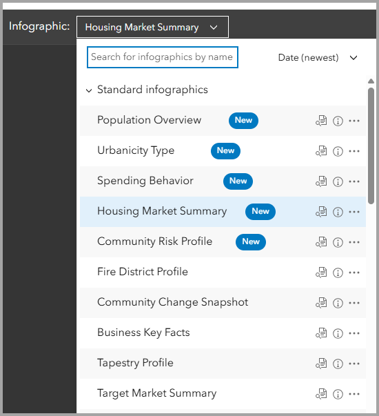
There are several new infographic templates included in this update, as well as several updates moving infographics from gallery to Standard. New templates are easily identified in the Web App with the New label for the June release. All Standard templates have also been updated to support accessibility.
New Standard Infographic: Community Risk Profile | United States (Esri 2026)
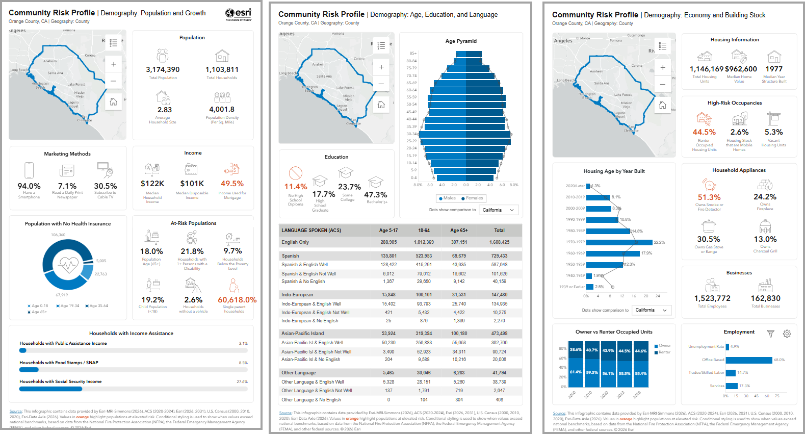
Community risk profile provides an overview of a community’s risk in the event of natural disasters. Variables like how people receive news, income, health insurance, age, language spoken, and housing make this infographic especially useful for local governments assessing the risk level of communities.
New Standard Infographic: Population Overview | Puerto Rico (Census and ACS 2026)
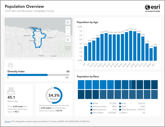
The Population Overview infographic provides an overview of population facts for your site. Variables included in the template present information on diversity index, population by race, and population by age compared to the national average. Users can gain a broad overview of a community’s demographic context in Puerto Rico with the support of this infographic.
Several templates have moved from Gallery to Standard in this update: Population Overview, Housing Market Summary, Spending Behavior, Urbanicity Type.
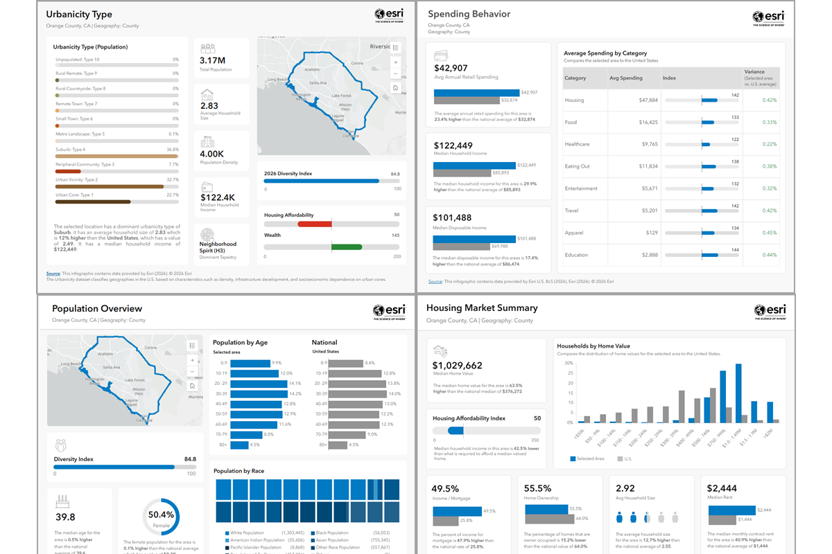
When browsing templates in the Standard tab, hover your mouse over the More information icon next to any template name to view a brief description.
New infographics for Gallery:
ArcGIS Tapestry Demographic Summary
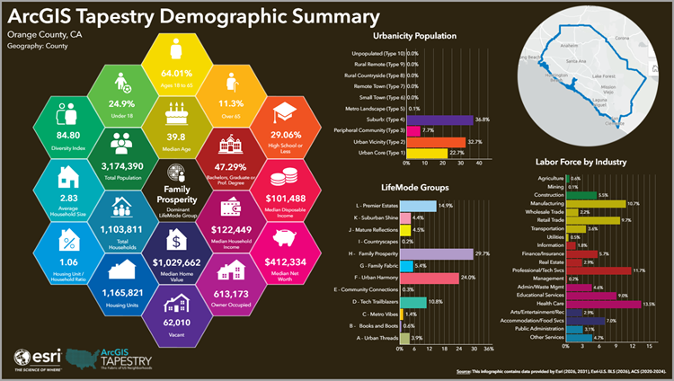
This infographic template provides a snapshot of characteristics of the dominant ArcGIS Tapestry Segment cluster of a community. Businesses and organizations looking to expand and understand new markets will find this infographic valuable to their analysis. Variables included in the template present information on urbanization groups, labor force by industry, household composition, and income.
ArcGIS Tapestry Summary
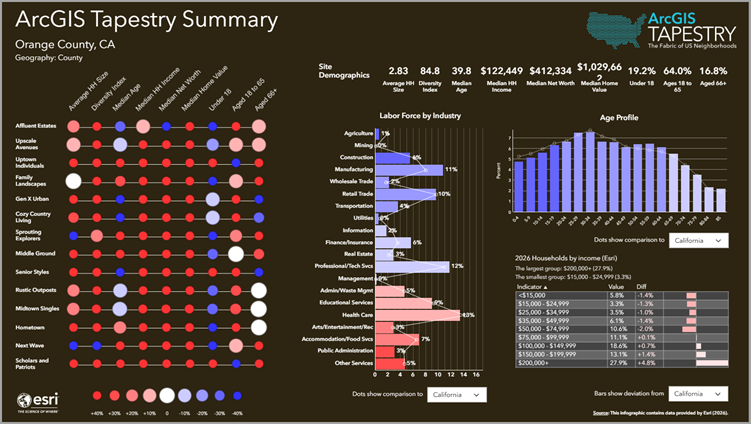
Like the ArcGIS Tapestry Demographic Summary infographic, the ArcGIS Tapestry Summary infographic will be useful to businesses and communities looking to expand and understand their markets. Variables included in the template present information on labor force by industry, age, and households by income.
ACS and U.S. Census data – more variables now available for use in infographics
With the June release, hundreds of ACS variables that were previously only available for mapping workflows, are now available for GeeEnrichment workflows – and this includes creating infographics. In previous versions of ArcGIS Business Analyst Web App, these variables were separated as “Tract” variables. With the release of Esri 2026, these variables are moved to the main datasets for ACS and U.S. Census.
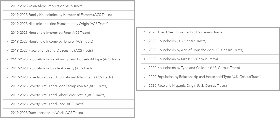
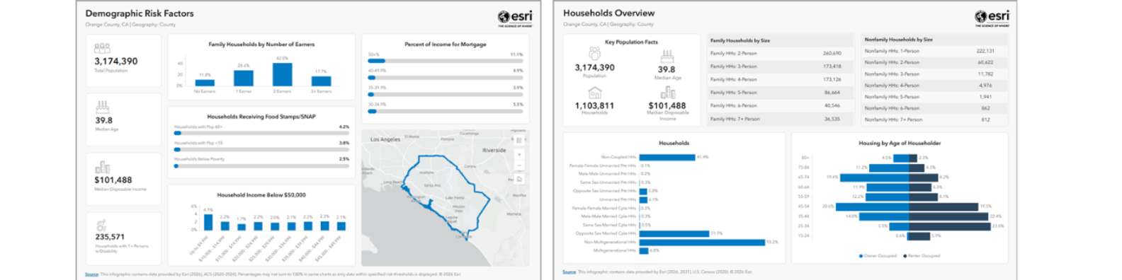
This update unlocks many workflows that have historically been unavailable for users. To highlight this exciting new ability, we have added two new templates to the gallery: Demographic Risk Factors, and Households Overview.
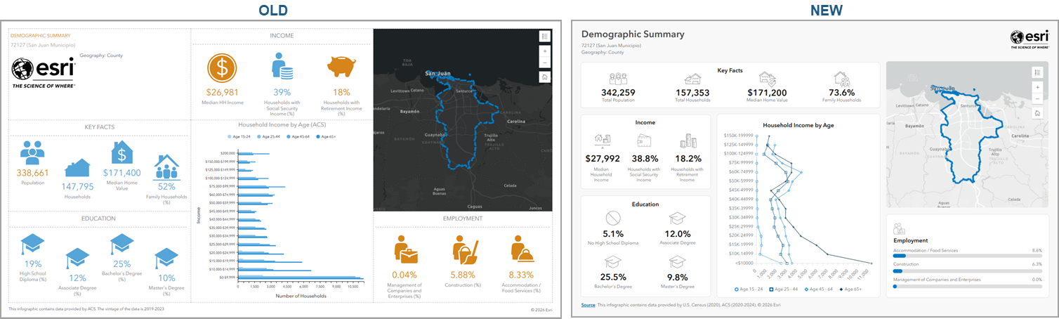
The demographic summary infographic has also been updated to the new design standards for infographics with this release.
Deprecation Note: The Coronavirus Impact Planning template has been removed from the Gallery.
Stay current with refreshed data and geographies
ArcGIS Business Analyst includes over 15,000 variable options from more than 177 countries, and we are constantly updating our data. Business Analyst users have access to Advanced Demographics data sourced from a number of data providers and Standard Demographics data sourced from Michael Bauer GmbH. Here are the latest data updates:
Europe cross-border data source out of beta
Analyzing markets, demographics, and consumer behavior across Europe has meant managing multiple data sources and inconsistent geographies that may complicate direct comparisons. With this release, that obstacle is no longer in your way.
The European cross-border data source, now generally available to Advanced users, combines thirty-nine European countries into one seamless group with population, household statistics, purchasing power, and consumer spending all standardized in Euros. This makes cross-country comparisons easy and reliable.
This release also introduces NUTS (Nomenclature of Territorial Units for Statistics) boundaries in this data source, allowing you to evaluate regions on equivalent regional tiers regardless of how individual countries define their boundaries. Whether you are identifying expansion opportunities, assessing purchasing power in new markets, or tracking , this data source delivers the consistency that European market analysis needs at a much bigger scale.
For more information, read our following blog articles: Using Europe data source in ArcGIS Business Analyst and Understand new NUTS boundaries in ArcGIS
Updated data:
Data is a crucial component, and this release brings meaningful updates across the data that powers your analysis. Here are some notable data updates we don’t want you to miss:
Esri’s updated Demographics now includes new occupation, educational attainment, and school enrollment variables, plus expanded age by income details, giving you a more nuanced lens for profiling workforce, education and household patterns.
Census tract-level data is now available across any workflow that uses the data browser, including building custom infographics, with more than 480 variables spanning income, commuting, poverty, race, ancestry, and household characteristics, bringing you sharper demographic detail.
The Market Potential dataset has also expanded with 114 new variables covering financial services, health, travel, social media, and more.
For organizations operating in Canada, new 2046 DemoStats Trends variables and updates 2026 PRIZM highlights reveal emerging shifts, including growth in high-rise neighborhoods, more older Canadians in retirement communities, and evolving household compositions, keeping your Canadian market intelligence current and actionable.
Complete list of updated datasets:
- 2026/2031 Esri Updated Demographics, 2026/2031 Esri Consumer Spending, 2026 Esri Market Potential, 2026 Retail Demand by Industry, 2026 Urbanicity Type, 2026 ArcGIS Tapestry for USA
- 2020–2024 American Community Survey and Census 2020 data for the U.S. and Puerto Rico, updated to 2026 geography
- Advanced demographics for Canada from Environics Analytics (2026)
- Business Summary data for the United States from Data Axle (April 2026)
- POIs: United States and Canada POIs from Data Axle (April 2026); United States, Canada, and Puerto Rico POIs from SafeGraph (March 2026)
- U.S. Crime Indexes data from AGS (2026A)
- U.S. Traffic Counts data from Kalibrate (Q1 2026)
For more details on the latest data and boundaries, read the What’s New in Esri Demographics blog.
Important data changes: new geography levels
Three new geography levels are now available, giving you more precise and meaningful ways to analyze your maps.
- Census ZIP Code Tabulation Areas (ZCTAs): This offers a more stable, standardized alternative to standard ZIP codes, making it easier to track and compare demographic patterns over time.
- Combined Statistical Areas (CSAs) for the United States (U.S.) and Puerto Rico: This groups neighboring metro areas with shared economic ties, so you can analyze broader regional dynamics without manually piecing multiple markets together.
- Neighborhoods for the United States (U.S.): Your analysis can align with the familiar places people know about making your insights easier to communicate and act on.
Important data changes: Data Transitions
As you are aware, data is constantly evolving and changing. The June 2026 release includes two data updates that require your attentions:
- Esri Tapestry Segmentation and 2024 dataset: As of June 2026, both Esri Tapestry Segmentation and 2024 dataset is retired. IF you have custom infographics, reports, saved lists, or custom variables built on the deprecated Tapestry variables, now is the time to migrate to ArcGIS Tapestry. Read more: Migrate from Esri Tapestry Segmentation to ArcGIS Tapestry using ArcGIS Business Analyst.
- Standard Industrial Classification (SIC) codes: These codes will be fully removed and replaced by NAICS codes across POI Search, Nearby Analysis, Void Analysis, and Data Browser. To ensure your workflows remain uninterrupted, read more: SIC codes transition in Business Analyst.
ArcGIS Business Analyst Mobile App
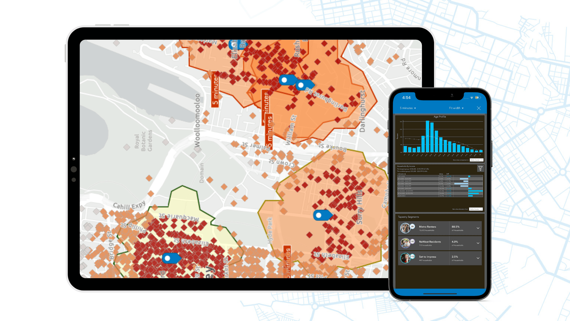
ArcGIS Business Analyst Mobile App is a companion to ArcGIS Business Analyst Web App allowing you to perform location market analysis anytime, anywhere. With the mobile app, you can get quick facts and run infographics for any location with demographic, market, and community data. This release includes several bug fixes and minor enhancements. Available for download on ioS and Android devices.
ArcGIS Experience Builder: Business Analyst widget
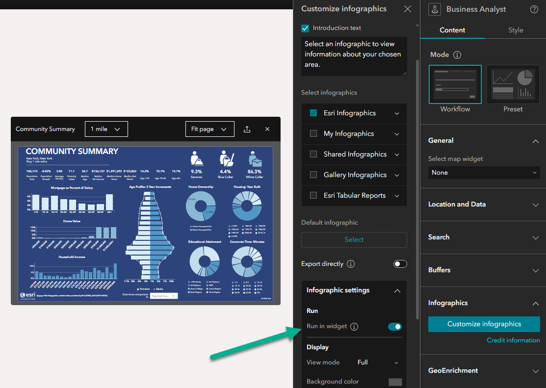
The popular Business Analyst widget in ArcGIS Experience Builder adds several workflow and builder mode enhancements to this update. In Workflow mode, app creators can now enable direct export and customize supported output formats for end users, including PDF, HTML, and Excel. When direct export is turned on, users can also batch export up to five infographics at a time, making sharing even more seamless. Workflow mode also adds the option to view infographics within the extent of the widget instead of needing to open them in full screen. Finally, this release also includes several builder mode UI updates, bug fixes, and general enhancements to better support use of the widget in your workflows. For more details on What’s New in Business Analyst Widget in ArcGIS Experience Builder read the Esri Community Post.
Additional resources
We’re so happy to share this latest release of ArcGIS Business Analyst Web App and ArcGIS Business Analyst Mobile App with you.
Below, we’ve added resources to help you with your ArcGIS Business Analyst journey:
- Register for the ArcGIS Business Analyst Webinar: You Have It. Now Use It.
- Business Analyst product overview page
- Review pricing and purchase Business Analyst
- Join our LinkedIn Business Analyst User Group
- Join our Business Analyst Esri Community
- Follow us on X @ArcGISApps
- Read more Business Analyst blog articles on ArcGIS Blog
- Watch Business Analyst Web App videos
- Watch Business Analyst Mobile App videos
- Visit the Business Analyst Resources page


Article Discussion: