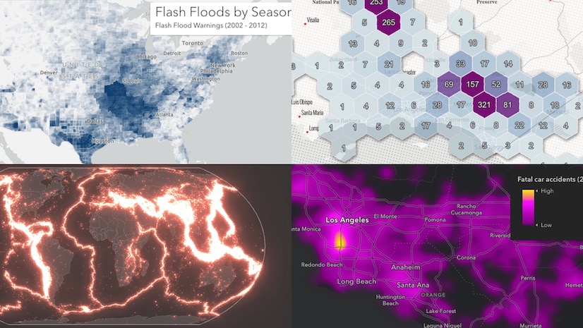
The team building the ArcGIS Maps SDK for JavaScript (JavaScript Maps SDK) is constantly making improvements to boost rendering performance. With each new improvement, we can render more data faster than ever before in the browser. More data means you should be more fluent in the various ways you can effectively visualize the density of large datasets in web apps.
Large point layers can be deceptive. What appears to be just a few points in a small area can in reality be several thousand.
.")
The JavaScript Maps SDK provides a variety of ways to visualize point density. This post will map motor vehicle crashes in New York City using five different techniques for visualizing high density data. I’ll describe each technique, when and why to use it, and link to resources that provide more detail about how to create the style.
Each of the following techniques is also described with different examples in the High Density Data chapter of the Visualization guide in the JavaScript Maps SDK documentation.
Opacity | Heatmap | Clustering | Binning | Bloom
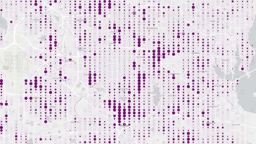
Opacity
Any layer with overlapping features can be effectively visualized by setting a highly transparent symbol on all features. The higher the density, the higher threshold you should set for transparency (between 95% and 99% works best).
Small scale example
 visualized with per-feature opacity.")
When points overlap, the opacity of each graphic has an additive effect, meaning areas of greater density appear prominently and less dense areas only have a faint symbol. This makes individual points very difficult to see, but areas with a high density of overlapping points are prominent.
Large scale example
The following image shows how this style appears when zoomed to a large scale.
 visualized with per-feature opacity.")
I also set a size visual variable on the renderer to change the size of all points as the user zooms in and out. Without this degree of control, points with a fixed size in screen space will begin to overlap at small scales. This will result in a blob of points much like the initial image in this article.
layer.renderer = {
  type: "simple",
  label: "Crash location",
  symbol: {
    type: "simple-marker",
    color: "rgba(197, 27, 138, 0.025)",
    outline: null
  },
  visualVariables: [{
    type: "size",
    valueExpression: "$view.scale",
    stops: [
      // vary the size of icons by scale
      { value: initialViewScale * 4, size: 1 },
      { value: initialViewScale * 2, size: 2 },
      { value: initialViewScale, size: 3 },
      { value: initialViewScale / 4, size: 6 },
      { value: initialViewScale / 16, size: 10 }
    ]
  }]
}

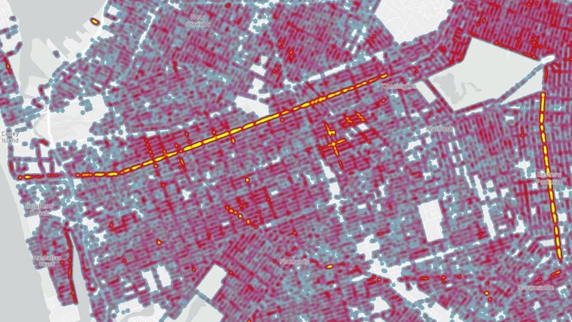
Heatmap
A Heatmap renders point features as a continuous surface, emphasizing areas with a higher density of points along a continuous color ramp. You can also weight the heatmap surface based on a data value. Each pixel in the view is colored based on an interpolated value between areas of high and low density.
Check out this article to learn how to create a heatmap.
Small scale example
 visualized as a heatmap.")
Large scale example
Heatmap can also be effectively used at large scales. Note that the renderer values should be updated so the visualization becomes more appropriate for the scale.
 visualized as a heatmap.")
Had I not updated the style in previous image, I would see the interpolated surface extend into areas, like buildings and parks, where crashes cannot occur.

The referenceScale property of a HeatmapRenderer allows you to lock the visualization to a meaningful scale. This has the effect of making the heat map static, so the density surface remains consistent as you zoom in and out.
Clustering
Clustering is a method of representing points as aggregates based on their proximity to one another in screen space. Typically, clusters are proportionally sized based on the number of features within each cluster.
Clusters automatically adjust as you zoom in the view, making this a good way to view how spatial patterns in density appear at various resolutions.
You can also create multivariate visualizations using cluster symbols, giving you more flexibility than you get with opacity or heatmap.
Small scale example
 visualized with clustering.")
Large scale example
 visualized with clustering.")
Binning
Binning aggregates data to predefined geographic cells, effectively representing point data as a gridded polygon layer. Typically, bins are styled with a continuous color ramp and labeled with the count of points contained by the bin. You can also use any style suitable for polygon layers to summarize point data as aggregates. The JavaScript Maps API uses the public domain geohash geocoding system to create the bins.
The appropriate bin size depends on the view scale and desired data resolution.
Small scale example
The following image shows car crashes binned at a fixedBinLevel of 6.
 visualized with binning.")
Large scale example
Similar to choosing an appropriate radius for clustering or heatmap, the size of each bin should be based on the expected viewing scale. The following image shows car crashes binned at a fixedBinLevel of 7. This bin size is more appropriate as the user zooms in because it shows more precision in how crash densities occur in linear patterns (along roads).
 visualized with binning.")
Bloom
Bloom is a visual effect that brightens symbols representing a layer’s features, making them appear to glow. This has an additive effect so areas where more features overlap will have a brighter and more intense glow. This makes bloom an effective way for visualizing dense datasets, especially against dark backgrounds.
Large scale example
At a large scale, areas with a higher density of crash locations appear brighter. However, because the differences in density are subtle, the variation in this map is not as obvious as other methods like clustering.
 visualized with bloom.")
Small scale example
While bloom creates an eye-catching visual, it can be frustratingly difficult to make bloom settings work at more than one scale. For example, it’s difficult to see intersections with a higher density of crash incidents when zoomed to a smaller scale.
 visualized with bloom.")
Conclusion
There you have it. We have used five techniques to map the density of point datasets. Always ask yourself the following questions when creating a density visualization:
- At which scale or range of scales is calculating the density meaningful?
- At which scale or range of scales is the viewing density visualization important to the end user?
- Is there a scale at which viewing individual locations becomes important?
- Is the phenomena I’m trying to illustrate continuous or discrete? If continuous, is the range in values small or large?
- Do I need to map other attribute information in addition to density?
The preferred technique depends largely on your personal preference. Keep in mind that each has its benefits, bias, and limitations. You should always be aware of these and be deliberate in which limitations you’re willing to live with.
Check out the related articles below to learn more details about some of the examples described in this article.

Article Discussion: